July 14, 2026
The Frequency Matrix: A Tableau Technique You're Missing

What if the data you already have could reveal something you've never seen before? It can, and it starts with a technique most Tableau analysts have never tried: the frequency matrix.
In this full keynote from Appalachian State University's Analytics Day, Andy Kriebel (Tableau Hall of Fame Visionary and founder of Next Level Tableau) builds a frequency matrix from scratch, then shows the same underlying data six different ways: Sankey diagrams, tree diagrams, network diagrams, geographic flow maps, box plots, and slope graphs.
You'll walk away with a technique you can take straight back to your own data, whether you're working with enrollment numbers, customer flow, product usage, or anything else where you need to compare two categories at once.
What's covered:
- What a frequency matrix is and how to read one
- Building a frequency matrix step by step in Tableau
- Using calculated fields to highlight the most common and highest-performing combinations
- Visualizing the same relationship with Sankey diagrams, tree diagrams, and network diagrams
- Mapping geographic flow with Make Point and Make Line
- Guiding principles for building dashboards stakeholders actually use
- Live Q&A on accessibility, color palettes, and chart governance
Want more? Grab my free 30-Day Tableau Skill-Building Accelerator: nextleveltableau.com/accelerator
Download the workbook and data here:
https://nlt.kit.com/frequency-matrix
May 25, 2024
How to Create a Dot Strip Plot in Tableau
June 1, 2021
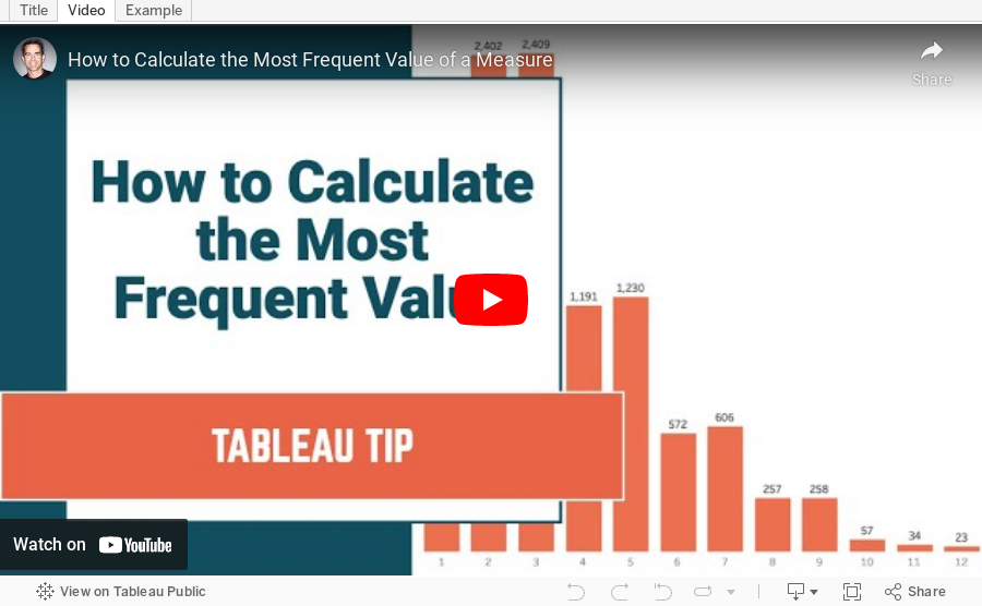
How to Calculate the Most Frequent Value of a Measure

May 25, 2021
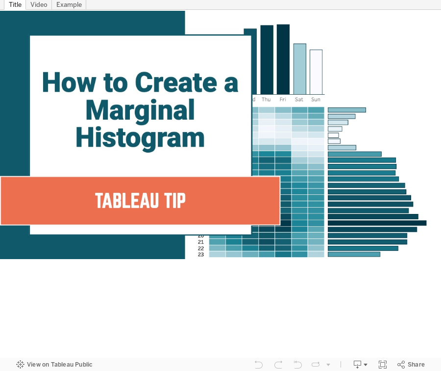
How to Create a Marginal Histogram

December 17, 2020
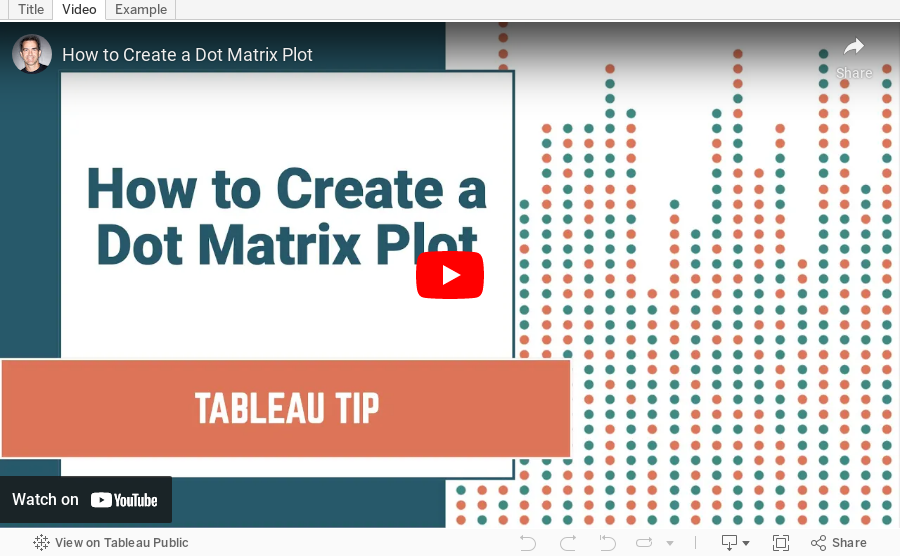
How to Create a Dot Matrix Plot

Dot matrix charts are useful for visualizing the distribution and frequency of discrete data. They help you understand the scale and proportion. The purchase is to understand how many, not how much.
In this example, I'm using two colors to distinguish new vs. used cars. However, if you have only one variable or category, then stick to one color.
Resources:
- Workbook - https://bit.ly/DotMatrixPlot
- Data set - https://data.world/vizwiz/car-sales-mock-data
February 26, 2020
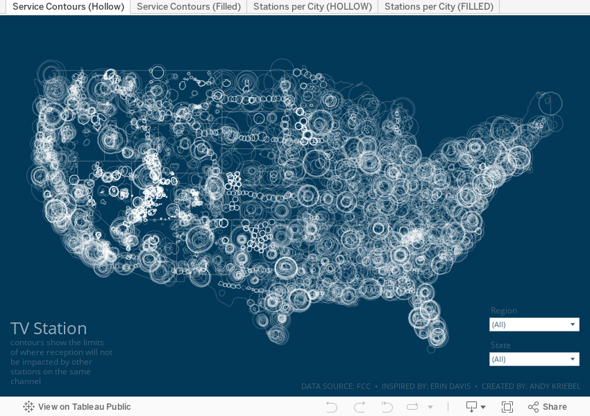
Visualizing the Geography of TV Stations

The piece I wanted to replicate in Tableau is based on her beautiful work Visualizing the Geography of FM Radio. Since she had already done this for radio, I thought I'd try to replicate her work, but with TV stations, that is, the strength and coverage that the broadcast signals from TV stations transmit.
First, I had to prep the data. Fortunately the raw data was easily accessible on the FCC website as are explanations of the fields and how to use them. The FCC also have information about which States fall into which FCC regions. I manually grouped the States into their regions in Tableau (it would have needed to be manually created data anyway).
From there, it was some data prep to get the signal boundaries for each state, ensure they are in the correct State (e.g., some stations that were listed in California actually plotted in other States), then export as a TDE (Hyper files don't work well with polygons).
Here's the Alteryx workflow:

For Tableau, I created a custom color palette based on the color legend on Erin's vizzes, replicated her maps as close as possible, and that's it!
Enjoy!
July 14, 2019
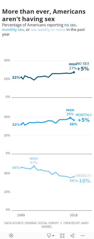
#MakeoverMonday: More than ever, Americans aren't having sex


What works well?
- Overall, the chart is really good.
- The title and subtitle make it very clear what the viz is about.
- The labels focus you to the topic the creator wants you to focus on.
- I like how the first year is a filled dot and the last year is an open dot.
- Bolding the first and last years on the axis
- Including the % sign on the y-axis for only the top value
- Is this colorblind friendly? I'd recommend verifying.
- Does green mean good?
- I don't know how they came up with the percentages they did. They don't match the source.
- Label the lines directly with their frequency instead of using a color legend.
- Lighten the gridlines.
- Like the original, I filtered out 2012 because the data looks corrupted.
- I liked the original, so I didn't change a whole lot. The main difference was splitting up the frequencies vertically.
- Because I split of the frequencies, I made the viz tall and skinny and mobile friendly.
- I labeled the start and end of each line.
- I labeled the highest value for each frequency.
- I included the change between 1989-2018 on the end of each line as a summary. I had to float everything to make this work, which damaged my soul a bit.
- I'm only displaying the first and last year on the y-axis.
- I included tooltips so the reader can see the exact values.
- I used three shades of a single color that go from least sex to most sex (since the focus is on less sex).
- I kept the same title and subtitle.
- I used fonts from the Washington Post website. NOTE: They won't render on Tableau Public unless you have the same fonts installed (Playfair Display and Yantramanav).
July 1, 2018
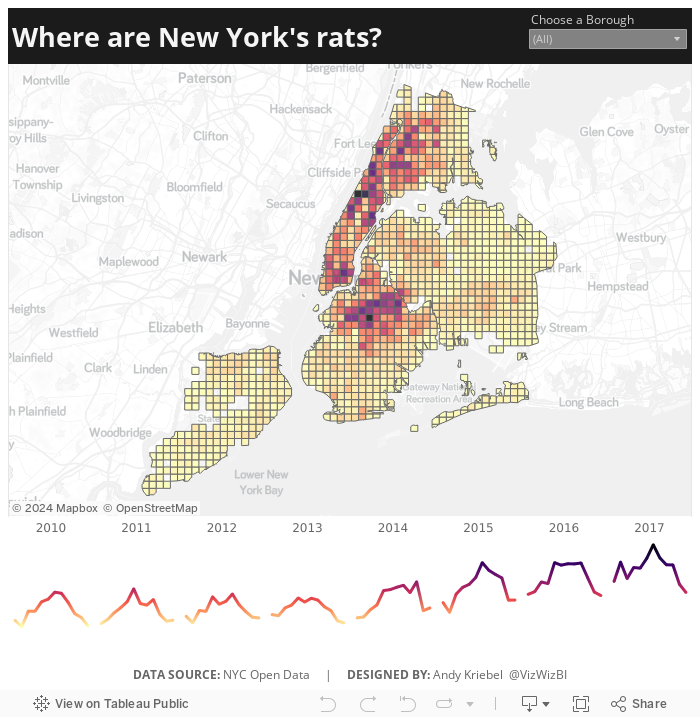
Makeover Monday: Where are New York's rats?

The original article by Jowanza Joseph contains several fantastic visualization, most which look like they were created in R. For this week's makeover, we need to try to make this visualization better:

What works well?
- Simple title that tells us what the data is about and the time period
- Axes are clearly labeled
- Including light gridlines for context that aren't distracting
- Including every sighting as a dot for context; it's interesting how these show cyclical patterns
- Including an average line which confidence bands to show the overall pattern
- Excellent color choices; the purple really works well again the grey background
What could be improved?
- Include an explanation of what the line represents
- Include the data source and author's name
- Remove the word "Date" from the x-axis. That's implied by the title and the year labels.
What I did
- We were doing Alteryx spatial training this week at The Data School this week, so I wanted to do something using the locations of the rats, but not a simple dot of where each sighting occurred.
- I wanted to use Alteryx as I'm working to improve my skills in that area.
- I create a tile grid map using Alteryx for London crimes last year and wanted to do that again, as I need to practice techniques several times to reinforce them.
- Create the tile grid map so every 1/2 mile and have them cut off at a Borough's edge
- Create a simple, minimalist map and line chart in Tableau
- Use the Magma color palette as I really like how it works as a heat map
Alteryx Workflow

The workflow is pretty simple. It takes the individual sightings, converts them to spatial points, assigns them to a 1/2 mile grid based on shape files available for each borough, then I export it as a shape file.
Tableau Visualization
April 4, 2018
Workout Wednesday: Frequency Matrix
Easiest Parts
- Use sub-categories (HINT: Since it's a frequency matrix, there's a trick here.)
- Dashboard size is 1000 x 900; tiled; 1 sheet
- Distinctly count the number of orders that have purchases from both sub-categories
- Sort the categories from highest to lowest frequency
- White out when the sub-category matches and include the number of orders
- Match formatting & tooltips – special emphasis on tooltip verbiage
Hardest Parts
- Calculate the average sales per order for each sub-category
- Identify in the tooltip the highest average spend per sub-category (see Phones & Tables)
- If it’s the highest average spend for both sub-categories, identify with a dot in the square
I messed around with the average sales per order calc for quite a while. I have every number the same except for a couple in paper and binders. I have had a look at Ann's solution and I think mine is more accurate, so I'm sticking with it. :-)
September 5, 2017
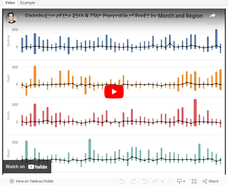
Tableau Tip Tuesday: Comparing 75th to 25th Percentile With a Music Waves Chart
- Create percentile calcs and place them on the same axis.
- The date field must be discrete.
- Use Measure Names on the Path shelf.
May 24, 2016
Tableau Tip Tuesday: Five Use Cases for Strip Plots

In last week’s Makeover Monday about global warming I included a strip plot at the bottom of my final visualisation. You may hear these also called barcode charts or frequency charts, but whatever their “official” name, they are very useful for:
- Seeing a lot of data at a glance
- Understanding concentration of the data
- Seasonal trends
In this week’s video tip, I walk you through five use cases for strip plots varying from global warming to the frequency of fires to distribution of sales to deprivation in Scotland.






