July 1, 2018
Makeover Monday: Where are New York's rats?
Alteryx
,
boroughs
,
frequency
,
heat map
,
Jowanza Joseph
,
line chart
,
Makeover Monday
,
new york city
,
open data
,
rats
,
tableau
,
tile grid map
No comments

The original article by Jowanza Joseph contains several fantastic visualization, most which look like they were created in R. For this week's makeover, we need to try to make this visualization better:

What works well?
- Simple title that tells us what the data is about and the time period
- Axes are clearly labeled
- Including light gridlines for context that aren't distracting
- Including every sighting as a dot for context; it's interesting how these show cyclical patterns
- Including an average line which confidence bands to show the overall pattern
- Excellent color choices; the purple really works well again the grey background
What could be improved?
- Include an explanation of what the line represents
- Include the data source and author's name
- Remove the word "Date" from the x-axis. That's implied by the title and the year labels.
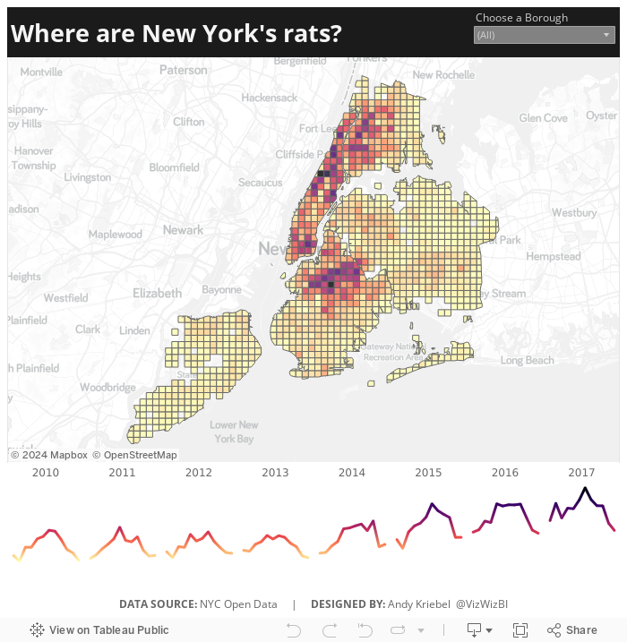
What I did
- We were doing Alteryx spatial training this week at The Data School this week, so I wanted to do something using the locations of the rats, but not a simple dot of where each sighting occurred.
- I wanted to use Alteryx as I'm working to improve my skills in that area.
- I create a tile grid map using Alteryx for London crimes last year and wanted to do that again, as I need to practice techniques several times to reinforce them.
- Create the tile grid map so every 1/2 mile and have them cut off at a Borough's edge
- Create a simple, minimalist map and line chart in Tableau
- Use the Magma color palette as I really like how it works as a heat map
Alteryx Workflow

The workflow is pretty simple. It takes the individual sightings, converts them to spatial points, assigns them to a 1/2 mile grid based on shape files available for each borough, then I export it as a shape file.
Tableau Visualization
In Tableau, it's simply a matter of double clicking on the spatial object, adding the borough and grid ID to give it the right level of detail, adding color by number of sightings, creating a line chart, adding a borough filter, and cleaning up the tooltips.
Because all of the heavy work was done in Alteryx, it takes about 10 minutes to create the visualization in Tableau, most of that time being formatting. With that, here's my Makeover Monday week 27 about rat sightings in New York City.
Subscribe to:
Post Comments
(
Atom
)


No comments
Post a Comment