July 22, 2018
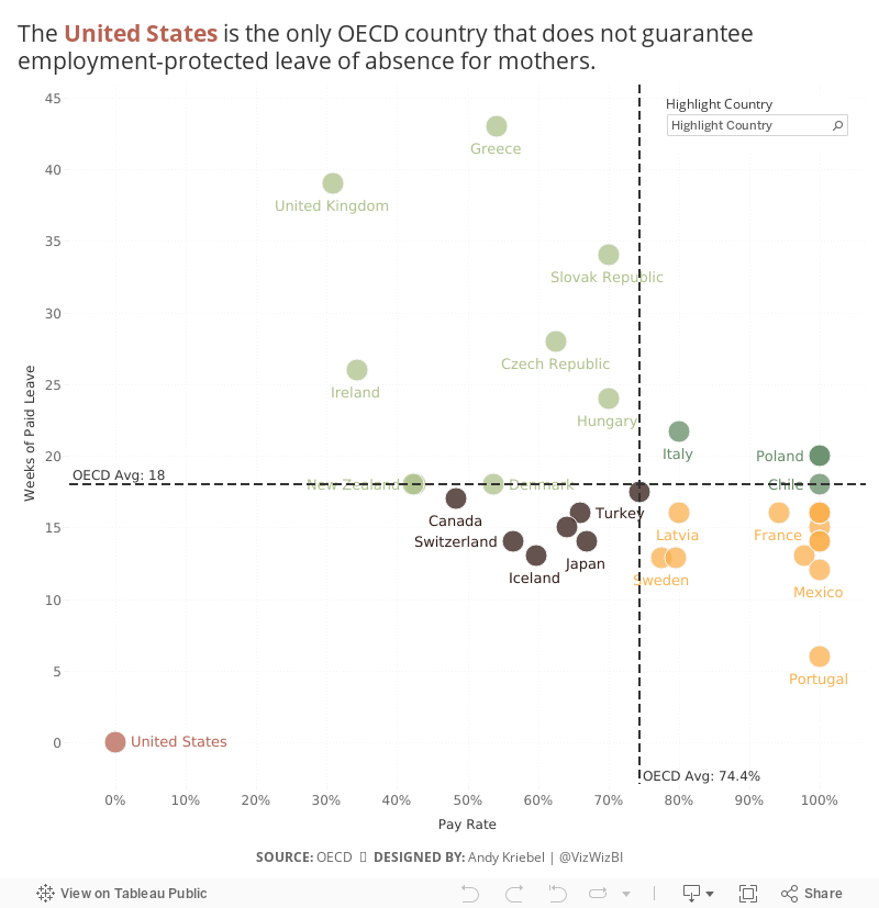
Makeover Monday: Employment-Protected Leave of Absence for Mothers

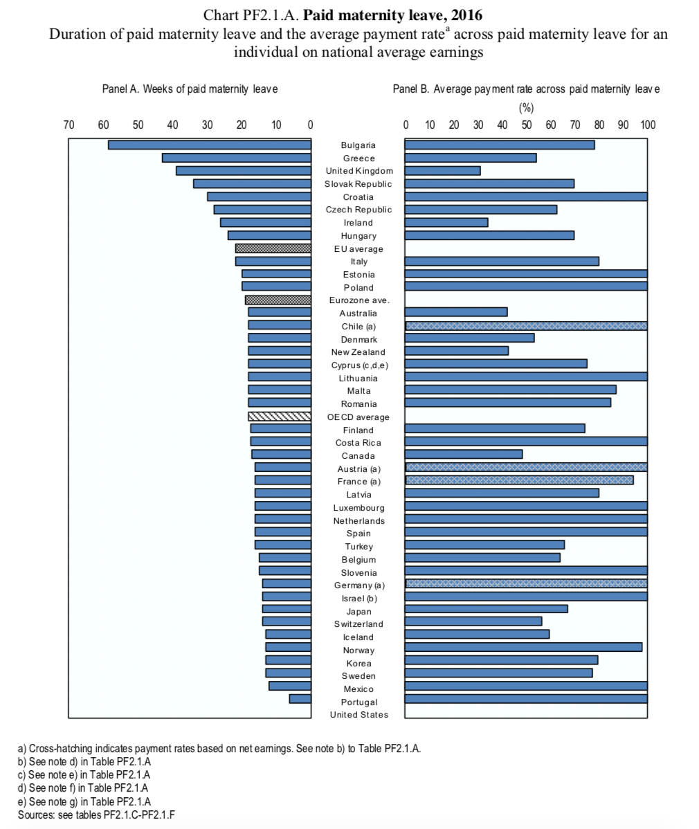
What works well?
- The countries are clearly ordered by the weeks of paid maternity leave.
- Including the three aggregations for context and giving them their own color so they stand out.
- The subtitle explains what the chart represents.
What could be improved?
- Remove all of the dark borders
- Remove "Panel A" and "Panel B" from the chart headers
- Change the title to summarize the findings in the data
- Make understanding the relationship between the two data points easier
What I did
- Removed any non-OECD countries and aggregates
- Update the OECD averages in the source data since it wasn't calculating correctly
- Converted the original diverging bar chart to a scatterplot
- Included OECD average lines for both metrics
- Color-coded each quadrant
- Highlighted the United States' horrific performance
- Include the OECD average in the tooltip for context
- Enabled the highlighter option to allow the user to pick a country of their choice
Subscribe to:
Post Comments
(
Atom
)


No comments
Post a Comment