July 30, 2018
Makeover Monday: How has The Big Mac Index changed since January 2012?
big mac index
,
currency
,
economics
,
economy
,
Makeover Monday
,
pricing
,
The Economist
No comments


What works well?
- Using the footnotes to help describe the caveats in the data
- Including a reference line at zero so that it's easy to see if the country is over- or under-indexed
- Including the latest price to the right for context
- Sorting by the latest price
- Using two colors that are easy to distinguish from each other
- Subtitle explains the metrics in the viz
What could be improved?
- The timeframe is so short that it's hard to see much change at all between the data points.
- I have no idea what happened between these two points.
- There's no explanation as to why this is the selected list of countries.
- Sizing the dots for the most recent price doesn't add much value.
- The white gridlines are too strong for my liking; I find them distracting.
- I would exclude the Euro Zone since not all Euro countries are included in the viz and it's also the only aggregate included. If you look at the chart alone without reading the article, it doesn't make sense to include it.
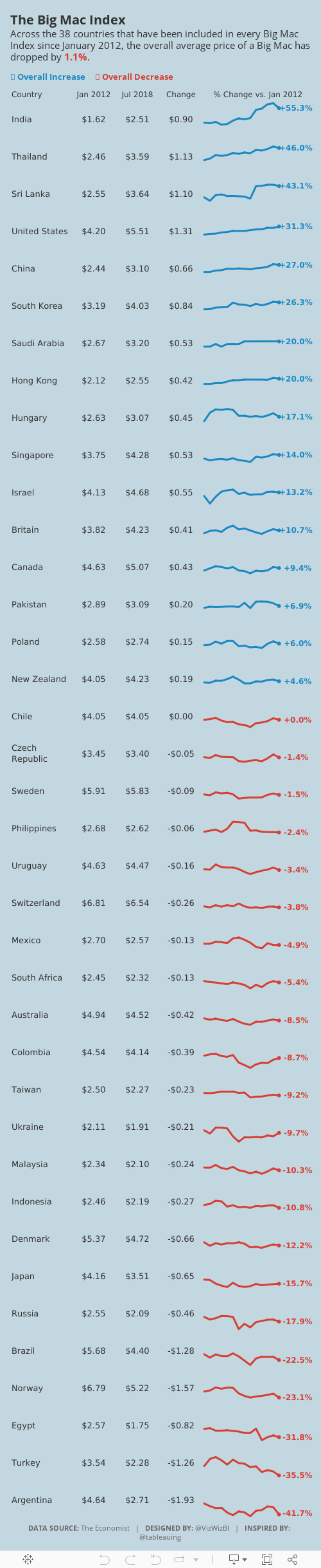
What I did
- I created some simple sparklines. Right after I thought about it, Rodrigo Calloni posted this viz which was nearly identical to what I wanted to create. The difference for me was that I wanted to look at the change in the price of a Big Mac over time, whereas Rodrigo looked at the change vs. the US price over time.
- I used the colors from the original viz. I liked how they worked together.
- I included some numbers for context.
- I limited the data set to only countries that had been in all of the 14 most recent surveys.
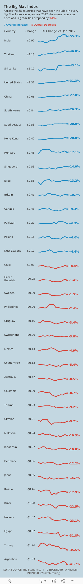
- I create a simplified mobile version that removes some of the BANs in order to fit onto the width of a mobile device.
Subscribe to:
Post Comments
(
Atom
)


No comments
Post a Comment