December 22, 2022
How to Calculate Customer Churn Rate in Tableau
analysis
,
calculated field
,
change
,
churn rate
,
customer churn rate
,
how to
,
percentage
,
retention
,
tableau
,
tip
,
variance
No comments

In this tip, I’m show you how to calculate the 3-month and 6-month churn rate in Tableau. To calculate churn rate, all you need to do is:
1. Create 4 calculations
2. Follow the 8 simple steps to build the view
Customer churn rate is the % of customers that you’re losing in a predetermined time period. Churn rate is bad because if you don’t know how many customers are leaving, then you won’t know the impact on your revenue and you would be able to make changes to reduce churn.

December 13, 2022
#MakeoverMonday Week 50 - Which Countries Get the Most Vacation Days?

I remember when I started working at Coca-Cola. I got 10 days of vacation time for my first 2 years. Then I got 1 additional day for each year thereafter. It was terrible, but unfortunately the norm in the US.
I started by trying to create a tile map of the World, but it was going to take too much manual renaming of the countries than it was worth. So I got the idea that I wanted to show rankings, which led me back to Workout Wednesday Week 31. The view was pretty simple to create; follow along in WatchMeViz below.
My final viz is below the video, or you can view it here.
December 8, 2022
How to Conduct Customer Retention & Cohort Analysis
cohort analysis
,
comparison
,
context
,
data analysis
,
how to
,
level of detail
,
LOD
,
tableau
,
tip
,
triangle chart
,
tutorial
No comments

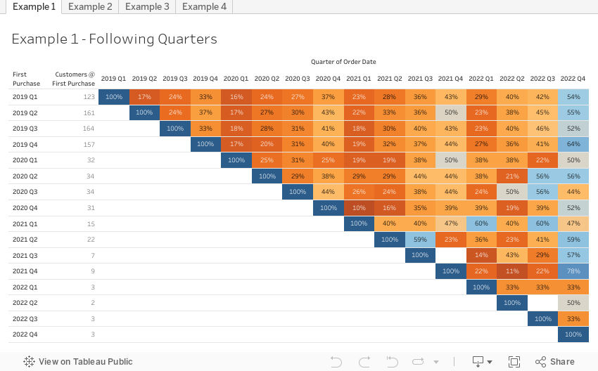
In this tip, I’m going to show you how to analyze customer retention and conduct cohort analysis in Tableau.
With cohort analysis you group your users based on a shared characteristic to better track and understand their behaviors. Cohort analysis is typically used to understand customer churn or retention.
Cohort analysis is nearly always done for an app launch.
- First, down the view, the users are divided into cohorts based on when they first installed the app
- Then, across the view, the users are tracked for 10 days after the launch to see who continued to use it.
Comparing these two groups allows us to see when users are churning so that we can then investigate why.
December 6, 2022
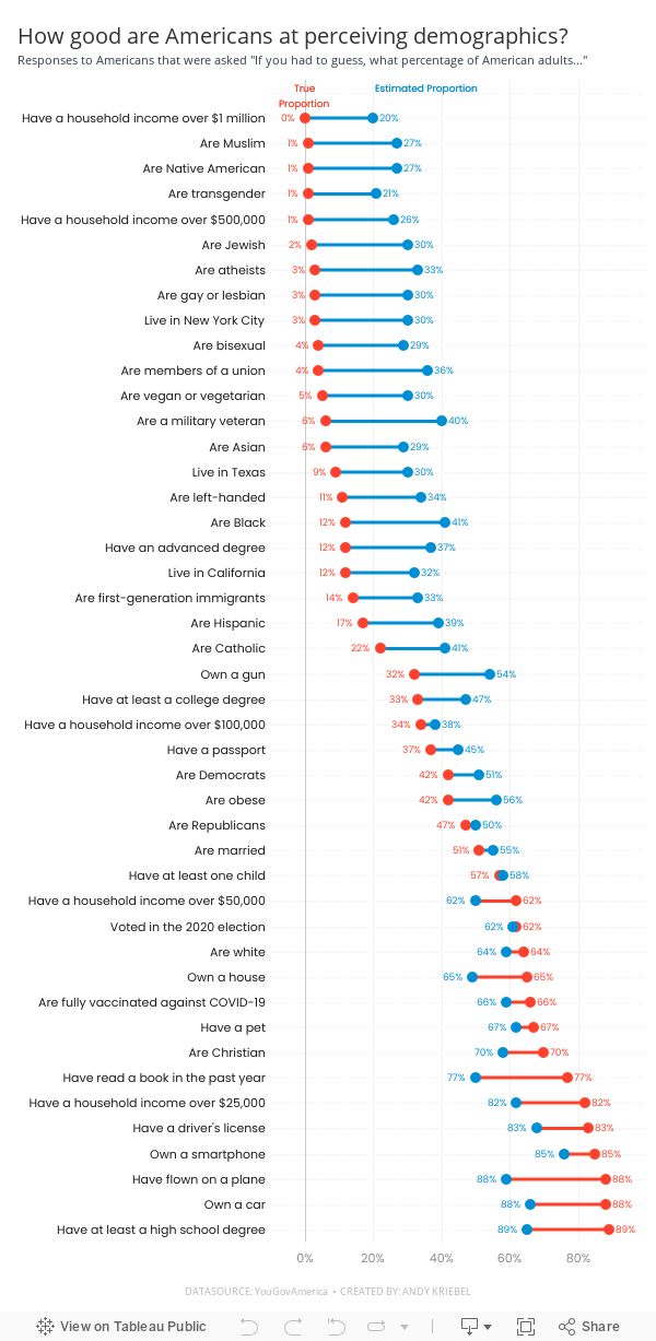
#MakeoverMonday Week 49 - How good are Americans at perceiving demographics?
America
,
barbell chart
,
color picker
,
dashboard
,
dot plot
,
formatting
,
gridlines
,
how to
,
labels
,
line chart
,
Makeover Monday
,
measure names
,
measure values
,
reference line
,
survey
,
tableau
,
tooltip
,
YouGov
No comments

Easy to replicate:
- Barbell chart with dots on the ends and a line connecting them
- Coloring the lines by the larger value
- Choosing the colors
- Formatting the view (except the labels)
Challenges/things that should be easier:
- Labeling the dots/ends of the lines; this took several iterations on the calculations
- Creating the color legend as headers; I had to use reference lines, turn on totals, move the totals to the top, then work on the formatting to get them close. They still aren't perfect.
- Creating the horizontal reference lines; this required me to create a dummy axis
While there are only 3 challenges, I estimate those three challenges took 75-80% of my time. I can only imagine how much more productive I could be if formatting didn't take so long.
In the end, I'm satisfied with how close I got to recreating the original chart. I like the additional context I added by coloring the lines connecting the dots.
If you missed #WatchMeViz, check it out below. Below the video is my final visualization.
Subscribe to:
Posts
(
Atom
)


