April 1, 2024
#WatchMeViz: Can viral infections be cured with antibiotics?

October 17, 2023
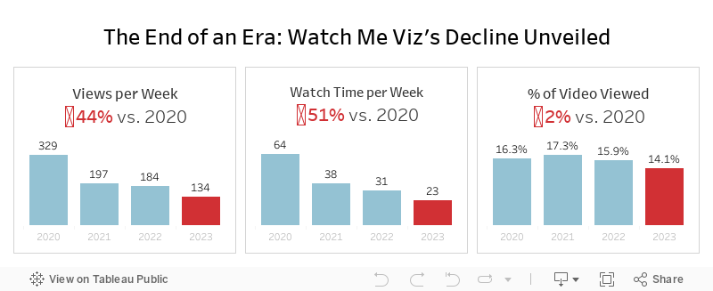
The End of an Era: Watch Me Viz's Decline Unveiled

That's a wrap. Watch Me Viz has retired, for good.
This week's data was about the performance of all of the WMV livestreams. There was some incredible viewer participation, which ultimately led to this viz that explains why WMV should quietly disappear.
Check out the livestream below.
October 9, 2023
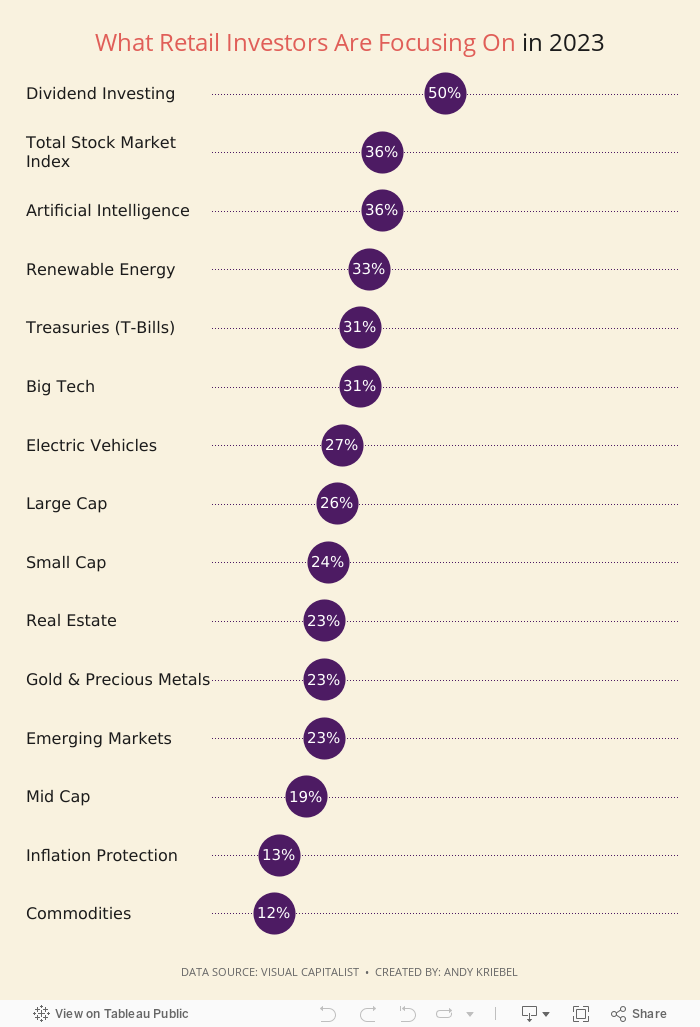
Behind the Chart Redesign: Retail Investment Step-by-Step Makeover

Catch up on my latest #MakeoverMonday Watch Me Viz. I dive into a step-by-step redesign of Visual Capitalists "What are Retail Investors Interested in Buying in 2023?" chart.
Starting with an overview of the original visualization, I review the gaps and areas for improvement. Why was a makeover necessary, and what potential did we see?
The livestream walks you through the entire transformation process, from the initial critique to the final touches.
Expect to uncover advanced design techniques and gain insights into the strategic thought process behind each decision.
Whether you're an aspiring designer or a seasoned data analyst, this step-by-step makeover promises valuable takeaways for all.
June 6, 2023
Mastering TABLEAU Dashboards from Scratch

This comprehensive video will help you create business dashboards that are more actionable and meaningful and that your users will find easy to use at first glance. You’ll be on your way to being a dashboarding expert!
You’ll learn:
- Building basic charts
- Formatting fundamentals
- Using layout containers
- Dashboard formatting
- Essential tips for padding
- Filter controls
We'll create an interactive sales dashboard for Adidas in Tableau that's going to dynamically update based on the filters on the side of the dashboard which will allow us to select specific years, regions, products, and more.
⏬ DOWNLOAD my preferences file, the data, and starter and solution workbooks for £2 (this covers the costs of making this and future videos):
https://andykriebel.gumroad.com/l/adidassalesdashboard
Sign up for my newsletter to get advance, exclusive viewing of all of my videos, tips for using Tableau, plus exclusive discounts on products that I create.
https://andykriebel.com/
May 23, 2023
Make an Awesome TABLEAU Dashboard in Just 10 Minutes

In this video we'll build a dynamic Tableau dashboard from scratch in just 10 minutes. We'll create a sales dashboard for Superstore’s European region.
1️⃣ We’ll create all of the charts which include a map, bar chart, line chart, and KPIs.
2️⃣ We’ll customize the charts to fit our style.
3️⃣ We’ll place the charts on the dashboard using layout containers, padding, formatting and more.
4️⃣ We’ll add interactivity to the dashboard to make for a great user experience.
DOWNLOAD the data and starter and solution workbooks (this covers the costs of making this and future videos):
https://andykriebel.gumroad.com/l/10-minute-dashboard
I would appreciate your support, however, if you want the Excel file for free, download it here:
https://data.world/vizwiz/superstore-europe
Want early access to my upcoming videos like this one? Sign up for my newsletter. Every Friday morning, you'll get actionable tips to launch, grow, and unlock your career in data.
Sign up here.
January 6, 2023
How to Create a Two Color Area Chart in Tableau
In this week's Watch Me Viz, I showed the problem this tip helps solve. An area chart in Tableau only allows a single color. Like this…
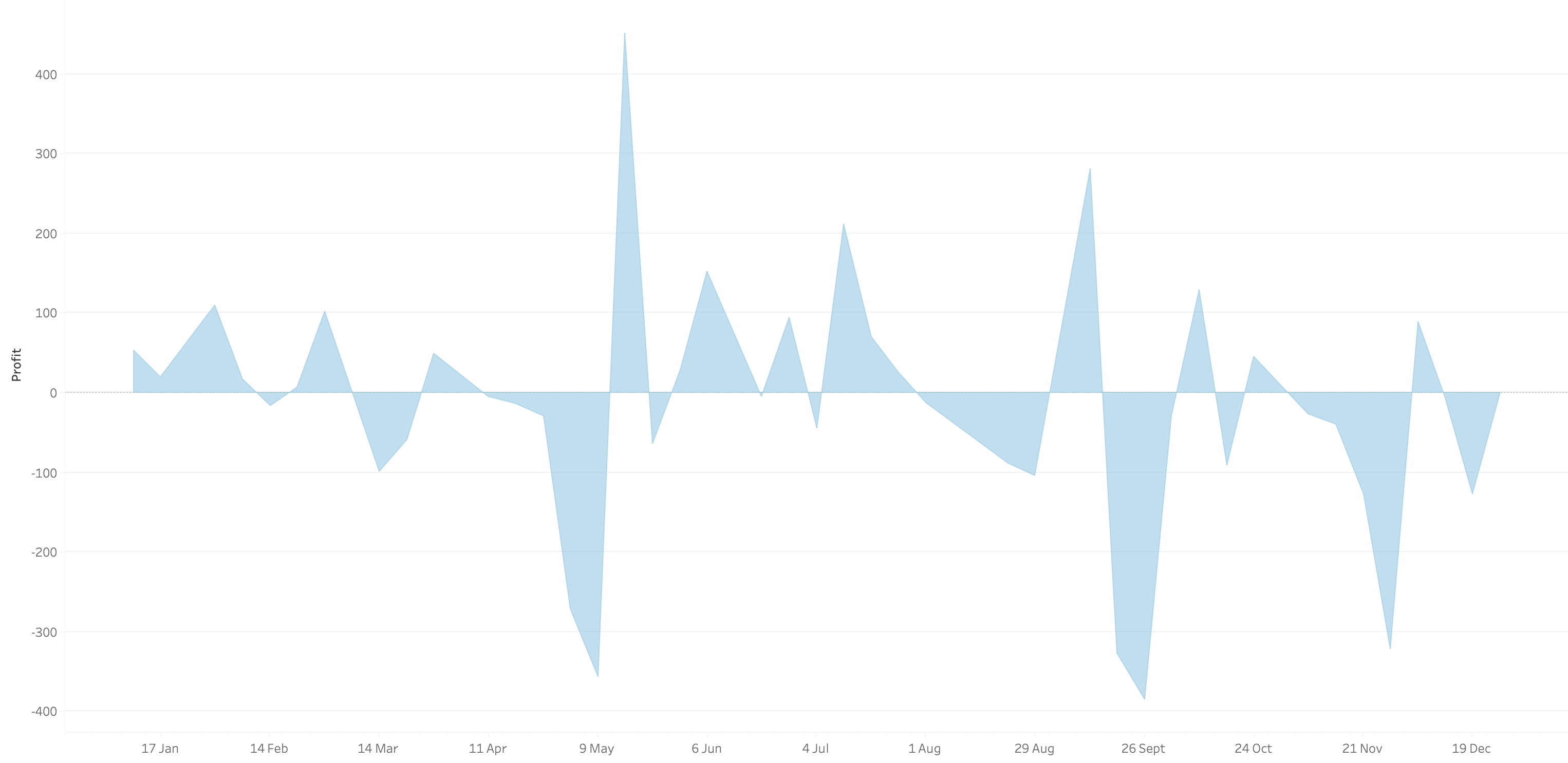
What we want is an area chart like this with two colors.
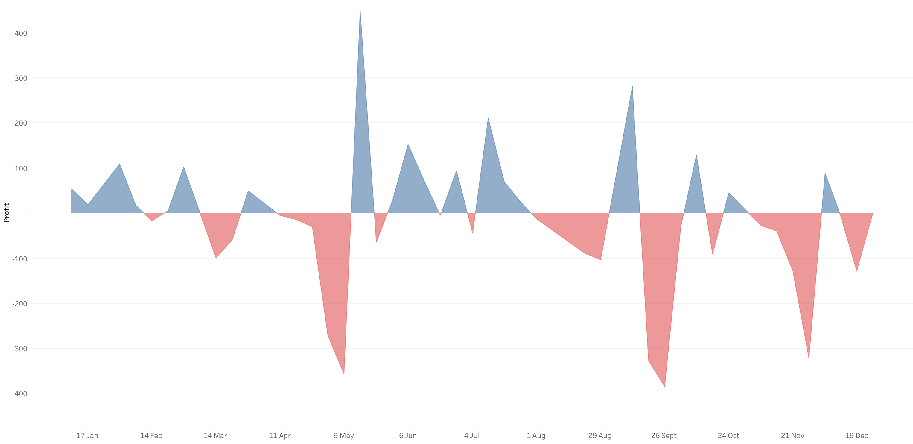
In 9 simple steps, I’ll show you how to build it. Follow along with the video. The 9 steps are listed at the bottom of this post.
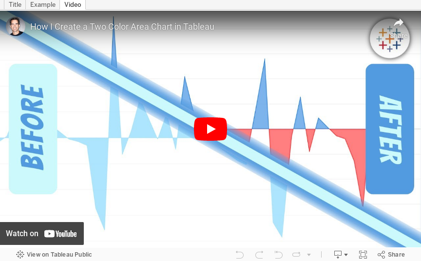
STEPS
1. Create the area chart
2. Show what happens when you add a profit to color - you only get one color
3. Duplicate the measure
4. Fix the axes
1. Top axis starts at 0
2. Bottom axis ends at 0
5. Choose a color for each area chart
6. Format the axes to get rid of 0
7. Add reference lines to scale the charts relative to each other
1. WINDOW_MAX(ABS(SUM([Profit])))
8. Duplicate for the negative reference line
9. Formatting
December 6, 2022
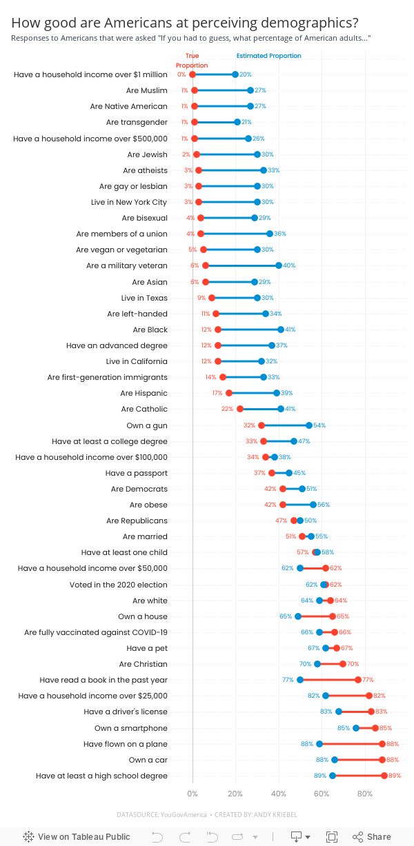
#MakeoverMonday Week 49 - How good are Americans at perceiving demographics?

- Barbell chart with dots on the ends and a line connecting them
- Coloring the lines by the larger value
- Choosing the colors
- Formatting the view (except the labels)
- Labeling the dots/ends of the lines; this took several iterations on the calculations
- Creating the color legend as headers; I had to use reference lines, turn on totals, move the totals to the top, then work on the formatting to get them close. They still aren't perfect.
- Creating the horizontal reference lines; this required me to create a dummy axis
November 22, 2022
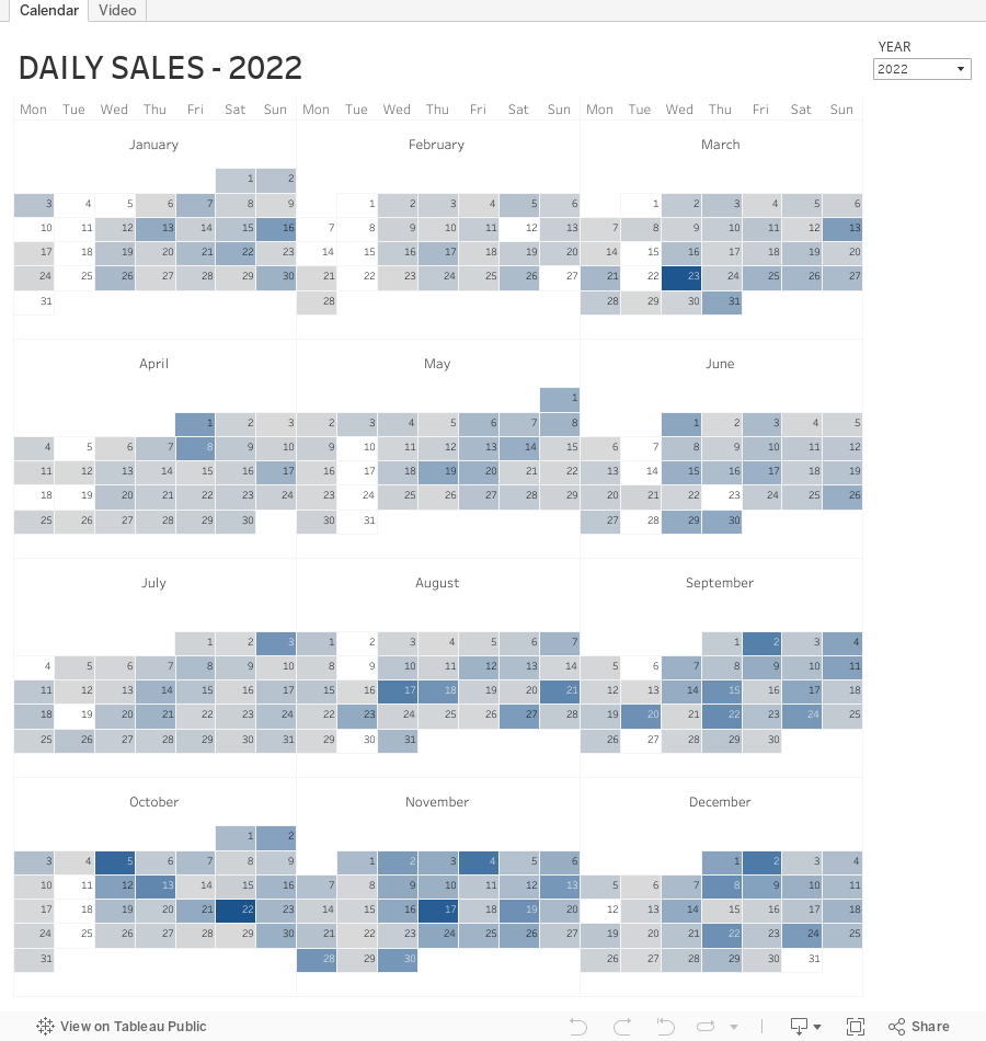
How to Create a Full Year Calendar Heatmap in Tableau

Calendar heatmaps are a great way to visualize time-series data over an entire calendar year. Individual days are shaded on a light-to-dark gradient based on a measure that has been added to the visualization.
Creating a heatmap for a single month in Tableau is pretty straightforward. It gets a bit more complicated when you want to view an entire year at once. In this tip, I going to show you, step-by-step, how to create a full year calendar heatmap in Tableau. The workbook is below this video to download.
November 10, 2022
How to Add Hundreds of Custom Color Palettes
Tableau comes with some great color palettes that have been designed to work well together. And you can add your own custom color palettes by making a couple of simple changes to the preferences.tps file that comes with Tableau Desktop. For example, you may have a color palette that matches your company’s brand.
In this video I show you how to add 3 different types of color palettes to Tableau:
- Categorical
- Sequential
- Diverging
November 8, 2022
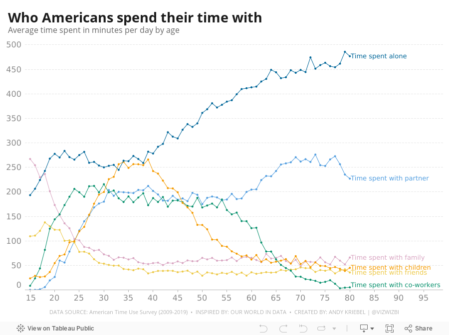
#MakeoverMonday Week 45 - Who Americans Spend Their Time With

October 25, 2022
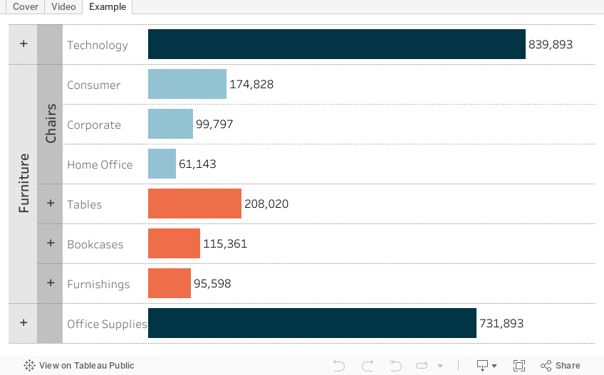
How to Create a 3 Level Drill Down in Tableau
I've showed you in several videos and WatchMeViz live streams how to create a 2 level drill down. And naturally the follow up question is always, how can I go one level deeper? This tip has exactly what you're looking for. I show you how to create a 3 level drill down in Tableau.
This example shows you how to drill down from Category to Sub-Category to Segment. All you need to do for your situation is replace the dimensions I'm using with yours. This will work with any combination of 3 dimensions.
Check out the interactive version below the video.
This type is inspired by this example from Lindsey Poulter - https://public.tableau.com/app/profile/lindsey.poulter8872/viz/SetActionDrilldown/ChooseaMetric
August 23, 2022
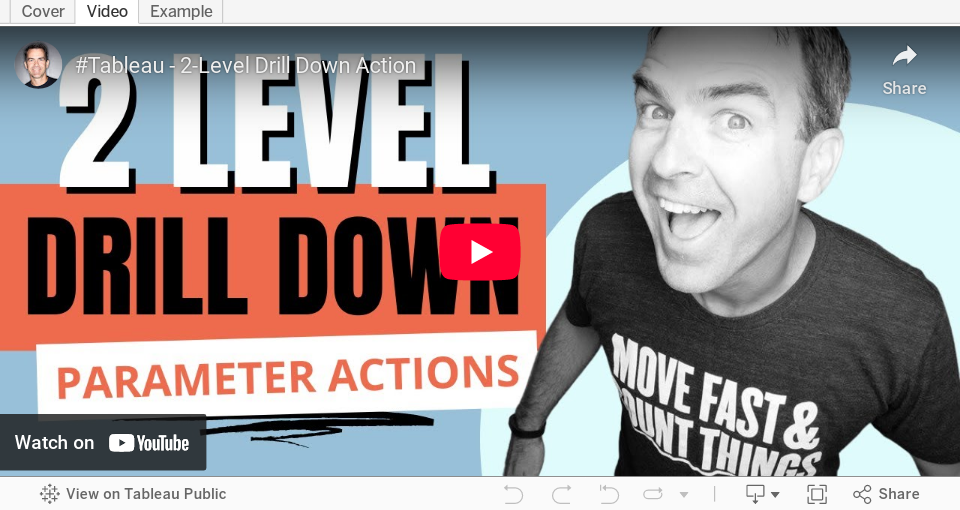
How to Create a Two-Level Drill Down in Tableau
There are tons of ways to create a single level drill down, but if you’re having issues creating a second drill down, this video is a guaranteed way to help you fix this problem.
Additional video - Single Level Drill Down
June 28, 2022
How to Use the Highlighter to Set a Default Color Palette
June 14, 2022
How to Create a Two-Panel Column Chart
May 11, 2022
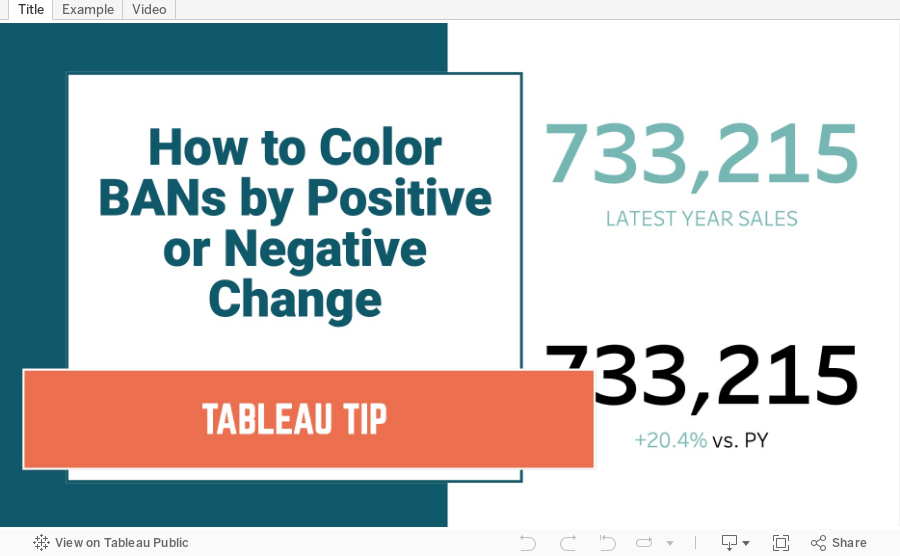
How to Color BANs by Positive or Negative Change
April 21, 2022
#B2VB - 2022/W4 - Design Some KPIs
Resources:
KPI Samples from Tableau Public:

March 29, 2022
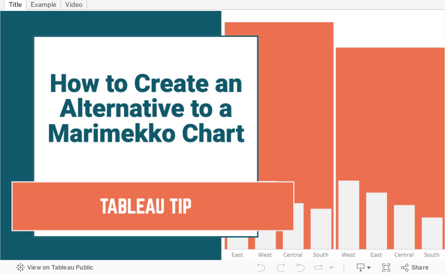
How to Create an Alternative to a Merimekko Chart
A Merimekko Chart, also known as a variable width bar chart, is useful for comparing both high-level data and low-level data in the same chart. However, since we have size variables for both the width of the bars AND the height of the bars, comparing different segments of the chart is more challenging than it needs to be. Read more about the problems with Merimekko charts here.
In this example, I show you how to make an alternative to a traditional Merimekko Chart. I show you how to compare both category sales and regions sales within each category at the same time.
This can be easily replicated by simply swapping out the dimensions and updating one LOD calculation. Alternatively, you could use two parameters to allow the user to pick both the high-level and low-level dimensions and a third parameter for the measure to compare.
March 22, 2022
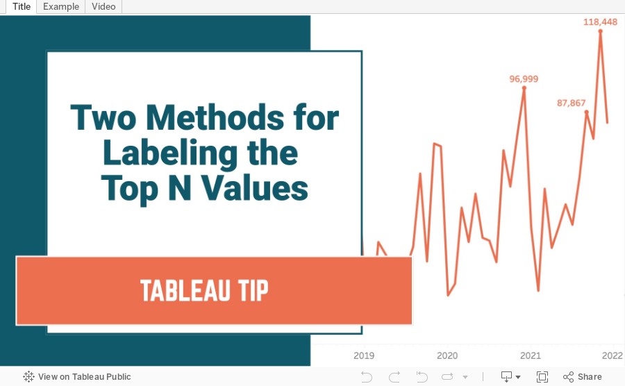
Two Methods for Labeling the Top N Values in a Chart
In this tip I show you how to use the INDEX and RANK functions to label the top N values in a chart. I also explain the difference in how they work, and how the RANK function is simpler to configure.
February 2, 2022
How to Create a Jitter Plot
In this tip I show you how to create a jitter plot. A jitter plot is very similar to a dot strip plot other than it reduces the overlapping of the data points. The data is plotted like a dot plot and then we use either the RANDOM() or INDEX() functions to spread out the dots.


