January 22, 2025
L-Shaped Bars: The Chart You Didn't Know You Needed


May 1, 2024
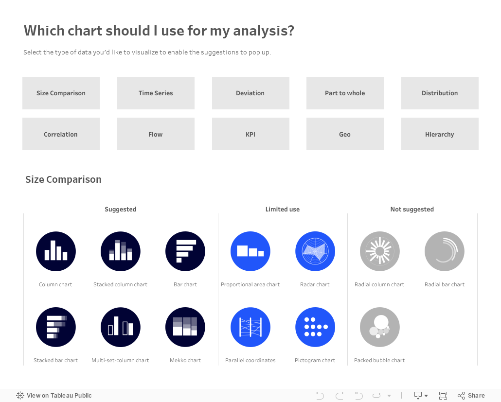
Which chart should you use for your analysis?

Over on Tableau Public, Judit Bekker create this fantastic directory of charts to help you pick the one that's most appropriate for your analysis.
Check it out below.
October 24, 2023
Master Containers: Build an Interactive Tableau Dashboard From Scratch

May 11, 2022
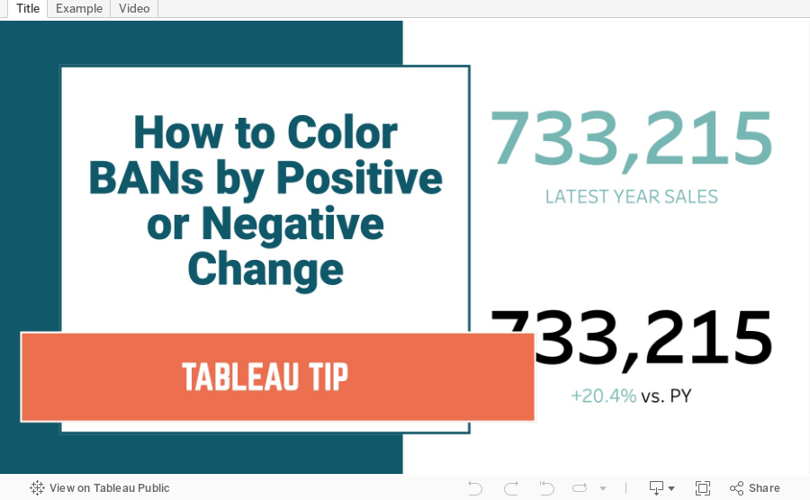
How to Color BANs by Positive or Negative Change
March 22, 2022
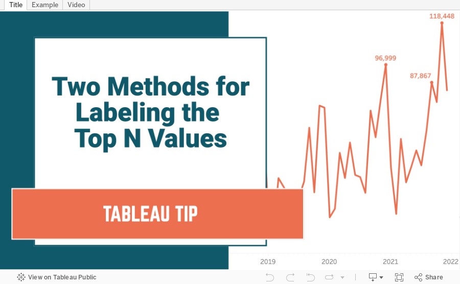
Two Methods for Labeling the Top N Values in a Chart
In this tip I show you how to use the INDEX and RANK functions to label the top N values in a chart. I also explain the difference in how they work, and how the RANK function is simpler to configure.
March 11, 2022
How to Include Multiple Dimensions on the Color Shelf
- You can have more than two dimensions on the color shelf. Simply repeat the steps for adding a second color.
- This only works for dimensions, as I show in the video.
- You do not have to use Sets for this to work; I used that in my example for simplicity.
February 15, 2022
How to Create a Barbell Chart
February 8, 2022
How to Create an Enclosed Dot Plot
February 2, 2022
How to Create a Jitter Plot
In this tip I show you how to create a jitter plot. A jitter plot is very similar to a dot strip plot other than it reduces the overlapping of the data points. The data is plotted like a dot plot and then we use either the RANDOM() or INDEX() functions to spread out the dots.
January 25, 2022
How to Calculate the Distance Between Two Points
July 19, 2021
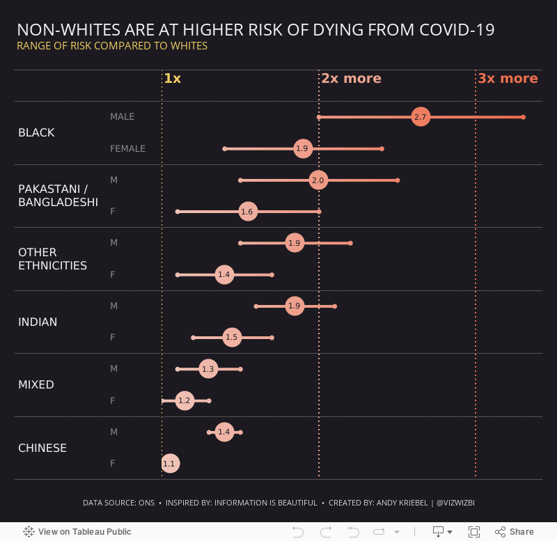
#MakeoverMonday 2021 Week 29 - Non-Whites Are At Higher Risk of Dying From COVID-19

Another COVID-19 data set this week and a great visualization that shows how much more likely ethnic minorities in the UK are to die from COVID.
In the video, I worked through rebuilding the original viz since I liked it so much. Interact with the viz below the video.
July 7, 2021
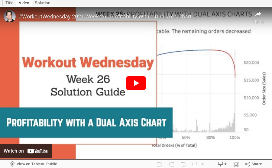
#WOW2021 Week 26 - Profitability With a Dual Axis Chart

June 7, 2021
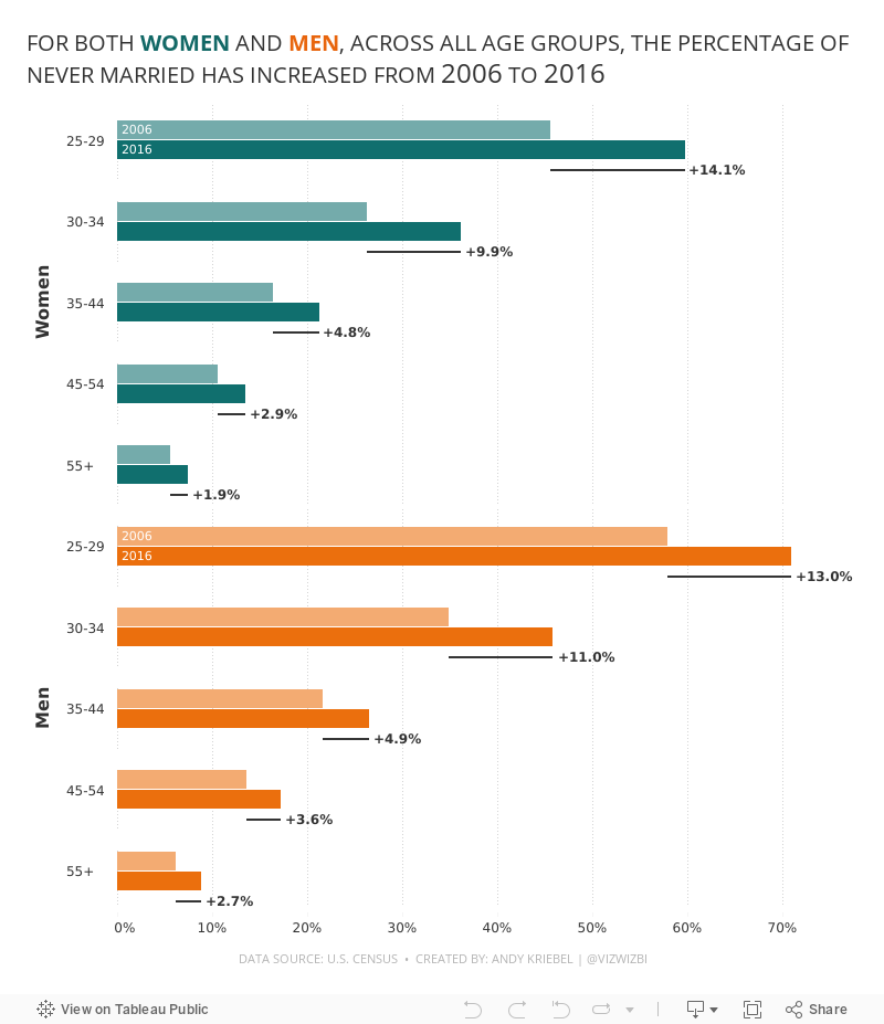
#MakeoverMonday 2021 Week 23: The Percentage of Never Married is on the Rise

- Final Viz (and below)
- Preferences file (all of my custom color palettes)
- How to Create a Combination Bar Chart & Candlestick Chart
May 17, 2021
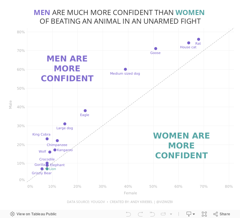
#MakeoverMonday Week 20 - Humans vs Animals

WatchMeViz
Visualization
April 26, 2021
#MakeoverMonday 2021 Week 17 - Price Parity in America
In this week's Watch Me Viz, I covered the following charts:
- Line chart
- Trellis chart
- Slope graph
- Connected scatter plot
- Bar charts with comparisons
- Diverging bar charts
- Heatmap
- Hex map
- Tile map
- Barbell chart
- Peas in a pod chart
- Bump Chart
- Comet chart
In the end, I settled on the bump chart using highlighting and BANs. Other topics covered include:
- Sorting calculations
- Level of detail expressions
- Rank table calculations
- Parameters
- Filter actions
- Padding in dashboards
- Cleaning tooltips
- Divider lines in dashboards

March 9, 2021
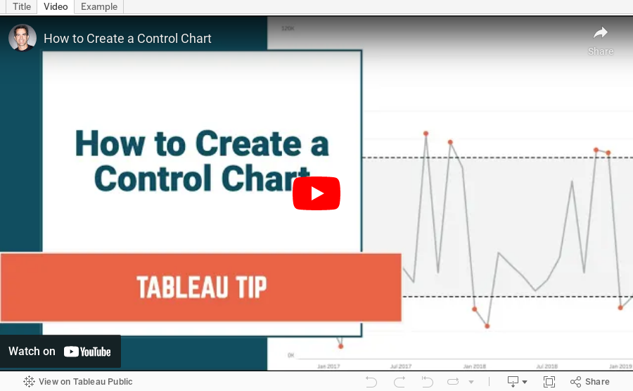
How to Create a Control Chart

- A control chart is a time series graph.
- A line across the time series that represents the mean of all of the measurements in the graph.
- Upper and lower control limits (UCL and LCL) that are displayed as a reference band across the view at a specified number of standard deviations from the mean.
- Indicators to show which measurements are "out of control".
March 2, 2021
Mastering Containers in Tableau
The Workout Wednesday 2020 Week 53 challenge required extensive knowledge of containers in Tableau. Containers can be quite the mystery! It's taken me years to grasp them.

In this webinar, I showed what I've learned about containers, how to complete the Workout Wednesday challenge, and how you can master containers.
Resources:
- Workout Wednesday Challenge - http://www.workout-wednesday.com/2020w53/
- Data source (Superstore 2020.3) - https://data.world/vizwiz/superstore-20203
- Workbook - http://bit.ly/WOW2020WEEK53
October 26, 2020
#MakeoverMonday 2020 Week 43 - #WatchMeViz - Apparel Exports to the U.S.
For #MakeoverMonday week 43 we analyzed data about apparel exports to the US during the Coronavirus pandemic. In this session of #WatchMeViz, I showed 28 different ways to visualize time series data (there are way more) before we all settled on a viz that's basically the same as the original and looks nicer.
Subscribe to my YouTube channel here to get all of my latest Tableau Tips and notifications for upcoming live streams.
Show Notes / References:
- Data Set - https://data.world/makeovermonday/2020w43-apparel-exports-to-us
- Tableau Reference Guide (incredible repository of thousands of Tableau tips) by Jeffrey Shaffer - http://www.tableaureferenceguide.com/
- How to Shade Between Two Lines with Polygons by Rody Zakovich - http://www.datatableauandme.com/2017/08/how-to-shade-between-2-lines-in-tableau.html
- Title Capitalization - https://capitalizemytitle.com/

June 13, 2013
How many ways can Facebook Dublin team visualize simple data?
After an incredible Tableau conference in London, I headed to Dublin for two more days of data viz and Tableau training. Today’s class was about brain games and data visualization, my favorite class to teach.
I end the class with a simple exercise that I want to share.

I don’t remember where I found this idea on the web, but credit to whoever came up with the idea. (UPDATE 14-Jun: Thank you to readers Michael Cristiani and Joey for reminding me that it came from this post from Santiago Ortiz on the visual.ly blog!)
It always amazes me how many different ideas people come up with. The purpose isn’t necessarily to get them to only use what they’ve learned; it’s more of a way for them to be creative and have some fun. Inevitably several people create pie charts, the only reason being that they know I hate them.

There were about 25 people in the class and they came up with 73 ideas in about 10 minutes. Pretty good ROI!


