May 1, 2024
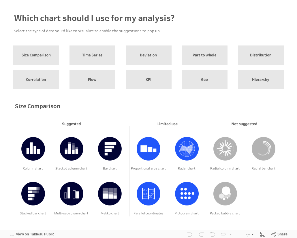
Which chart should you use for your analysis?

Over on Tableau Public, Judit Bekker create this fantastic directory of charts to help you pick the one that's most appropriate for your analysis.
Check it out below.
April 26, 2024
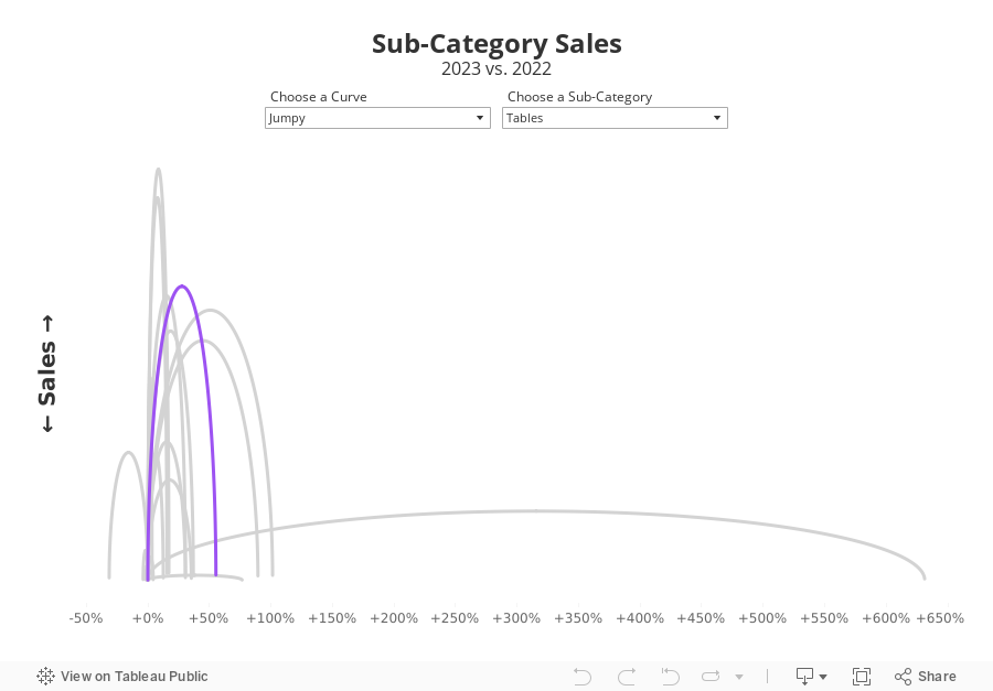
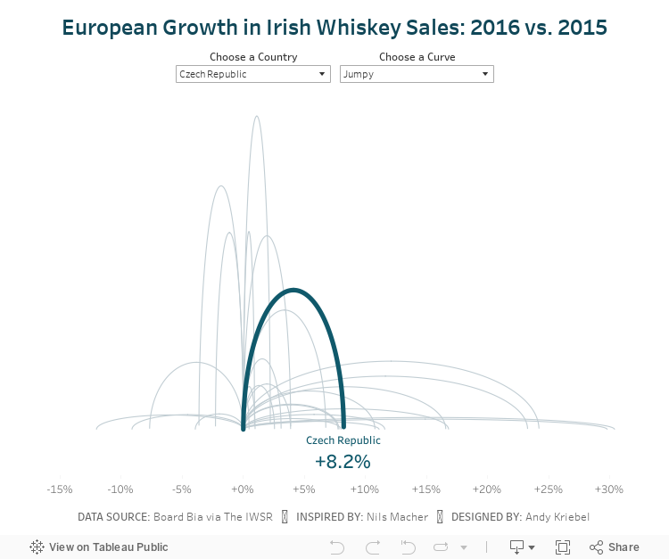
Jumpy Curvy Things in Tableau

I received a request to teach how to build a jump plot during Next-Level Tableau office hours. The idea was to recreate this visualization that I created for Makeover Monday back in 2018.
The problem, though, was that the data preparation was done in Alteryx, which I no longer have a license for. Thanks for a member of NLT that had an Alteryx license, we were able to decode what the workflow was doing.
Then, in office hours, we recreated the data prep in Tableau Prep before building the visualization in Tableau. Download the Prep flow here. Download the workbook below.
This is just one example of one thing learned as a member of NLT. Sign up today and I guarantee you'll become a Tableau expert.
August 7, 2018
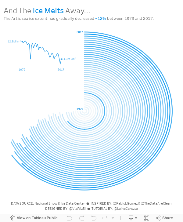
Makeover Monday: And The Ice Melts Away (as a Radial Chart)

I'd never built a radial chart from scratch before, so I was excited to learn to build a second new chart type today. In Laine's tutorial, she used the Custom SQL option that's available in the Legacy data connector in Tableau for Windows. However, there's no custom sql option on a Mac, so I decided to create the data structure using Tableau Prep.
 |
| Download the Flow here |
This is a pretty straightforward workflow. You split the data into parts to create the start and end points, then union them back together, along with some cleanup along the way.
Laine provided all of the details of the table calcs and the bin needed to create the curves, so I follow her steps using the Arctic Sea Ice Extent data from Makeover Monday week 15. That worked rather perfectly!
From there it was on to the polish. I love Pablo Gomez's style, so I used this radial chart viz of his as inspiration for the overall design, and then I used the wording from Arpit Arora's Makeover Monday viz about the same topic to help frame the messaging.
July 18, 2018
Financial Times Visual Vocabulary: Tableau Edition


Over the past month, I've been building all of these charts in Tableau so that everyone in the Tableau Community would have examples they could use and learn from. This has been quite the labor of love and I would like to thank the (best) team at The Information Lab for their support, reviews and feedback along the way.
There are 72 charts in total, most of which I built myself or with help of tutorials from the community. To build the violin plot, equalized cartogram, and heat map examples, I prepared the data in Alteryx and the output was shape files. The scaled cartogram was built using Tilegrams by Pitch Interactive based on this tutorial from Ken Flerlage.
While the people listed below may not have been the original creators of the charts, they are the resources I used to create the charts in my workbook.
Chart
|
Person
|
Link
|
|---|---|---|
| Diverging Stacked Bar | Steve Wexler | Data Revelations |
| Surplus/Deficit Filled Line | Jeffrey Shaffer | Data +Science |
| Violin Plot | Ben Moss | YouTube / Alteryx App |
| Sunburst Chart | Leonid Golub | Super Data Science |
| Arc Chart | Ken Flerlage | KenFlerlage.com |
| Venn Diagram | Leonid Golub | Super Data Science |
| Radar Chart | Adam McCann | Dueling Data |
| Scaled Cartogram | Ken Flerlage | KenFlerlage.com |
| Sankey Diagram | Leonid Golub | Super Data Science |
| Chord Diagram | Noah Salvaterra | DataBlick |
How to use this workbook
- Start on the Visual Vocabulary tab.
- Click on the text in any section to get to the chart types associated with that topic.
- To go back to the beginning, click on the Visual Vocabulary tab (NOTE: I'll add dashboard navigation buttons once Tableau releases that feature.)
- You should be able to swap your data out for any chart type fairly easily.
- Give credit to the creator of the chart as appropriate.
- If you want to see how that charts are built, email me and I'll we can have a chat.
Notes
- This is NOT meant to be an exhaustive list of charts that can be built with Tableau. This is based on the charts created by the Financial Times for the Visual Vocabulary.
- Actions are quite slow to respond on Tableau Public. If you download the workbook, it's much more responsive.
- There's a mobile version as well.
- Images of each set of charts can be found on Google Photos.
June 13, 2018
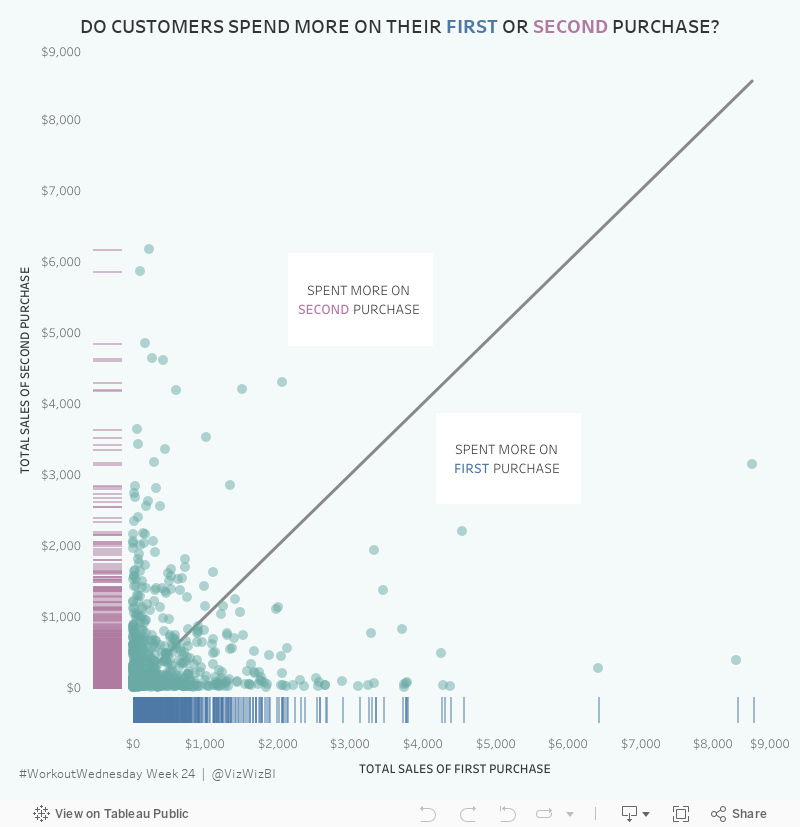
Workout Wednesday: Do Customers Spend More on Their First or Second Purchase?

The high-level requirements:
- Create a data set in Tableau Prep that returns the first and second order for each customer along with the sales, number of categories and number of products sold on that day.
- The data must be wide rather than tall. That is, you must have nine columns in total: Customer ID, two dates, two sales totals, two category counts, two product counts.
- Create a dashboard with a scatterplot and two strip plots.
- Float everything...YUCK!

Building the viz was pretty simple. Scaling the axes the same is something I do a lot, but I do expect that to trip up people. Creating the 45º line is something I've written a tip on before, but Ann's has a twist as it has to be behind the dots. Sneaky!
The sucky part was floating everything. I started by tiling everything, literally writing down the position and size for each element. Then I floated them one by one and entered what I wrote down to put them back in their proper position. From there, it was a little bit of tweaking to move the axes closer together.
Nice challenge. It wasn't overly complex and required me to reach back into the memory bank.

June 5, 2018
Tableau Tip Tuesday: Split, Pivoting and Union with Tableau Prep

You can download the flow here.
March 9, 2013
Where do American’s commute to work? An interactive map of county-to-county commutes.
Our mission at Facebook is to “make the world more open and connected” and I thought a great way to look at connectedness is through commuter flows. I built the map below, which contains 255K+ lines, using census data about American commuters (this is census data, not Facebook data).
My initial test results for this example reveal:
- Tableau 8 is not noticeably faster than Tableau 7, even with the OpenGL graphics turned on. This is the case both on Desktop and Server.
- There’s a bug in 8 that is prohibiting worksheets from dynamically sizing within a container. The basically kills the ability to show/hide viz types dynamically using containers and parameters.
From Brian McKenzie’s working paper:
Workplace information is crucial for understanding the degree of interconnectedness among our nation’s communities. Commuting plays an important role in the larger interchange of people, goods, services, and information across places, and helps shape the contours of metropolitan and micropolitan statistical areas.
The Census Bureau produces county and MCD-level commuting flow tables every five years, using non-overlapping 5-year ACS estimates beginning with 2006-2010.
To give you an idea for how I am using this, consider this question: Where do people travel from that want to come to the Silicon Valley (San Mateo County, CA)?
To do this I:
- Filter the Workplace State to California. This will reduce the Workplace County list to only counties in CA.
- Filter the Workplace County to San Mateo.

From this, I wanted to only see where a large number of commuters were coming from, i.e., the most frequent commuters to Silicon Valley. I filtered out the Average Commuters of 1-100 and 101-500.

This is interesting. As I would expect, there are a lot of commuters from the closest counties. However, there’s a significant number of people that commute from LA. Fascinating.
Switch to the Dots view if you don’t want to see the lines.

Another nice looking viz is: Residence State = Georgia with 501 average commuters and higher. There are not loads of people traveling outside of Georgia, but then again, it has a lower population than CA (there’s a population bias in the data).

Give it a try with where you live and work. Share an image of your findings. Note that this initial view is filtered to those residing in CA so that it will draw in a reasonable amount of time. Once it loads, check (All) for Residence State and see all commutes in the US. It’s pretty cool.
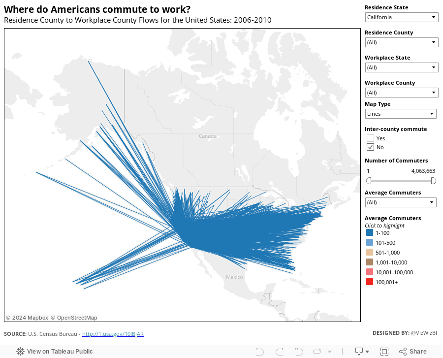
Download the data here and the workbook here.
January 12, 2013
Creating Stream Graphs in Tableau 8 in 6 simple steps (it works in Tableau 7 too, but doesn’t look as cool)
Today I attended Andy Kirk’s “Introduction to Data Visualisation” course, learning a lot about data visualization and constructing stories with data. One of the topics Andy covers is “Establishing editorial focus with your subject matter”. During this section Andy showed the now famous stream graph created by the New York Times which visualized box office receipts from 1986-2008.
So at the next break I thought “Hmm…I wonder if I can build a stream graph in Tableau 8” and about 3 minutes later I had the basics built.
First, you should know that Wikipedia defines a stream graph as “a type of stacked area graph which is displaced around a central axis, resulting in a flowing, organic shape.” The NYT graph has nice smooth curves from one point to the next, however Tableau doesn’t support smoothed lines. Bearing this in mind, let me present you with my first stream graph.

There are two particularly nice new features of Tableau 8. The experience is better in Desktop (or Public) than Server, so if you have the beta, download this workbook and you’ll see what I mean.
- Try out the zoom controls. When you lasso zoom, there’s a really smooth transition.
- In Desktop, as you scroll your mouse across the chart, you see dots at the top and bottom of the band for the color you’re over for that day. It’s super fast and gives you a quicker sense of the height of the color. Really well done Tableau!

You might be asking how I did this. It actually is simpler than you might think. Here’s how you would create a stream graph of Sales based on Order Priority.
Step 1 – Drag Order Date to the Columns shelf, right click on it, and choose Exact Date.
Step 2 – Create a calculated field that determines which Order Priorities go up and which go down.

The trick here is to put a negative in front of sales for some of the Order Priorities.
Step 3 – Drag your new calculated field to the Rows shelf.
Step 4 – Drag Order Priority onto the color shelf (and change the colors if you want…I used the Color Blind palette).
Step 5 – Change the Mark Type to Area
You should now have something like this, which technically is a stream graph and we’re done.

I don’t like the look of this though. It’s way too jagged and I’d like to smooth it out a bit. Moving averages are useful with time-series data to smooth out short-term fluctuations (Wikipedia). A 30-day moving average calculation should do the trick since this is four years worth of data. A 7-day moving average when there’s a shorter time period (like one year or less) works well, or whatever makes sense for your data.
Step 6 – Right click on the Sales by Order Priority pill on the Rows Shelf and choose Add Calculated field.

And you’re done. You should now have a stream graph that looks like this:

For my version above, I did a few more things:
- Lots of formatting and cleanup
- Played around with the colors to get them the way I wanted (blues on top, oranges below)
- Created two parameters that allow the user to pick (1) dimensions to slice the data by and (2) measures to analyze.
- Added a time slicer
- Put it all on a dashboard, added some annotations, etc.
I’ve yet to convince myself where I’d use these in a business context, but at least I now know how to build them. How would you use them?


