May 30, 2023
How to Create a Radial Bubble Chart in Tableau

August 7, 2018
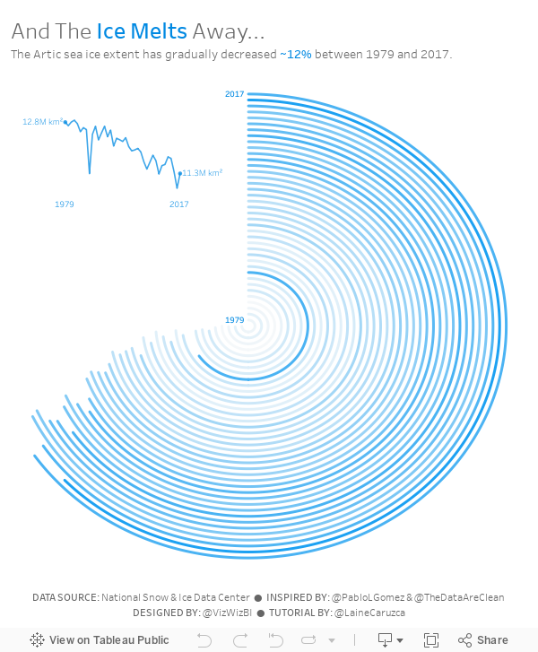
Makeover Monday: And The Ice Melts Away (as a Radial Chart)

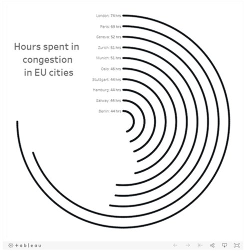
I'd never built a radial chart from scratch before, so I was excited to learn to build a second new chart type today. In Laine's tutorial, she used the Custom SQL option that's available in the Legacy data connector in Tableau for Windows. However, there's no custom sql option on a Mac, so I decided to create the data structure using Tableau Prep.
 |
| Download the Flow here |
This is a pretty straightforward workflow. You split the data into parts to create the start and end points, then union them back together, along with some cleanup along the way.
Laine provided all of the details of the table calcs and the bin needed to create the curves, so I follow her steps using the Arctic Sea Ice Extent data from Makeover Monday week 15. That worked rather perfectly!
From there it was on to the polish. I love Pablo Gomez's style, so I used this radial chart viz of his as inspiration for the overall design, and then I used the wording from Arpit Arora's Makeover Monday viz about the same topic to help frame the messaging.
May 17, 2016
Tableau Tip Tuesday: How to Create Monthly Radar Charts

In this week’s Tableau Tip Tuesday, I show you how to create radar charts that are based on monthly data. That is, the months go around an imaginery circle like a clock. Thanks to Jonathan Trajkovic for this great explanation and to Ed Hawkins for the inspiration.
May 15, 2016
Makeover Monday: How warm is Earth becoming?

There was a lot of chatter on Twitter last week about this terrific visualisation by Ed Hawkins:
Spiralling global temperatures from 1850-2016 (full animation) https://t.co/YETC5HkmTr pic.twitter.com/Ypci717AHq
— Ed Hawkins (@ed_hawkins) May 9, 2016
The beauty of this visualisation is in the animation. However, without the animation, it kind of fails to tell the story. Let’s dig a bit deeper.
What works well?
- There is a clear title.
- The background circles provide helpful context.
- Including the month labels makes it easier to understand what you’re seeing.
- The year in the middle helps tell the story.
- The animation is compelling.
- It has a nice color scheme that works well on a black background.
What could be improved?
- While the title is clear, it could be more eye-catching, like a news headline.
- If you see this as a static image, you lose the sense of change.
- You can’t compare any time periods. All you know is 2016 is the warmest.
- There’s no explanation about what the numbers represent. Though I do see in the Twitter post a link to additional information.
- The color scale has nothing to do with the temperature change, which I assumed it did until I read hte additional information. The colors actually represent the years. That doesn’t add much value. I think coloring by the temperature change would be more impactful.
So, this data set is actually incredibly simple. All we have is one record per month, the temperature, and the confidence intervals.
The first thing I wanted to do was rebuild the radial chart. This wasn’t nearly as easy as I thought. This post by Jonathan Trajkovic was very helpful, but it wasn’t designed for months. I’ll record how I did made it for a future Tableau Tip Tuesday.
 |
| Click the image for the interactive version |
This radial chart is basically the same as the original, however I can’t make it “play”on Tableau Public and I also changed the color to be the median temperature difference. Really, I only built this to see if I could. It’s not any more useful than the original.
Next, I took the radial chart and flattened it out.
 |
| Click the image for the interactive version |
This doesn’t make the understanding all that much easier because I can’t tell which years are which. Maybe I should switch the color legend back to years?
 |
| Click the image for the interactive version |
Oh wow! What a difference! Now I can easily see the distinction between the older and more recent years. I think this is much, much better than the original, especially in static format. I wanted to keep iterating though.
Whenever I’m working with time-based data, I like to build either calendar heatmaps or heatmaps by year and month. Here’s what this data set looks like as a heatmap:
 |
| Click the image for the interactive version |
The heatmap makes the series of lines even easier to understand. It’s super easy to see the gradual temperature change over time. This is pretty compelling, yet I wanted to keep going. Was there a better way to tell the story?
Next I looked at the 10-year average, that is, a 120 month moving average of the median temperature change. I then overlaid the confidence intervals.
 |
| Click the image for the interactive version |
Lastly, I took the 10-year moving average view and replaced the monthly confidence intervals for the monthly values while keeping the overall 10-year average. This is my submission for Makeover Monday. In this view, I like how I can see the drastic monthly fluctuations but still have the overall context. Including a reference line at zero helps emphasize the dramatic change since about 1984.
I also included a strip plot under the graph that shows the average median temperature difference for the entire year. This brings back a bit of the heatmap view above.
In the end, another fun week with a simple data set that provides lots and lots of options. Which one do you like best?
UPDATE: This week has been a fascinating exercise in iterating. That’s the beauty of Tableau. I can get another idea and build it quickly. After seeing some of the submission for this week, I thought a jitter plot might work well. Thoughts?
 |
| Click the image for the interactive version |
February 15, 2016
Makeover Monday: How Does Video Game Playing Vary by Demographic?

This week’s Makeover Monday has a mix of good and bad parts. It comes to use from Forbes.

Let’s review this from top to bottom.
- The video game font they chose for the title is cute, yet the title itself doesn’t reflect what contained in the entire visualisation.
- I don’t understand why they chose to use a grey-to-white background. What value does that add? Remember, everything you include in a viz should have a purpose. If not, remove it.
- I really like the adults vs. teens section. In particular, I like how the bars start on opposite ends and come towards each other.
- Then we get to the parents vs. non-parents section. Why didn’t they continue the theme from the adults vs. teens section? Instead they chose some weird radial chart type thing that makes comparisons very difficult both between parents and non-parents and across platforms within a single category. Basically, this section is a disaster.
- The images of people playing videos games on a giant screen is cute, but it doesn’t enhance the viz in my opinion.
Click here to download the Tableau workbook.






