Showing posts with label Tableau Prep. Show all posts
April 26, 2024
Jumpy Curvy Things in Tableau
calculations
,
cos
,
cosine
,
curve plot
,
flow
,
geometry
,
how to
,
jump plot
,
math
,
next level tableau
,
NLT
,
sin
,
sine
,
tableau
,
Tableau Prep
,
workflow
No comments

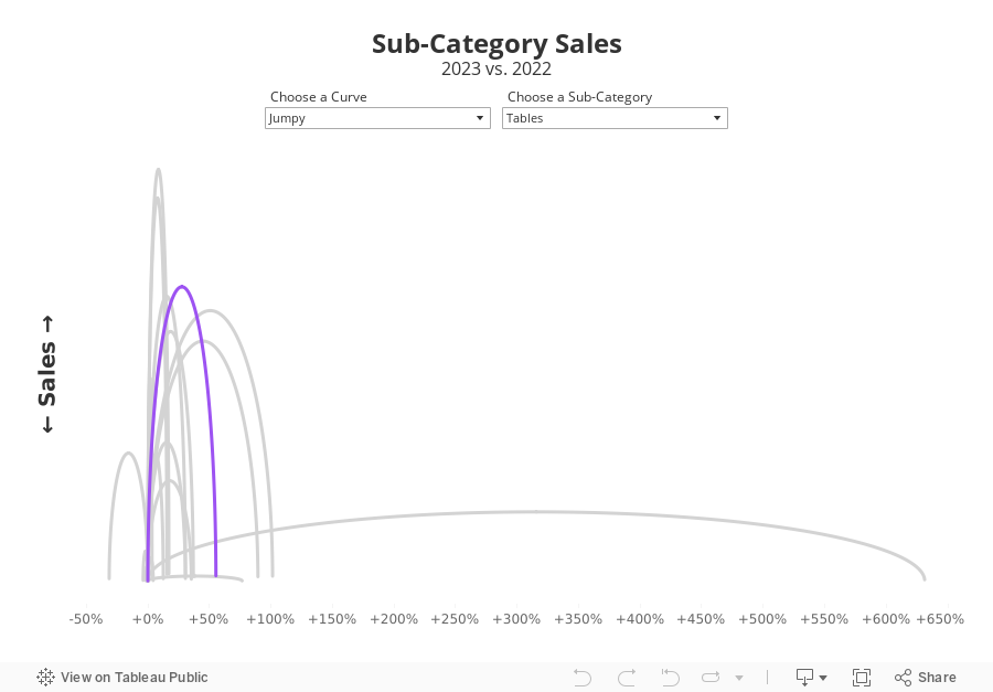
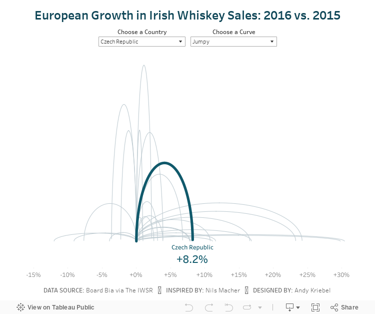
I received a request to teach how to build a jump plot during Next-Level Tableau office hours. The idea was to recreate this visualization that I created for Makeover Monday back in 2018.
The problem, though, was that the data preparation was done in Alteryx, which I no longer have a license for. Thanks for a member of NLT that had an Alteryx license, we were able to decode what the workflow was doing.
Then, in office hours, we recreated the data prep in Tableau Prep before building the visualization in Tableau. Download the Prep flow here. Download the workbook below.
This is just one example of one thing learned as a member of NLT. Sign up today and I guarantee you'll become a Tableau expert.
August 7, 2018
Makeover Monday: And The Ice Melts Away (as a Radial Chart)
arctic sea ice
,
Arpit Arora
,
data prep
,
flow
,
Laine Caruzca
,
Makeover Monday
,
Pablo Gomez
,
radial chart
,
Tableau Prep
,
workflow
No comments

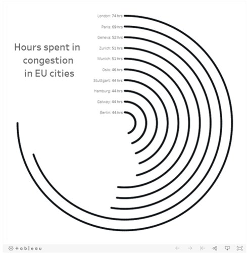
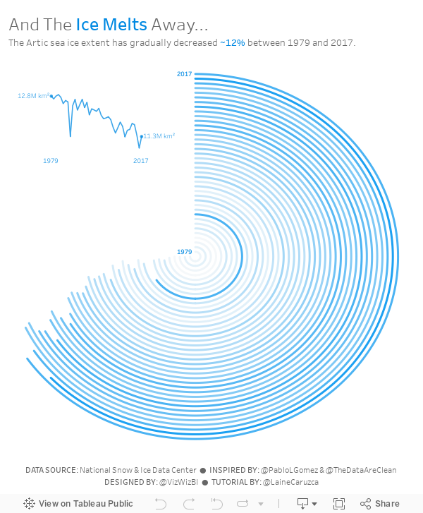
I'd never built a radial chart from scratch before, so I was excited to learn to build a second new chart type today. In Laine's tutorial, she used the Custom SQL option that's available in the Legacy data connector in Tableau for Windows. However, there's no custom sql option on a Mac, so I decided to create the data structure using Tableau Prep.
 |
| Download the Flow here |
This is a pretty straightforward workflow. You split the data into parts to create the start and end points, then union them back together, along with some cleanup along the way.
Laine provided all of the details of the table calcs and the bin needed to create the curves, so I follow her steps using the Arctic Sea Ice Extent data from Makeover Monday week 15. That worked rather perfectly!
From there it was on to the polish. I love Pablo Gomez's style, so I used this radial chart viz of his as inspiration for the overall design, and then I used the wording from Arpit Arora's Makeover Monday viz about the same topic to help frame the messaging.
June 15, 2018
Tableau Prep Tip: Returning the First and Second Purchase Dates
aggregation
,
summarize
,
Tableau Prep
,
Tableau Tip Tuesday
,
workflow
,
Workout Wednesday
No comments

In this video, I should you how I approached returning the first and second purchase dates for a customer, include some summary measures, then bring them both back together into a single table for visualizing in Tableau.
June 13, 2018
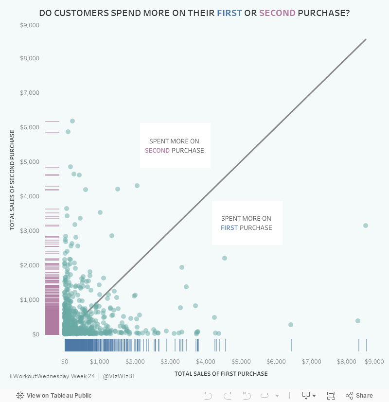
Workout Wednesday: Do Customers Spend More on Their First or Second Purchase?

The high-level requirements:
- Create a data set in Tableau Prep that returns the first and second order for each customer along with the sales, number of categories and number of products sold on that day.
- The data must be wide rather than tall. That is, you must have nine columns in total: Customer ID, two dates, two sales totals, two category counts, two product counts.
- Create a dashboard with a scatterplot and two strip plots.
- Float everything...YUCK!
Here's what my flow looks like from Prep:

I intentionally did NOT rename my tools so that you wouldn't know exactly what I did. You can see my final output below the flow.
Building the viz was pretty simple. Scaling the axes the same is something I do a lot, but I do expect that to trip up people. Creating the 45º line is something I've written a tip on before, but Ann's has a twist as it has to be behind the dots. Sneaky!
The sucky part was floating everything. I started by tiling everything, literally writing down the position and size for each element. Then I floated them one by one and entered what I wrote down to put them back in their proper position. From there, it was a little bit of tweaking to move the axes closer together.
Nice challenge. It wasn't overly complex and required me to reach back into the memory bank.
Building the viz was pretty simple. Scaling the axes the same is something I do a lot, but I do expect that to trip up people. Creating the 45º line is something I've written a tip on before, but Ann's has a twist as it has to be behind the dots. Sneaky!
The sucky part was floating everything. I started by tiling everything, literally writing down the position and size for each element. Then I floated them one by one and entered what I wrote down to put them back in their proper position. From there, it was a little bit of tweaking to move the axes closer together.
Nice challenge. It wasn't overly complex and required me to reach back into the memory bank.

June 5, 2018
Tableau Tip Tuesday: Split, Pivoting and Union with Tableau Prep
flow
,
pivot
,
split
,
Tableau Prep
,
Tableau Tip Tuesday
,
union
,
workflow
No comments

You can download the flow here.
Subscribe to:
Posts
(
Atom
)






