March 19, 2025
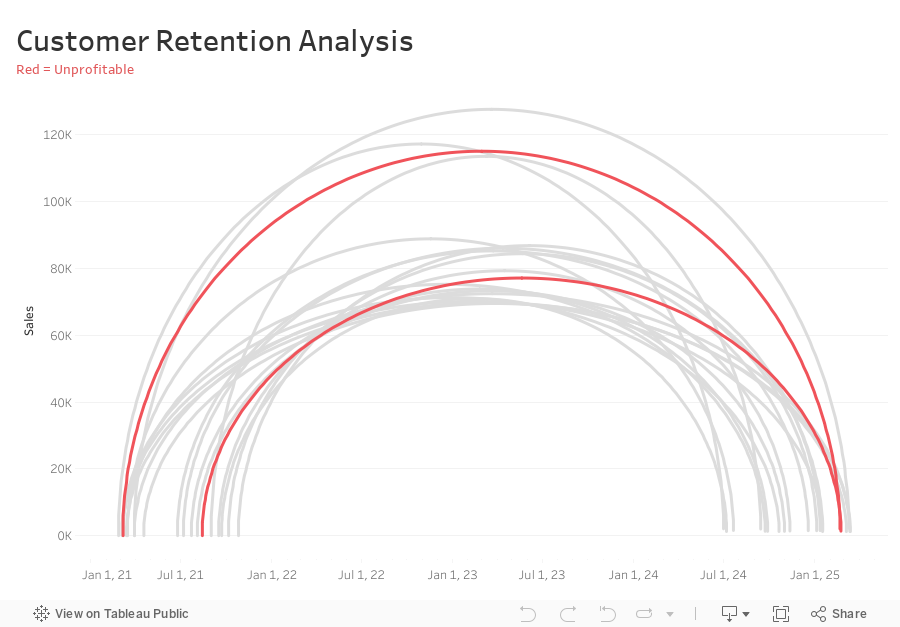
How to Analyze Customer Retention with a Jump Plot

-
Connect sales data source to 180 points and relate “1” to “1”
-
Compute Min Date by customer
{ FIXED [Customer Name] : MIN([Purchase Date]) } -
Compute the Max Date by Customer
{ FIXED [Customer Name] : MAX([Purchase Date]) } -
Filter customers that made more than one order (Max Date > Min Date)
[Max Date]>[Min Date] -
Create Customer Length calc
DATEDIFF('day',[Min Date],[Max Date]) -
Create Columns calc (continuous dimension)
DATE( ((COS([Point] * PI() / 180)) + 1 ) * (FLOAT([Max Date])-FLOAT([Min Date])) / 2 + FLOAT([Min Date]) ) -
Create Rows calc (continuous dimension)
SIN((MIN([Point])) * PI() / 180) * SUM([Sales]) -
Add Columns and Rows to viz
-
Add Customer to Detail
-
Add Path to Path
-
Create Profitable calc and add to Color
{ FIXED [Customer Name] : SUM([Profit])}>0
April 26, 2024
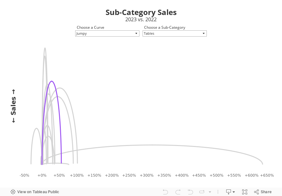
Jumpy Curvy Things in Tableau

I received a request to teach how to build a jump plot during Next-Level Tableau office hours. The idea was to recreate this visualization that I created for Makeover Monday back in 2018.
The problem, though, was that the data preparation was done in Alteryx, which I no longer have a license for. Thanks for a member of NLT that had an Alteryx license, we were able to decode what the workflow was doing.
Then, in office hours, we recreated the data prep in Tableau Prep before building the visualization in Tableau. Download the Prep flow here. Download the workbook below.
This is just one example of one thing learned as a member of NLT. Sign up today and I guarantee you'll become a Tableau expert.
August 7, 2018
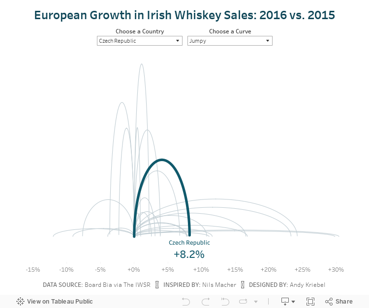
Makeover Monday: Jumpy Curvy European Irish Whiskey Sales

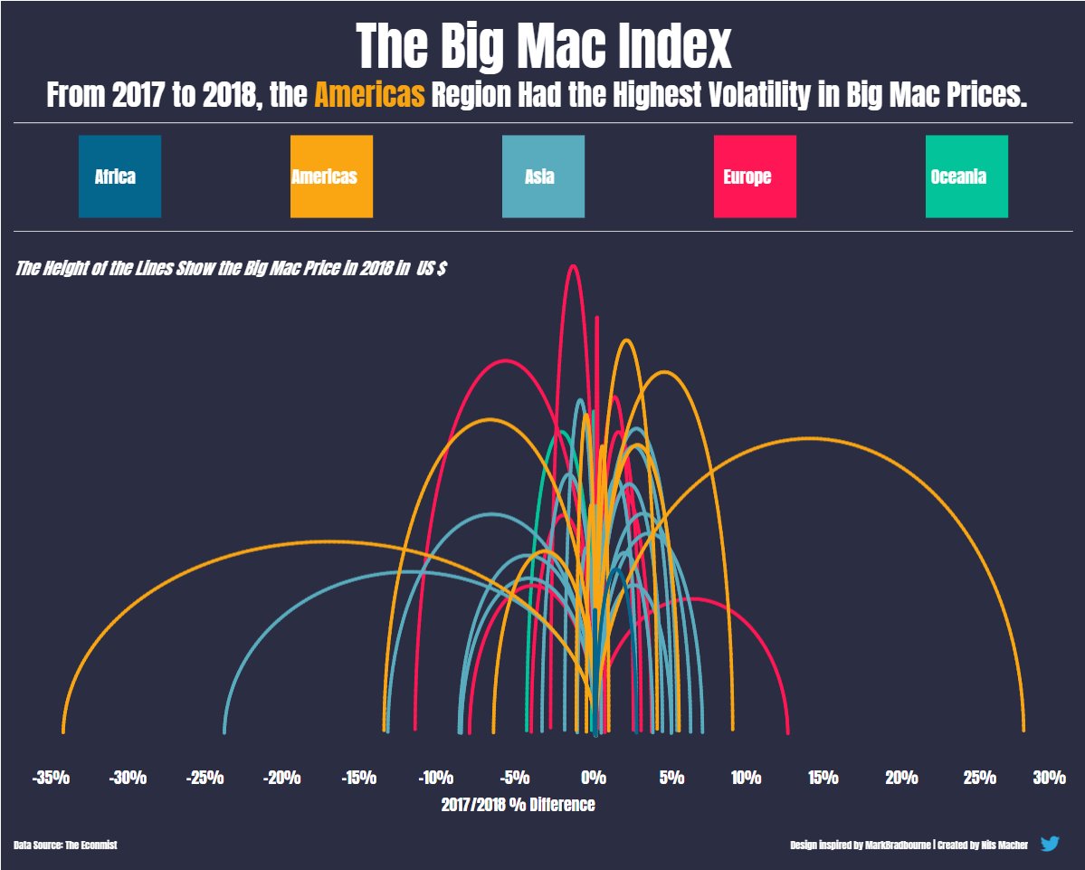 |
| Nils' viz inspired by Mark Bradbourne |
Today, Nils taught us how he shaped the data and built the viz, then we each took a Makeover Monday data set and applied what we learned. I chose to use the Irish Whiskey sales data from week 11.
I started by shaping the data in Alteryx via these steps in my workflow:

I then created a jump plot similar to Nils and also found a curvy plot interesting too, so I decided to include both via a parameter. Another fun day of learning! Never stop!