Showing posts with label ireland. Show all posts
August 7, 2018
Makeover Monday: Jumpy Curvy European Irish Whiskey Sales
BordBia
,
curve plot
,
europe
,
Information Lab
,
ireland
,
irish
,
jump plot
,
Makeover Monday
,
Nils Macher
,
sales
,
The IWSR
,
whiskey
No comments

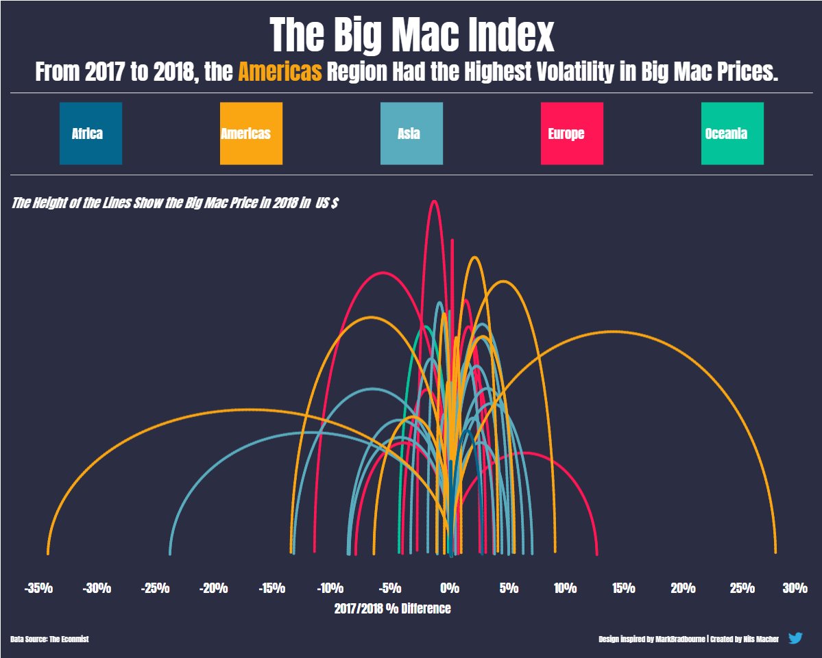 |
| Nils' viz inspired by Mark Bradbourne |
Today, Nils taught us how he shaped the data and built the viz, then we each took a Makeover Monday data set and applied what we learned. I chose to use the Irish Whiskey sales data from week 11.
I started by shaping the data in Alteryx via these steps in my workflow:

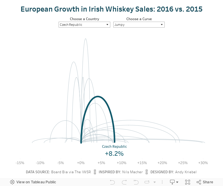
I then created a jump plot similar to Nils and also found a curvy plot interesting too, so I decided to include both via a parameter. Another fun day of learning! Never stop!
March 11, 2018
Makeover Monday: The Twisted Nature of Irish Whiskey Sales
alcohol consumption
,
BordBia
,
Glendalough
,
Information Lab
,
ireland
,
irish
,
Makeover Monday
,
St. Patrick's Day
,
The IWSR
,
whiskey
,
whisky
4 comments

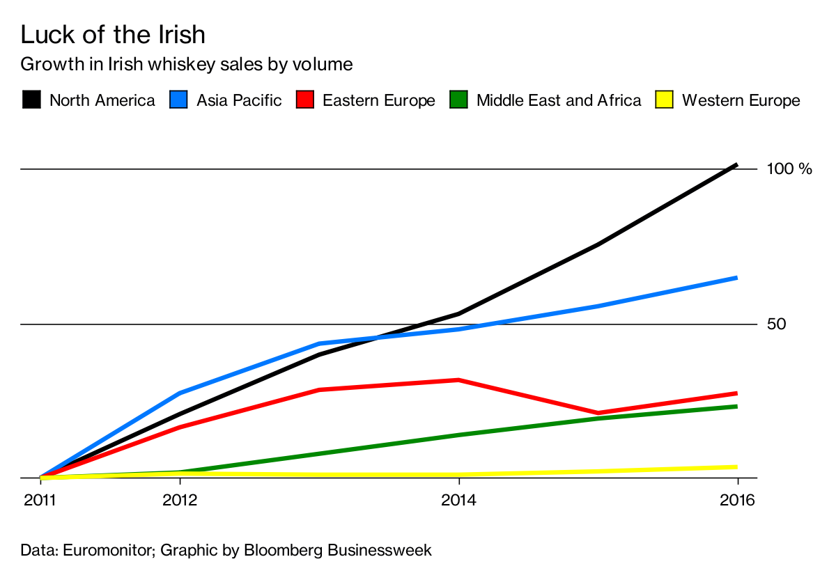
Also, thank you to BordBia for providing the data that they collected from The IWSR. Let's have a look at the visualization to makeover from Bloomberg Businessweek:
What works well?
- Overall the design is clean, including minimal gridlines.
- Showing cumulative growth since 2011 makes it easy to compare the regions.
- The region colors are easy to distinguish from one another.
- The subtitle tells me what the chart is about.
- The legend is prominently placed so that we know it's important.
- Putting the axis on the right speed processing because the axis is next to the end of the lines.
What could be improved?
- Labeling the lines directly would remove the need for the legend.
- Labeling the ends of the lines would tell us what the growth actually has been.
- The title isn't very relevant to the data. Why does this make the Irish lucky? A better title is needed.
- So what? What are we supposed to get from this?
My Goals
- There are a lot of countries and a lot more years in the data set, explore them and look for stories.
- Consider the regional aggregations to see if there's an significance.
- Look at both volume and change. Looking at just change doesn't factor in the volume that each country imports.
- This is time series data, so spend time looking at line charts.
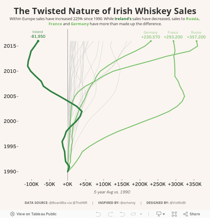
After playing with data for a while, I remembered this great viz by Emily Chen and thought it might fit well with this data set because whiskey sales within Ireland have decreased. I used her viz as my style guide to create my Makeover Monday week 11.
Subscribe to:
Posts
(
Atom
)






