May 25, 2026
The Big Beautiful Bar Chart: Build It in Tableau with Map Layers

May 12, 2026
The Marimekko Alternative

Stacked bars are fine. But once you need to compare proportions across groups AND show the actual totals, they start to break down. This is the chart that replaced it.
In this tutorial, you'll build a Marimekko alternative in Tableau that shows the proportional breakdown of each group by light conditions — with the total count for each group displayed directly on the chart. It's a technique straight from a Next Level Tableau class, and once you build it, you won't go back.
What you'll learn:
- How to set up the base chart and sort groups by volume
- Building a running total calculation and placing it on columns
- Using fixed size with right-alignment to create the Marimekko bar effect
- Nesting a running total inside a percentage-of-total calculation and why two separate table calculations are required
- Configuring compute-by settings for both the column axis and the size shelf
- Adding a reference line from the Analytics pane to show group totals
- Formatting so the totals sit cleanly above the bars without clutter
If you're comfortable with table calculations and want a more powerful alternative to the stacked bar, this one belongs in your toolkit.
To follow along, download the workbook and data at https://nlt.kit.com/marimekko.
April 28, 2026
How to Count Only Weekdays Between Any Two Dates in Tableau (No Excel Needed)

Stop doing this in Excel. Tableau has a cleaner, more powerful way to count only the weekdays between any two dates. And once you see how it works,you'll use it everywhere.
In this tutorial, you'll learn how to build a dynamic date range selector using parameter actions, then strip out Saturdays and Sundays using DATEPART weekday logic wrapped in a Level of Detail expression, so you always get an accurate weekday count, no matter the range.
This is one of the most common questions I get asked, and the solution is simpler than you think.
📥 Download the workbook + data: https://nlt.kit.com/weekdays
April 22, 2026
How to Make Your Worksheet Actions Work on a Dashboard

April 17, 2026
Build a Marginal Histogram with Map Layers in One Sheet


March 31, 2026
Fix These 5 Tableau Dashboard Mistakes Today

These 5 Tableau dashboard mistakes can make your work look cluttered, confusing, and beginner-level fast. In this video, I break down the 5 biggest mistakes new Tableau users make and show you how to fix them so your dashboards look cleaner, more professional, and easier to use.
Download the practice workbook from this video here.
If you’re learning Tableau dashboard design, this video will help you avoid common problems like misusing colors, adding too many charts, ignoring your audience, overcomplicating layouts, and forgetting interactivity. These simple dashboard design tips will help you build cleaner, more actionable dashboards that feel less like data dumps and more like real business tools.
What we’ll cover:
- Misusing Colors, avoid the “Skittles Effect” and highlight what matters
- Chart Overload, use the Rule of 4 for cleaner dashboards
- Ignoring Your Audience, build for stakeholder decisions, not personal preference
- Container Chaos, why simple layouts beat overbuilt designs
- Functionality Fails, improve filter actions and remove distracting defaults
March 9, 2026
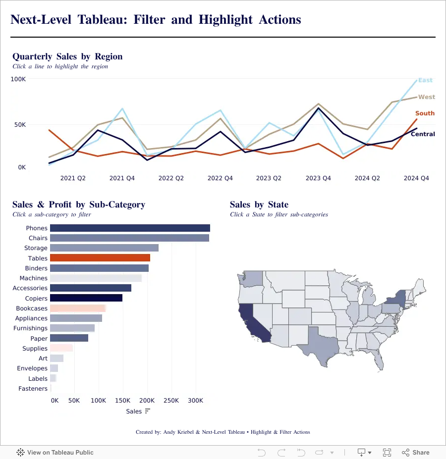
Highlight vs Filter Actions in Tableau: When Should You Use Each?

Highlight vs Filter Actions in Tableau can completely change how users interact with your dashboards. In this tutorial, you’ll learn the difference between highlight actions and filter actions, when to use each one, and how to build both into a Tableau dashboard from start to finish.
Using a practical end-to-end example, we’ll create charts, assemble them into a dashboard, and add interactive actions that improve usability and analysis. By the end, you’ll understand how highlight actions guide attention, how filter actions change the view, and how to use both together to create more effective Tableau dashboards.
Whether you’re new to Tableau dashboard actions or looking to sharpen your skills, this walkthrough will help you build more interactive and user-friendly dashboards with confidence.
February 25, 2026
How to Build a Quadrant Chart in Tableau | Step-by-Step Tutorial

In this lesson, I walk through how to build a quadrant chart (4-quadrant scatterplot) in Tableau.
Quadrant charts are one of the most effective ways to compare performance across two measures and quickly identify outliers, opportunities, and risk areas.
In this example, we’re analyzing:
- Profit Ratio
- Average Discount
At first glance, a scatterplot shows the relationship.
But once you add quadrant segmentation, the insight becomes much clearer.
You can instantly see:
- High profit / Low discount performers
- High profit but heavily discounted items
- Low profit / Low discount products
- Low profit / High discount problem areas
Inside the video, I’ll walk you through:
- Creating a Profit Ratio calculation
- Building the base scatterplot
- Adding average reference lines
- Splitting the view into four quadrants
- Categorizing marks based on performance
- Two different ways to build the quadrant chart
This is a foundational analysis technique you can apply to product performance, customer segments, sales teams, marketing channels, and more.
Download the Workbook + Dataset
You can download the workbook and dataset used in this lesson here:
👉 https://nlt.kit.com/quadrant
If you want to go deeper than individual chart techniques, this is exactly the kind of real-world training we focus on inside Next-Level Tableau.
Live classes.
Real use cases.
Advanced techniques you can apply immediately.
Learn more here:
👉 https://www.nextleveltableau.com/
February 18, 2026
How to Use Split, Custom Split, and Replace in Tableau


