February 25, 2026
How to Build a Quadrant Chart in Tableau | Step-by-Step Tutorial

In this lesson, I walk through how to build a quadrant chart (4-quadrant scatterplot) in Tableau.
Quadrant charts are one of the most effective ways to compare performance across two measures and quickly identify outliers, opportunities, and risk areas.
In this example, we’re analyzing:
- Profit Ratio
- Average Discount
At first glance, a scatterplot shows the relationship.
But once you add quadrant segmentation, the insight becomes much clearer.
You can instantly see:
- High profit / Low discount performers
- High profit but heavily discounted items
- Low profit / Low discount products
- Low profit / High discount problem areas
Inside the video, I’ll walk you through:
- Creating a Profit Ratio calculation
- Building the base scatterplot
- Adding average reference lines
- Splitting the view into four quadrants
- Categorizing marks based on performance
- Two different ways to build the quadrant chart
This is a foundational analysis technique you can apply to product performance, customer segments, sales teams, marketing channels, and more.
Download the Workbook + Dataset
You can download the workbook and dataset used in this lesson here:
👉 https://nlt.kit.com/quadrant
If you want to go deeper than individual chart techniques, this is exactly the kind of real-world training we focus on inside Next-Level Tableau.
Live classes.
Real use cases.
Advanced techniques you can apply immediately.
Learn more here:
👉 https://www.nextleveltableau.com/
March 11, 2022
How to Include Multiple Dimensions on the Color Shelf
- You can have more than two dimensions on the color shelf. Simply repeat the steps for adding a second color.
- This only works for dimensions, as I show in the video.
- You do not have to use Sets for this to work; I used that in my example for simplicity.
September 29, 2021
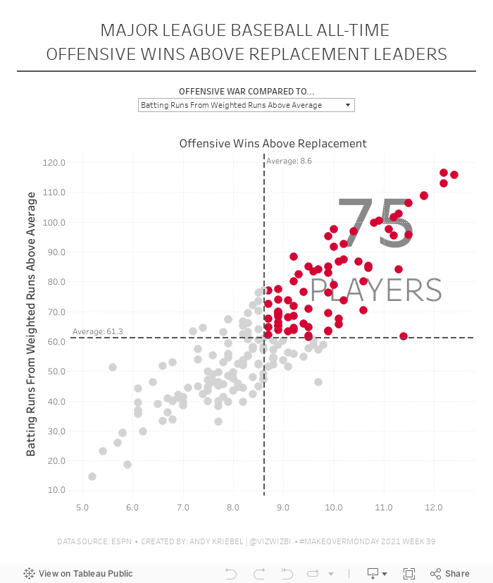
#MakeoverMonday 2021 Week 39 - MLB All-Time Offensive Wins Above Replacement

April 27, 2021
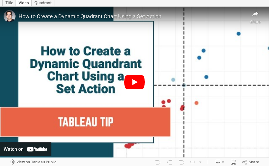
How to Create a Dynamic Quadrant Chart Using a Set Action

April 22, 2021
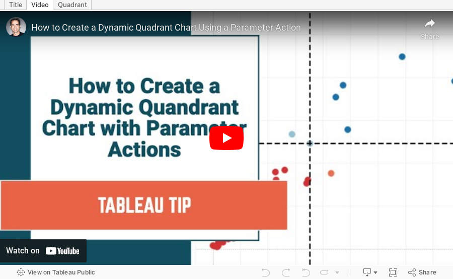
How to Create a Dynamic Quadrant Chart Using a Parameter Action
November 5, 2019
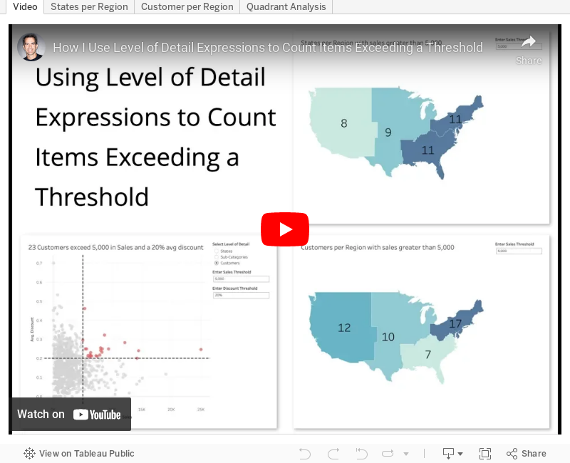
#TableauTipTuesday: Using Level of Detail Expressions to Count Items Exceeding a Threshold

I ended up babbling quite a bit as I created more examples; sorry for that, but I was on a roll.
May 28, 2019
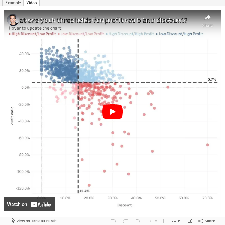
#TableauTipTuesday: Create an Interactive Quadrant Chart with Parameter Actions

The first chart I wanted to try was a quadrant chart. A quadrant chart colors each quadrant based on thresholds set for each axis in a scatter plot. Previously, I created two parameters and the user had to type in numbers to adjust the view. However, with parameter actions, I can now enable to use to update the quadrants by simply hovering over a dot.
And here's the video...enjoy!
May 6, 2019
#MakeoverMonday: Major League Baseball's Most Cost Effective Players


What works well?
- The title and subtitle explain what the viz is about.
- Dividing the viz into two sections by using different background colors on the scatter plots
- Consistent scales for the salaries across the charts for each section
- Using gridlines to help the audience understand the approximate values of each point
- Only labeling the type of stat once by putting the label between the players and teams charts
What could be improved?
- There's no data source listed.
- I have no idea why these players or team are highlighted; an explanation is needed. At first, I thought it was highlighting the most effective player/team, but it's not (at least that's what I see).
- The logos are meaningless for people that aren't familiar with the teams.
- What does the big logo on the upper right represent? Is that the author?
- The data should be filtered to players that meet certain criteria, like at bats in a season. This would then filter out many players near zero.
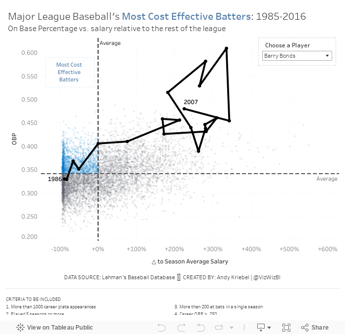
Based on Ryan's explanation, I decided to use OBP as my proxy for batter effectiveness (y-axis). For the x-axis, I wanted to use salary for comparison. However, the data does not adjust salaries for inflation, so a salary in 1985 is not listed in 2016 value. Instead, I came up with a way to normalize the data across all of the seasons.
I created a calculation that compares a player's salary to that of the average salary of the entire league for each season. I made this a percent difference so that the data would then be normalized. Therefore, a player that was 10% above a 1985 salary would be comparable to players that was 10% above a 2016 salary.
Here are my calculations:
- Season average salary: { FIXED [Season] : AVG([Salary]) }
- △ to Season Average Salary: (AVG([Salary]) - SUM([Season avg Salary])) / SUM([Season avg Salary])
- First, I applied some filters to only include what I deemed "eligible" players. These are noted at the bottom of the viz.
- Now that I have the x-axis (salary variance from season average) and the y-axis (OBP), I created a scatter plot and added a point for each player for each season.
- I added reference lines for the average of each axis.
- The players on the upper left are the most cost efficient players. That led me to a quadrant chart, but I only wanted to highlight the most cost effective. I created a calculation to determine the points in that quadrant and place it on the color shelf.
- The problem now was that it was basically impossible to find a player in the viz. I thought about using a set action to drill in to a player, but that loses all of the context of the other players. Therefore, I create a parameter to allow the user to highlight a player and I show that players as a connected scatter plot.
- Players tend to be more cost effective earlier in their careers. That makes sense since they are on rookie contracts for the first few years of the career.
- Once players sign their first big contract, they tend to either move to the upper right (high OBP, high relative salary) or the bottom right (low OBP, high relative salary).
- Some players can sustain that for the rest of of their careers, but that's rare. Typically it's the superstars that follow this pattern (like Barry Bonds or Chipper Jones).
- For many of the other players, as they approach the end of their career, they tend to move either to the lower right (high relative salary, low OBP) or the lower left (low relative salary, low OBP). Neither of these are particularly good for the team.
And here's my final product. I had never thought of combining a scatter plot and a connected scatter plot before. I'm quite pleased with how this turned out.
December 4, 2017
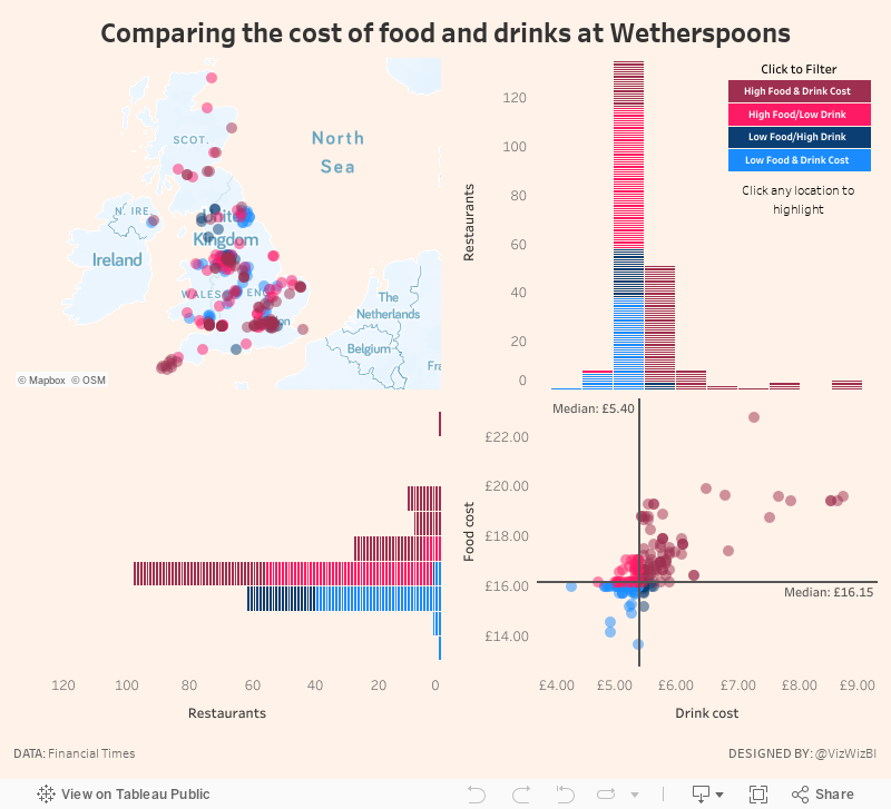
Makeover Monday: Comparing the cost of food and drinks at Wetherspoons
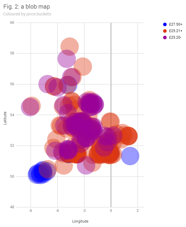
What works well?
- Binning the prices helps cluster the restaurants
- Distinct enough colors
What could be improved?
- The viz is desperately trying to be a map, but failing miserably.
- The dots are so big that they are causing massive overlapping.
- There's no interactivity, so I have no idea which restaurant is which.
- The title doesn't tell me anything.
- What do the dots represent?
My Goals
- Explore the data, particularly focusing on price comparisons.
- Are there regional differences?
- Do large metro areas charge more?
- Many restaurants make a lot of their money from drinks. Does Wetherspoons?
- Elaborate on the price buckets idea from the original. How are the prices distributed?
- Use FT-themed colors (which you can find here)
- Practice highlight actions so that a restaurant can be more easily found on the map
- Create a custom Mapbox map based on what I learned from our webinar last week.
July 5, 2017
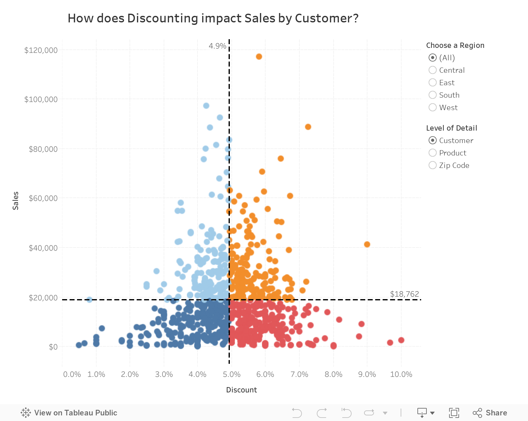
Workout Wednesday: The Quadrant Chart
need help creating a box on worksheet exactly similar to high volume high percentage box in attached image.@VizWizBI @TriMyData @balders93 pic.twitter.com/YdryjNYdf0— Gaurav Arora (@gauravboss1005) July 4, 2017
This week your challenge is to build a quadrant chart, with a few tricks thrown in of course. Download the data here (it's the same version of Superstore Sales I've used for other Workouts).
- Match the tooltips
- Match the title (note that it changes as you change the options on the right)
- Match the colors
- Match the formatting
- Include a Region filter
- Include an option for the user to pick the level of detail in the view
- Include lines to aid in breaking up the quadrants