September 20, 2022
Comparing Change Between Time Periods with a Scatterplot
September 5, 2022
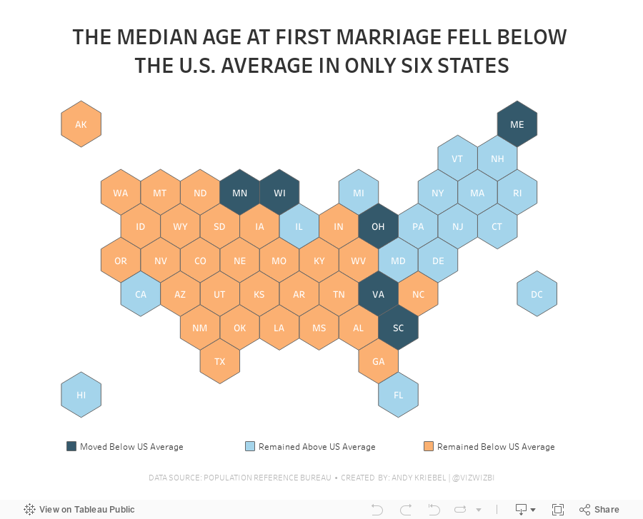
#MakeoverMonday 2022 Week 36 - Median Age at First Marriage in America

This was a relatively simple data set and I was able to build quite a few vizzes during Watch Me Viz. I ended up with something more complex that it needed to be, but it was fun figuring out how to create the calculations.
Here's how it works:
- Compare the median age at first marriage of each state to the US average for 2006-2010
- Compare the median age at first marriage of each state to the US average for 2015-2019
- Check whether the State
- Stayed above the US average in both time periods
- Stayed below the US average in both time periods
- Moved from below the US average to above the US average
- Moved from above the US average to below the US average
May 3, 2021
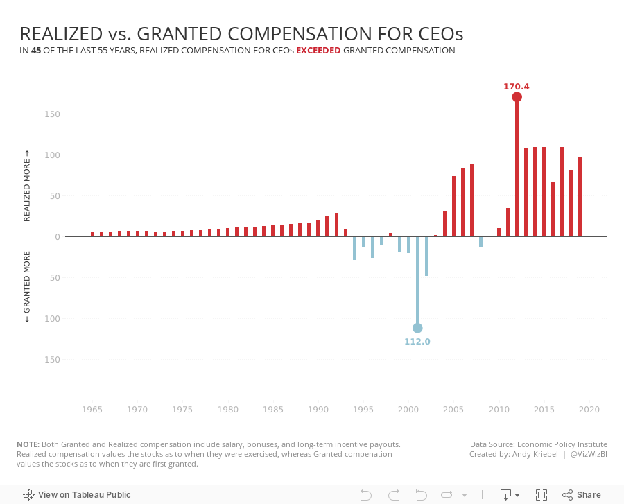
#MakeoverMonday 2021 Week 18 - Realized vs. Granted Compensation for CEOs

- Line Chart
- Stepped Lines
- Variance to baseline
- Win/Loss chart
- Comet Chart
- Gantt Chart
- Bar chart w/ reference line
- Connected scatter plot
- Slope Graph
- Circle Timeline
- Heatmap
- Data Set - https://data.world/makeovermonday/2021w18
- Chart chooser - https://datavizproject.com/
November 23, 2020
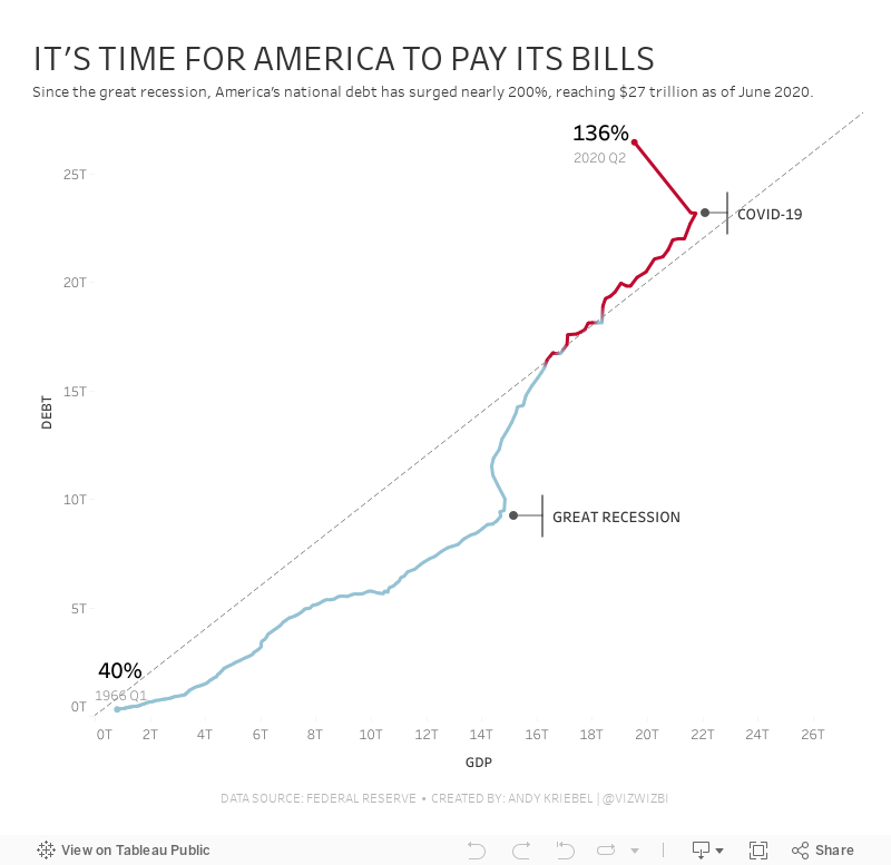
#MakeoverMonday: America Needs to Pay Its Bills

Today's Makeover Monday marked my 1,000th viz published to Tableau Public. I must say that I'm pretty proud of myself. This feels like a pretty big milestone in my career. I wonder how many hours I've spent using Tableau in my life.
Thank you for all of your support and encouragement along the way. Tableau wouldn't be anything without the Community.
Let's get to week 47. The visualization comes from Visual Capitalist.

- The bar/line combination charts work well since they are on the same scale. This also makes them easier to distinguish.
- Choosing colors that match the American flag (I'm assuming that was intentional)
- Making 2020 a slightly different shade of red
- Title is clear
- Text callouts add useful context
- Big numbers to show the most recent values
- The 2020 bars are at the quarterly level, but the remaining bars are by year. Is it the end of the year? The start of the year? That could easily lead to confusion. Keep it as a consistent time scale.
- Compare debt to GDP
- Show the debt to GDP ratio
- Show when the debt to GDP ratio exceeded 100%
- Highlight important milestones that led to the largest increases
November 9, 2020
#MakeoverMonday Week 45 - Global Share of Nintendo Switch Software & Hardware Sales
For #MakeoverMonday week 45, we were analyzing the software and hardware units sold across several regions, as defined by Nintendo itself. The data was pretty simple. I started by doing some basic data prep to simplify the names of the fields and to pivot the data to make it easier to compare the years.
In this video, I will first review the initial visualization and talk about what works and what does. I then iterate through several methods for visualizing the data, hoping to find one that works well with this data set. With feedback from the viewers, I was able to create a bar chart that compares the percentage of global units sold of software vs. hardware for Nintendo.
I showed several methods for visualizing the data:
- Line charts (several versions)
- Stacked bar chart
- Side-by-Side Bar
- Tables
- Scatter plot
- Connected scatterplot
Resources:
- Data Set - https://data.world/makeovermonday/2020w45-dedicated-video-game-sales-units
- Final visualization - https://bit.ly/MM2020W45
- Tableau Color Palette Generator - https://color.tableaumagic.com/
- Colors from Image Tool - https://html-color-codes.info/colors-from-image/
- ASCII character reference - https://jrgraphix.net/r/Unicode/27F0-27FF

May 6, 2019
#MakeoverMonday: Major League Baseball's Most Cost Effective Players


What works well?
- The title and subtitle explain what the viz is about.
- Dividing the viz into two sections by using different background colors on the scatter plots
- Consistent scales for the salaries across the charts for each section
- Using gridlines to help the audience understand the approximate values of each point
- Only labeling the type of stat once by putting the label between the players and teams charts
What could be improved?
- There's no data source listed.
- I have no idea why these players or team are highlighted; an explanation is needed. At first, I thought it was highlighting the most effective player/team, but it's not (at least that's what I see).
- The logos are meaningless for people that aren't familiar with the teams.
- What does the big logo on the upper right represent? Is that the author?
- The data should be filtered to players that meet certain criteria, like at bats in a season. This would then filter out many players near zero.
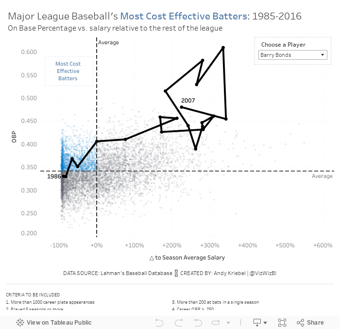
Based on Ryan's explanation, I decided to use OBP as my proxy for batter effectiveness (y-axis). For the x-axis, I wanted to use salary for comparison. However, the data does not adjust salaries for inflation, so a salary in 1985 is not listed in 2016 value. Instead, I came up with a way to normalize the data across all of the seasons.
I created a calculation that compares a player's salary to that of the average salary of the entire league for each season. I made this a percent difference so that the data would then be normalized. Therefore, a player that was 10% above a 1985 salary would be comparable to players that was 10% above a 2016 salary.
Here are my calculations:
- Season average salary: { FIXED [Season] : AVG([Salary]) }
- △ to Season Average Salary: (AVG([Salary]) - SUM([Season avg Salary])) / SUM([Season avg Salary])
- First, I applied some filters to only include what I deemed "eligible" players. These are noted at the bottom of the viz.
- Now that I have the x-axis (salary variance from season average) and the y-axis (OBP), I created a scatter plot and added a point for each player for each season.
- I added reference lines for the average of each axis.
- The players on the upper left are the most cost efficient players. That led me to a quadrant chart, but I only wanted to highlight the most cost effective. I created a calculation to determine the points in that quadrant and place it on the color shelf.
- The problem now was that it was basically impossible to find a player in the viz. I thought about using a set action to drill in to a player, but that loses all of the context of the other players. Therefore, I create a parameter to allow the user to highlight a player and I show that players as a connected scatter plot.
- Players tend to be more cost effective earlier in their careers. That makes sense since they are on rookie contracts for the first few years of the career.
- Once players sign their first big contract, they tend to either move to the upper right (high OBP, high relative salary) or the bottom right (low OBP, high relative salary).
- Some players can sustain that for the rest of of their careers, but that's rare. Typically it's the superstars that follow this pattern (like Barry Bonds or Chipper Jones).
- For many of the other players, as they approach the end of their career, they tend to move either to the lower right (high relative salary, low OBP) or the lower left (low relative salary, low OBP). Neither of these are particularly good for the team.
And here's my final product. I had never thought of combining a scatter plot and a connected scatter plot before. I'm quite pleased with how this turned out.
January 23, 2017
Have Increases in Healthcare Spending Led to an Increase In Life Expectancy in America?
January 9, 2017
Makeover Monday: Have Apple Lost Their Edge With iPhone?

The iPhone…what would I do without mine? We’ve become so dependent on our mobile phones and this is primarily due to the revolution that Steve Jobs launched back in 2007. This week for Makeover Monday, we look at this chart from DazeInfo:

What works well?
- Title captures your attention
- Nice highlighting of the declining bar in 2016
- Simple colors that work well
- Pretty simple, easy to understand viz
What could be improved?
- Beveled bars are unnecessary; just make them flat
- What does the * mean next to 2016?
- Is the axis needed if the bars are labeled?
- Inconsistent label formatting; make them all the same number of decimals
- Remove the gridlines
For my version, I wanted to focus on the story that was in the article itself. I was particularly struck by the percentage of revenue that the iPhone now accounts for in Apple’s overall revenue.
November 28, 2016
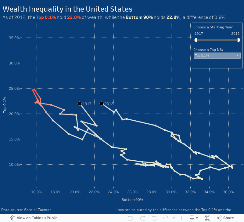
Makeover Monday: Patterns of Change in Wealth Inequality

Different take on this week's #makeovermonday - used path analysis technique I learned from @eagereyes at #data16https://t.co/jFV8zyA8uQ pic.twitter.com/AMRTmPMQxo
— Matt Hoover (@Matt_Hoov) November 28, 2016
A connected scatterplot is great for visualising paired time series data. In this case, the pair is the bottom 90% vs. the top N% as picked by the user. The line is colored by the difference between the bottom 90% and the top N%. I added dots on the ends of the lines to make the start and end easier to find.
April 15, 2016
Fire Response in the UK: How is your local authority performing?

This morning, Tom Brown and I were meeting with a customer and talking about data that’s available from the UK government about the public sector. I found a great data set about fires and the response time by fire department in each of the local authorities. A bit of Excel cleanup, unioning the files in Tableau 9.3 and 30 minutes later I had this dashboard that allows people in the UK to see how well their local fire department is responding.
What’s interesting is that for nearly every authority, the number of fires is decreasing across all fire types, yet response times are inversely increasing. I don’t know this is, but that’s the power of data visualisation; it leads to more questions, more discussion and hopefully better outcomes.
November 2, 2015
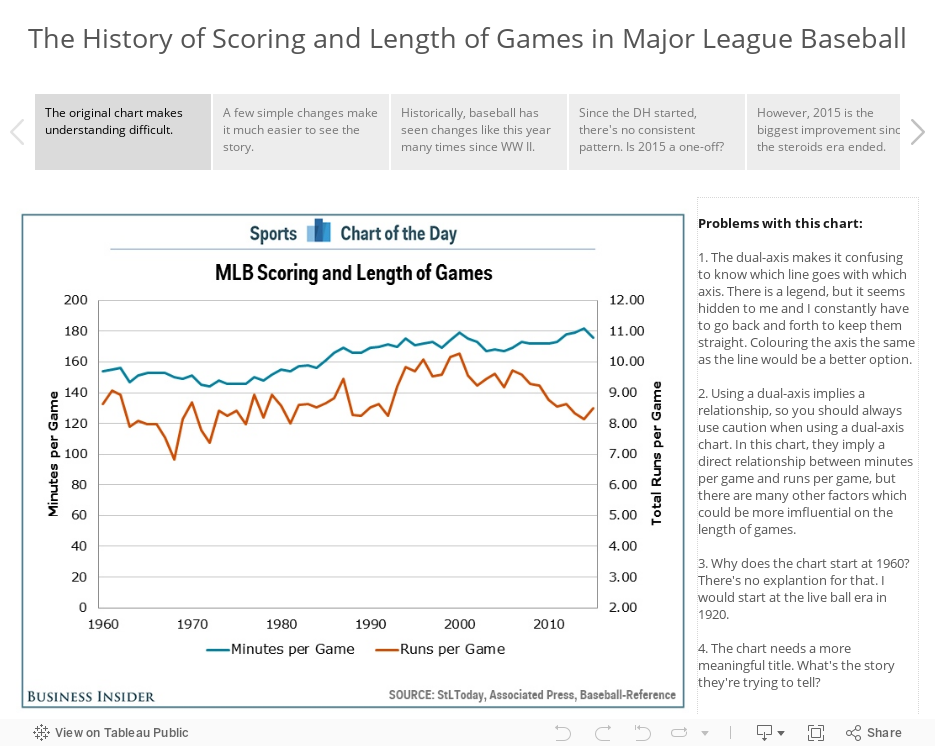
Makeover Monday: The History of Scoring and Length of Games in Major League Baseball

This week, I’m taking a look at this chart from Sports Chart of the Day. In the article, Cork Gaines states:
"It is just one season, but the first year under commissioner Rob Manfred would have to be considered a resounding success as two of the league's most troubling trends are now once again moving in a better direction."This is great, but the accompanying chart implies that a one year change makes a trend. For the makeover, I’m using story points to:
- Show what’s wrong with the chart
- Show a better version of the same chart
- Show an alternative view that debunks Cork’s implication
- Use a connected scatterplot in the vain of those praised by Alberto Cairo to tell the story of runs per game versus length of game from 1920 to 2015.
I’d love your feedback on my approach to the makeover using story points and also how I constructed the connected scatterplot. Does it do a better job of telling the story?