Showing posts with label annotation. Show all posts
November 23, 2020
#MakeoverMonday: America Needs to Pay Its Bills
annotation
,
area chart
,
beginner
,
connected scatterplot
,
debt
,
fundamentals
,
gdp
,
Makeover Monday
,
reference band
,
tableau
,
tableau public
,
tornado chart
,
trend line
,
United States
,
WatchMeViz
No comments

Today's Makeover Monday marked my 1,000th viz published to Tableau Public. I must say that I'm pretty proud of myself. This feels like a pretty big milestone in my career. I wonder how many hours I've spent using Tableau in my life.
Thank you for all of your support and encouragement along the way. Tableau wouldn't be anything without the Community.
Let's get to week 47. The visualization comes from Visual Capitalist.

What works well?
- The bar/line combination charts work well since they are on the same scale. This also makes them easier to distinguish.
- Choosing colors that match the American flag (I'm assuming that was intentional)
- Making 2020 a slightly different shade of red
- Title is clear
- Text callouts add useful context
- Big numbers to show the most recent values
What could be improved?
- The 2020 bars are at the quarterly level, but the remaining bars are by year. Is it the end of the year? The start of the year? That could easily lead to confusion. Keep it as a consistent time scale.
That's about it. Overall, it's pretty well done.
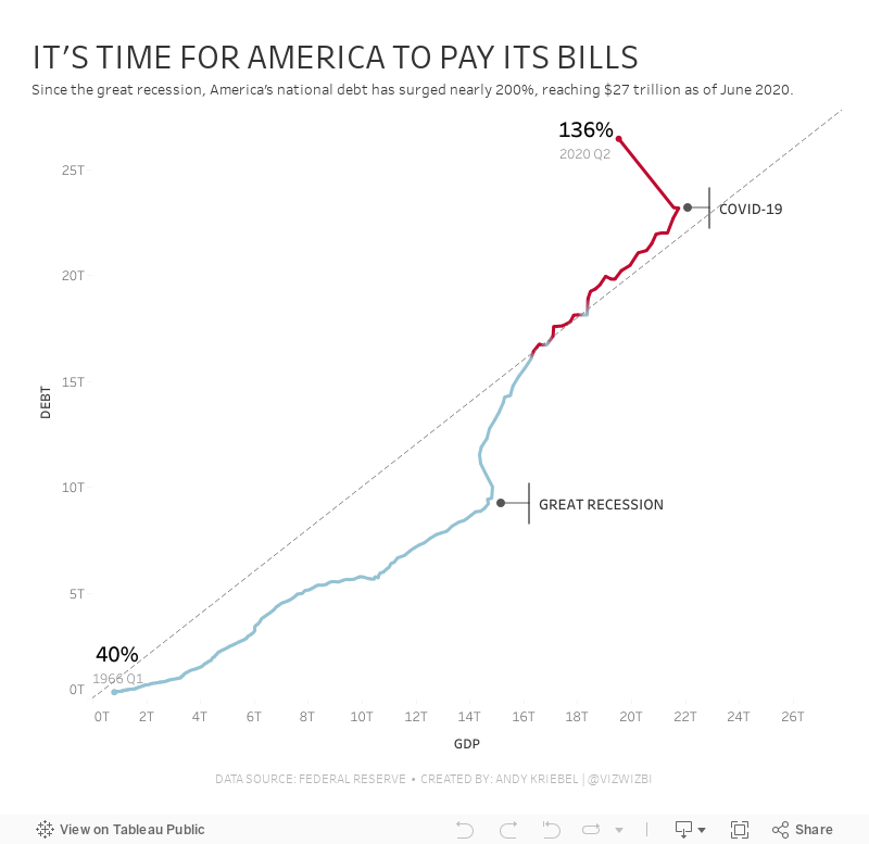
During this week's #WatchMeViz, I iterated through 16 different charts before settling on a connected scatterplot. I created a tornado chart that I really, really wanted to make work, but I didn't quite get there.
My goals:
- Compare debt to GDP
- Show the debt to GDP ratio
- Show when the debt to GDP ratio exceeded 100%
- Highlight important milestones that led to the largest increases
I find that I nearly always end up with a simple chart. I don't know why. I do know I don't like complicated though. I bet 90% of my vizzes are bars, lines, scatterplots, heatmaps, and maps.
Click on the viz to view on Tableau Public.
October 2, 2018
Storytelling With Data Challenge: Annotated Line Graph
annotated line chart
,
annotation
,
challenge
,
Cole Nussbaumer
,
Knaflic
,
line chart
,
stock
,
storytelling with data
,
tableau
No comments
For those unaware, Cole Knaflic runs a monthly data viz challenge over on her website. These are a great way for you to flex your data viz muscles. I haven't participated yet, until now!
I'm going all the way back to her first challenge in January: Annotated Line Graph. For me, it's been tough to learn the balance between enough text for context and too much that overwhelms. I feel like I'm splitting the difference here, by highlighting the highs and lows of Tableau's stock price.
Thanks for the challenge Cole! Click on the image for the interactive version.

I'm going all the way back to her first challenge in January: Annotated Line Graph. For me, it's been tough to learn the balance between enough text for context and too much that overwhelms. I feel like I'm splitting the difference here, by highlighting the highs and lows of Tableau's stock price.
Thanks for the challenge Cole! Click on the image for the interactive version.
July 24, 2017
Makeover Monday: Do you know how much water it takes to produce the animal products we eat?

What works well?
- Good title and subtitle
- Sorting the products makes the ranking obvious
- Including the label at the end since the axis is not displayed
- Including the source of the data
What could be improved?
- Using partial icons can be misleading; a simple bar chart would be more accurate
- Shading every other row isn't necessary
- Icons for each food are distracting
- The scale is unnecessary decoration.
- The story in the data, which is referenced in the article, is not alluded to in the viz.
My goals
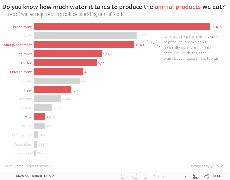
- Make a simple bar chart
- Use highlighting for the animal products
- Put the title in the form of a question that refers back to the article
With those goals in mind, here's my Makeover Monday week 30.
June 18, 2010
Keeping Mark Annotations with Tableau
annotation
,
joemako
,
tableau
,
tips
,
tricks
2 comments
When I was presenting at the Atlanta Tableau User Group meeting yesterday a question came up that I wasn't able to answer. Being as determined as I am, I was scanning the Tableau forums for a solution and ran across an idea from Joe Mako that I thought would work and, eureka, it worked perfectly.
Here's the problem and the steps to solve it.
On this first screenshot below, note how the mark is annotated. Also note that Customer Segment is on the Pages shelf.

I would expect the mark to go to the same point (Feb 2008) when I go to the next Customer Segment, but it disappears. The point only displays when you are on that specific Customer Segment.

Here's how you make it work.

When you annotate the mark again and scroll through the records using the Slider Quick Filter, the mark annotation remains.

Here's the problem and the steps to solve it.
On this first screenshot below, note how the mark is annotated. Also note that Customer Segment is on the Pages shelf.

I would expect the mark to go to the same point (Feb 2008) when I go to the next Customer Segment, but it disappears. The point only displays when you are on that specific Customer Segment.
Here's how you make it work.
- Remove Customer Segment from the Pages shelf.
- Place Customer Segment in the Filters shelf and select all values.
- Show the Quick Filter for Customer Segment.
- Change the Quick Filter to a Slider.
When you annotate the mark again and scroll through the records using the Slider Quick Filter, the mark annotation remains.
Subscribe to:
Posts
(
Atom
)






