November 23, 2020
#MakeoverMonday: America Needs to Pay Its Bills
annotation
,
area chart
,
beginner
,
connected scatterplot
,
debt
,
fundamentals
,
gdp
,
Makeover Monday
,
reference band
,
tableau
,
tableau public
,
tornado chart
,
trend line
,
United States
,
WatchMeViz
No comments

Today's Makeover Monday marked my 1,000th viz published to Tableau Public. I must say that I'm pretty proud of myself. This feels like a pretty big milestone in my career. I wonder how many hours I've spent using Tableau in my life.
Thank you for all of your support and encouragement along the way. Tableau wouldn't be anything without the Community.
Let's get to week 47. The visualization comes from Visual Capitalist.

What works well?
- The bar/line combination charts work well since they are on the same scale. This also makes them easier to distinguish.
- Choosing colors that match the American flag (I'm assuming that was intentional)
- Making 2020 a slightly different shade of red
- Title is clear
- Text callouts add useful context
- Big numbers to show the most recent values
What could be improved?
- The 2020 bars are at the quarterly level, but the remaining bars are by year. Is it the end of the year? The start of the year? That could easily lead to confusion. Keep it as a consistent time scale.
That's about it. Overall, it's pretty well done.
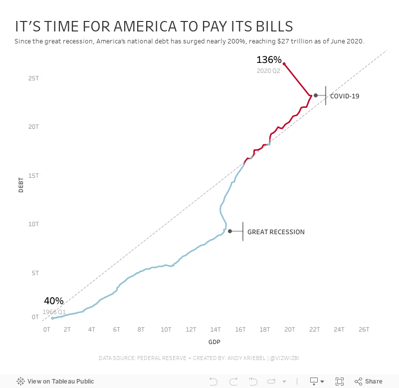
During this week's #WatchMeViz, I iterated through 16 different charts before settling on a connected scatterplot. I created a tornado chart that I really, really wanted to make work, but I didn't quite get there.
My goals:
- Compare debt to GDP
- Show the debt to GDP ratio
- Show when the debt to GDP ratio exceeded 100%
- Highlight important milestones that led to the largest increases
I find that I nearly always end up with a simple chart. I don't know why. I do know I don't like complicated though. I bet 90% of my vizzes are bars, lines, scatterplots, heatmaps, and maps.
Click on the viz to view on Tableau Public.
Subscribe to:
Post Comments
(
Atom
)


No comments
Post a Comment