June 20, 2023
Tableau Tutorial for Beginners | Create Your First Dashboard

Learn how to use Tableau and created impressive dashboards.
Tableau is easy to use, but it can seem quite complex and confusing at first. The best way for you to learn Tableau is to download the files from the description of this video and follow along with me.
By the end of the video, you will have a much better understanding of Tableau and be confident that you can build dashboards on your own.
I'll take you step-by-step and show you how to create, publish and share your first interactive Tableau dashboard.
I'll cover:
- Tableau's welcome screen
- Connecting to data
- Making visuals
- Creating a dashboard
- Adding interactivity
- Publishing to Tableau Server
- Sharing with others
By the end of the video, you'll have created your first interactive Tableau dashboard which you can publish to the web or to your company's Tableau Server. I'll also show you how you can share your Tableau dashboard with others.
⏬ DOWNLOAD the data, and starter and solution workbooks here.
I would appreciate your support with a small donation to continue to make videos for you.
Sign up for my newsletter to get advance, exclusive viewing of all of my videos, tips for using Tableau, and exclusive discounts on products I create.
December 17, 2020
How to Create a Dot Matrix Plot

Dot matrix charts are useful for visualizing the distribution and frequency of discrete data. They help you understand the scale and proportion. The purchase is to understand how many, not how much.
In this example, I'm using two colors to distinguish new vs. used cars. However, if you have only one variable or category, then stick to one color.
Resources:
- Workbook - https://bit.ly/DotMatrixPlot
- Data set - https://data.world/vizwiz/car-sales-mock-data
December 8, 2020
#TableauTipTuesday: How to Sort a Chart with a Parameter Action

- Build the chart
- Create a parameter
- Create a calculated field to sort the bars, then sort the Region field.
- Create de-highlight calculated field and place it on the Detail shelf
- Create a Parameter Action
- Create a Highlight Action
- Turn on Animations
- How to Reorder a Chart with a Set Action - https://www.vizwiz.com/2020/11/reorder-stacked-bars.html
- Data Set - https://data.world/vizwiz/superstore-20203
December 1, 2020
How to Create an Evenly Distributed Butterfly Chart

A Butterfly Chart is (typically) a bar chart where two sets of data series are displayed side by side. The purpose is to allow you to compare the two data series across a dimension.
Here is an example of a butterfly chart I created for Makeover Monday.

Notice how I have zero at the center and the scales are the same on either side of zero. This helps show how the chart "leans" to one side or the other.
The comparisons would be more difficult to see if the left and right hand sides of the butterfly did not have the same axis scale. In this video, I show you how two examples for creating a butterfly chart.
November 24, 2020
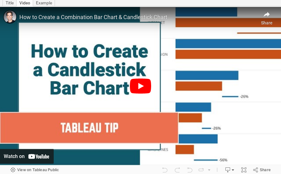
How to Create a Combination Bar Chart & Candlestick Chart

In a recent Makeover Monday #WatchMeViz, I showed how to create a bar chart to compare two measures and then add a candlestick chart as well to show the difference between the two measures. It's actually quite simple; it requires some knowledge of:
- How Measure Names and Measure Values work together
- How to create a combined axis chart
- How to create a dual axis chart
- How to create a Gantt chart
November 23, 2020
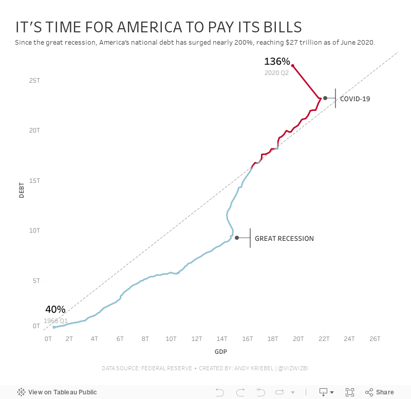
#MakeoverMonday: America Needs to Pay Its Bills

Today's Makeover Monday marked my 1,000th viz published to Tableau Public. I must say that I'm pretty proud of myself. This feels like a pretty big milestone in my career. I wonder how many hours I've spent using Tableau in my life.
Thank you for all of your support and encouragement along the way. Tableau wouldn't be anything without the Community.
Let's get to week 47. The visualization comes from Visual Capitalist.

- The bar/line combination charts work well since they are on the same scale. This also makes them easier to distinguish.
- Choosing colors that match the American flag (I'm assuming that was intentional)
- Making 2020 a slightly different shade of red
- Title is clear
- Text callouts add useful context
- Big numbers to show the most recent values
- The 2020 bars are at the quarterly level, but the remaining bars are by year. Is it the end of the year? The start of the year? That could easily lead to confusion. Keep it as a consistent time scale.
- Compare debt to GDP
- Show the debt to GDP ratio
- Show when the debt to GDP ratio exceeded 100%
- Highlight important milestones that led to the largest increases
November 17, 2020
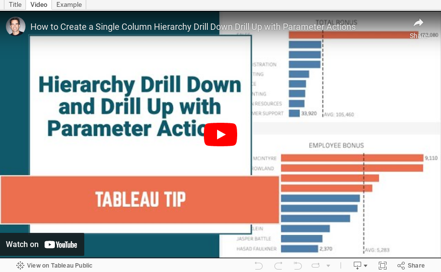
How to Create a Single Column Hierarchy Drill Down Drill Up with Parameter Actions

Twice recently I've used parameter actions to create a single column drill down and drill up to mimic a hierarchy.
November 12, 2020
How I Use Layout Containers (Part 2) - HR Analytics KPI Dashboard


November 10, 2020
How I Use Layout Containers (Part 1) - Social Media KPI Dashboard


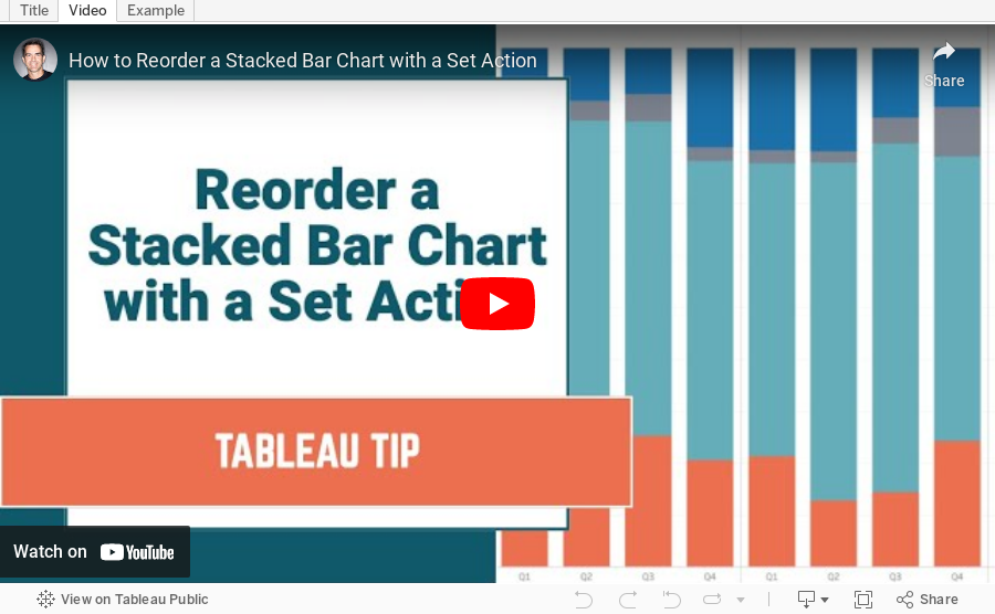
#TableauTipTuesday: How to Reorder a Stacked Bar Chart with Set Actions

November 3, 2020
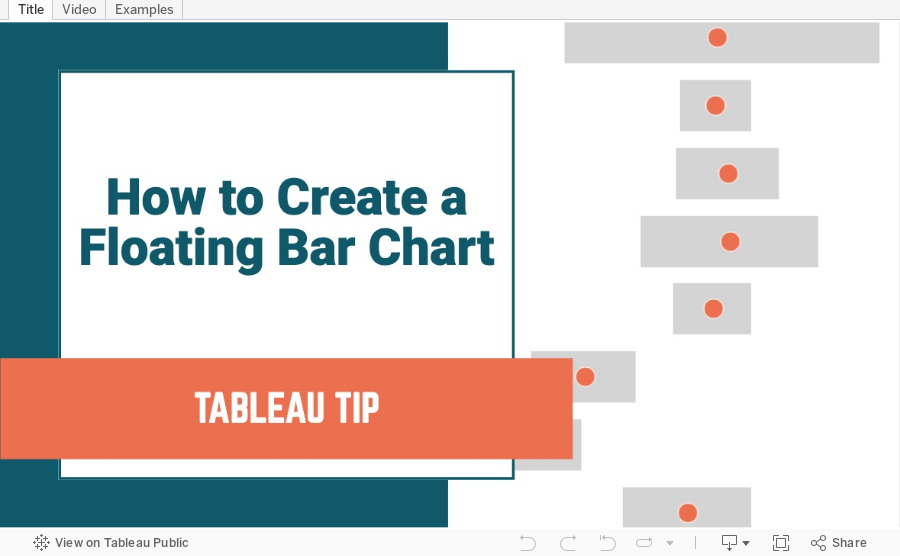
How to Create a Floating Bar Chart

Floating bar charts are similar to Gantt bar charts, except they don't use dates or duration for the length of the bar. In this video, I show you how to use floating bar charts for comparing metrics.
Example 1 - Comparing mental health syndromes between women and men
Example 2 - Comparing year over year sales
Data Sources:
- Mental Health Symptoms - https://data.world/makeovermonday/2020w27-comparing-common-mental-disorder-by-sex
- Superstore 2020.3 - https://data.world/vizwiz/superstore-20203
October 20, 2020
#TableauTipTuesday: Four Methods for Creating Dots on a Map

People love maps. Putting dots on a map gives a sense of precision. There are lots of methods for displaying maps. In this video, I show you four:
- The exact locations
- Density map
- Using the ROUND function to generalize the points
- Using the HEXBIN functions to generalize the points, but at a level controllable by the user