August 23, 2023
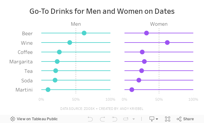
#MakeoverMonday Week 34 - Go-To Drinks for Men and Women on Dates

Join me for live analysis of Zoosk's recent survey, covering 8,793 members' dating drink preferences!
In this livestream, I'll break down the responses across 7 different drink types, comparing the preferences between men and women.
Is there a gender divide when it comes to what people choose to drink on dates?
I'll explore this question and more.
July 11, 2023
#MakeoverMonday 2023 Week 28 - Global Passport Rankings

- Grouped bar chart
- Bar in bar chart
- Grouped bar chart with a gantt bar for the difference
- Diverging bar chart
- Histogram
- Butterfly chart
- Barbell chart
- Scatter plot
- Slope graph
- Trellis chart
- Jittered bar chart
June 7, 2021
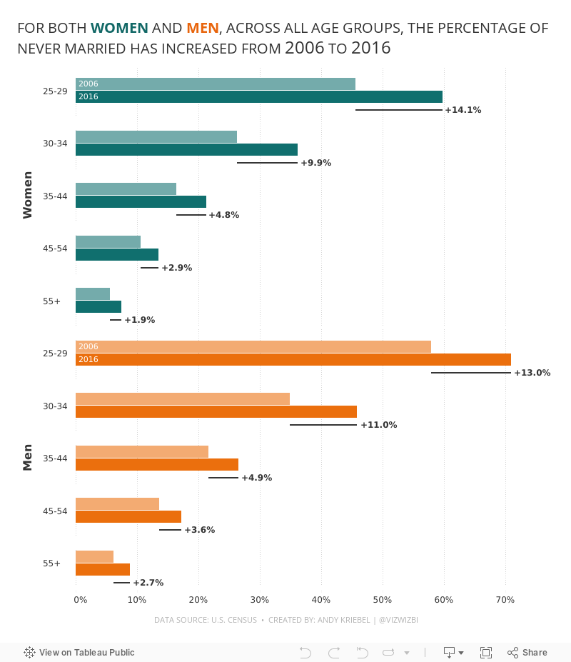
#MakeoverMonday 2021 Week 23: The Percentage of Never Married is on the Rise

- Final Viz (and below)
- Preferences file (all of my custom color palettes)
- How to Create a Combination Bar Chart & Candlestick Chart
February 8, 2021
#MakeoverMonday Week 6: Why Are Women Perceived to Be Unequal to Men?

Wow! What a fun #WatchMeViz that was! I iterated through 16 charts and then when the idea solidified, there was some great conversation and feedback on the chat to help me get to the end. I find survey responses quite difficult to visualize, so instead of getting frustrated, I thought about all of the ways I can compare data to see if anything would work.
Most importantly, thank you to all of your on the live chat. It makes a huge difference to me and I love getting your feedback and questions along the way. You make me better. You can find the final visualization below the video.

December 1, 2020
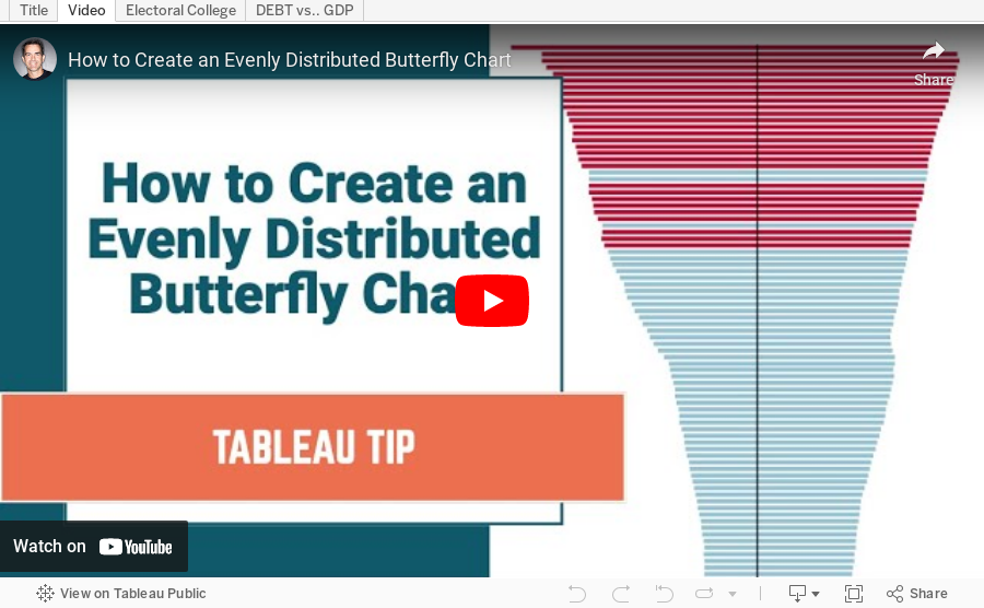
How to Create an Evenly Distributed Butterfly Chart

A Butterfly Chart is (typically) a bar chart where two sets of data series are displayed side by side. The purpose is to allow you to compare the two data series across a dimension.
Here is an example of a butterfly chart I created for Makeover Monday.

Notice how I have zero at the center and the scales are the same on either side of zero. This helps show how the chart "leans" to one side or the other.
The comparisons would be more difficult to see if the left and right hand sides of the butterfly did not have the same axis scale. In this video, I show you how two examples for creating a butterfly chart.
February 9, 2017
Workout Wednesday: How Will the UK population Change By 2039?
Conceptually, I knew exactly what I needed to do:
- Create separate measures for males and females
- Create additional measures to make them percentages by dividing by the population estimate
- Create an LOD for the national average for males and females
- Create additional measure to make them percentages
- Make the male axis reversed
- Set all of the axes scales to be equivalent (Emma didn't do this, but I think the axes should be the same on each side of the center)
- Create the calcs for the rows and columns of the trellis
- Add a filter for local authority and add that to the title
- Throw is all together in a dashboard size 1000x800






