February 8, 2021
#MakeoverMonday Week 6: Why Are Women Perceived to Be Unequal to Men?

Wow! What a fun #WatchMeViz that was! I iterated through 16 charts and then when the idea solidified, there was some great conversation and feedback on the chat to help me get to the end. I find survey responses quite difficult to visualize, so instead of getting frustrated, I thought about all of the ways I can compare data to see if anything would work.
Most importantly, thank you to all of your on the live chat. It makes a huge difference to me and I love getting your feedback and questions along the way. You make me better. You can find the final visualization below the video.

January 11, 2021
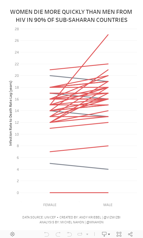
#MakeoverMonday Week 2 - Women Die More Quickly Than Men From HIV Infection

I must admit that I REALLY struggled with this data set. I could have easily just compared males vs. females by country and year, but it seems we've been doing that over and over again. I looked to explore the data and thought a connected scatterplot would look nice, but it didn't.
Fortunately Michel Mahon proposed looking at the lag between the year of HIV infection rate and death. Morbid yet interesting analysis. It took me a while to get the calcs working; I'd recommend you build your view as a table to verify the calcs when you're not sure if they're correct. In the end, thanks to Michel's suggestion, I created a slope graph that compares the lag in years for both men and women.
As the documentation suggested, women die more quickly than men.
Below are both my visualization and the Watch Me Viz session on YouTube. Thanks for tuning in!
November 2, 2020
#MakeoverMonday Week 44 - Where do women have more access to the internet and mobile phones than men?
#MakeoverMonday week 44 is another #Viz5 initiative. The topic this week is access to the internet and mobile phones by gender and country.
First, sorry about the video cutting out at the very end. My mistake.
In this video, I first review the initial visualization and talk about what works and what does. In the end, I went with a quadrant chart, which is a scatter plot with broken up into four quadrants. The viz focuses on only two of the quadrants to highlight the significant difference in the number of countries where women have more access to men for both technologies vs. the opposite.
I showed several methods for visualizing the data:
- Side-by-Side Bar
- Bar in bar
- Bar Graph vs. Reference Line
- Barbell
- Peas in a pod
- Floating bar chart
- Slope graph (terrible choice)
- Ranked slope graph (even worse choice)
- Histograms
- Box plot
- Scatter plot
Resources:
- Final workbook - LINK
- Data set - https://data.world/makeovermonday/2020w44
- Country and region information (Be careful joining this as some country names don't match. You'll want to using data blending and alias the country names to match.) - https://data.world/vizwiz/country-region-codes
- Chart Guide - https://chart.guide/
- Interactive chart chooser - https://depictdatastudio.com/charts/

September 28, 2020
#MakeoverMonday 2020 Week 39 - Child Marriage Around the World
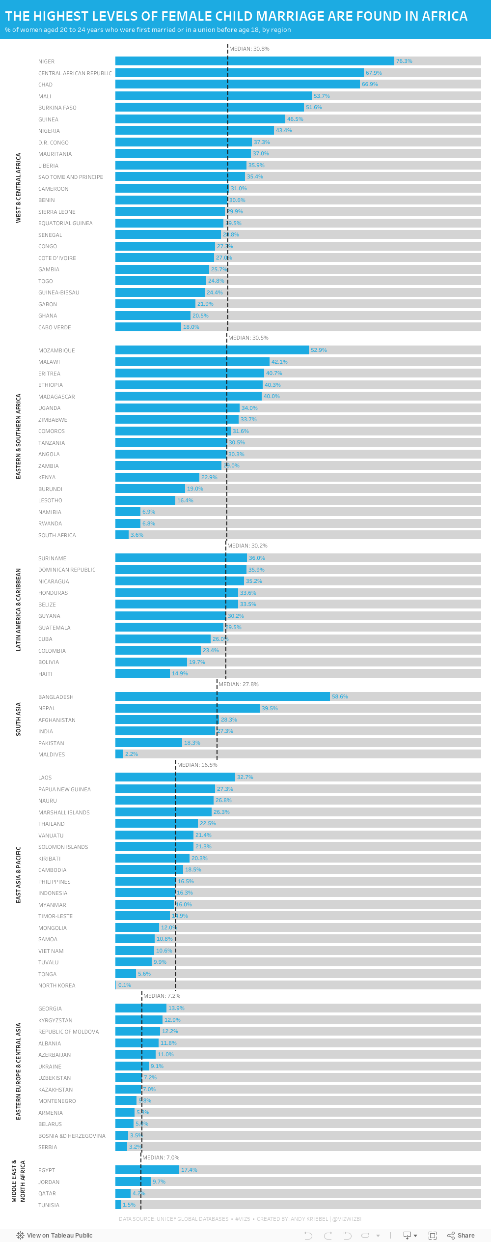
Week 39 brought another #Viz5 topic, this time it was about children that are now 20-24 who were married under the age of 18. Child marriage is, of course, horrific and it's a violation of human rights. Unicef has done an excellent job of recapping all of the issues and why these marriages happen on their website here.
As I've mentioned before, I ALWAYS find these Viz5 data sets tought. I'm not sure why; perhaps I have a mental block on them now. This week the data set was three columns: country, female %, and male %. That can't be too tough...right?
Well, I sure made it tough. First, I joined the data to regional mappings from Unicef so that I could possibly look at the data at the regional level; I decided to use medians for each region in the end. Then I went into Tableau and built a bunch of charts to explore the data. I used chart guides to help me think through options and none of them seemed to make any particularly interesting insights pop out.
After about two hours of nothing, I got the idea of simply looking at the % of females that were married under the age of 18. I ended up with a simple bar chart, which turned out to not be too far from the first chart I created a few minutes in.
Here's the #WatchMeViz video and below is the visualization. Thanks to those that watched live and contributed ideas along the way!! It really helps knowing others are there encouraging me.