January 11, 2021
#MakeoverMonday Week 2 - Women Die More Quickly Than Men From HIV Infection

I must admit that I REALLY struggled with this data set. I could have easily just compared males vs. females by country and year, but it seems we've been doing that over and over again. I looked to explore the data and thought a connected scatterplot would look nice, but it didn't.
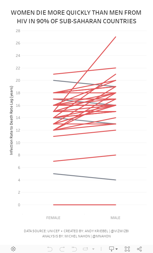
Fortunately Michel Mahon proposed looking at the lag between the year of HIV infection rate and death. Morbid yet interesting analysis. It took me a while to get the calcs working; I'd recommend you build your view as a table to verify the calcs when you're not sure if they're correct. In the end, thanks to Michel's suggestion, I created a slope graph that compares the lag in years for both men and women.
As the documentation suggested, women die more quickly than men.
Below are both my visualization and the Watch Me Viz session on YouTube. Thanks for tuning in!
August 24, 2018
Makeover Monday: Africa's Deadliest Armed Conflicts - Density Map vs. Heat Maps


The workflow is simple and I'm sure there's a more elegant want to create it. The guts of the workflow:
- Create spatial points from the latitude and longitude of each record.
- Convert the spatial points into a heat map by grouping the points into grids.
- Union the four streams back together.
- Export the data as a shapefile.
The reason I have four streams in the workflow is because I didn't see a way of doing a grouping by the event type within the heatmap tool.
The Alteryx heatmaps are easy to adjust; I played with the grid size and maximum distance a few times until I got something close to Tableau's density maps (without fiddling with the settings endlessly). I settled on a grid of 33 miles and a max size of 75 miles.
I also chose to create the shapes as donuts so that they wouldn't stack on top of each other. Here's the result:
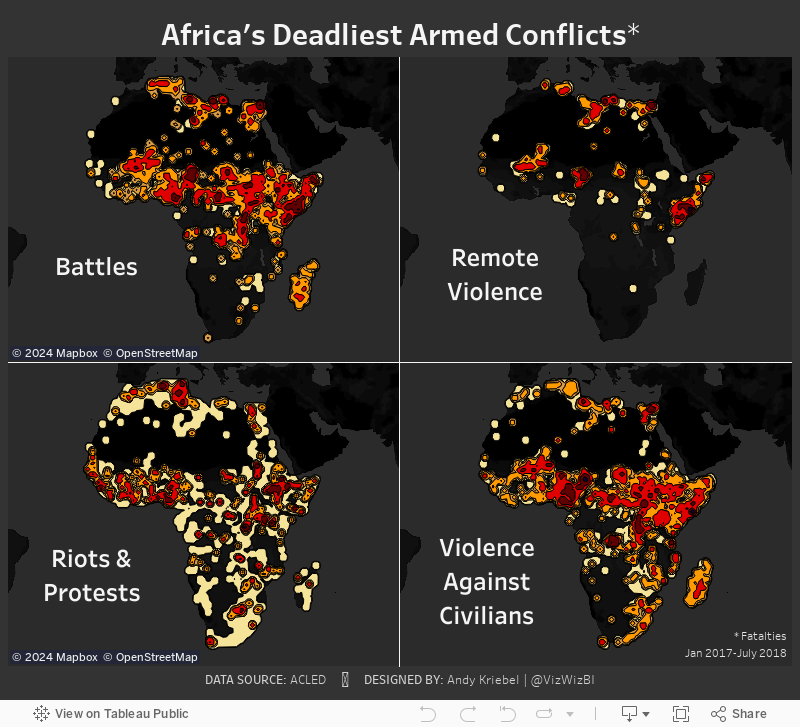
Density Maps vs. Heat Maps

Here are some of the differences I have noted:
- Density maps in Tableau are completely dependent upon the number of marks in the view. The more accurate you want the density, the more marks you need to include. That's 9229 marks in this case.
- Since the heat maps Alteryx generates are shapefiles, they will render much faster as there are only 28 marks.
- The Alteryx heat maps clearly encompass all points, meaning you can see EVERYWHERE that there was an incident.
- Tableau's density maps hide the outliers.
- You can't have highlight actions on a density map as there no dimension categorizing the heat.
- The density maps looks much cleaner than the heat maps.
August 19, 2018
Makeover Monday: Africa's Deadliest Armed Conflicts

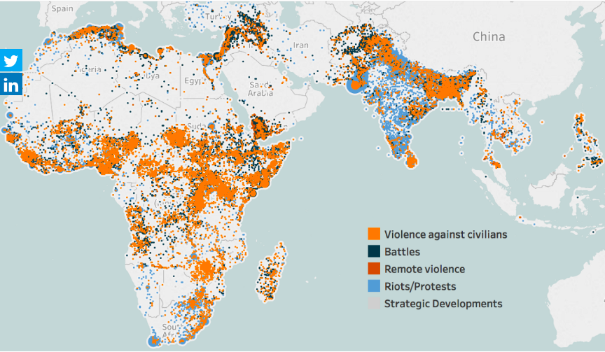
What works well?
- The map is zoomed into the areas that are the focus of the data.
- The color palette has enough variation to distinguish between the type of violence.
- Putting every incident on the map helps show the volume of conflicts.
What could be improved?
- Because the dots are overlapping and there's no transparency, you can't see what is behind each dot. Are there battles behind the violence against citizens? I have no idea from this chart.
- Some of the dots look like they are sized differently. Why?
- There's no title.
- The data source isn't referenced.
- While the color palette give a good range, I'm not sold on the color choices. These are all bad topics, but the blue could come across as not bad.
- Have fatalities been accounted for?
What I did
- I like the idea of a map for this data set, but I think a density map will work much better. As this is now only in beta, I can only post an image. I'll post the interactive version once Tableau 10.3 comes out.
- I wanted to understand where the deadliest conflicts occur, so I create a metric for fatalities per incident.
- The density is colored by this metric.
- I separated out the types of violence to address the issue of overlapping.
August 22, 2016
Makeover Monday: Together We Can Eradicate Malaria in Africa

This week for Makeover Monday we are tackling the malaria epidemic. The fact that countries still have to worry about malaria despite the prevention measures available is quite sad. Fortunately, the Tableau Foundation is helping and you can help too. Please visit visualizenomalaria.org to help.
Let’s look at the original visualisation on the World Health Organization website.

What works well?
- Really nice interactivity with both hover and click actions
- You can make any are full screen
- Consistent color palette
- Easy to understand
What doesn’t work well?
- Map is way too wide
- List of countries doesn’t aid in understanding
- Time series and bar chart don’t adjust for the data that is filtered
- Timeline is missing several years, even though the data exists
- Time series doesn’t display anything until you click on a country
I wanted my visualisation to fix the issues listed above, but also to be more focused on Africa. I also wanted it to serve as a call to action. I start with a summary and background information, dig a bit into some insights I found, and wrap it up with a way people can help.
May 24, 2011
The World’s Deadliest Roads – Watch out for cars in Africa
Before you travel around the world, you may want to consider where you are safest. According to the Guardian, road traffic accidents “kill more people around the world than malaria”. While China would obviously have the highest number of accidents based on the size of the population, I was surprised that many countries in Africa and the Middle East have such a high incidence of deaths (measured as deaths per 100K of population).
Use the interactive viz below to see if anything stands out to you. One good way to look at the data to really make the death rate in Africa stand out is to choose “Estimated Deaths per 100K” for both the color and the size. What do you see?






