Showing posts with label UN. Show all posts
September 4, 2017
Makeover Monday: Which UN Sustainable Development Goals Are of Most Immediate Concern?
Let's have a look at the original viz:

What works well?
- Nice interactivity with the icons at the top
- Easy to see the breakdown by demographics
- Simple filtering
- Neatly organized
- Labeling the boxes on highlight
- Ordering the icons by goal
What could be improved?
- Way too many colors
- You eye goes all the way across making it look like all of the demographics are connected
- Seems very busy
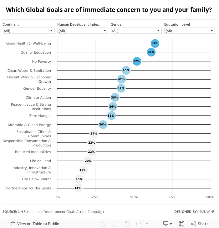
I wanted to keep the visualisation very simple, start with an overview, and allow the user to pick what they want to see. I ended up with this simple dot plot. I also used Device Designer to create a mobile version which will render if you're seeing this on your phone.
May 24, 2011
The World’s Deadliest Roads – Watch out for cars in Africa
Africa
,
datablog
,
deadly
,
death
,
Guardian
,
roads
,
tableau
,
tableau public
,
traffic
,
UN
No comments
Before you travel around the world, you may want to consider where you are safest. According to the Guardian, road traffic accidents “kill more people around the world than malaria”. While China would obviously have the highest number of accidents based on the size of the population, I was surprised that many countries in Africa and the Middle East have such a high incidence of deaths (measured as deaths per 100K of population).
Use the interactive viz below to see if anything stands out to you. One good way to look at the data to really make the death rate in Africa stand out is to choose “Estimated Deaths per 100K” for both the color and the size. What do you see?
October 12, 2010
Hans Rosling: The good news of the decade?
About this talk
Hans Rosling reframes 10 years of UN data with his spectacular visuals, lighting up an astonishing -- mostly unreported -- piece of front-page-worthy good news: We're winning the war against child mortality. Along the way, he debunks one flawed approach to stats that blots out such vital stories.
Hans Rosling reframes 10 years of UN data with his spectacular visuals, lighting up an astonishing -- mostly unreported -- piece of front-page-worthy good news: We're winning the war against child mortality. Along the way, he debunks one flawed approach to stats that blots out such vital stories.
Subscribe to:
Posts
(
Atom
)






