September 4, 2017
Makeover Monday: Which UN Sustainable Development Goals Are of Most Immediate Concern?
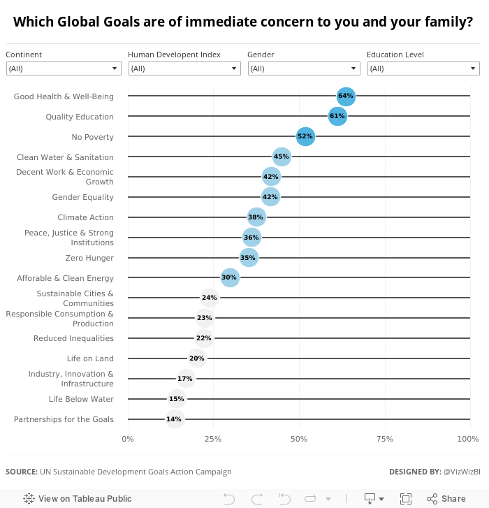
Let's have a look at the original viz:

What works well?
- Nice interactivity with the icons at the top
- Easy to see the breakdown by demographics
- Simple filtering
- Neatly organized
- Labeling the boxes on highlight
- Ordering the icons by goal
What could be improved?
- Way too many colors
- You eye goes all the way across making it look like all of the demographics are connected
- Seems very busy
I wanted to keep the visualisation very simple, start with an overview, and allow the user to pick what they want to see. I ended up with this simple dot plot. I also used Device Designer to create a mobile version which will render if you're seeing this on your phone.
Subscribe to:
Post Comments
(
Atom
)


Dramatically better.
ReplyDeleteThanks Dan! I hope to see you in Vegas.
Delete