September 13, 2017
Workout Wednesday: Killings of Blacks by Whites Are Far More Likely to Be Ruled 'Justifiable'
caption
,
containers
,
layout
,
text box
,
The Upshot
,
waffle chart
,
Workout Wednesday
No comments
Requirements:
- Dashboard size is 750x2350.
- Make sure you credit the data source and credit The Upshot for inspiration as I have.
- Match my title.
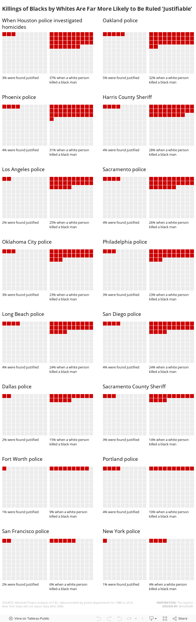
- For each city, there should be two waffle charts. The first should show the overall percentage of justified killings. The second waffle chart should show the percentage justified when a white person killed a black.
- Match the text under each waffle chart. Note that the text must be in the same worksheet and the percentage displayed must be based on a calculation.
- The text above each pair of charts should span across the two waffle charts for that city.
- There should be a 20 pixel buffer between each row of charts.
- There should be a 20 pixel buffer between cities that are on the same row.
- Use hex code #CC0000 to represent the percentage justified and use #ECECEC to represent the unjustified killings.
- Match the layout exactly for the text boxes.
- Match the tooltips.
- Everything MUST be tiled; no floating elements allowed.
- I used the Benton Sans font, but that won't render on Tableau Public, so use whatever font you wish. Benton Sans helped me get the word wrapping and spacing just like The Upshot had it.
Data sources:
By the end of this exercise, you should be much more familiar with layout containers. Personally, I love containers because I know how to manipulate them well. Hopefully you'll feel the same by the end.
Make sure you tag @VizWizBI, @EmmaWhyte and @TheUpshot (for their inspiration) when you tweet your final work. Also include a link to your dashboard.
Lastly, this is not particularly difficult, there are no crazy calculations, it's more a tedious exercise. Have fun!
Subscribe to:
Post Comments
(
Atom
)


No comments
Post a Comment