September 5, 2017
Tableau Tip Tuesday: Comparing 75th to 25th Percentile With a Music Waves Chart
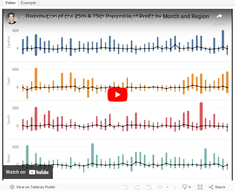
- Create percentile calcs and place them on the same axis.
- The date field must be discrete.
- Use Measure Names on the Path shelf.
There are some other subtleties that you'll pick up on the video as well. Enjoy!
Subscribe to:
Post Comments
(
Atom
)


No comments
Post a Comment