September 24, 2017
Makeover Monday: Restricted Dietary Requirements Around the Globe
arc
,
bar chart
,
curve
,
diet
,
Makeover Monday
,
narrative
,
story
,
vegan
,
vegetarian
No comments

What works well?
- Consistent ordering of the countries within each diet type
- Colors are easy to distinguish from one another
- Arcs, while not best practice, are engaging and capture your attention
- Subtitle that explains what the viz is about
What could be improved?
- Comparing the length of arc is difficult, especially across diet types.
- The icons are not needed since each diet is already labeled.
- The story in the data is lost as it's not included along with the charts.
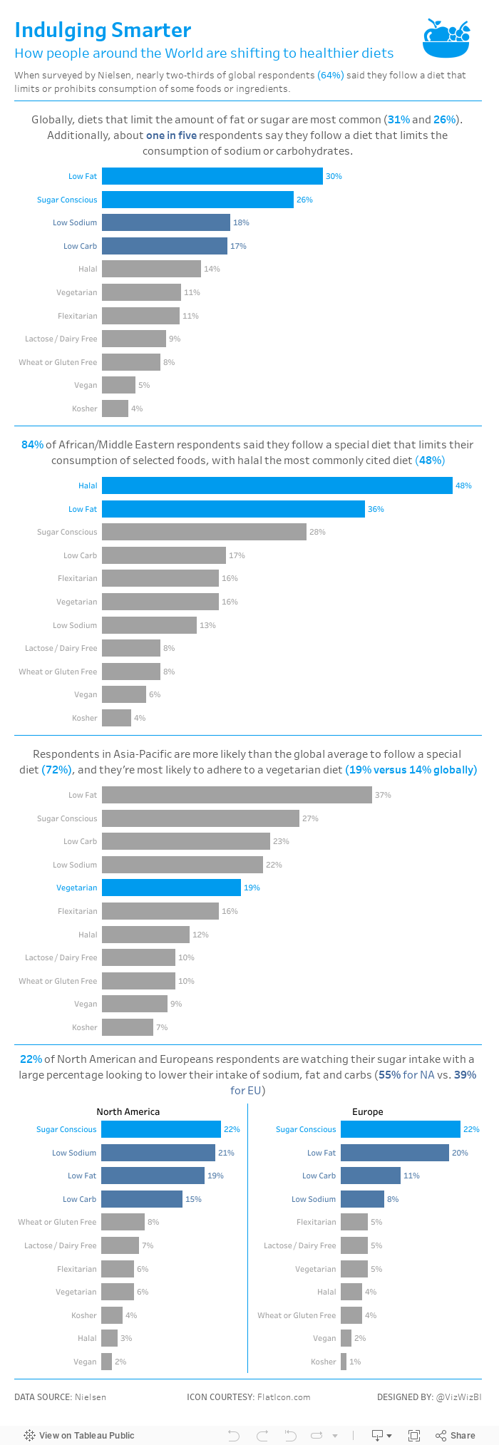
My goals
- Simplify the visualisation; bar charts are a good place to start.
- Turn the text from the previous page that explains the findings into a story of some sort, probably long form and not story points.
- Remove the icons
With those goals in mind, here's my Makeover Monday week 39.
Subscribe to:
Post Comments
(
Atom
)


No comments
Post a Comment