January 9, 2023
#MakeoverMonday 2023 Week 2 - The Spartacus Gay Travel Index

I found the subject of this week's data set on the Instagram account of The Map Zone. It's a simple map of what's called the "Gay Travel Index".
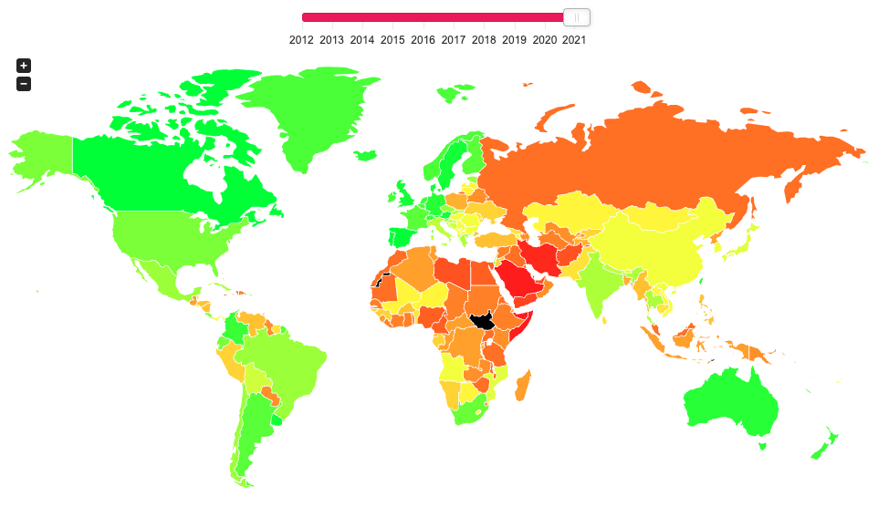
The annually updated SPARTACUS Gay Travel Index informs travellers about the situation of lesbians, gays, bisexuals and transgender (LGBT) in a total of 202 countries and regions. The US-Index provides information about each of the 50 federal states of the US.
The index attempts at finding a balance between measuring the rights of the local LGBT community and considering the demands of queer holidaymakers. Our aim is to monitor the safety of queer people in each country and also increase the awareness on grievances.
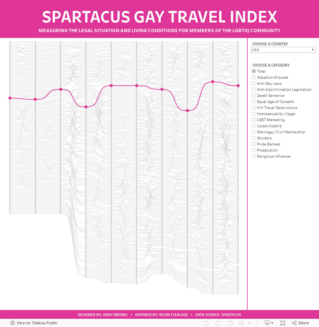
When I saw that the data was a ranking over time, I thought I'd give a curvy bump chart a try. I used this blog by Kevin Flerlage. He makes it super simple to follow along. During WatchMeViz, I showed how to use one of Kevin's visualizations from an old Makeover Monday as a template. I showed how to take the data we had for this week, transform it to the write shape needed for the template, then how to swap out the data source with the new one we created.
Honestly, when I swapped out the data sources, I was convinced that I would have messed things up along the way, but alas, I didn't and I was basically done. I spent time formatting, adding in more categories, and a bit more. Check out the viz below or here and follow along with Watch Me Viz to see how to build one yourself here.
September 24, 2017
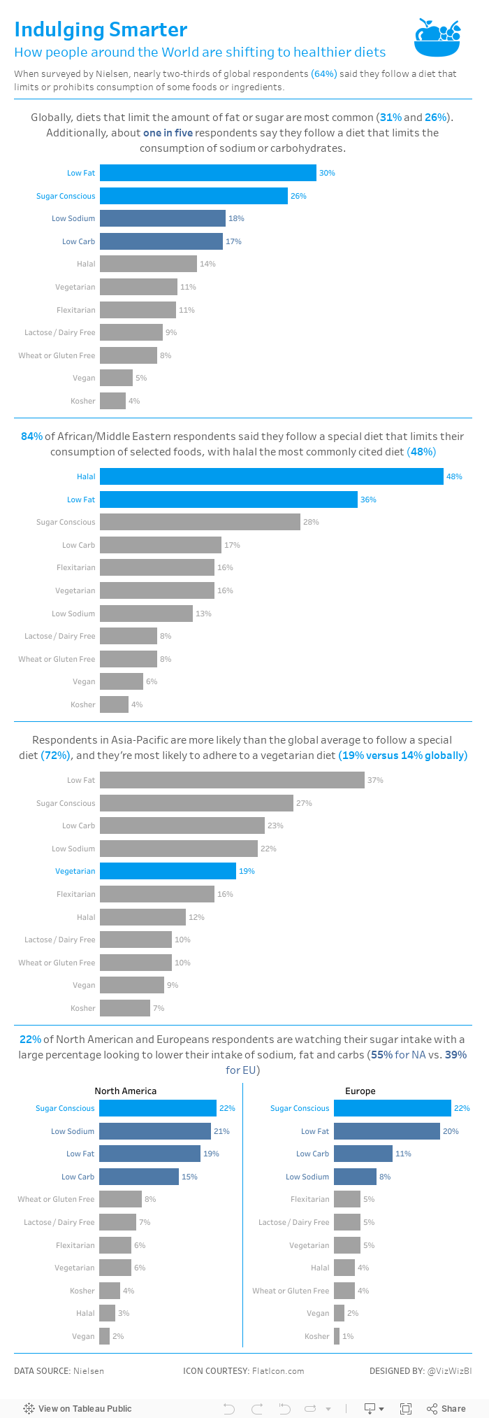
Makeover Monday: Restricted Dietary Requirements Around the Globe

What works well?
- Consistent ordering of the countries within each diet type
- Colors are easy to distinguish from one another
- Arcs, while not best practice, are engaging and capture your attention
- Subtitle that explains what the viz is about
What could be improved?
- Comparing the length of arc is difficult, especially across diet types.
- The icons are not needed since each diet is already labeled.
- The story in the data is lost as it's not included along with the charts.
My goals
- Simplify the visualisation; bar charts are a good place to start.
- Turn the text from the previous page that explains the findings into a story of some sort, probably long form and not story points.
- Remove the icons
December 16, 2016
How have humans grown in the last 100 years?

This morning I was catching up on my backlog on feedly and read the two amazing blog post by Rody Zakovich and Alexander Mou about creating a Sigmoid curves. I have never created a chart like this before and I love the visual appearance so I thought I’d give it a go.
I went back to my Data School Gym challenge from a few months ago because I knew it was simply comparing one point in time to another like Alexander covers in his blog. In this case, I was looking at the change in human height by country from 1896 to 1996. Alex’s blog is so well written and easy to follow. All I had to do was essentially copy/paste his calculations and I was off.
I’m asked very often how to get better at Tableau. For me, there’s no better way than practicing. And when you think you’ve practiced enough, practice more. You will never ever know everything. Just keep learning, like I’ve done this morning. With that, here’s my first Sigmoid curve.
December 21, 2011
When you use a smoothed line chart, your data is not affected, it’s misrepresented!
This past week, I was watching a presentation on Q3 performance and up pop a bunch of charts that were clearly created in Excel with smoothed lines. I hadn’t seen smoothed line charts in quite a while, so I was taken aback. I almost, but thankfully didn’t, stand up and call out the junk.
It was incredibly clear to me that the smoothed lines were distorting the data, not much, but distorting it nonetheless. And I have a problem with THAT!
Let’s first take a look at some examples to see how badly the data can be distorted. The first chart is obviously the smoothed lines. Nice and pretty, I agree. It makes me feel like I’m going up a chairlift then skiing down the slopes of Keystone, Colorado.

I added the gridlines, though I would never do this if I were presenting this for real, so that you can see where the points truly intersect. It should be abundantly clear now that the line is trying to connect points that don’t exist. Look between July & August 2009 or between August & September 2008. In both of these instances, and many more across the chart, the lines go beyond where they should in an attempt to make the chart nice and smooth.
If I were to look at this quickly, I might think that my sales increased from July to August 2009, but in fact, there was a slight decrease. In order for the line to connect smoothly to September 2009, the line has to go around August 2009. Think about all of the people that don’t used zero-based axes. Imagine how distorted their data could look.
Contrast the smoothed line chart to this standard line chart.

You now easily see that sales decreased from July to August 2009. It’d be tough to interpret anything from this chart between the months because the lines clearly connect month to month. The smoothed lines lead you to believe that there is more data being connected.
Now, let’s look at how the smoothed and straight lines look on the same chart. For illustrative purposes, we’re only looking at 2008. Now that dip after August really stands out.

Jon Peltier of the Peltier Tech Blog sums it up best in his post about the charts to choose and avoid in Excel 2010:
Smoothed lines are abused. If you are plotting measured data, the only valid connecting curve between points is a straight line (or a line which is fitted to a function that comes from a physical model of the data). A smoothed curve implies that the data goes places where it has not been measured. Smoothed lines without points are even worse, because the person trying to interpret the chart doesn’t even know what points on the smoothed curve belong there.
My advise? NEVER use smoothed lines. The ONLY possible outcome is misinterpretation.
Let me wrap up with what I find to be a bit of a funny line from Microsoft’s help for creating smoothed lines:
When you use this procedure to soften the jagged edges of a line chart, your data is not affected.
This is very true. Your data is not affected, it’s merely misrepresented. Semantics?






