October 11, 2022
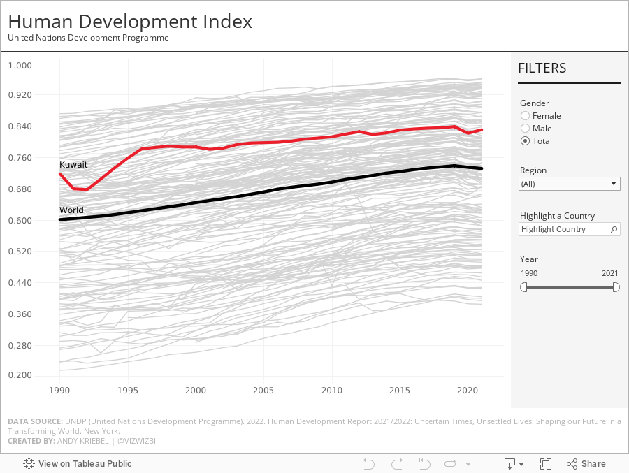
#MakeoverMonday 2022 Week 41 - UNDP Human Development Index

From UNDP:
The Human Development Index (HDI) is a summary measure of average achievement in key dimensions of human development: a long and healthy life, being knowledgeable and have a decent standard of living. The HDI is the geometric mean of normalized indices for each of the three dimensions.
This week, I really liked the original visualization, so during #WatchMeViz, I spend the time recreating the visual. I got most of the way there in an hour and finished it off in the evening. The questions on the live stream are super helpful...thank you!
A couple things I learned:
- Hover action interactivity is very, very slow in Tableau. I ended up changing it to a select action.
- Labeling is overly complicated.
- Tables in a tooltip can look really good. And they are very responsive.
May 17, 2021
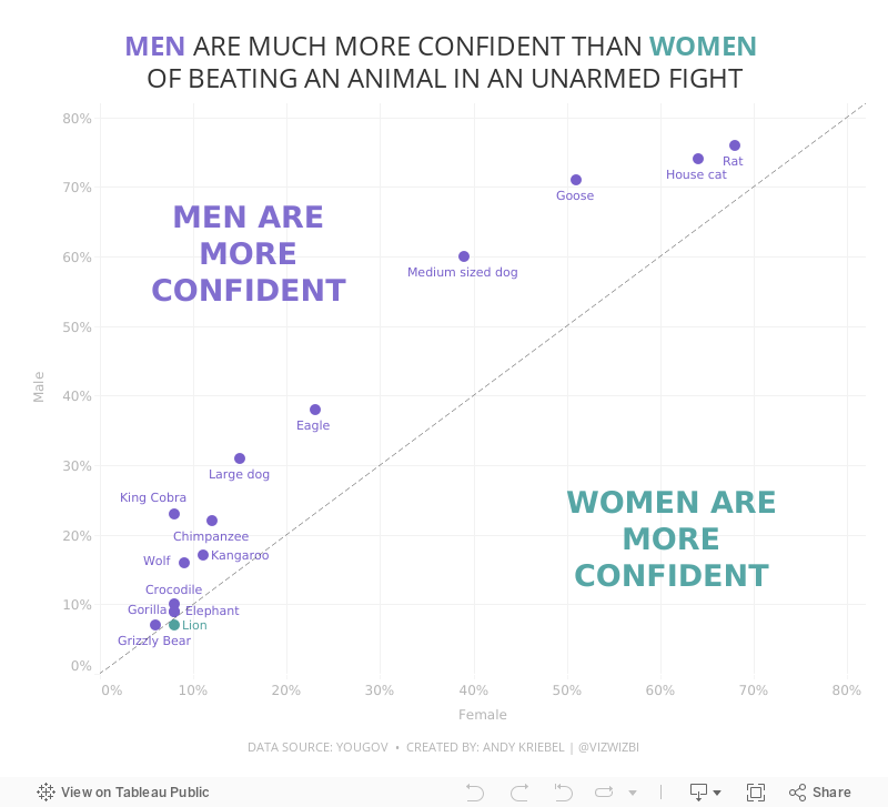
#MakeoverMonday Week 20 - Humans vs Animals

WatchMeViz
Visualization
December 16, 2016
How have humans grown in the last 100 years?

This morning I was catching up on my backlog on feedly and read the two amazing blog post by Rody Zakovich and Alexander Mou about creating a Sigmoid curves. I have never created a chart like this before and I love the visual appearance so I thought I’d give it a go.
I went back to my Data School Gym challenge from a few months ago because I knew it was simply comparing one point in time to another like Alexander covers in his blog. In this case, I was looking at the change in human height by country from 1896 to 1996. Alex’s blog is so well written and easy to follow. All I had to do was essentially copy/paste his calculations and I was off.
I’m asked very often how to get better at Tableau. For me, there’s no better way than practicing. And when you think you’ve practiced enough, practice more. You will never ever know everything. Just keep learning, like I’ve done this morning. With that, here’s my first Sigmoid curve.






