March 29, 2013
Tableau Tip: Displaying multiple, disparate measures on multiple rows
I received a great question from a colleague today. Here’s the situation: You want to look at five measures. You want three measures on the first line chart and two measures on the other line chart. BUT, you want them all in the same view, i.e., one worksheet.
In the end, you want something like this:

This example uses the Superstore Sales data that comes with Tableau. I’ve filtered the Order Date to 2012.
Step 1: Right-click drag the Order Date field onto the Columns shelf and choose a date aggregation.

Choosing the continuous Month, you get this:

Step 2: Drag your first measure onto the Rows shelf. I used Sales.

Step 3: CTRL+Select the other measures you want on the same chart as Sales and drag them onto the Sales axis. I chose Profit and Unit Price. You should see multiple green rulers on the axis before your drop them.

The chart should look like this:

Now we want to add a seconds row that contains Profit Ratio and Discount.
Step 4: Drag Profit Ratio onto the Rows shelf.

Step 5: Drag Discount to the right side of the Profit Ratio chart. You should see a dotted line before you drop it.

The result is a dual-axis chart on the second row.

Step 6: Right click on the Discount axis and choose Synchronize Axis
Step 7: Right click on the Discount axis and uncheck Show Header. This hides the right axis.
Step 8: Clean up the axis titles and formats on the left and you’re done.

There are two catches to this type of chart.
- You can have as many measures as you want on the top chart. Simply drag them onto that axis.
- You can only have two measures in the bottom chart, one of the left axis and one on the right axis.
If someone knows how to get around #2, I’d love to hear how.
Download the workbook here (Tableau 7).
March 27, 2013
Video tutorial: How I built my Facebook friend map in Tableau in less than one minute
Have you ever wondered how to connect lines on a map to make it look like a hub & spoke diagram? Check out this video tutorial of how I built my Facebook friend map. I did a live demo of this at the Gartner BI Summit in 42 seconds, including the animation.
March 26, 2013
Putting Tableau 8 to the test – Every photo from the International Space Station

Given that this is over 1 million data points, I wanted to give Tableau 8 a test ride to see how long it took to render all of the dots. Natronics provided the data in 34 text files, which I then combined via Custom SQL in Tableau.
Since I knew I wanted to draw every point, my first step was to turn mark aggregations off.

From there, all I needed to do was double click on Latitude and double-click on Longitude. Tableau took about eight seconds to render each of these steps. Keep in mind that it’s drawing over 1 million dots, which seemed pretty speedy to me. This is what you see initially (click on any of the images below to see a larger version):
1,129,177 Images from the International Space Station

A big blob of nothing. Next, I unchecked all Map Layers in the Map Options to remove the entire background. This takes about 8-10 seconds for each item that’s unchecked because Tableau redraws the map after each change. Wouldn’t it be awesome to be able to make all of these changes and then click an Apply button?
1,129,177 Images from the International Space Station

To make it look just like natronics’ map I have to make a few more changes. I changed the color of the dots to red.
1,129,177 Images from the International Space Station

I then made the size of the dots as small as possible.
1,129,177 Images from the International Space Station

I’m really close now. To get it just like theirs I had to set the transparency to 5%.
1,129,177 Images from the International Space Station

I’m pretty impressed with the rendering engine in Tableau 8, but I did start to get warning messages about Tableau running out of memory after I had been playing with the maps for a while.
I created two of the other visualizations on the natronics page as well.
1,129,177 Images from the International Space StationColored by Mission

1,129,177 Images from the International Space StationWith Underlying Map

Note: I removed the Mission colors from my version.
You can download the Tableau workbook here to build something yourself.
March 22, 2013
An apology to Tableau
Editorial revision: I have updated this blog post to correct a few inaccuracies that I referred to from Stephen Few’s post and I have removed the attack I made on Stephen himself. We should all keep in mind that what we write can have a long-lasting impact on relationships. We need to remain civil and keep our comments and thoughts to the subject, not the people.
Allow me to refer you to this great advice from “22 Things Happy People Do Differently”. In particular:
- Don’t hold grudges
- Treat everyone with kindness
- Speak well of others
- Take the time to listen
Now back to the apology.
You may think of me as a bit of a weasel now, and I’m ok with that. Other than my family, nothing has had a more profound impact on my life than Tableau Software. Simply said, I love Tableau. I have no idea where I’d be without Tableau, certainly I wouldn’t be working at Facebook, doing what I love to do every day. I literally use Tableau every single day. When I see something in the wild, I’ll often tell myself “I bet I can Tableau that.” Tableau is so integral in my life that it’s now become a verb.
With all of this in mind, I’ve had time to reflect on some things I said last week and I would like to issue an apology to Tableau. I got caught up on the emotions of Stephen Few’s post last week and I let that emotion get the best of me. I replied to Stephen’s post with some critical comments about Tableau that I believe are both honest and accurate. Obviously I must stand by what I wrote, and there are some core issues that I have, but I must reiterate what a great product Tableau is. Please, Tableau, accept my sincerest apologies.
There are a three people in particular that helped set me straight, and I thank them.
- My wife. When I told her what I wrote she reminded me of what Tableau has done for me personally and professionally. Does that mean I can’t be critical? Absolutely not. Yet I need to be a bit more thoughtful and courteous in my reactions. She’s always the angel on my shoulder.
- Jonathan Drummey. Other than Joe Mako, I don’t know anyone that knows Tableau more intimately than Jonathan. Jonathan said it best: “It's a good sign of us being emotionally involved in the topic.” I can’t think of any other software product where people are so passionate about the product. Do you ever hear such passion from MicroStrategy, Qlikview or Spotfire users? Nope. Thanks Jonathan for the reminder.
- Elissa Fink. Yes, Elissa does work for Tableau. She gave me the kick in the ass I needed when I responded to Stephen. When I got a text from her, I knew I had probably crossed a line. Elissa has had an immeasurable impact on my professional success, including inviting me to speak twice at the Tableau Customer Conference. She’s the person I call whenever I have a question because I know she’ll shoot straight with me and put me in my place when I need it. If it weren’t for Elissa, I wouldn’t have discovered my passion for story telling and public speaking. I’d still be some grumpy project manager, frustrated by IT teams at Coke.
Let me clearly state that I am not upset about what I wrote. No, it was my opinion at the time.
Stephen focused on two features in particular that he believes are inappropriate for a visual analysis tool: bubble charts and tree maps. While I believe that these will get abused by those that don’t know how to use them and that I’ll have some defense to play to offset this abuse, I lost sight of all of the great new features that are coming in Tableau 8.
- Freeform dashboards – We can now do a much better job of telling stories and using space more effectively with Tableau 8. Is this implementation perfect? No. Is it better? Yes, by leaps and bounds.
- Multiple data labels – It’s always been a nuisance that you can only have one dimension or measure on that label shelf. No more! Have as many as you want.
- Significant improvements in Sets. Now you can compare things both inside and outside a set. Think Venn diagrams.
- The new Marks card allows dragging and dropping as many things as you want. The possibilities for this are endless.
There are three new features that have me particularly excited.
- Data blending – You no longer have to include the linked field in your view. This makes blending a completely seamless experience.
- Shared filters – We’ve all heard the question with version 7 and older “How do I apply a filter to only a couple of the views?” There are workarounds using action filters, but those have always seemed completely unnecessary. With Tableau 8, you can pick the worksheets you want a filter to apply to. This is HUGE!
- Web authoring – I don’t know the impact this will have quite yet, but I see this as a feature that will help organizations collaborate like they never have before.
So with this post, I hope to re-establish my love with Tableau and I hope they accept my sincerest apologies. I intended no ill will and only want the best for the product and those that work there. I consider you all part of my extended family. I have so much respect and adoration for you all. There’s no other product like Tableau on the market. If you haven’t tried Tableau, you should. It’ll change your life.
March 21, 2013
How we built a Tableau tribe at Facebook
At Facebook we have complete freedom to find our own path, create a new direction, pursue our passions, and evangelize. That’s basically what we’ve done with our Tableau implementation. Given that, I created the graphic below, which I shared during our talk at the Gartner BI Summit on Tuesday.

Picture this slide building along the way:
- Hands-on training – We’ve established a robust weekly training schedule.
- Every other week we conduct a 90-minute intro class. This includes getting everyone set up to use Tableau and introducing them to the basics of the tool. This class is completely adhoc, meaning there’s no set script we go through. This allows people to come to the class on multiple occasions with a good chance of learning something new. What has really helped in this class is using our own data, making the training more applicable to the audience.
- On the opposite weeks we have intermediate/advanced classes. Topics include: Effective use of parameters, Dashboard actions, Optimizing extracts, Advanced chart types (my personal favorite to teach), and many more topics. It’s a total geek out.
- Forums & Groups – At Facebook, we dogfood our own products. Given that, Facebook Groups are a big part of how we communicate and collaborate. If you’re not using Groups for your teams, you should. In our Tableau Users Group, people post questions, problems, work they’ve done…really anything. This has helped us build an extensive tribe. Users don’t have to email any of the “core” team to get an answer. I’ve really enjoyed seeing people that we’ve trained answering questions in the Group.
- Consultation – Our team provides tool agnostic data visualization consulting. We’re brought into projects to help evaluate current designs and suggest alternatives that communicate more effectively. We also do a lot of prototyping. For example, I may be given a sample data set of advertiser data and I’ll be asked to create some mockups for a product we’re developing. We often use Tableau in this case because we can iterate incredibly quickly, even though Tableau might not be the tool that’s used for the final solution.
- Contests – We’ve held an Iron Viz challenge (a minor success) and we spotlight great dashboards. The winners are rewarded with swag. People will do some amazing work when they know there’s a cool t-shirt up for grabs.
- Hackathons – These are overnight events (typically 7pm-6am) that we use to create content and solve problems that we’ve always been intrigued by. The only requirement is that you can’t work on your day-to-day projects. This gives us an opportunity to do things like learn how to build hub-and-spoke diagrams like my personal two degrees of separation friend map.
As a side note, we did a live demo of building this friend map in 45 seconds, including animating it to see how my network has grown over time. This map shows that I can visit almost any country in the world and I’m likely to at least be able to contact a friend of a friend.

I hope our implementation helps you make your BI program a success.
March 19, 2013
VizWiz has reached a milestone. Thanks for following!
Today this little blog, that’s basically my data viz diary, passed 400,000 pageviews. I appreciate all of the visits, comments and thoughtful conversation. I learn something new every day!

March 17, 2013
Are you going to the Gartner BI Summit? Come hear Facebook’s Tableau deployment story.
Stop by the Facebook talk on Tuesday from 11:45 AM to 12:30 PM in Texas C and hear our Tableau deployment story. Namit RaiSurana and I will be speaking.
Tableau Software: Like! Facebook’s Tableau Deployment
Facebook has defined a new standard for the world when it comes to social networking. A relentless focus on being a data-driven company is one of the underpinnings of this success. (Their Hadoop environment sees over 100TB of compressed data daily!) This session will describe why Tableau was selected to put analytics in the hands of every data user so they no longer were reliant on developers to serve up reports and analysis.
Stop by and say hi! Also, we’re hiring!
March 11, 2013
We broke up because: Comparing pies and slope graphs as forms of data visualization
Lee Byron, who has previously work with David McCandless, has done an interesting analysis that breaks down the timing and methods for breakups. I really like his time-series analysis.

The time-series analysis does a great job of pointing out the peaks and valleys of breakups. It seems to me that people either want more freedom at spring break or break up as a result of spring break or both. People also break up at a high rate before Christmas. Is this to avoid giving a gift?
Lee ruined my day with his pie chart analysis.

There are a few problems with these charts:
- The first pie chart adds up to 101%. Pie charts are supposed to be base 100.
- The charts go in completely reverse order. Tilt your head so that “in person” is at 12 o’clock and you’ll see what I mean. The left pie chart reads counter clockwise and the right pie chart reads clockwise. This makes looking across the pie charts nearly impossible.
- The whole idea for this analysis is to compare different generations. Pie charts do not do this job (or any job) well.
Lee’s analysis is well done.
Compared to people born before 1975, people born after 1984 are twice as likely to breakup via the digital world, twice as likely to breakup over the phone and far less likely to decide to talk it out over coffee.
It’s a shame he didn’t make a better chart choice to support his message. One alternative Lee could have considered, and one that I’ve been falling in love with since Alberto Cairo explained why he likes them, is a slope chart. I made this chart in Excel is less than one minute.

Going back to Lee’s summary, the slope chart does a much better job of supporting his message. You can clearly see the shift away from personal interaction towards phone and instant messaging (less personal interaction).
Having four kids of my own, I can clearly see this shift in communication. I do my best to encourage my kids to call their friends instead of texting, and it’s a continuous challenge. Texting is way more convenient and takes much of the emotion out of the conversation. I can see how this would make breakups easier, however I can’t help but wonder what the long term impact will be on society due to this shift away from in-person contact.
Download the Excel file here.
March 9, 2013
Where do American’s commute to work? An interactive map of county-to-county commutes.
Our mission at Facebook is to “make the world more open and connected” and I thought a great way to look at connectedness is through commuter flows. I built the map below, which contains 255K+ lines, using census data about American commuters (this is census data, not Facebook data).
My initial test results for this example reveal:
- Tableau 8 is not noticeably faster than Tableau 7, even with the OpenGL graphics turned on. This is the case both on Desktop and Server.
- There’s a bug in 8 that is prohibiting worksheets from dynamically sizing within a container. The basically kills the ability to show/hide viz types dynamically using containers and parameters.
From Brian McKenzie’s working paper:
Workplace information is crucial for understanding the degree of interconnectedness among our nation’s communities. Commuting plays an important role in the larger interchange of people, goods, services, and information across places, and helps shape the contours of metropolitan and micropolitan statistical areas.
The Census Bureau produces county and MCD-level commuting flow tables every five years, using non-overlapping 5-year ACS estimates beginning with 2006-2010.
To give you an idea for how I am using this, consider this question: Where do people travel from that want to come to the Silicon Valley (San Mateo County, CA)?
To do this I:
- Filter the Workplace State to California. This will reduce the Workplace County list to only counties in CA.
- Filter the Workplace County to San Mateo.

From this, I wanted to only see where a large number of commuters were coming from, i.e., the most frequent commuters to Silicon Valley. I filtered out the Average Commuters of 1-100 and 101-500.

This is interesting. As I would expect, there are a lot of commuters from the closest counties. However, there’s a significant number of people that commute from LA. Fascinating.
Switch to the Dots view if you don’t want to see the lines.

Another nice looking viz is: Residence State = Georgia with 501 average commuters and higher. There are not loads of people traveling outside of Georgia, but then again, it has a lower population than CA (there’s a population bias in the data).

Give it a try with where you live and work. Share an image of your findings. Note that this initial view is filtered to those residing in CA so that it will draw in a reasonable amount of time. Once it loads, check (All) for Residence State and see all commutes in the US. It’s pretty cool.
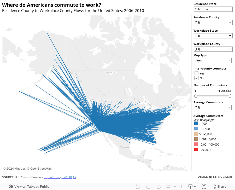
Download the data here and the workbook here.
March 5, 2013
Spirals vs. bars – Why does Nielsen makes things so hard for us?
I’m not exactly sure what to call this type of chart from Nielsen, so I’m going to stick with calling it a spiral chart. It’s just plain awful.

I understand the ranking, only because of the numbers, not the chart. I’m guessing the colors are used so that you can follow them around the race track. Wouldn’t a simple bar chart be so much better?


