Showing posts with label International Space Station. Show all posts
April 28, 2019
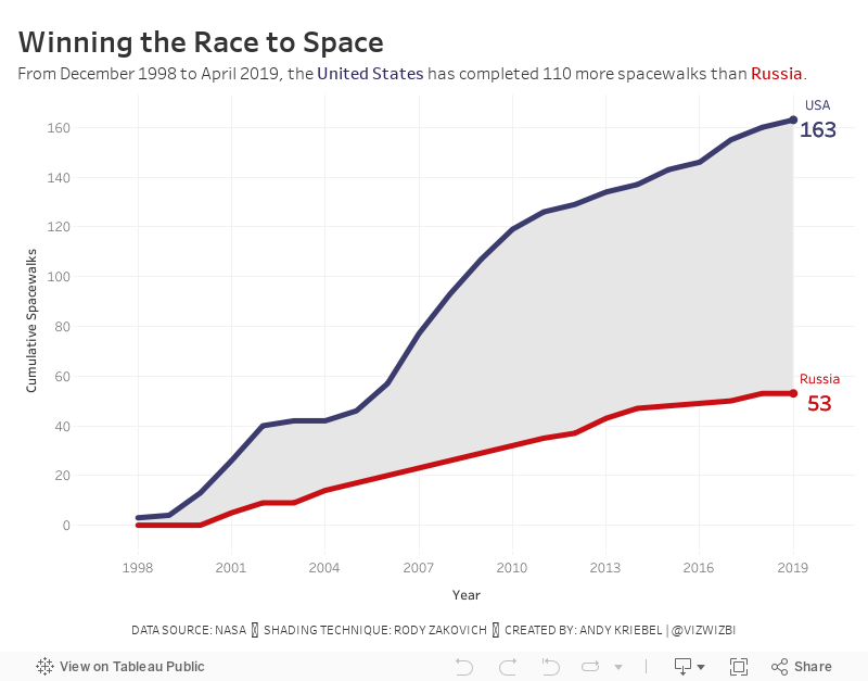
#MakeoverMonday: Space Station Spacewalks

 |
| Credit: NASA |
What works well?
- The title provides a nice summary of the data.
- The stacked bar chart makes is easy to compare the US and Russia within a single year.
- The colors are easy to distinguish from each other.
- Since there is no axis, labeling the bars makes sense.
What could be improved?
- The background image doesn't add any value and takes attention away from the chart.
- It took me a minute to figure out which color went with which country. That should be more obvious.
- Straighten the diagonal text for the years.
My Ideas
- Consider other chart types: area chart, stacked area chart, barbell chart, line chart.
- Consider other metrics like cumulative spacewalks or variance to some year.
- Check the two country flags for their official colors.
In the end I went with a cumulative line chart with shading between the lines. I did this with a polygon. See this blog post from Rody Zakovich to learn how to create it.
March 26, 2013
Putting Tableau 8 to the test – Every photo from the International Space Station
International Space Station
,
ISS
,
map
,
natronics
,
photos
,
rendering
,
tableau
2 comments
This cool photo showed up on my RSS feed yesterday. It’s from the natronics on github. Click on the image to see it full-size.

Given that this is over 1 million data points, I wanted to give Tableau 8 a test ride to see how long it took to render all of the dots. Natronics provided the data in 34 text files, which I then combined via Custom SQL in Tableau.
Since I knew I wanted to draw every point, my first step was to turn mark aggregations off.

From there, all I needed to do was double click on Latitude and double-click on Longitude. Tableau took about eight seconds to render each of these steps. Keep in mind that it’s drawing over 1 million dots, which seemed pretty speedy to me. This is what you see initially (click on any of the images below to see a larger version):
1,129,177 Images from the International Space Station

A big blob of nothing. Next, I unchecked all Map Layers in the Map Options to remove the entire background. This takes about 8-10 seconds for each item that’s unchecked because Tableau redraws the map after each change. Wouldn’t it be awesome to be able to make all of these changes and then click an Apply button?
1,129,177 Images from the International Space Station

To make it look just like natronics’ map I have to make a few more changes. I changed the color of the dots to red.
1,129,177 Images from the International Space Station

I then made the size of the dots as small as possible.
1,129,177 Images from the International Space Station

I’m really close now. To get it just like theirs I had to set the transparency to 5%.
1,129,177 Images from the International Space Station

I’m pretty impressed with the rendering engine in Tableau 8, but I did start to get warning messages about Tableau running out of memory after I had been playing with the maps for a while.
I created two of the other visualizations on the natronics page as well.
1,129,177 Images from the International Space StationColored by Mission

1,129,177 Images from the International Space StationWith Underlying Map

Note: I removed the Mission colors from my version.
You can download the Tableau workbook here to build something yourself.
Given that this is over 1 million data points, I wanted to give Tableau 8 a test ride to see how long it took to render all of the dots. Natronics provided the data in 34 text files, which I then combined via Custom SQL in Tableau.
Since I knew I wanted to draw every point, my first step was to turn mark aggregations off.
From there, all I needed to do was double click on Latitude and double-click on Longitude. Tableau took about eight seconds to render each of these steps. Keep in mind that it’s drawing over 1 million dots, which seemed pretty speedy to me. This is what you see initially (click on any of the images below to see a larger version):
1,129,177 Images from the International Space Station

A big blob of nothing. Next, I unchecked all Map Layers in the Map Options to remove the entire background. This takes about 8-10 seconds for each item that’s unchecked because Tableau redraws the map after each change. Wouldn’t it be awesome to be able to make all of these changes and then click an Apply button?
1,129,177 Images from the International Space Station

To make it look just like natronics’ map I have to make a few more changes. I changed the color of the dots to red.
1,129,177 Images from the International Space Station

I then made the size of the dots as small as possible.
1,129,177 Images from the International Space Station

I’m really close now. To get it just like theirs I had to set the transparency to 5%.
1,129,177 Images from the International Space Station

I’m pretty impressed with the rendering engine in Tableau 8, but I did start to get warning messages about Tableau running out of memory after I had been playing with the maps for a while.
I created two of the other visualizations on the natronics page as well.
1,129,177 Images from the International Space StationColored by Mission

1,129,177 Images from the International Space StationWith Underlying Map

Note: I removed the Mission colors from my version.
You can download the Tableau workbook here to build something yourself.
Subscribe to:
Posts
(
Atom
)


