April 30, 2021
#WOW2021 Week 15 - Workout Wednesday Website Analytics
The requirements for week 15 are here. This is another super useful challenge as it helps you develop a dashboard you could easily use in your own organization.
My go-to blog post for working with and formatting time is this one from Jonathan Drummey. I'd say it's critical for solving this challenge. Also, think about the calcs for the reference lines and the BANs. As a hint, they're not just simple reference lines based on the measure on the rows. You WILL need to calculate the overall average separately.
Click on the image to interact with the dashboard and/or download the workbook here.

April 29, 2021
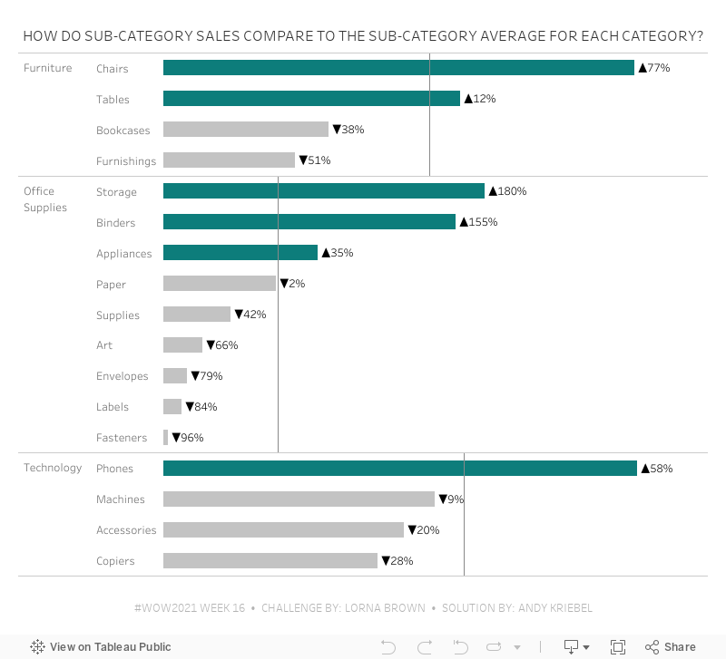
#WOW2021 Week 16 - How Do Sub-Category Sales Compare to the Sub-Category Average for Each Category?

- Create a Quick LOD of Sales by Sub-Category by dropping Sales on top of Sub-Category (hold Command on a Mac while dropping). Since I left the default aggregation of Sales as SUM, this results in this LOD:
{ FIXED [Sub-Category]: SUM([Sales]) } - Change the default aggregation of this new field to average. You have to do this so that at the Category level, you're getting the average of the sales across the sub-categories in each Category.
- Again, create the Quick LOD by holding Command (Control on a PC) and dropping the calc created in step 1 on top of the Category field. This is the resulting calculation:
{ FIXED [Category]: AVG([Sales (Sub-Category)]) }
April 28, 2021
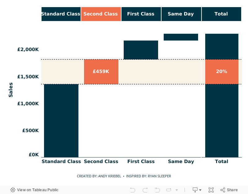
Using Parameter Actions to Highlight a Segment of a Waterfall Chart

- Parameter actions
- Table calculations
- Gantt chart to build the waterfall chart
- Highlighting
- Formatting
- Calculated reference bands
- Dashboard layout: containers, padding
April 27, 2021
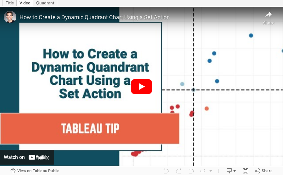
How to Create a Dynamic Quadrant Chart Using a Set Action

April 26, 2021
#MakeoverMonday 2021 Week 17 - Price Parity in America
In this week's Watch Me Viz, I covered the following charts:
- Line chart
- Trellis chart
- Slope graph
- Connected scatter plot
- Bar charts with comparisons
- Diverging bar charts
- Heatmap
- Hex map
- Tile map
- Barbell chart
- Peas in a pod chart
- Bump Chart
- Comet chart
In the end, I settled on the bump chart using highlighting and BANs. Other topics covered include:
- Sorting calculations
- Level of detail expressions
- Rank table calculations
- Parameters
- Filter actions
- Padding in dashboards
- Cleaning tooltips
- Divider lines in dashboards

April 22, 2021
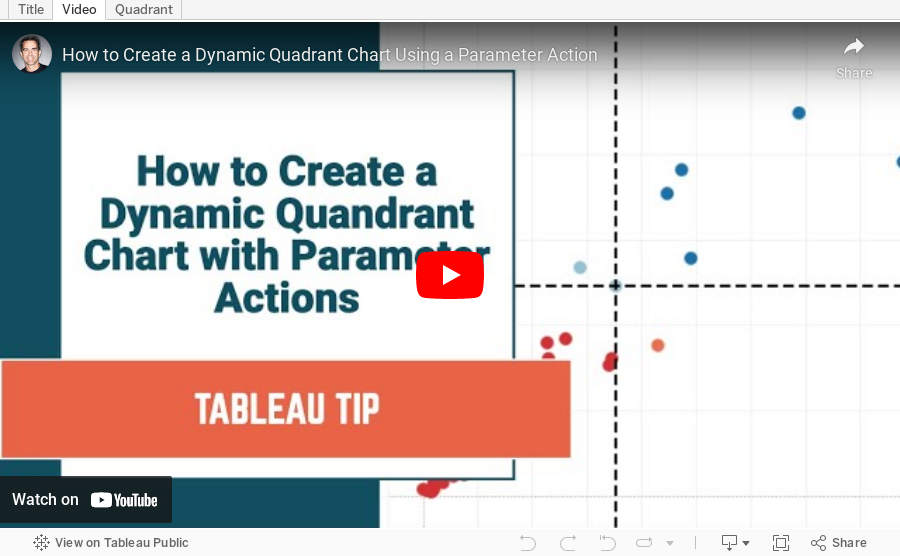
How to Create a Dynamic Quadrant Chart Using a Parameter Action
April 19, 2021
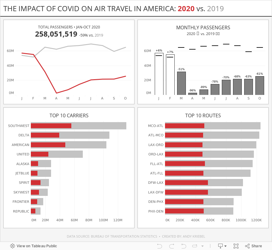
#MakeoverMonday Week 16 - The Impact of Covid on Air Travel in America
I struggled to come up with anything interesting this week, but that's ok. I was still able to explore the data a lot and ended up with a simple dashboard. Check out #WatchMeViz and interact with the viz below.

April 13, 2021
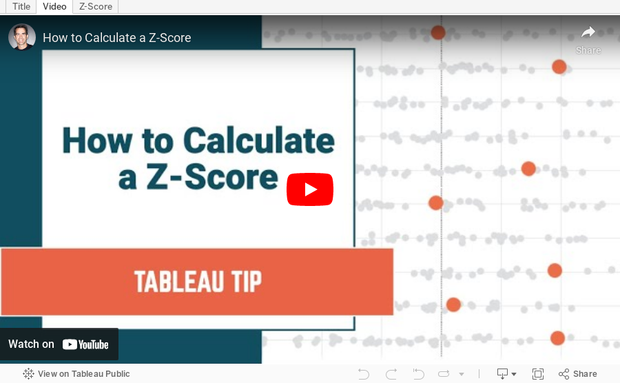
How to Calculate a Z-Score

- If a Z-score is 0, it indicates that the data point's score is identical to the mean score.
- A Z-score of 1.0 would indicate a value that is one standard deviation from the mean.
- Z-scores may be positive or negative, with a positive value indicating the score is above the mean and a negative score indicating it is below the mean.
April 12, 2021
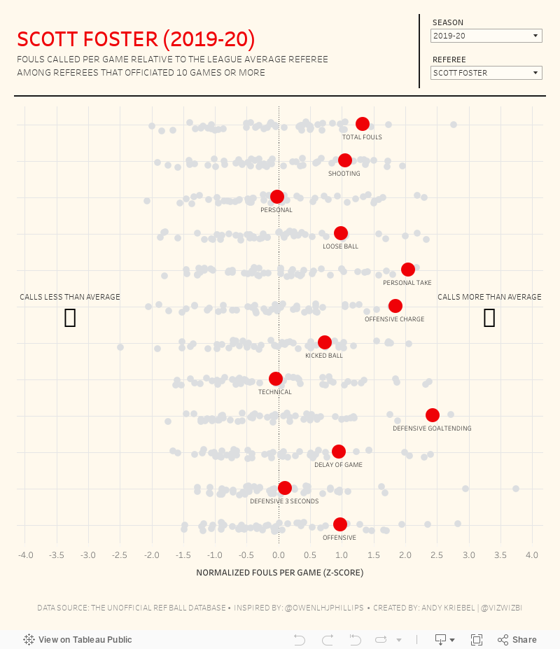
#MakeoverMonday 2021 Week 15 - Fouls Called by NBA Referees
The original viz for this week was so good that I struggled to come up with something different. In the end, I wanted to learn by recreating the original. Check out #WatchMeViz and interact with the viz below.

April 8, 2021
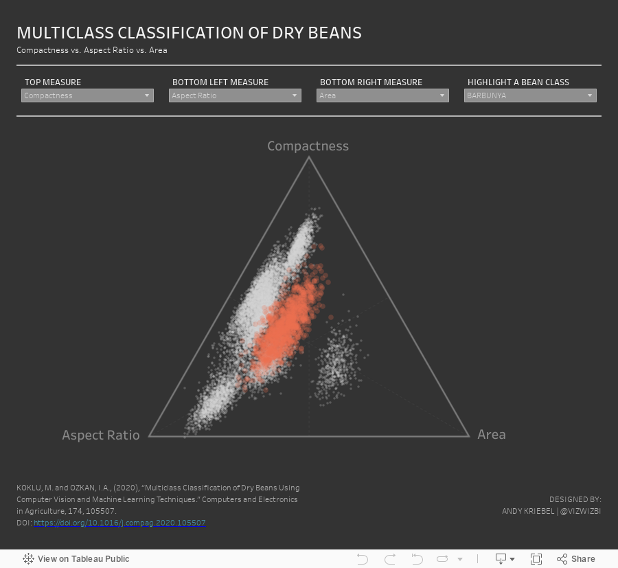
How to Create a Ternary Graph / Triangular Chart


April 5, 2021
#MakeoverMonday 2021 Week 14 - Multiclass Classification of Dry Beans