May 11, 2021
Threshold Analysis - Level of Detail Expressions vs. Table Calculations
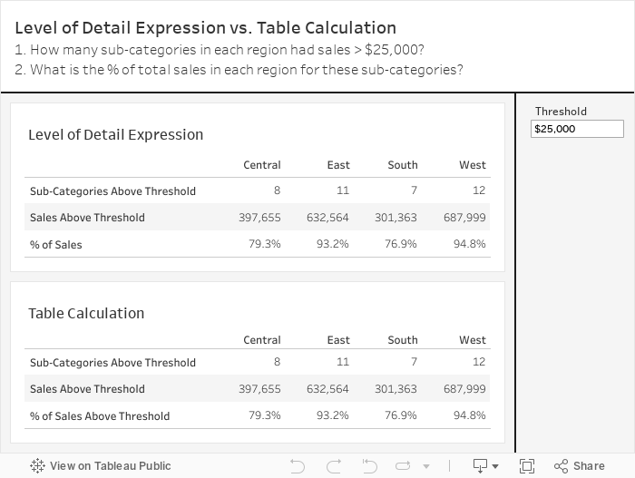
DS22 is nearing the end of their training and today was a bit of a refresher. One of the questions I wanted them to answer was how many sub-categories in each region had sales above $40,000?
We then expanded that to include (1) the sales for those sub-categories and (2) the % of sales those sub-categories make up of the region sales. They were to complete this using LODs.
As they worked on the task, I thought that this, for sure, could be done with table calculations. This is perfect for the Data School Gym.
If you know me, you know I love table calculations. And if you know Lorna Brown, you'll know she HATES table calculations. So this is your Data School Gym challenge Lorna.
Of course, everyone is welcome at the Data School Gym. It's actually not that hard and is a good way to help you learn about LODs vs. table calcs.
I'm not too fussed about making it look exactly the same. The point is to see if you can create the identical tables. Enjoy!

April 28, 2021
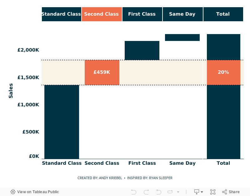
Using Parameter Actions to Highlight a Segment of a Waterfall Chart

- Parameter actions
- Table calculations
- Gantt chart to build the waterfall chart
- Highlighting
- Formatting
- Calculated reference bands
- Dashboard layout: containers, padding
March 19, 2021
#WorkoutWednesday 2021 - Week 2: Customer Lifetime Value (CLTV) Matrix

If you like a table calc challenge, this Workout Wednesday is for you. Get Ann's requirements here. On the surface it seems pretty simple:
- Get the first order date for each customer.
- Determine the number of quarters that elapsed since then.
- Calculate the cumulative value of each cohort.

Next, calculate each cohort's cumulative lifetime value.

You should now have a view like this with the marks are filled in across the whole table


January 24, 2018
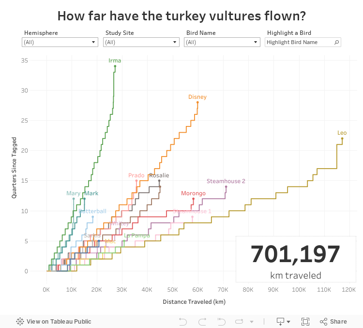
Makeover Monday: How far have the turkey vultures flown?
In addition to the stepped lines, I wanted to be able to compare all the birds on the same baseline. I created a calculation for quarters since each bird was tagged and then calculated the running total of the distance along the quarters. Standardizing the data this way helps me to see which bird flew the farthest (Leo) and which bird has flown to longest (Irma, which really means Irma has been tagged the longest).
Lastly, I sent the viz to Eva for some feedback and she suggested swapping the axes so that distance was on the X and time on the Y. This definitely makes more sense since distance is the independent variable.
Fun learning exercise and Rody's blog really makes creating stepped lines so, so much easier.
January 10, 2018
Workout Wednesday: Fiscal Date Running Sum
This week, Rody posted a challenge that required calculating the running total of sales based on a parameter that determines the fiscal month.
My Thoughts
- Fiscal dates suck; they are way too hard to work with in Tableau (this was my first time ever using them)
- The calculations are quite straightforward. I figure out what I needed to do by building a table of dates first, then creating the calcs.
- Getting the x-axis formatting correct took me the most time.
- It's way more fun issuing the pain of these challenges than it is to receive the pain.
August 9, 2017
Workout Wednesday: Continuous Dates are Tricky

Her requirements are pretty straightforward. I was able to get everything quickly with the exception of the month labels on the x-axis.
FIRST ATTEMPT
To do the line chart, I created a Day of Year calc and plotted that on the x-axis. Notice this results in the day number on the scale.
SECOND ATTEMPT
To format the scale, I first changed the number format to mmm to give me month abbreviations. That gets me close, but some months are missing and the months are labeled at the middle of the month whereas Emma's are labeled at the start of the month.
THIRD ATTEMPT
I sent Emma a message with a few questions, basically because I was stuck. All she said was:You'll have to re-think the date you have on the x-axis so you can also colour by year.
What does that even mean? I'm beginning to get a sense for the sort of torture I put people through. Ok, so I somehow need to get my x-axis to act like a date, yet still be able to show every day for each year in the view. I also need it to only be month and day. Hmmm: Hey Google, can you help?
Yes indeed! I searched for "tableau month and day of year" and the second search result took me to the Forums which had exactly the question I was asking. The brilliant Jonathan Drummey came up with this formula:
DATE(DATEADD('day',DATEPART('day',[Date]),DATEADD('month',DATEPART('month',[Date])-1,#1903-12-31#)))
Sweet! All I needed to do was swap out [Date] for [Order Date] and I was good to go. Now I have the exact result I needed.
Awesome challenge! I love learning something new! Here's my final product.
June 21, 2017
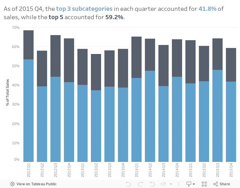
Workout Wednesday: The Value of Top 3 & Top 5 Contributors
First, we wanted to understand what percentage of sales come from the top 3 and top 5 subcategories in each quarter, then we want to understand the cumulative contribution through time.
So that's your challenge. Build the viz below using this data source with these conditions:
- Match the title
- Match the tooltip
- Match the colors
- Show the contribution of the top 3 and the top 5 subcategories in each quarter
- Bar height represents the cumulative contributions from the first quarter
- Use only one worksheet
- Viz size is 800x600
I'm pretty sure that's everything. If I missed something, leave a comment or tweet me and I'll update the requirements. Remember to post you version to twitter and tag @EmmaWhyte and @VizWizBI. Good luck!
February 4, 2015
Tableau Tip Tuesday: Display the Total on Top of Stacked Bars (without Using the Secondary Axis)

To display the total for each year on top of the stacked bars, follow these steps.
Step 1: Change the mark type for the left axis to Gantt.

Step 2: Right-click on the Sales pill and add a Running Total Quick Table Calculation
Step 3: Change the Compute Using to Department. The view should now look like this:

Step 4: Create a calculated field that returns the negative Sales.

Step 5: Add this new calculated field to the Size shelf for the Sales axis.

The viz should now look like a stacked bar chart.

Step 6: Create a calculated field to return the running total of sales, but only return it for the top bar.

Step 7: Drag this new calculated field onto the Label shelf for the Sales axis.
Step 8: Change the Compute Using to Department.
That's it! The view will now look like a stacked bar chart with the total of each year on the top.

Download the Tableau workbook here.
August 10, 2012
Displaying time-series data: Stacked bars, area charts or lines…you decide!

First, let me say that this is a tremendous improvement over those produced by the U.S. Bureau of Alcohol, Tobacco, Firearms and Explosives (a.k.a. the ATF). Don’t bother reading the ATF report, unless you love 3D bar charts and 3D pie charts created in Excel.
A stacked bar chart is basically a pie chart unrolled to make a stick. And more often than not, when plotted as a time series, they do a poor job at showing the overall trends. Stacked bars are good up to three bars, no more. Why? Because it’s difficult to compare the heights of any of the bars except for the bottom bar, rifles in this case.
Let’s go through several alternative displays. If you’re interested in playing with the data, Matt published it here for me. Thank you Matt!
All of the charts below were built with Tableau. You can view an interactive version of all of these charts here and download the workbook here.
Let’s start with a redesigned stacked bar chart that uses Tableau’s built-in color blind palette.

Can you see the trends for each of the weapons? Maybe an area chart would be better.

Well, ok. Now the trends are easier to see, right? Area charts certainly improve the ability to see trends over time, but there are only two trends that give an accurate reading:
- The line at the top of the bottom area, i.e., rifles.
- The top of the top chart, which represents the total.
We still don’t have the ability to see the trends for any weapon except for rifles.
Before you read on, take out a piece of paper and sketch what you think the trend is for shotguns (light blue) based on the area chart above.
Ok. Now let’s compare the area chart above with the area chart for shotguns.

Did you come close? I doubt you did. Why? Because the tops of each color are influenced by the size of the colors below it, therefore making gauging the true size of each individual color extremely difficult.
Here’s another way to prove it. I know this isn’t a good way to represent the data, but bear with me, I’m trying to prove a point. If I overlay lines for each weapon over the area chart, look how different the shapes of the lines become.

Like most time-series data, your best way to represent the data is nearly always going to be a line chart.

Using a line chart we can quickly make some observations:
- There was a three-year spike in the early 90s for pistols made and there’s been a similar, but longer, surge since 2006. What was the cause of the big decline in 1995? Was there a change in handgun laws in 2005 or 2006?
- Revolvers were on a steady 20-year decline until 2005-2006. Is this merely coincidental with the pistols? Possibly so, possibly not.
- Rifles have increased recently, but shotguns have decreased. Are people buying rifles instead of shotguns? Their rate of variance since 1994 has grown consistently and the gap continues to get wider.
Using a line chart, you’re immediately asking questions of your data. Rapid-fire analysis!
When analyzing time-series data across several categories, consider not only looking at the raw numbers like above, but also review how each category contributes to the total. Let’s go through the same series of charts.

We’re off to a good start with the stacked bar chart. It looks like measuring the contribution of each weapon to the total may tell us something. Let’s try it as an area chart.

Not much better, other than it looks smoother. How about a line chart?

Ok, now we’re onto something. You might think that this is the same as the line chart for the raw numbers, and I can see how you might make that conclusion at a quick glance. But let’s look at them side-by-side.

The charts look very similar up until 1997, but then look at how many more rifles started to be made compared to the rest. And look at the drop off in percentage of shotguns produced since 2004.
Hopefully you’ve learned two main lessons:
- Don’t display time-series data as stacked bars (or pies unrolled onto on a stick if you prefer). The best medium for time-series data is a line chart.
- Consider looking at both the raw numbers and their contribution to the total. It’s always a good idea to look at your data in more than one way. You may get some additional and/or different insights.
Let me wrap with two charts that disturbed me a bit as I was playing with the data for this blog post. I’m not disturbed by their visual display, but by what they reveal.

The chart on the left is the running total of guns made by gun type since 1986. The chart on the right summarizes the chart on the left.
These charts tell us that the US has manufactured over 99 million guns since 1986. Seriously! 99 million! According to the US Census Bureau, there were ~238M Americans over 18. That means that approximately one of every five Americans 18 or older owns a gun.
That terrifies me!
Perhaps political interests (and lobbyists) have played a part?? For more information on how to use the US Census Bureau data, check out this guide.

UPDATE – Source CNN: This certainly explains the drop that started in 1994 and the subsequent increase in 2005.
The Clinton administration imposed a ban on several types of military-style semi-automatic rifles and high-capacity magazines in 1994, but that ban was allowed to lapse in 2004. Obama has proposed restoring the ban, requiring background checks for buyers at gun shows, and other "common-sense measures."


