July 14, 2026
The Frequency Matrix: A Tableau Technique You're Missing

What if the data you already have could reveal something you've never seen before? It can, and it starts with a technique most Tableau analysts have never tried: the frequency matrix.
In this full keynote from Appalachian State University's Analytics Day, Andy Kriebel (Tableau Hall of Fame Visionary and founder of Next Level Tableau) builds a frequency matrix from scratch, then shows the same underlying data six different ways: Sankey diagrams, tree diagrams, network diagrams, geographic flow maps, box plots, and slope graphs.
You'll walk away with a technique you can take straight back to your own data, whether you're working with enrollment numbers, customer flow, product usage, or anything else where you need to compare two categories at once.
What's covered:
- What a frequency matrix is and how to read one
- Building a frequency matrix step by step in Tableau
- Using calculated fields to highlight the most common and highest-performing combinations
- Visualizing the same relationship with Sankey diagrams, tree diagrams, and network diagrams
- Mapping geographic flow with Make Point and Make Line
- Guiding principles for building dashboards stakeholders actually use
- Live Q&A on accessibility, color palettes, and chart governance
Want more? Grab my free 30-Day Tableau Skill-Building Accelerator: nextleveltableau.com/accelerator
Download the workbook and data here:
https://nlt.kit.com/frequency-matrix
June 25, 2024
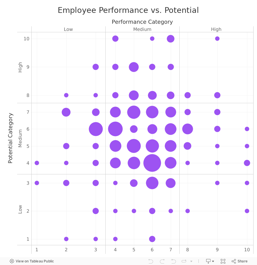
How to Create a 9-Box Matrix in Tableau

In this video, I show you how to build a 9-box matrix.
These are commonly used in talent management and HR to map a company's workforce along two dimensions, potential and performance.
Each of these two dimensions is split up into three categories, low, medium, and high, depending on the score.
For each employee performance is then plotted horizontally and potential is plotted vertically. From there, we summarize the number of employees that fall within each box.
March 1, 2023
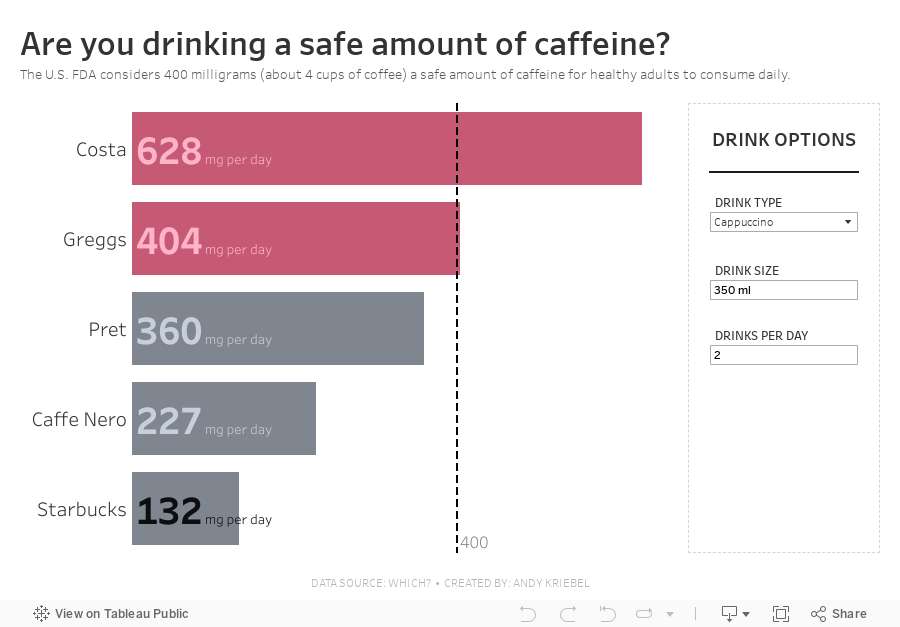
#MakeoverMonday 2023 Week 9 - Are you drinking a safe amount of caffeine?


March 19, 2021
#WorkoutWednesday 2021 - Week 2: Customer Lifetime Value (CLTV) Matrix

If you like a table calc challenge, this Workout Wednesday is for you. Get Ann's requirements here. On the surface it seems pretty simple:
- Get the first order date for each customer.
- Determine the number of quarters that elapsed since then.
- Calculate the cumulative value of each cohort.

Next, calculate each cohort's cumulative lifetime value.

You should now have a view like this with the marks are filled in across the whole table


April 4, 2018
Workout Wednesday: Frequency Matrix
Easiest Parts
- Use sub-categories (HINT: Since it's a frequency matrix, there's a trick here.)
- Dashboard size is 1000 x 900; tiled; 1 sheet
- Distinctly count the number of orders that have purchases from both sub-categories
- Sort the categories from highest to lowest frequency
- White out when the sub-category matches and include the number of orders
- Match formatting & tooltips – special emphasis on tooltip verbiage
Hardest Parts
- Calculate the average sales per order for each sub-category
- Identify in the tooltip the highest average spend per sub-category (see Phones & Tables)
- If it’s the highest average spend for both sub-categories, identify with a dot in the square
I messed around with the average sales per order calc for quite a while. I have every number the same except for a couple in paper and binders. I have had a look at Ann's solution and I think mine is more accurate, so I'm sticking with it. :-)






