Showing posts with label drinks. Show all posts
March 1, 2023
#MakeoverMonday 2023 Week 9 - Are you drinking a safe amount of caffeine?
bar chart
,
caffe nero
,
caffeine
,
calculated field
,
circles
,
coffee
,
containers
,
costa
,
drinks
,
greggs
,
heatmap
,
how to
,
layout
,
matrix
,
mobile
,
parameter
,
phone
,
pret
,
starbucks
,
tableau
No comments


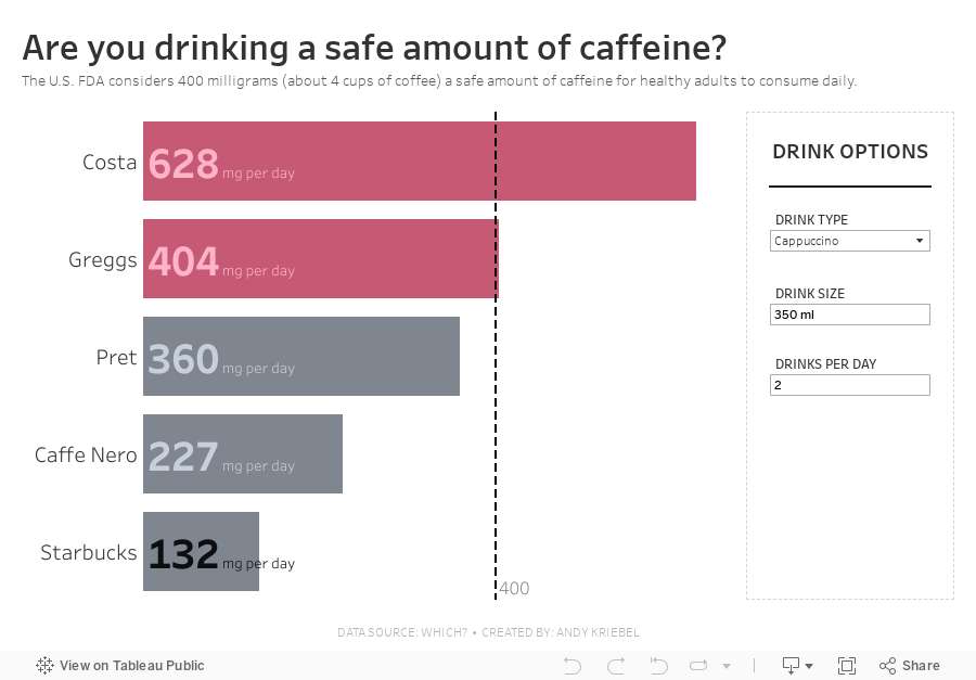
and turn it into an interactive chart that allows the user to know if they are drinking a safe amount of caffeine.
Check out Watch Me Viz below. Thanks to the feedback from viewers, we came up with the idea of letting the user pick (via parameters) their drink type, the drink size, and how many they drink per day. I calculated the mg of caffeine per ml and then multiplied that by the drink size and the number of drinks per day.
I spent time showing how to effectively use containers (you can never get enough practice with containers) and then showed how to create a mobile version as well. I think you'll learn a lot by watching and following along with the final build.
If you are looking for 1:1 or group coaching sessions, I can help! Get in touch here.
December 4, 2017
Makeover Monday: Comparing the cost of food and drinks at Wetherspoons
cost
,
drinks
,
food
,
Makeover Monday
,
quadrant chart
,
restaurants
,
scatter plot
,
strip plot
,
Wetherspoons
2 comments
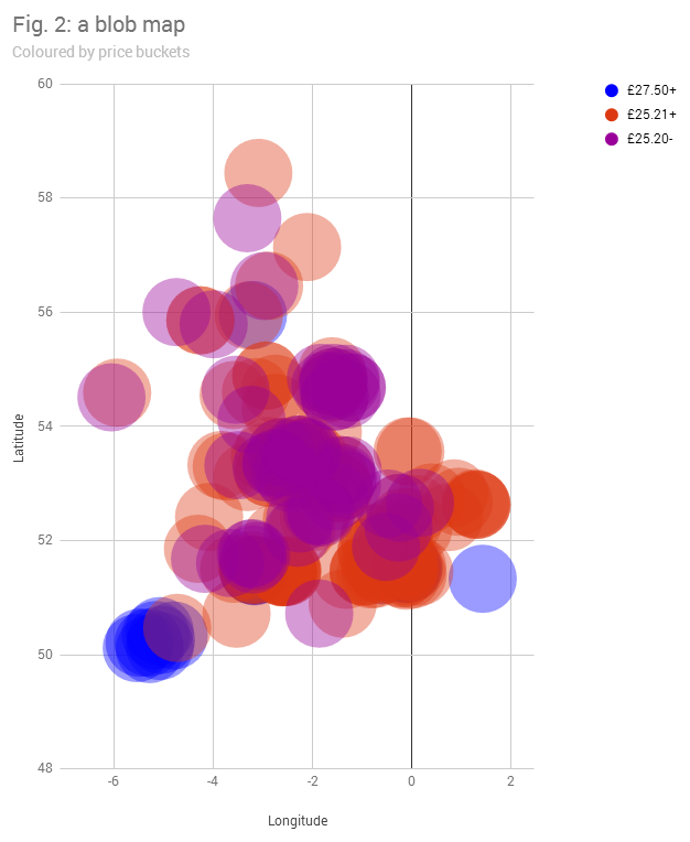
What works well?
- Binning the prices helps cluster the restaurants
- Distinct enough colors
What could be improved?
- The viz is desperately trying to be a map, but failing miserably.
- The dots are so big that they are causing massive overlapping.
- There's no interactivity, so I have no idea which restaurant is which.
- The title doesn't tell me anything.
- What do the dots represent?
My Goals
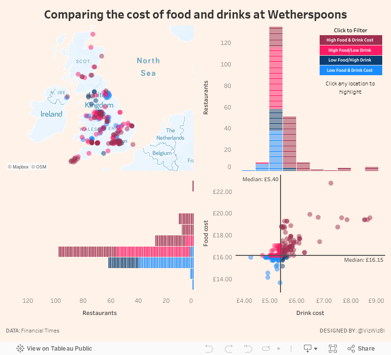
- Explore the data, particularly focusing on price comparisons.
- Are there regional differences?
- Do large metro areas charge more?
- Many restaurants make a lot of their money from drinks. Does Wetherspoons?
- Elaborate on the price buckets idea from the original. How are the prices distributed?
- Use FT-themed colors (which you can find here)
- Practice highlight actions so that a restaurant can be more easily found on the map
- Create a custom Mapbox map based on what I learned from our webinar last week.
With these goals in mind, here's my creation for Makeover Monday week 49.
August 12, 2015
Dear Data Two | Week 18: Drinks
beer
,
circles
,
Dear Data Two
,
drinks
,
shapes
,
table calculation
,
water
No comments

I’m actually on time with this week’s postcard. This meant skipping a few weeks, but I’ll catch up on those. Week 18 was particularly fun for me for several reasons:
The data collection was really simple this week. I logged all of my drinks in a Google Sheet: date/time, drink type, and the amount. I’m still having issues with the Web Data Connector for Sheets, so I ended up needing to download the data to Excel and connecting it to Tableau.
I had to rip up two postcards because I messed up. I was trying to use coins for the circles, but it’s quite a pain to fill them in. I really need to buy a stencil kit, but the stationery stores here in London don’t carry them. Instead, my wife suggested using her circular paper cutters from her scrapbooking supplies. I cut holes in the birthday card my sister sent me (sorry sis) and used those for the patterns. This really sped up the process.
My wife also suggested using light pencil lines to sketch a grid on the postcard. This was immensely helpful as well because I had to make sure all of the circles would fit on the postcard and stay neatly aligned. I then used her white eraser to remove the lines at the end.
Lastly, I want to improve my handwriting by way of this project. I’ve always really liked the handwriting of architects. A quick Google (or is it Alphabet) search, turned up this YouTube video that gave me some good ideas and I feel like I’ve made giant strides already.
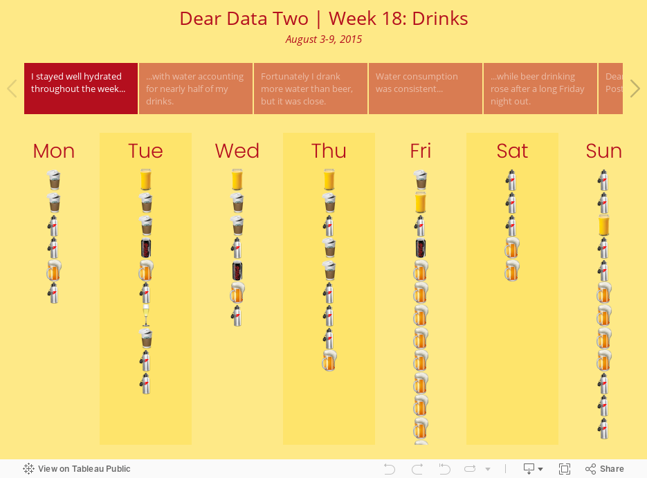
With all of this in mind, here is the week 18 visualisation. Note: my Friday night was NOT a typical Friday night. I’m fairly certain Jeffrey will be ashamed of me.
- My 13-yr old son did the project along with Jeffrey and me. He’s working on a blog post for his creation.
- It was fun seeing what I drank (and what I shouldn’t have).
- I learned more about custom shapes and table calculations (the learning never, ever stops).
- I really like how the postcard turned out; it’s probably my favorite so far.
The data collection was really simple this week. I logged all of my drinks in a Google Sheet: date/time, drink type, and the amount. I’m still having issues with the Web Data Connector for Sheets, so I ended up needing to download the data to Excel and connecting it to Tableau.
I had to rip up two postcards because I messed up. I was trying to use coins for the circles, but it’s quite a pain to fill them in. I really need to buy a stencil kit, but the stationery stores here in London don’t carry them. Instead, my wife suggested using her circular paper cutters from her scrapbooking supplies. I cut holes in the birthday card my sister sent me (sorry sis) and used those for the patterns. This really sped up the process.
My wife also suggested using light pencil lines to sketch a grid on the postcard. This was immensely helpful as well because I had to make sure all of the circles would fit on the postcard and stay neatly aligned. I then used her white eraser to remove the lines at the end.
Lastly, I want to improve my handwriting by way of this project. I’ve always really liked the handwriting of architects. A quick Google (or is it Alphabet) search, turned up this YouTube video that gave me some good ideas and I feel like I’ve made giant strides already.
With all of this in mind, here is the week 18 visualisation. Note: my Friday night was NOT a typical Friday night. I’m fairly certain Jeffrey will be ashamed of me.
Subscribe to:
Posts
(
Atom
)






