February 23, 2021
Four Methods for Creating a Seismogram


February 22, 2021
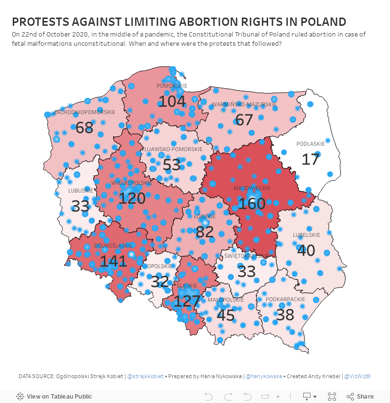
#MakeoverMonday Week 8 - Protests Against Limiting Abortion Rights in Poland

February 16, 2021
Understanding Table Calcs vs LODs: Explained with a Slope Graph

February 15, 2021
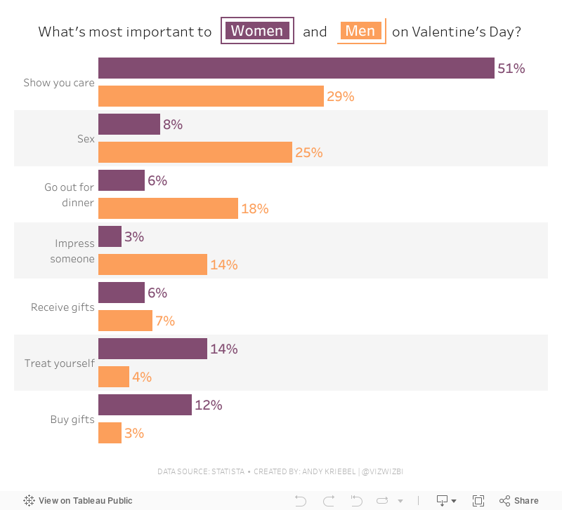
#MakeoverMonday Week 7 - What is most important on Valentine's Day?

It's Valentine's Day and what's the point? In this #WatchMeViz session, I explored lots of visualization before settling on a viz that was basically the same as the original with the exception of the colors, title and interactivity. Enjoy!
February 9, 2021
How to Assign Highlight Colors to Palette

February 8, 2021
#MakeoverMonday Week 6: Why Are Women Perceived to Be Unequal to Men?

Wow! What a fun #WatchMeViz that was! I iterated through 16 charts and then when the idea solidified, there was some great conversation and feedback on the chat to help me get to the end. I find survey responses quite difficult to visualize, so instead of getting frustrated, I thought about all of the ways I can compare data to see if anything would work.
Most importantly, thank you to all of your on the live chat. It makes a huge difference to me and I love getting your feedback and questions along the way. You make me better. You can find the final visualization below the video.

February 4, 2021
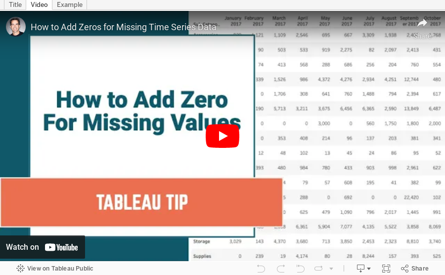
How to Add Zeros for Missing Time Series Data

February 2, 2021
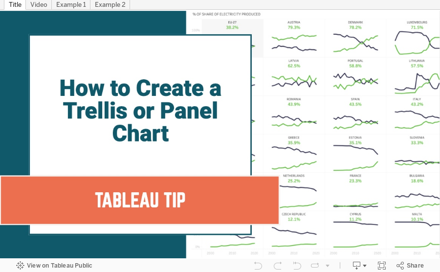
How to Create a Trellis Chart in Seven Steps

Trellis charts are a version of a small multiples chart that organizes the dimensions in the view across a grid. In this tip, I show you how to create a trellis chart that will work even when you are missing data.
Trellis / Panel Chart Calculations
//Columns
(index()-1)%(round(sqrt(size())))
//Rows
int( (index()-1)/(round(sqrt(size()))))
Steps
- Create the column and row calcs
- Create a custom date
- Place custom date on columns, measure on rows and dimension on detail
- Place column on columns, row on rows, and custom date on detail
- Ensure dimension is above date on detail shelf
- Change custom date on columns to ATTR
- Configure table calcs
- Check both the Dimension and the date field date in order
- Ensure the dimension is above the date field in the Specific Dimensions section
- Set "At the level" to the dimension
February 1, 2021
#MakeoverMonday Week 5 - Renewables vs Fossil Fuels in Europe

ORIGINAL CHART

WHAT WORKS WELL?
- The colors are perfect for the topic.
- I like the labels on the ends of the lines.
- The tooltips are very responsive and color-coded to match the line.
- The title and subtitle are informative and give good context.
- The slightly lighter shading of the axes labels make the chart stand out more.
WHAT COULD BE IMPROVED?
- Make the dashed lines solid.
- Format the percentages in the tooltip to one decimal place.
MY VERSION
