October 31, 2023
How to Create a Year→Quarter→Month→Day Drilldown in Tableau

Are you looking to take your Tableau skills to the next level? Do you want to create dashboards that offer a dynamic and interactive experience?
Look no further!
This comprehensive tutorial will walk you through the process of creating a Year→Quarter→Month→Day Drilldown in Tableau.
🔹 What You'll Learn:
1. How to set up 2 parameters for drilldown functionality
2. How to perform 9 simple calculations that power your dashboard
3. How to implement 8 simple dashboard actions for enhanced interactivity
4. Introduction to dynamic zone visibility
🔹 Who Should Watch:
1. Data analysts looking to expand their Tableau toolkit
2. Business intelligence professionals aiming for dynamic reporting
3. Anyone who wants to unlock the full potential of Tableau
🔹 Why This Tutorial is Unique:
1. Step-by-step guide for each component: Parameters, Calculations, and Dashboard Actions
2. Introduction to advanced Tableau functionalities like dynamic zone visibility
3. Reusable examples to cement your understanding
4. Tips and tricks for maximizing the utility of your drilldowns
Don't miss out on upgrading your Tableau skills.
Let's dive into the world of advanced Tableau functionalities and take your dashboards to the next level!
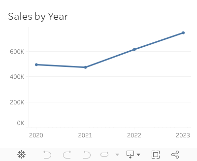
October 5, 2022
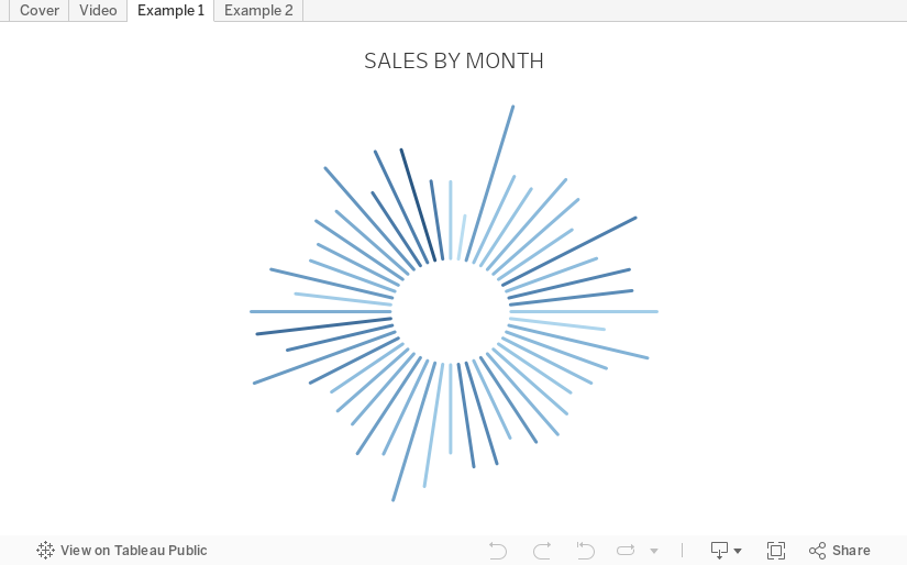
How to Create a Starburst Chart
Starburst charts, sometimes called sunburst charts or circular timelines, are one method of displaying data over time. They may look cool, but they aren't exactly easy to understand. If you are going to use them, I'd advise you to check with your audience first to ensure they understand how to read them.
In this video, I take you through how to build a single starburst as well as a series of starburst charts as small multiples or trellis chart.
All of the calculations are in the description for the video here. You can download the workbook below.
April 12, 2022
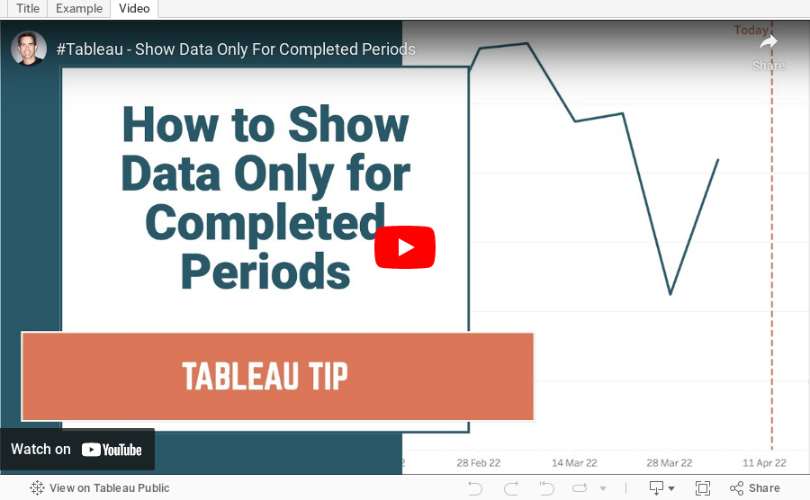
How to Show Data for Only Completed Periods
January 5, 2022
How to Create a User-Defined Moving Average
March 2, 2021
How to Create a Circle Timeline


February 23, 2021
Four Methods for Creating a Seismogram


February 4, 2021
How to Add Zeros for Missing Time Series Data

September 25, 2020
#WorkoutWednesday 2020 Week 3: Orders by Day and Time
As time permits, I'm going back through some of the Workout Wednesday challenges that I've yet to complete. I'm starting with those that will help me most as a teacher to impart what I learn on those that I have the pleasure to train at The Data School.
For week 3, Lorna Brown challenged us to create a viz that shows the number of orders by hour of the day that allows the user to swap between day of the month and weekday.
In her solution, she chose to create two sheets, one for the day of the month and another for weekdays. I didn't know that when I tackled the challenge so I proceeded down the route of doing it all in one sheet. Success!
I did a couple things differently than Lorna:
- I combined the order date and time into a string calculation and then used the DATEPARSE function to make it a date/time field.
- The size of my circles depends on the option selected in the parameter. For day of the month, the size is the number of orders. For weekday, I have them set to a fixed size. I chose to make them a fixed size because otherwise the circles become way too big for the view.
- I used only one sheet.
- I am not showing a tooltip when there are no orders.

June 7, 2018
Workout Wednesday: How does sales compare in the Current Period to the Previous?
But I'm back and this week Rody gave us this challenge. Read all of the requirements here.
I had an idea straight away how to do this and in all it took about 30 minutes. The date offsetting took some tinkering, but the rest was pretty easy. I'm glad Rody is back from his hiatus too. His challenges aren't as brutal as Ann's.#WorkoutWednesday Week 23: How do Sales compare in the current period to the previous.— Rody Zakovich (@RodyZakovich) June 6, 2018
Giving a slight twist on some older challenges. Enjoy!https://t.co/gBn05E4gev@lukestanke @AnnUJackson pic.twitter.com/trqc3ZnT3G
Click on the image for the interactive version.

May 9, 2017
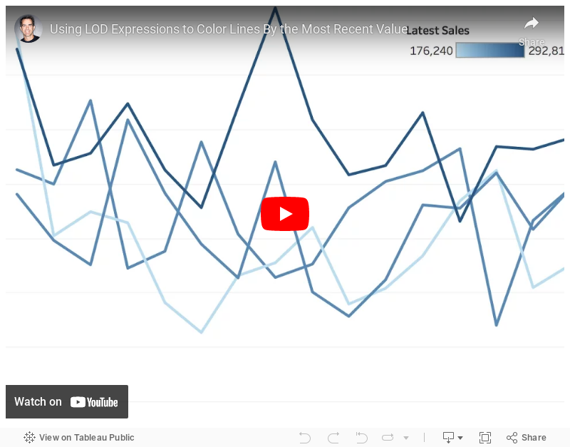
Tableau Tip Tuesday: Using LOD Expressions to Color Lines By the Most Recent Value
How can I color each line on a line chart by the most recent value?This requires a three-pass LOD expression. The key is to realize that Tableau created an aggregate table for each LOD working from the inside out. So
- Tableau calculates the inside LOD first.
- Then the second LOD is calculated based on the results of the first LOD.
- Then the third LOD is calculated based on the results of the second LOD.
Make sense? I hope so! If not, let me know. Enjoy!
February 15, 2017
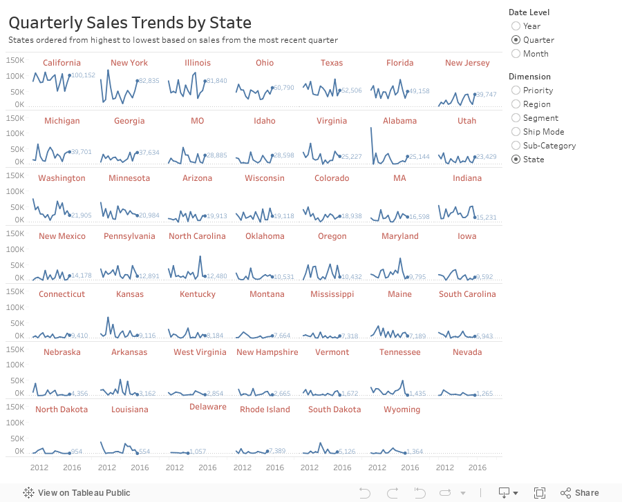
Workout Wednesday: Dynamic Trellis Chart
In this example, I'm using the same Superstore Sales I've used in previous Workout Wednesdays. Here are the guidelines:
- Match my colors.
- The user should be able to choose the level of detail they want for the date.
- The date axis format should not change, irrespective of the date level chosen.
- The user should be able to pick from the list of dimensions shown.
- The dimensions should be sorted from upper left to lower right based on the sales in the most recent time period.
- Match my tooltips. Note that they change based on the options the user selects. Pay attention to the date formats in particular.
- The title should update dynamically based on the date level and dimension selected.
- The end of each line should be labeled to the right of the last point.
- There should be a little circle on the end of each line.
- Each section of the trellis should include a label for the value of the dimension for that section. E.g., California should be on the upper left when you selected quarters by state.
- The dimension labels should be centered in each section.
- There should be no gridlines, but the zero line should be included.
- Each row should should have a light divider between them.
- My final view is 900x700.
October 24, 2014
Tableau Tip: Blending data sets that have different max dates
Here's a sample of data the represents the situation:


Inside Tableau, these are four different data sources. I blend them all together onto a single worksheet like this:

First, I created a calculated field in each data source to get the max date. Note that I've set the table calculation to calculate along Date.

I then added each of these calculations to the view to make sure I was getting the results I wanted.

Sweet! This is exactly what I was hoping for. Next I need to determine which one of these four dates is the minimum and then return the date from that data source. This is the calc I created and it's kinda messy, but it works. Note this I set the calc to compute along Date.


I add this to the Filters shelf, set the Compute using to Date and choose True. That's it!

If anyone knows a more efficient way to do this, I'm all ears! Download the workbook here.
August 29, 2014
Two-way Sorting in Tableau - Sorting Some of the Viz by a Measure and the Rest Alphabetically
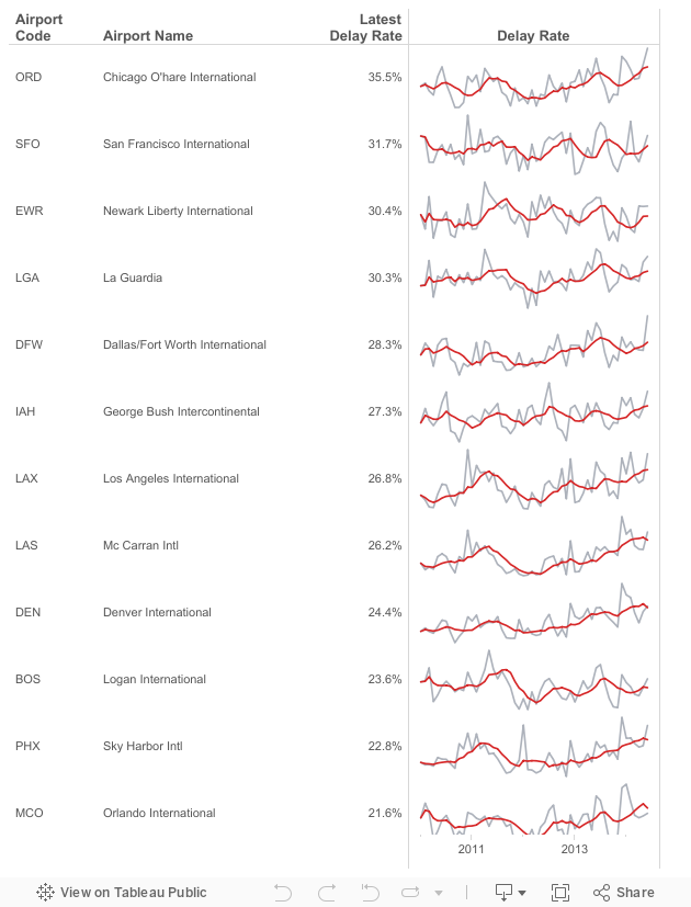
- Given a list of airports, there are a subset that are "targets". Let's assume they are the top 15 with the most flights in 2014: ATL, DFW, ORD, LAX, DEN, IAH, SFO, PHX, LAS, MCO, CLT, EWR, BOS, SLC, LGA
- The airports need to be sorted by the latest delay rate. However, only those in my top 15 list should be sorted by delay rate, the rest should be sorted alphabetically to make them easier to lookup.
- Include sparklines for each airport for 2010 to present.