February 15, 2017
Workout Wednesday: Dynamic Trellis Chart
date
,
datetrunc
,
dynamic
,
dynamic titles
,
line chart
,
panel chart
,
parameter
,
reference line
,
small multiples
,
spaces
,
sparklines
,
time series
,
trellis chart
,
Workout Wednesday
4 comments
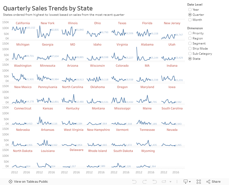
In this example, I'm using the same Superstore Sales I've used in previous Workout Wednesdays. Here are the guidelines:
- Match my colors.
- The user should be able to choose the level of detail they want for the date.
- The date axis format should not change, irrespective of the date level chosen.
- The user should be able to pick from the list of dimensions shown.
- The dimensions should be sorted from upper left to lower right based on the sales in the most recent time period.
- Match my tooltips. Note that they change based on the options the user selects. Pay attention to the date formats in particular.
- The title should update dynamically based on the date level and dimension selected.
- The end of each line should be labeled to the right of the last point.
- There should be a little circle on the end of each line.
- Each section of the trellis should include a label for the value of the dimension for that section. E.g., California should be on the upper left when you selected quarters by state.
- The dimension labels should be centered in each section.
- There should be no gridlines, but the zero line should be included.
- Each row should should have a light divider between them.
- My final view is 900x700.
Subscribe to:
Post Comments
(
Atom
)


Andy,
ReplyDeleteThis is an awesome example of a trellis. Thanks. Do you have any idea why the field Date has to be treated the way it does? (i.e. as a an attribute on the Columns shelf and also a dimension on the details shelf.) I would think you could just have Date as a continuous dimension on the Columns shelf and leave it off detail, but that causes the row and column table calcs to return incorrect values.
Here is a better description of my question https://community.tableau.com/thread/227883
DeleteIt has to do with domain padding. To draw the connected line, we need to make sure the dates don't get confused across the other dimensions. Yet we need the date on the detail for the table calc. It's all quite confusing! This post by Chris Love explains it better.
Deletehttps://www.theinformationlab.co.uk/2014/10/06/dynamic-visualisations-size-index/
Fresh start this morning helped. I was pulling a constant line from analytics pane and trying to label it. but i see that max rating offset itself is your calculated constant line!
ReplyDelete