February 6, 2017
Makeover Monday: Are We Nearing the Death of Chicago Taxis?

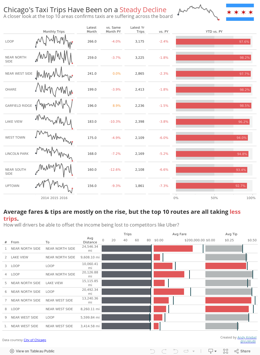
What works well?
- Using a line chart to portray a time series rarely is a bad choice
- Nice simple labeling of the axes
- Title tells me what I'm looking at
- Red line on the grey background works well
- The y-axis is truncated, but the chart maintains a nice 3x2 ratio so that the line trends aren't too distorted.
What could be improved?
- Scale of the y-axis is a bit odd; I like nice rounded numbers that make the math easy to do in my head
- There is SO much more data to work with; why limit to only trips?
- Could use a more impactful title
- Could use more context
This week I decide to apply some of the training we received from Rhiannon Fox and do a bit of mood boarding, color choosing and seeking overall inspiration. I knew I wanted to create a summary dashboard of sorts that included lots of context, so after a bunch of Google image searching and pinning, I ended with this mood board.
Overall, another fun week. Tonight I get to introduce this to a bunch of new Tableau users at the #MakeoverMonday Live session at Tableau HQ in London. Can't wait to see what they come up with!
Subscribe to:
Post Comments
(
Atom
)


Great work, Andy! Could you walk me through the Dot Color calc though? I can't wrap my head around that one.
ReplyDeleteYou can download the workbook and see how it works. Or did you do that already and just need a plain English explanation?
DeleteThat's what I'm needing, I think. My understanding is that it serves as a boolean test that will only return a result if the record is either the first or last month, but I'm not sure how it works. My first thought was you could just use a LAST()=0 calculation, then put it on color. It would work fine for a dual axis line, but that would show a point at each month (which would be crowded in a sparkline).
DeleteCorrect, it's a boolean test. I can then write another calc to do something else based on the result of the boolean.
DeleteHi Andy :),
ReplyDeleteFirst of all I'm a big fan of yours work. Dashboard looks awesome.
I have one question - after digging into calculations (i always learn something new from yours dashboards) i believe that Dot Color field is now working as should. We always will see false value because "Last value" < 0 Example is MOUNT GREENWOOD
I added exclude to duplicate data in second calculation.
IF LAST()=0 THEN
SUM(IF {MAX(DATETRUNC('month',[Trip Start]))}=DATETRUNC('month',[Trip Start])
THEN [Trips] ELSE 0 END)
<sum({ EXCLUDE DATETRUNC('month', [Trip Start]) :
SUM(if [Last Month Prev Yr?] THEN [Trips] ELSE 0 END) })
END
Could you please verify if I'm thinking correct or maybe I missing something ? :)
Cheers,
Kuba
Ah great catch! Thanks Kuba!
Delete