February 4, 2025
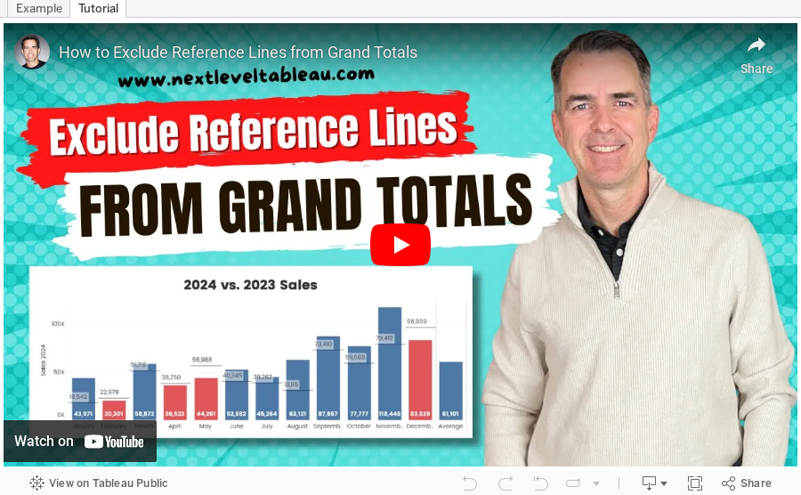
How to Exclude Reference Lines from Grand Totals in Tableau

Ever added a reference line to your Tableau visualization, only to see it appear in the grand total row, even when it doesn’t make sense?
If your grand total uses a different aggregation than your main data (e.g., SUM vs. AVG), the reference line can be misleading.
Unfortunately, Tableau doesn’t offer a simple way to exclude it—but there’s a trick to removing it while keeping your totals visible.
In the video below, I’ll walk you through the step-by-step solution to remove reference lines from grand totals.
Want to become an advanced Tableau user?
Unlock your full potential with Next-Level Tableau, the ultimate training program for Tableau users. Gain access to expert-led tutorials, live sessions, and a supportive community designed to help you master advanced skills, create stunning dashboards, and achieve your career goals.
Learn more and take your Tableau skills to the next level today at nextleveltableau.com.
Unsure? Sign up for my free course at starter.nextleveltableau.com.
June 4, 2024
Find Red Flags in Your Data in ONLY 5 MINUTES with Control Charts

May 25, 2024
How to Create a Dot Strip Plot in Tableau
May 3, 2024
How to Make Your Cycle Plots Actionable in Tableau

Cycle plots are a fantastic way to identify seasonality in a data set. And you can make them even more useful by adding indicators for whether they are above or below the average.
Here's how you can do that in Tableau in only 2 minutes.
Like this? You'll love Next-Level Tableau. Learn more at nextleveltableau.com.
January 6, 2023
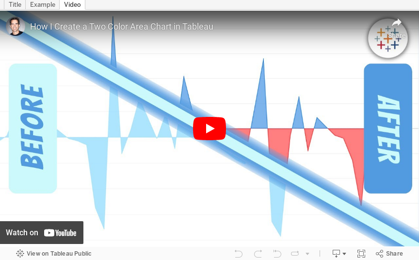
How to Create a Two Color Area Chart in Tableau
In this week's Watch Me Viz, I showed the problem this tip helps solve. An area chart in Tableau only allows a single color. Like this…
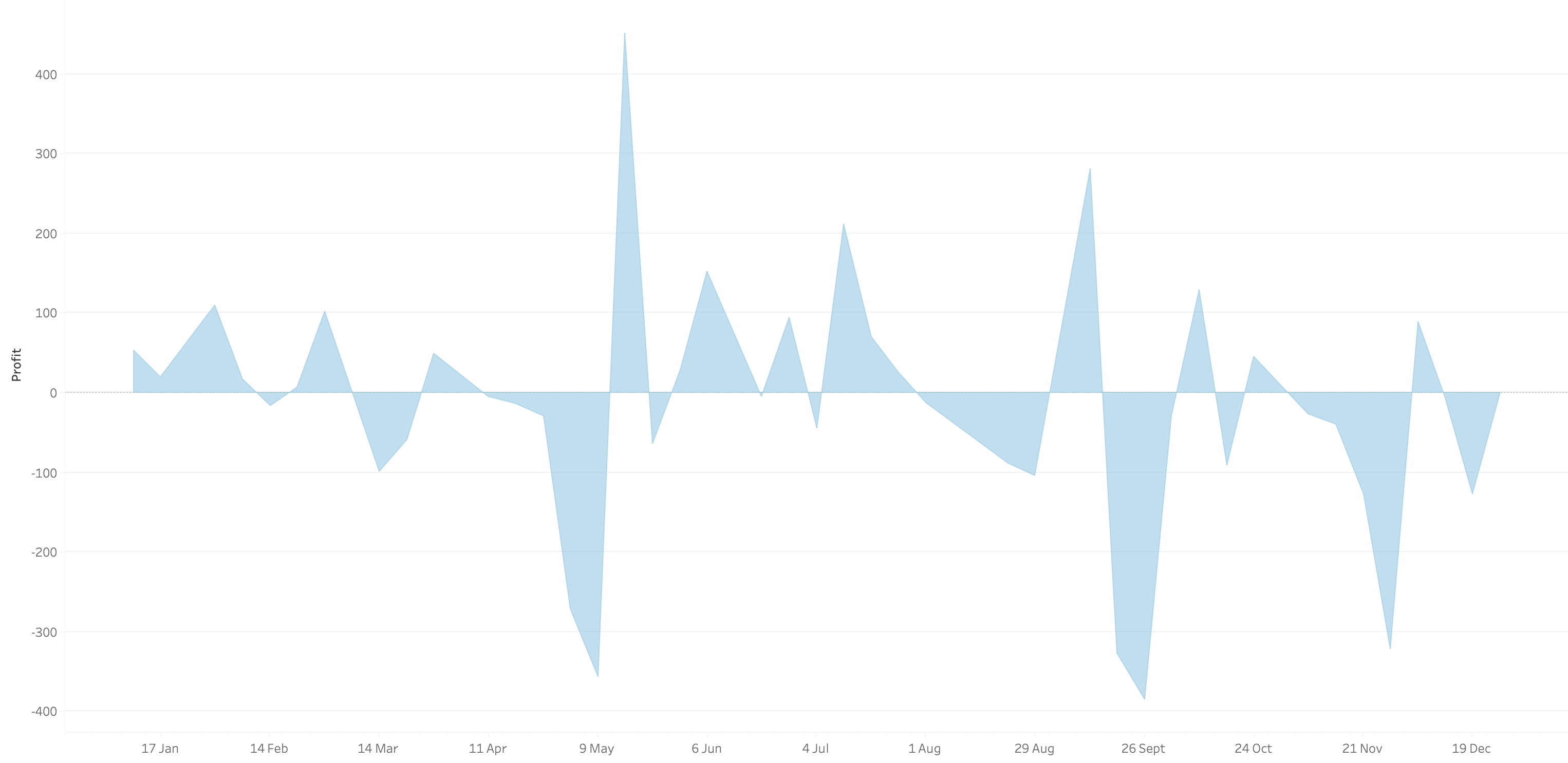
What we want is an area chart like this with two colors.
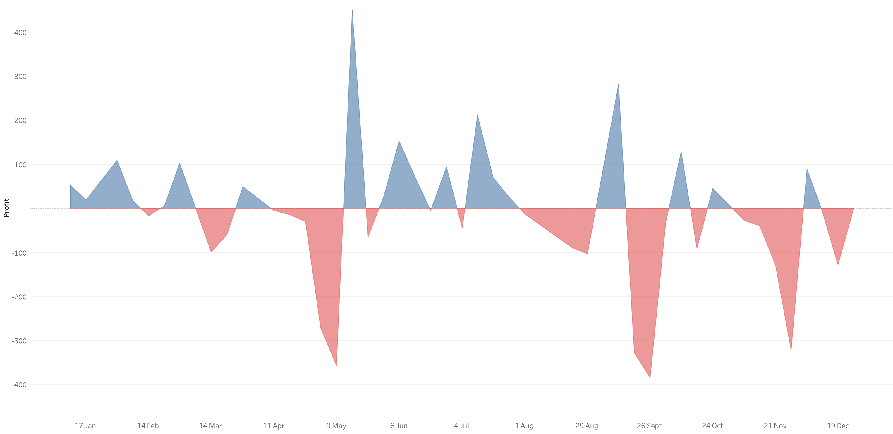
In 9 simple steps, I’ll show you how to build it. Follow along with the video. The 9 steps are listed at the bottom of this post.
STEPS
1. Create the area chart
2. Show what happens when you add a profit to color - you only get one color
3. Duplicate the measure
4. Fix the axes
1. Top axis starts at 0
2. Bottom axis ends at 0
5. Choose a color for each area chart
6. Format the axes to get rid of 0
7. Add reference lines to scale the charts relative to each other
1. WINDOW_MAX(ABS(SUM([Profit])))
8. Duplicate for the negative reference line
9. Formatting
December 6, 2022
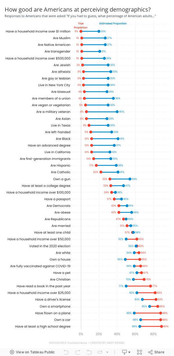
#MakeoverMonday Week 49 - How good are Americans at perceiving demographics?

- Barbell chart with dots on the ends and a line connecting them
- Coloring the lines by the larger value
- Choosing the colors
- Formatting the view (except the labels)
- Labeling the dots/ends of the lines; this took several iterations on the calculations
- Creating the color legend as headers; I had to use reference lines, turn on totals, move the totals to the top, then work on the formatting to get them close. They still aren't perfect.
- Creating the horizontal reference lines; this required me to create a dummy axis
November 8, 2022
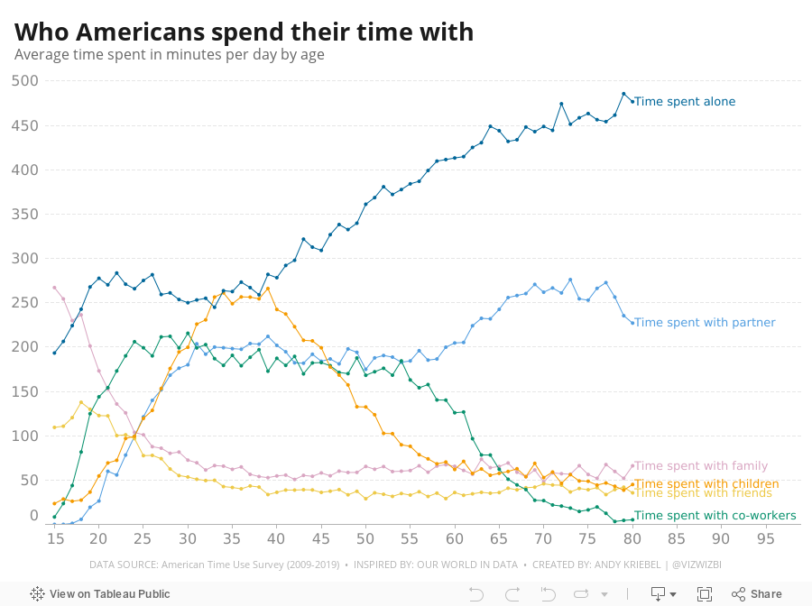
#MakeoverMonday Week 45 - Who Americans Spend Their Time With

September 5, 2022
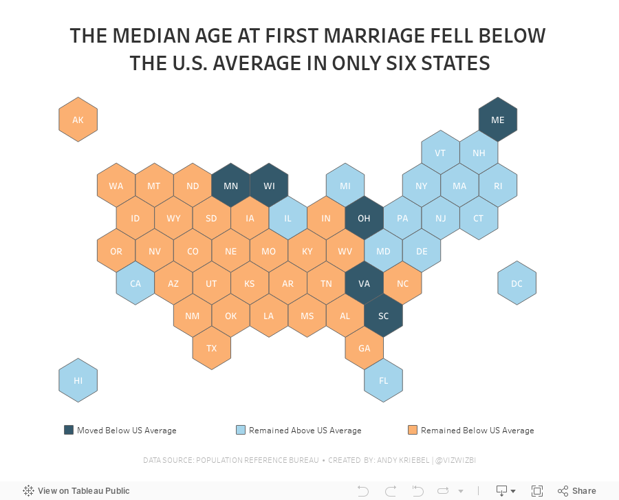
#MakeoverMonday 2022 Week 36 - Median Age at First Marriage in America

This was a relatively simple data set and I was able to build quite a few vizzes during Watch Me Viz. I ended up with something more complex that it needed to be, but it was fun figuring out how to create the calculations.
Here's how it works:
- Compare the median age at first marriage of each state to the US average for 2006-2010
- Compare the median age at first marriage of each state to the US average for 2015-2019
- Check whether the State
- Stayed above the US average in both time periods
- Stayed below the US average in both time periods
- Moved from below the US average to above the US average
- Moved from above the US average to below the US average
August 17, 2022
Analyzing Seasonality with Cycle Plots
July 1, 2021
#WOW2021 Week 22 - Can You Structure the Unstructured?

May 17, 2021
Designing for Mobile First - Sample Mobile Sales Dashboard

May 3, 2021
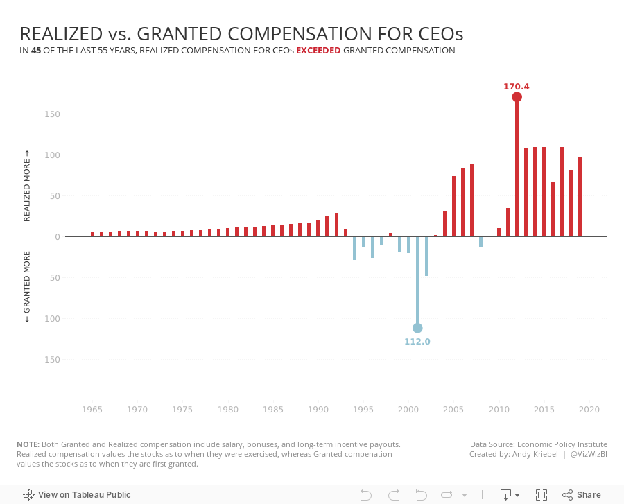
#MakeoverMonday 2021 Week 18 - Realized vs. Granted Compensation for CEOs

- Line Chart
- Stepped Lines
- Variance to baseline
- Win/Loss chart
- Comet Chart
- Gantt Chart
- Bar chart w/ reference line
- Connected scatter plot
- Slope Graph
- Circle Timeline
- Heatmap
- Data Set - https://data.world/makeovermonday/2021w18
- Chart chooser - https://datavizproject.com/
April 27, 2021
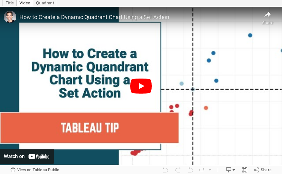
How to Create a Dynamic Quadrant Chart Using a Set Action

April 22, 2021
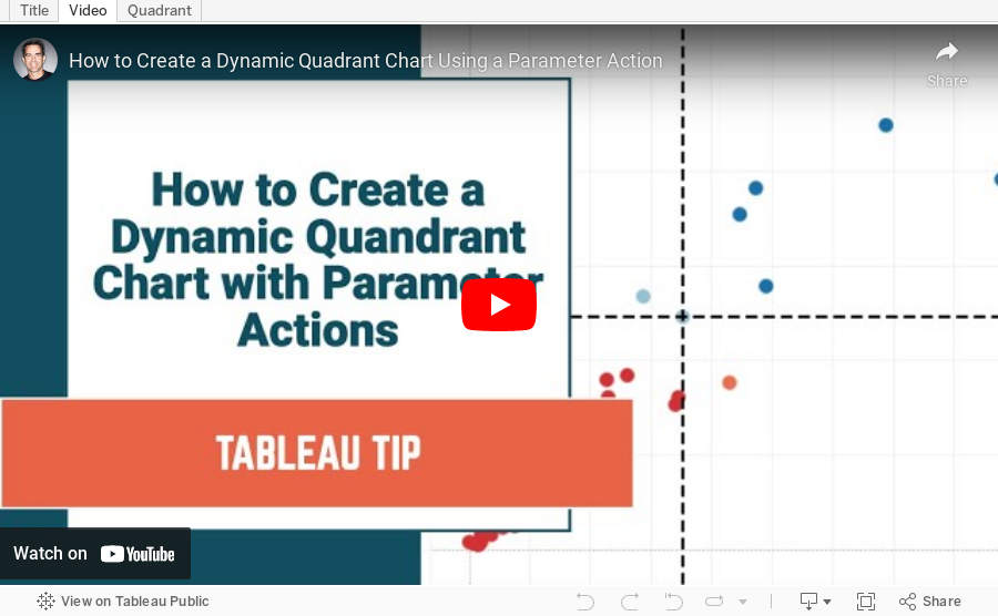
How to Create a Dynamic Quadrant Chart Using a Parameter Action
February 8, 2021
#MakeoverMonday Week 6: Why Are Women Perceived to Be Unequal to Men?

Wow! What a fun #WatchMeViz that was! I iterated through 16 charts and then when the idea solidified, there was some great conversation and feedback on the chat to help me get to the end. I find survey responses quite difficult to visualize, so instead of getting frustrated, I thought about all of the ways I can compare data to see if anything would work.
Most importantly, thank you to all of your on the live chat. It makes a huge difference to me and I love getting your feedback and questions along the way. You make me better. You can find the final visualization below the video.

December 1, 2020
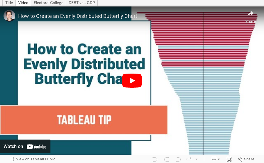
How to Create an Evenly Distributed Butterfly Chart

A Butterfly Chart is (typically) a bar chart where two sets of data series are displayed side by side. The purpose is to allow you to compare the two data series across a dimension.
Here is an example of a butterfly chart I created for Makeover Monday.

Notice how I have zero at the center and the scales are the same on either side of zero. This helps show how the chart "leans" to one side or the other.
The comparisons would be more difficult to see if the left and right hand sides of the butterfly did not have the same axis scale. In this video, I show you how two examples for creating a butterfly chart.
November 5, 2019
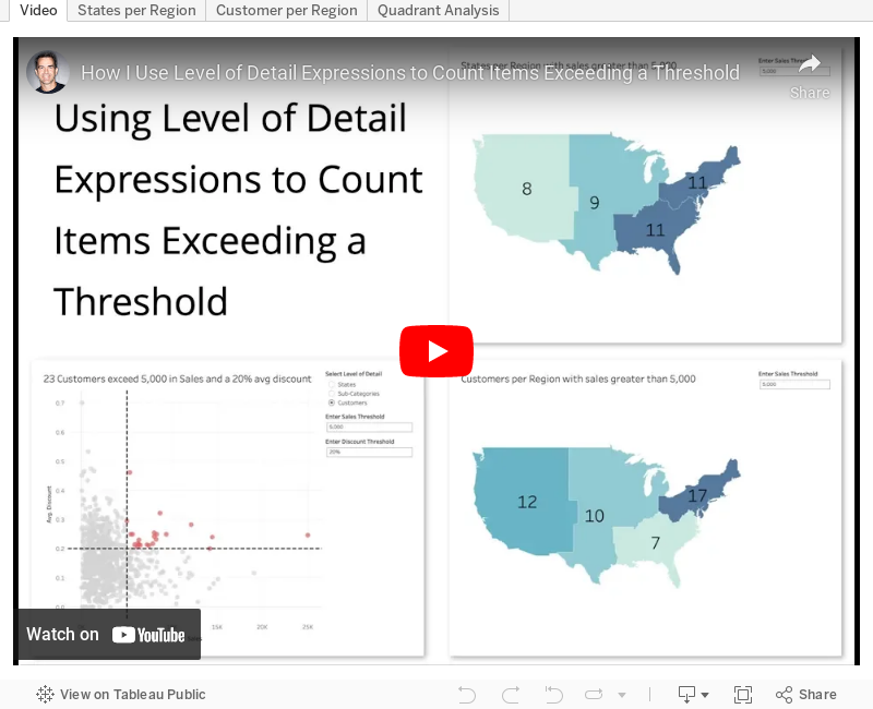
#TableauTipTuesday: Using Level of Detail Expressions to Count Items Exceeding a Threshold

I ended up babbling quite a bit as I created more examples; sorry for that, but I was on a roll.
June 8, 2019
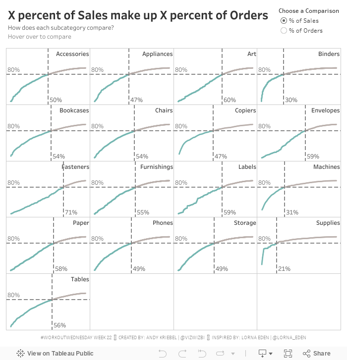
#WorkoutWednesday Week 22: X% of Sales make up Y% of Orders

Great! That part was pretty straightforward. I've done a Pareto tons of times. I've done a trellis tons of times.
Then there was the coloring of the line. That is, the line needed to be colored in each pane up to the point where two reference lines meet. I got that right way...so I thought.
Lastly, there was the little detail (i.e., not so little) of creating dynamic reference lines that update based on both the parameter selected and the point which you hover over. The fact that these are two conditions should have been my first clue.
I spent quite a while on the reference lines trying to make one reference line act upon two calculations. Well...that's not how reference lines work. Then it hit me that I actually needed four reference lines. Two of them will always hide based on the option selected in the parameter.
PROGRESS!!!!
The calcs were fiddly. I got lost in the logic a couple times because what you have to do is a bit counterintuitive, kind of like double negatives. I wrote down the four scenarios so that I could approach them one by one.
My calculation names are a mess, which drives me insane and actually made getting to the solution much harder. I'm normally very good about making sure I have clear names, but in this case I had several with almost the same name, so I kept mixing them up, hence why writing things down helped.
Once I got that figured out, I was done. A bit of tidying, then I downloaded Lorna's solution to compare mine too. We had taken a nearly identical approach (it must be that teacher she had at The Data School that set her on her way).
Thanks for the challenge Lorna! I enjoyed the struggle and always love the eureka moments. This was another viz that I could easily see used in a business context.
May 28, 2019
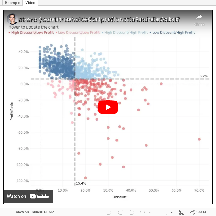
#TableauTipTuesday: Create an Interactive Quadrant Chart with Parameter Actions

The first chart I wanted to try was a quadrant chart. A quadrant chart colors each quadrant based on thresholds set for each axis in a scatter plot. Previously, I created two parameters and the user had to type in numbers to adjust the view. However, with parameter actions, I can now enable to use to update the quadrants by simply hovering over a dot.
And here's the video...enjoy!
February 26, 2019
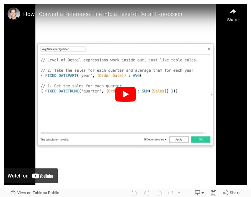
Tableau Tip Tuesday: How to Convert a Reference Line into a Level of Detail Expression
Enjoy!