Showing posts with label comet. Show all posts
April 29, 2024
How to Create a Comet Chart in Tableau
color
,
comet
,
comet chart
,
how to
,
path
,
size
,
table calculation
,
tableau
,
time series
No comments
A comet chart is a type of visualization used to display the trajectory of data points over time.
They’re often used to compare one time period to another to see the direction of the change.
The tail starts at the first time period and grows like a comet to the second period.
April 10, 2024
11 Ways to Compare Two Measures
bar in bar
,
barbell
,
comet
,
comparison
,
data visualization
,
diverging bar chart
,
floating bar chart
,
line chart
,
paired bar chart
,
scatter plot
,
slope graph
,
tableau
No comments
I don't believe in complexity in data visualization. I stick with simple charts when you needs to compare measures to add context.
Tableau workbook here.
September 4, 2023
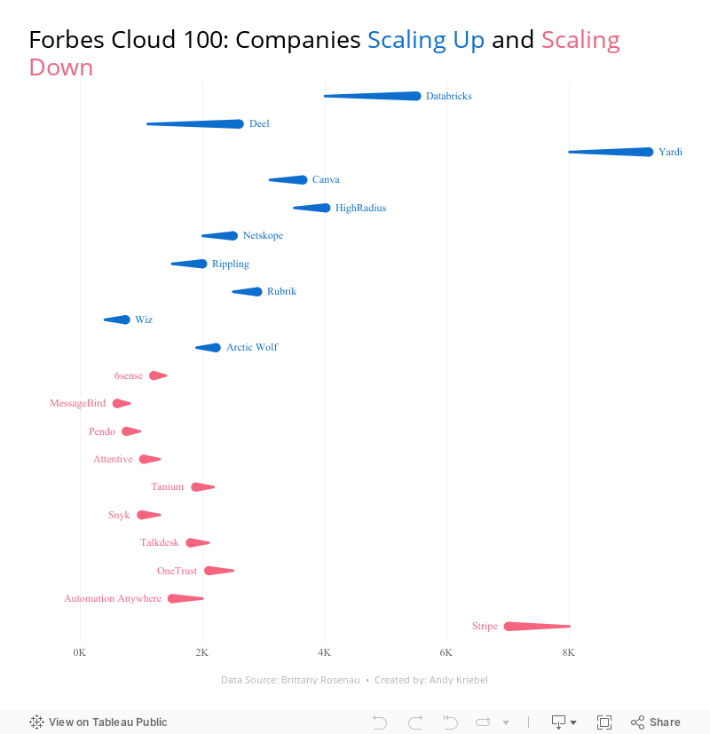
28 Charts in 60 Minutes - Forbes Cloud 100: Companies Scaling Up and Scaling Down
bar chart
,
bar in bar
,
barbell
,
bullet graph
,
butterfly
,
comet
,
comparison
,
dashboard
,
floating bar chart
,
how to
,
lollipop
,
Makeover Monday
,
scatter plot
,
seismogram
,
slope graph
,
tableau
,
tadpole
,
variance
No comments

How many people power the Forbes Cloud 100? Is there a correlation between company rank and employee size? Have they expanded or contracted.
Learn how to build 28 charts in 60 minutes that compare two years.
May 3, 2021
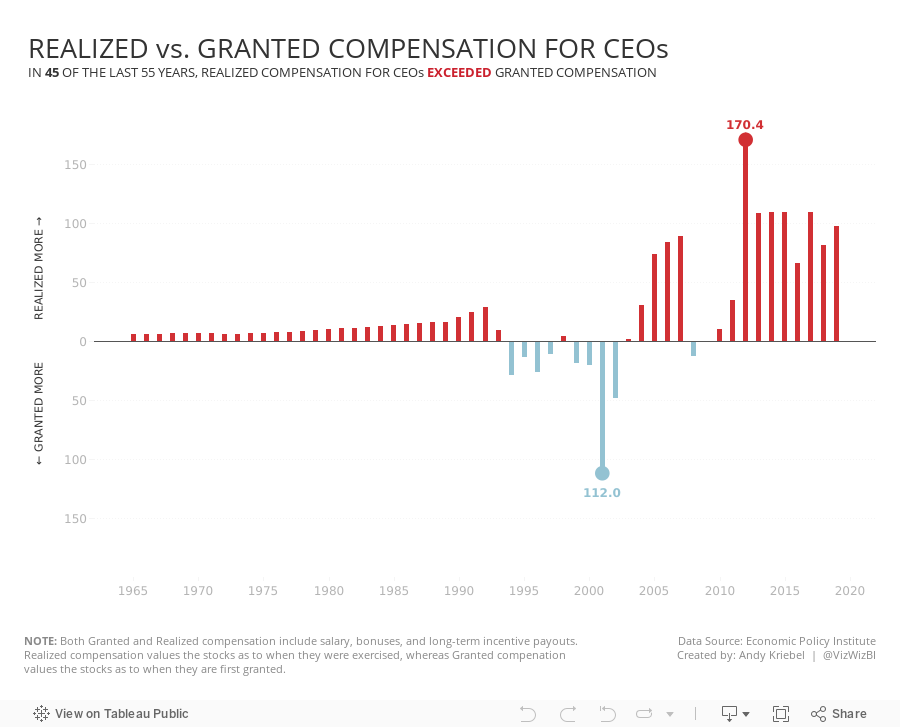
#MakeoverMonday 2021 Week 18 - Realized vs. Granted Compensation for CEOs
analysis
,
bar chart
,
circle timeline
,
comet
,
connected scatterplot
,
dashboard
,
gantt
,
heatmap
,
line chart
,
Makeover Monday
,
reference line
,
slope graph
,
stepped lines
,
tableau
,
variance
,
WatchMeViz
No comments

Charts created:
- Line Chart
- Stepped Lines
- Variance to baseline
- Win/Loss chart
- Comet Chart
- Gantt Chart
- Bar chart w/ reference line
- Connected scatter plot
- Slope Graph
- Circle Timeline
- Heatmap
- Data Set - https://data.world/makeovermonday/2021w18
- Chart chooser - https://datavizproject.com/
Subscribe to:
Posts
(
Atom
)






