April 29, 2024
How to Create a Comet Chart in Tableau
April 18, 2024
How to Create a Donut Chart in Tableau
April 16, 2024
How to Create a Bar-in-Bar Chart in Tableau
April 13, 2024
How to Create a Proportional Stacked Bar Chart in Tableau
Proportional stacked bar charts are a good way of showing the size and proportion of data at the same time.
April 9, 2024
How to Create a Floating Bar Chart in Tableau
A floating bar chart is similar to a Gantt chart, except it shows the range of two data points instead of two dates.
March 22, 2023
How to Master Containers in Tableau

If you use Tableau, you might be wondering how to organize your dashboards effectively. That's where containers come in handy. In this series of videos, I'll cover everything you need to know about using containers in Tableau.
→ I'll explain what containers are and why they're important.
→ I'll show you how to create and customize containers in Tableau, including how to adjust their size and position on the dashboard.
→ I'll demonstrate how to add worksheets to containers and how to control the layout of those worksheets within the container.
→ I'll also cover how to resize containers and how to align them with other objects on your dashboard.
Throughout these tutorials, I'll provide helpful tips and best practices for using containers effectively. I'll also answer common questions you might have about using containers in Tableau, such as how to use containers with filters.
By the end of these tutorials, you'll have a solid understanding of how to use containers in Tableau to organize and present your data effectively. Whether you're a beginner or an experienced Tableau user, this tutorial is sure to help you take your dashboards to the next level.
So, if you're ready to learn how to use containers in Tableau, watch these tutorial now!
March 16, 2023
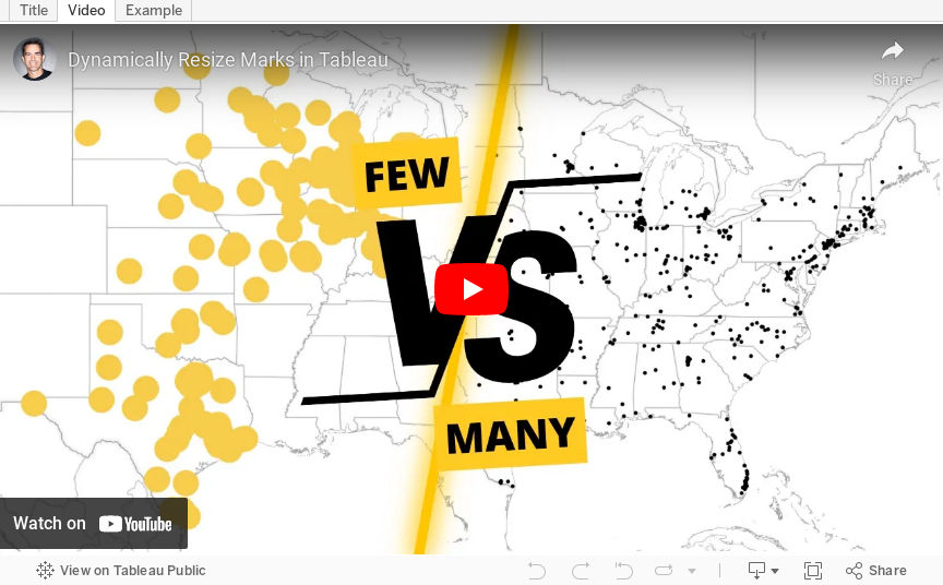
How to Dynamically Resize Marks in Tableau

In this video, I show you how to resize marks (in this case circles) dependent on how many marks are in the view. For example, if all possible marks are in the view (100%), the circles should be small. If only 10% of possible marks are in the view, the circles should be large.
I show how to do this on a map, but it can be extended to scatter plots, box plots, dot plots, jittered bar chart, and more.
February 8, 2022
How to Create an Enclosed Dot Plot
September 7, 2021
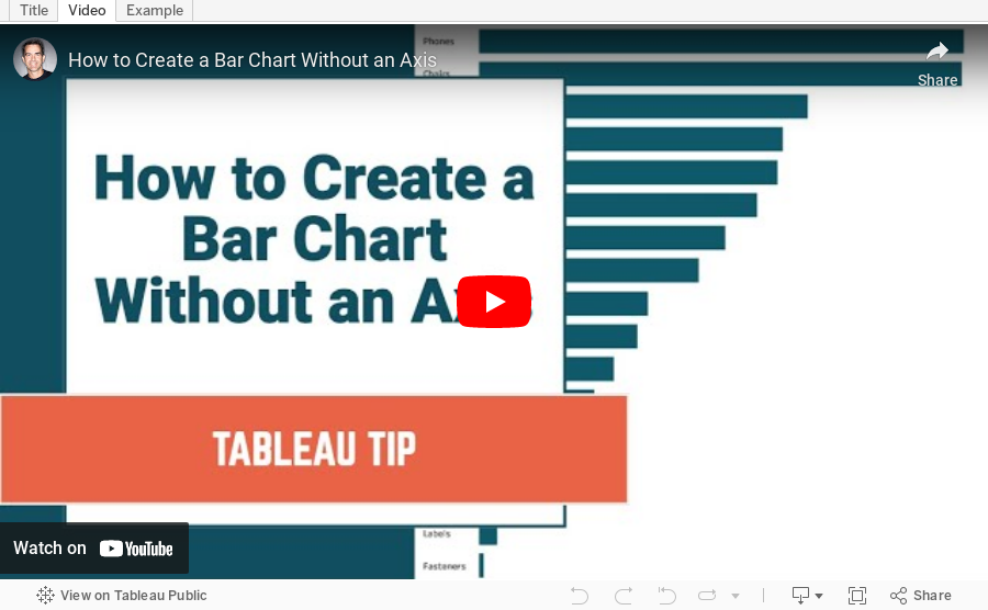
How to Create a Bar Chart Without an Axis
Did you know you can create a bar chart without using the rows or columns shelf? Check out this super simple tip to see how it's done.
April 29, 2021
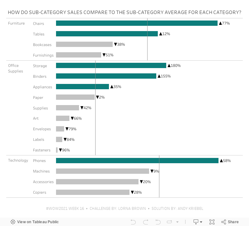
#WOW2021 Week 16 - How Do Sub-Category Sales Compare to the Sub-Category Average for Each Category?

- Create a Quick LOD of Sales by Sub-Category by dropping Sales on top of Sub-Category (hold Command on a Mac while dropping). Since I left the default aggregation of Sales as SUM, this results in this LOD:
{ FIXED [Sub-Category]: SUM([Sales]) } - Change the default aggregation of this new field to average. You have to do this so that at the Category level, you're getting the average of the sales across the sub-categories in each Category.
- Again, create the Quick LOD by holding Command (Control on a PC) and dropping the calc created in step 1 on top of the Category field. This is the resulting calculation:
{ FIXED [Category]: AVG([Sales (Sub-Category)]) }
October 28, 2020
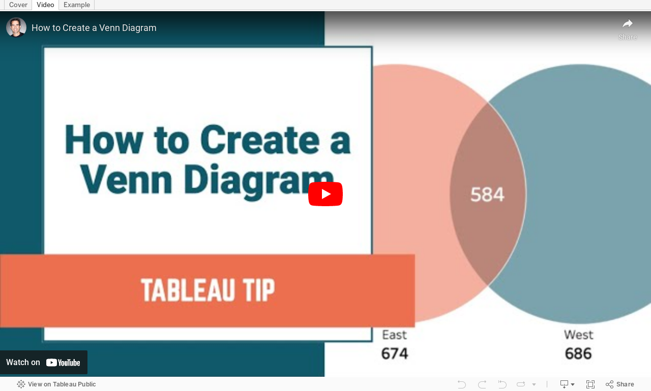
How to Create a Venn Diagram

Venn diagrams (also called Set diagrams or Logic diagrams) use overlapping circles to illustrate the logical relationships between two or more sets of items. They depict how things relate to each other within a particular segment.
For example, how many customers made purchases in the East region, in the West region, and in both regions?
Where the circles overlap, you display text or a value the represents the value associated with the relationship.
I created a Venn diagram for my Visual Vocabulary and while teaching how to create it, I thought of a much simpler way to create them. All of the versions you see online (and the version in the Visual Vocabulary) require you to:
- Create sets
- Evaluate how many things are in each set as an aggregate
- Align the circles according to these values
- Create a calc to display the text for the overlap with a computed set
September 25, 2020
#WorkoutWednesday 2020 Week 3: Orders by Day and Time
As time permits, I'm going back through some of the Workout Wednesday challenges that I've yet to complete. I'm starting with those that will help me most as a teacher to impart what I learn on those that I have the pleasure to train at The Data School.
For week 3, Lorna Brown challenged us to create a viz that shows the number of orders by hour of the day that allows the user to swap between day of the month and weekday.
In her solution, she chose to create two sheets, one for the day of the month and another for weekdays. I didn't know that when I tackled the challenge so I proceeded down the route of doing it all in one sheet. Success!
I did a couple things differently than Lorna:
- I combined the order date and time into a string calculation and then used the DATEPARSE function to make it a date/time field.
- The size of my circles depends on the option selected in the parameter. For day of the month, the size is the number of orders. For weekday, I have them set to a fixed size. I chose to make them a fixed size because otherwise the circles become way too big for the view.
- I used only one sheet.
- I am not showing a tooltip when there are no orders.

April 30, 2019
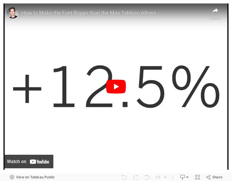
#TableauTipTuesday: How to Make the Font Bigger than the Max Tableau Allows

June 7, 2018
Workout Wednesday: How does sales compare in the Current Period to the Previous?
But I'm back and this week Rody gave us this challenge. Read all of the requirements here.
I had an idea straight away how to do this and in all it took about 30 minutes. The date offsetting took some tinkering, but the rest was pretty easy. I'm glad Rody is back from his hiatus too. His challenges aren't as brutal as Ann's.#WorkoutWednesday Week 23: How do Sales compare in the current period to the previous.— Rody Zakovich (@RodyZakovich) June 6, 2018
Giving a slight twist on some older challenges. Enjoy!https://t.co/gBn05E4gev@lukestanke @AnnUJackson pic.twitter.com/trqc3ZnT3G
Click on the image for the interactive version.

December 6, 2017
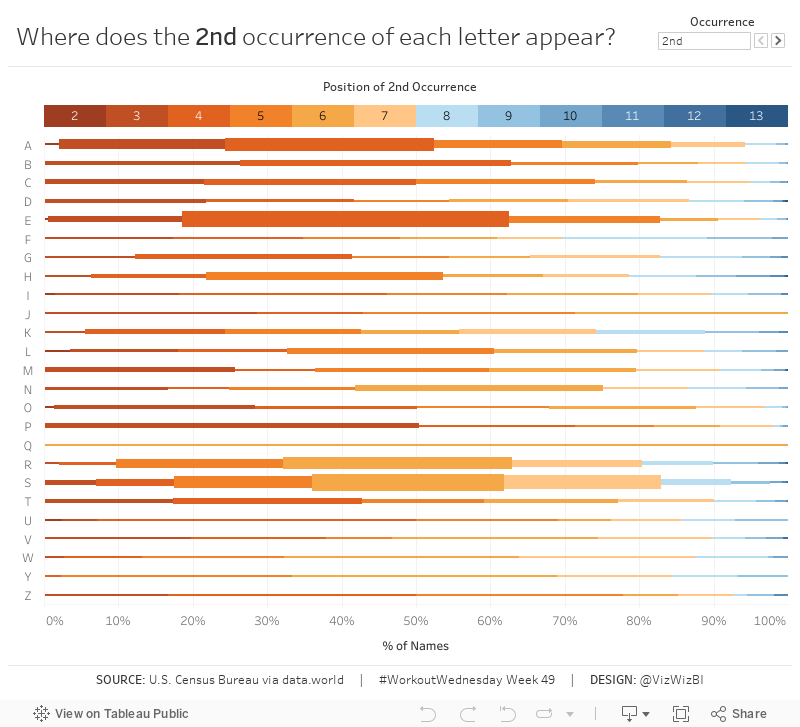
Workout Wednesday: Position of Letter Occurrences in Baby Names
Using this data set of names from the 1990 U.S. census (via data.world), build the same viz that you see below based on this set of requirements:
- The letter down the left is the first letter of the name.
- Determine the % of total times that a letter appears in the nth position of the names. In other words, the letter A appears in the 2nd position in 27 names, which represents 2.1% of names starting with the letter A.
- The viz should NOT display the % of times the letter appears in the first position.
- The % of total display should be sized by the number of names in which the letter appears in each position.
- The scale should show at 10% increments.
- Match the tooltip.
- When you click on a letter/position combination, those names should appear in a table below the chart. The table layout must look like mine.
- Notice how the names in the table are small. This helps them fit better (but not perfectly).
- Match my tooltips on the names table.
- When you deselect a letter/position combination, the table should disappear.
- Create a legend above the chart that reflects the possible positions of the nth occurrence.
- Match the colors on the legend, which should match the colors in the chart.
- When you click on a position in the legend it should highlight that position throughout the chart.
- Match my tooltips on the legend.
- The user must be able to select the nth occurrence they want to view. The options should be 2nd, 3rd or 4th and should look like mine.
- The title must update dynamically to reflect the nth occurrence selected.

May 17, 2017
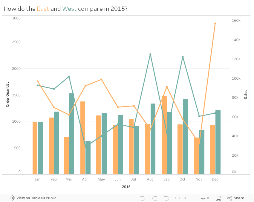
Workout Wednesday: Comparing Regions
Here are the requirements from Emma:
- Dashboard size is 850x650
- Quantity for the East and West regions should display as side-by-side bars
- Sales for the East and West regions should be displayed as lines
- Filtered to 2015 only
- Match the colours and tooltips
- Match the axis labels (abbreviated months)
October 11, 2016
Tableau Tip Tuesday: How to Limit the Number of Marks in a View

In this week’s tip, I show you how to limit the number of marks that are displayed in a visualisation. The example I show will help prevent your users from creating line charts with too many different lines.
September 25, 2015
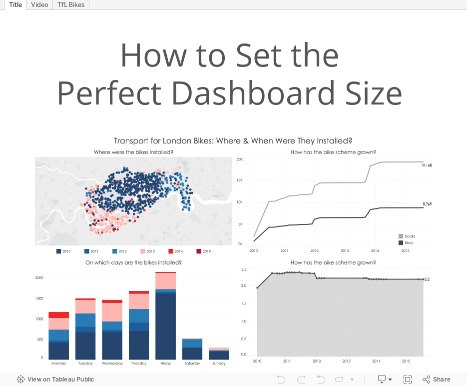
Tableau Tip: Sizing Dashboards | Transport for London Bikes: Where & When Were They Installed?

Below is a dashboard I created for the Transport for London bike scheme. Watch the video on how to get your dashboards to be the “perfect” size. In this video, I used James Dunkerley’s Web Data Connector, which you can find here.
June 2, 2015
Tableau Tip Tuesday: Sizing Worksheets & Dashboards to Fit Perfectly in Story Points

September 23, 2014
Facebook Jeopardy: My users are creating spaghetti charts and I might hurt someone!
This is the first in a series of six blog posts from the Jeopardy questions I answered. Bryan will be posting his solutions on his blog.
To start, here is a video of the final solution as demoed at #DATA14:
- If five or fewer countries are selected, show each country individually.
- If more than five countries are selected, show a summary.
Now let me walk you through how I did this.


