July 25, 2023
18 Ways to Create Bar Charts in Tableau

In this comprehensive Tableau tutorial, I will explore 18 different ways to create bar charts using Tableau. This video is inspired by Rosa Mariana de Leon-Escribano, my colleague at The Information Lab France.
In this tutorial, I will use various techniques to build bar charts that will help you visualize your data effectively. Whether you are a beginner or an advanced Tableau user, this video is designed to cater to all skill levels.
Throughout the video, I will guide you step-by-step, demonstrating each method so that you can follow along. I will help you understand when to use each type based on your data requirements.
By the end of this tutorial, you will have a solid foundation in creating bar charts in Tableau and be equipped with the knowledge to choose the appropriate bar chart type for your data analysis needs.
Rosa's bar chart catalog - Link | My bar chart catalog - Link
May 4, 2023
Tableau Techniques for Top Notch Spatial Analytics

MEMBERSHIP PROGRAM
March 22, 2023
How to Master Containers in Tableau

If you use Tableau, you might be wondering how to organize your dashboards effectively. That's where containers come in handy. In this series of videos, I'll cover everything you need to know about using containers in Tableau.
→ I'll explain what containers are and why they're important.
→ I'll show you how to create and customize containers in Tableau, including how to adjust their size and position on the dashboard.
→ I'll demonstrate how to add worksheets to containers and how to control the layout of those worksheets within the container.
→ I'll also cover how to resize containers and how to align them with other objects on your dashboard.
Throughout these tutorials, I'll provide helpful tips and best practices for using containers effectively. I'll also answer common questions you might have about using containers in Tableau, such as how to use containers with filters.
By the end of these tutorials, you'll have a solid understanding of how to use containers in Tableau to organize and present your data effectively. Whether you're a beginner or an experienced Tableau user, this tutorial is sure to help you take your dashboards to the next level.
So, if you're ready to learn how to use containers in Tableau, watch these tutorial now!
January 26, 2021
Three Methods for Creating Bar Charts that Fill to 100%

September 28, 2020
#MakeoverMonday 2020 Week 39 - Child Marriage Around the World
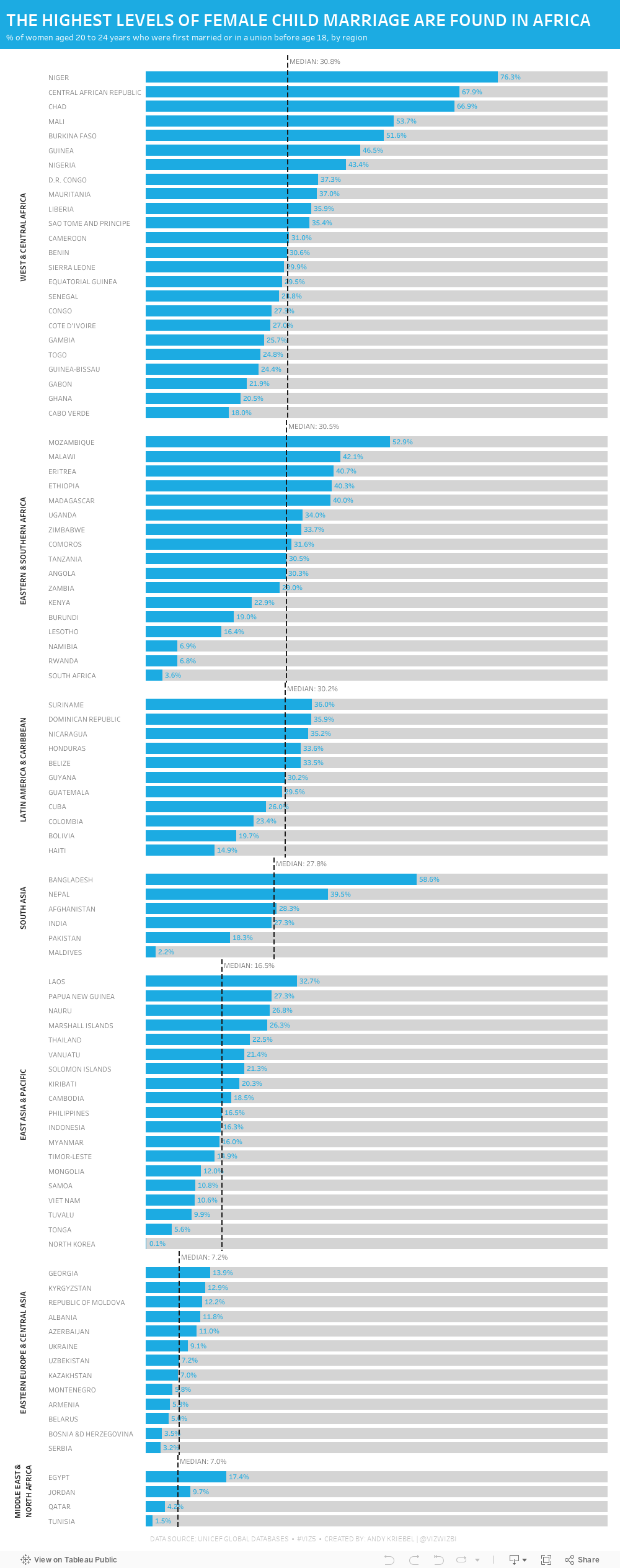
Week 39 brought another #Viz5 topic, this time it was about children that are now 20-24 who were married under the age of 18. Child marriage is, of course, horrific and it's a violation of human rights. Unicef has done an excellent job of recapping all of the issues and why these marriages happen on their website here.
As I've mentioned before, I ALWAYS find these Viz5 data sets tought. I'm not sure why; perhaps I have a mental block on them now. This week the data set was three columns: country, female %, and male %. That can't be too tough...right?
Well, I sure made it tough. First, I joined the data to regional mappings from Unicef so that I could possibly look at the data at the regional level; I decided to use medians for each region in the end. Then I went into Tableau and built a bunch of charts to explore the data. I used chart guides to help me think through options and none of them seemed to make any particularly interesting insights pop out.
After about two hours of nothing, I got the idea of simply looking at the % of females that were married under the age of 18. I ended up with a simple bar chart, which turned out to not be too far from the first chart I created a few minutes in.
Here's the #WatchMeViz video and below is the visualization. Thanks to those that watched live and contributed ideas along the way!! It really helps knowing others are there encouraging me.

April 18, 2017
Tableau Tip Tuesday: FIXED Level of Detail Expressions in a Plain English Sentence

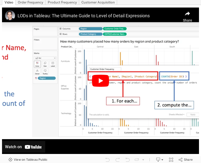
Back in February, I wrote about putting table calculations into an english sentence. This concept can be easily extended to level of detail expressions. As such, I'm going to kick off a series of blog posts that show how to take ANY level of detail expression and turn it into an english sentence.
First up are three use cases for FIXED LODs.
|
| How many customers placed how many orders by region and product category? |
 |
| How many products sell in how many regions by year and quarter? |
 |
| What is the total number of customers acquired by region by day? |
Here's a video of how I created each of the scenarios and the examples for you to download and follow along. Enjoy!
November 17, 2015
Tableau Tip Tuesday: Aligning Time - An Analysis of the Greatest 3-Point Shooters of All-Time
Click on the video tab to see how I built this.
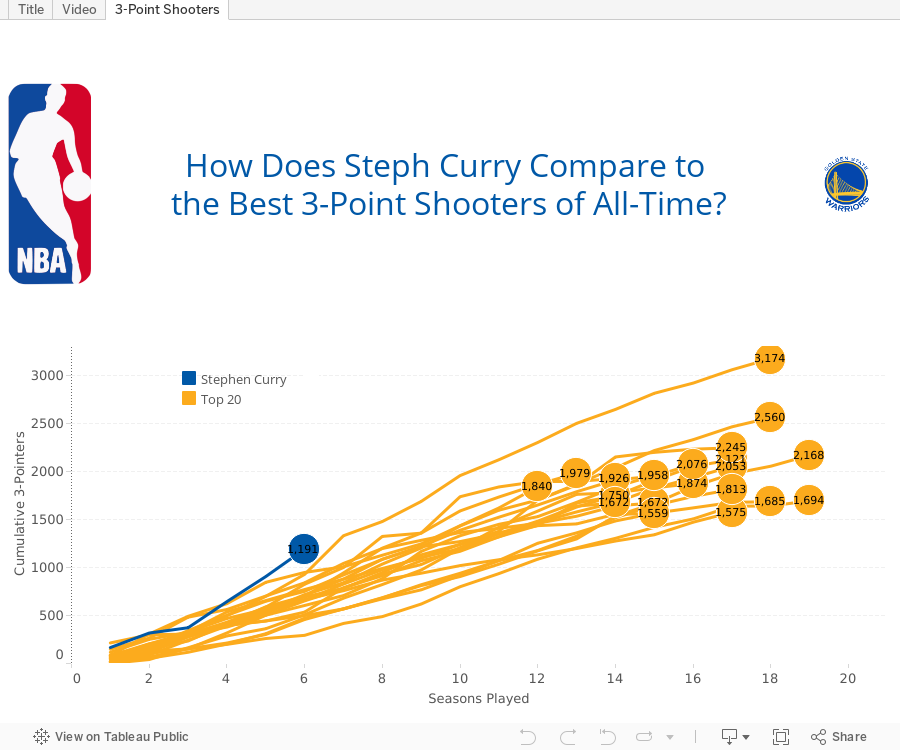
SPOILER: At this point in his career, Curry is far and away the best 3-point shooter of all time.

November 3, 2015
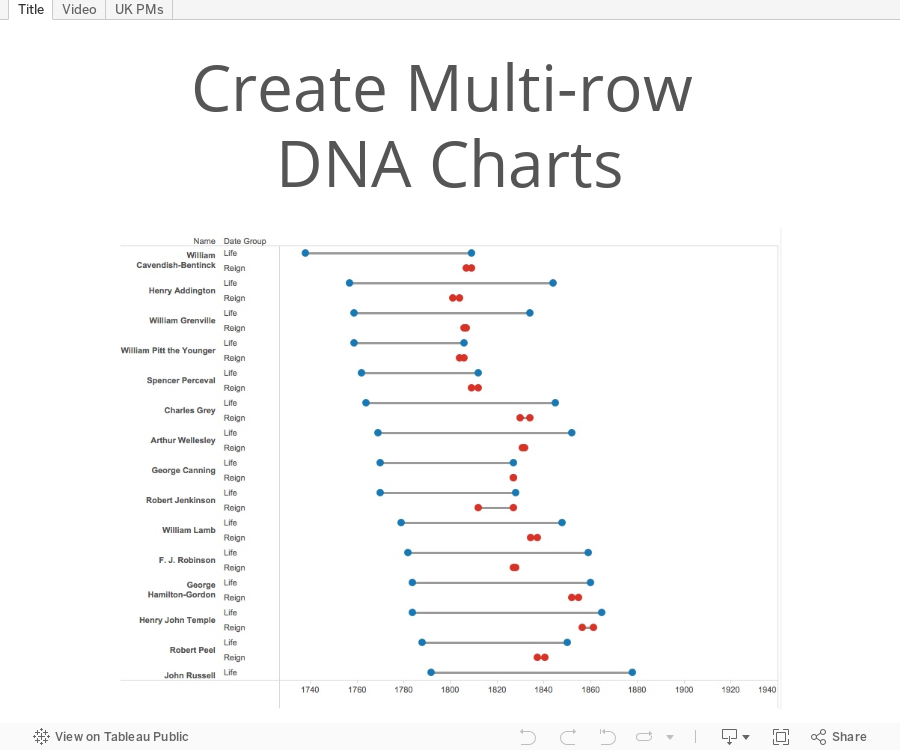
Tableau Tip Tuesday: How to Create Multi-row DNA Charts

This was pretty straightforward, but required using the pivoting capabilities in the connection window.
October 29, 2015
Dear Data Two - The Presentation & Video

Presenting with Jeffrey was an absolute joy! I’d present with him again any time.
Enjoy!
August 18, 2015
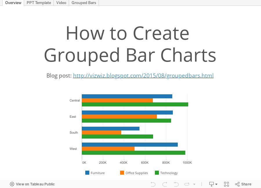
Tableau Tip Tuesday: How to Create Grouped Bar Charts

April 21, 2015
Tableau Tip Tuesday: Star Wars - The Force Awakens (Embedding Audio & Video in a Dashboard)

Just announced at Star Wars Celebration: The Force Awakens Teaser was watched over 88M times in its first 24 hours globally! Thanks to all the fans for a record breaking and truly historic response!
Posted by Star Wars on Sunday, April 19, 2015
Today’s tip is about embedding YouTube videos and Soundcloud audio into a Tableau dashboard. It’s pretty simple. Scroll down below the viz for the instructions. May the Force be with you!
- Drag a Web Page object onto the dashboard.
- When prompted for the URL, you want to grab the embed code:
- Copy the string after the “src=“ and add "?rel=0&showinfo=0” onto the end of it. The URL should look like:

The process for embedding audio is much the same.
- Go to the track on Soundcloud.
- Click on the Share button.
- When the share window appears, click on Embed at the top.
- Scroll to the bottom and click on More Options.
- Choose the size and check the Automatic play box.
- Copy the embed code.
- Select the text after the “src=“ and copy it
- Add a Web Page object onto the dashboard.
- Paste the copied text in the URL box.
That’s it!
March 10, 2015
Tableau Tip Tuesday: Moving Reference Lines Behind Bars
This is a neat little trick that I've put to use many times.
You can download the Tableau workbook used to create this video here (requires Tableau 9).
February 24, 2015
Tableau Tip Tuesday: Creating Bar in Bar Charts

This week's Tableau Tip Tuesday shows you how to create charts with a bar inside of another bar. These are very useful for making comparisons between either two measures (e.g., budget vs. actuals) or two discrete dimensions (e.g., central vs. east).
February 10, 2015
Tableau Tip Tuesday: Creating Basic and Intermediate Pareto Charts

You can download the Tableau workbook here (requires Tableau 9).
January 21, 2015
Tableau Tip Tuesday: How to Create Slopegraphs
Download the workbook used to create this video here.
Related posts:
December 23, 2014
Video Tip: How to quickly add labels to background images in Tableau
First, here is the video and farther down the page are summarized steps with screenshots.
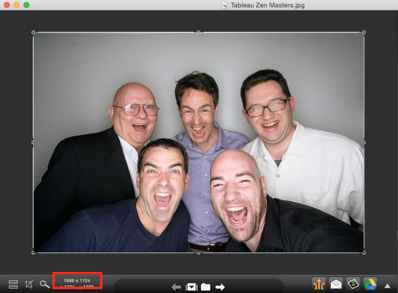
Step 1: Open the background image in a tool like Snagit to get the dimensions. Write the dimensions down.
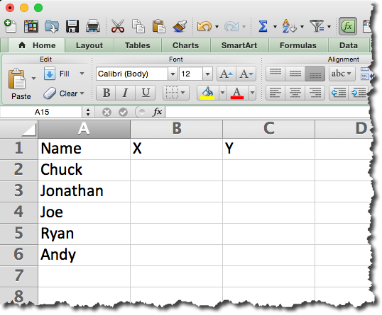
Step 2: Create a data source. In this example, I created the outline of the data source in Excel and left the X/Y coordinates blank.
Step 3: Connect to the data source created in step 2 in Tableau.
Step 4: Change the data type for the X & Y fields to Numbers and move them to the measures area.
Step 5: Add the X field to the Columns shelf and the Y field to the Rows shelf.
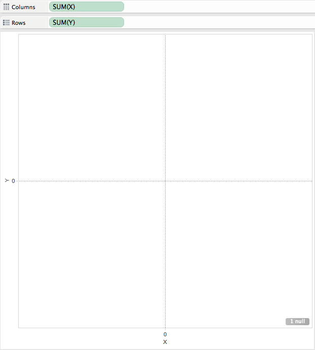
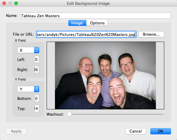
Step 6: Add the background image by going to Map => Background Image => [Sheet Name]. Choose the image and enter the dimensions that you wrote down in step 1 in the Right and Top boxes respectively.
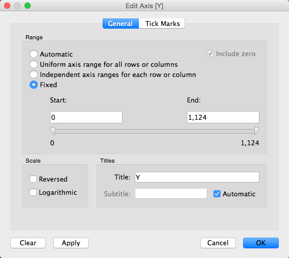
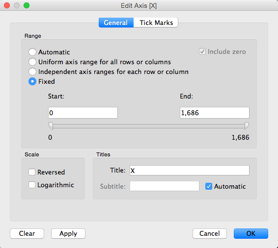
Step 7 (optional): Fix the axes to the size of the image.
Step 8: Hide the axis headers.
Step 9: Drag the Name field to the Label shelf.
Step 10: Annotate a point with the X/Y coordinates.
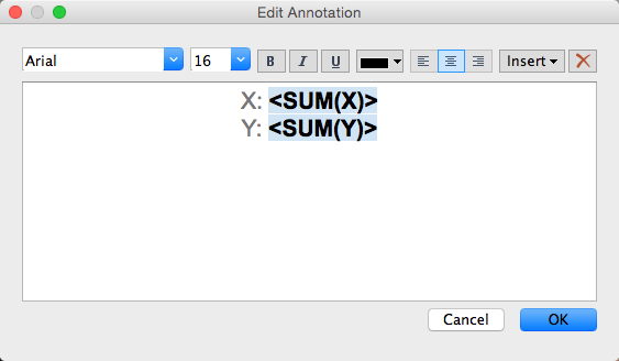
Note how this looks after you hit OK. You can now move the end of the arrow around to get the coordinates of any point in the image.
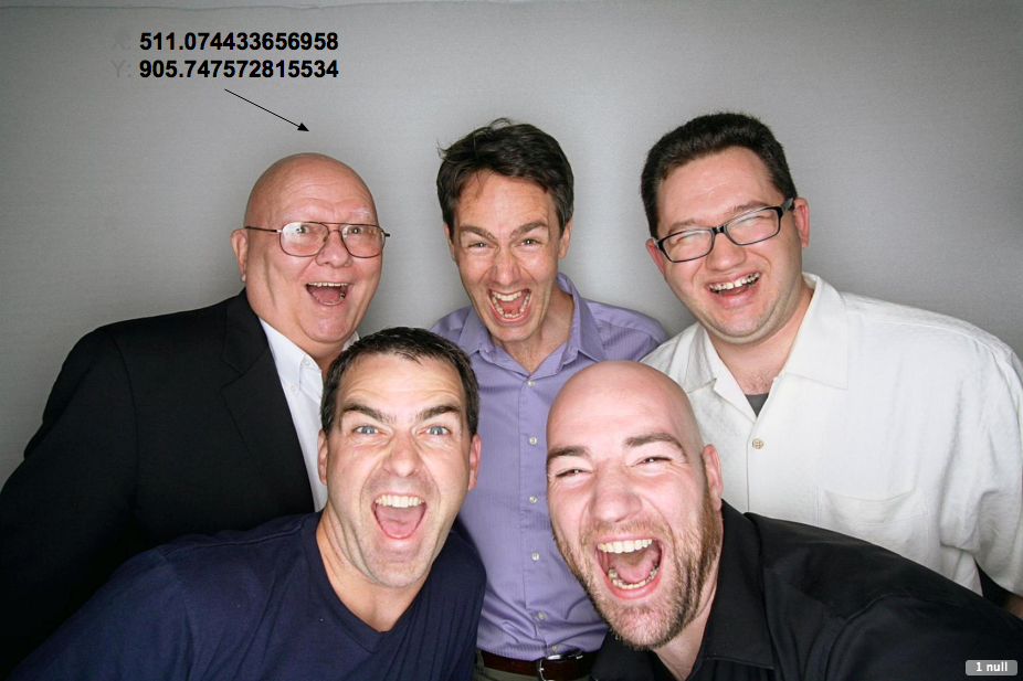
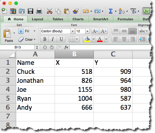
Step 11: Move the end of the arrow around to each place in the image that you want to place a label and enter those X/Y values into the Excel spreadsheet. Save the Excel spreadsheet.
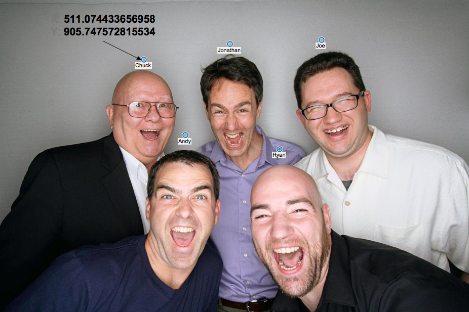
Step 12: Refresh the data source in Tableau and the labels will magically appear above the heads of each person.
Step 13: Remove the annotation.
Step 14: Change the Mark Type to Text and format the text as you see fit. That's it!
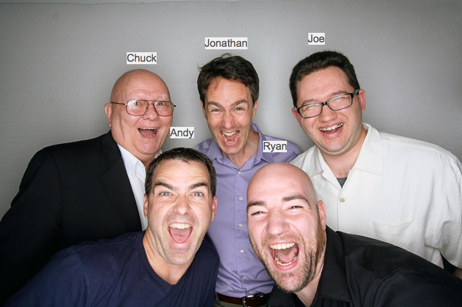
You can download the Excel file here and the Tableau workbook here.
April 2, 2013
Tableau time lapse video - Every photo from the International Space Station
Last week I wrote about how I created a map in Tableau of every photo taken from the ISS. The map with all of the dots is interesting on its own, but a time lapse version is way cooler.
Since Tableau does not support animation via the Pages shelf on Tableau Server or Tableau Public, I created this video so you could see the map of all of the photos build over time. The first ISS mission was on October 31, 2000 and Mission 34 was December 19, 2012. A list of all missions can be found here.
June 8, 2012
Donut charts are worse than pie charts: Have no fear! There are many alternatives.
Ironically enough, donut charts are basically pie charts with a hole in the middle, leaving you with even less information to fill your brain.
Donut charts are used to display data in rings, where each ring represents a data series. Each ring is a distinct category. Yes, there are examples of donuts within donuts (here is a particularly horrific example from Dundas).
Once again, Nielsen provides another example to pick on review. At least their consistent in their ineffectiveness, right?

Pie charts can be effective, rarely, but I don’t see why you would ever use a donut chart over a pie chart. Let’s look at some alternatives to Nielsen’s infographic.
Alternative 1 – Pie Chart

Grade = F
- It’s a pie chart
- It’s a pie chart
- It’s a pie chart
Alternative 2 – Bar chart by Device by Category

Grade = C
- Comparisons between Devices is difficult
- Data is sorted by frequency of using the Device, making it harder to see the winners and losers
- The coloring by Category is distracting
Alternative 3 – Bar chart by Category by Device

Grade = B
- Easy to compare devices, which was the point of the article
- Labels removed since the exact values are not all that important and distract from comparing the size of the bars
- Devices are sorted by frequency within each Category, making it easy to see the winners and losers in each Category
- The colors neatly segment the data
Alternative 4 – Heat Map

Grade = A
- Easy to compare all of the data at once, whether you want to look vertically, horizontally or both.
- A heat map makes it clear that people use their computers at home to watch video most frequently and that people watch a LOT of video, independent of the device.
- The colors are impactful and provide rich meaning, while not overwhelming your eyes.
Alternative 5 – Highlight Table

Grade = A+
- You get all of the benefits of the heat map, but you also get the values, providing additional detail.
These are only five of the many possible alternatives. Download the Tableau workbook here.
Would you use any of these charts to visualize this data? Why or why not? What other alternatives would you find effective?
November 4, 2011
Download the TCC11 Session Materials
TCC11 has passed, but everyone in attendance is anxious to get their hands on all of the great presentations, workbooks, etc. For those of you not able to go, now I’m making them available to you as well. Enjoy!
Session Materials
We packed the 2011 schedule with so many great sessions and learning opportunities that it may have been difficult to choose which session to attend. Visit our conference content page to watch the video recordings and download session materials. We will be adding more materials as they become available.
Save the Dates for our 2012 Tableau Customer Conference
European Customer Conference – April 2-4, 2012: W Hotel, Barcelona, Spain – apply to speak
North American Customer Conference – November 5-8, 2012: Hilton Bayfront, San Diego, CA
April 4, 2011
A Nielsen Table Improved - Number of Americans Watching Mobile Video
A blog post from Nielsen says:
According to a new mobile video report from The Nielsen Company, the number of U.S. mobile subscribers watching video on their mobile devices rose more than 40 percent year-over-year in both the third and fourth quarters of 2010, ending the year at nearly 25 million people.
They presented their results with this table:

What’s wrong here?
- Their summary says watching improved in both the third and fourth quarters of 2010, but why isn’t Q3 09 on the table?
- Why do they include Q3 10 if they don’t include the quarter to quarter comparison?
- The table is quite dark and dreary, with unnecessary color
I would reformat the table like this.

I have:
- Added Q3 09 along with quarter over quarter comparisons (% diff on the right) and year over year comparisons (% diff at the bottom)
- Removed any unnecessary color
While Nielsen’s report says “the number of U.S. mobile subscribers watching video on their mobile devices rose more than 40 percent year-over-year in both the third and fourth quarters of 2010”, they fail to point out that growth has actually slowed in 2010, both quarter over quarter and year over year.
Bottom line, be careful what you read. I hope not, but Nielsen may have intentionally left out Q3 09 to paint a better picture.






