August 6, 2025
Tableau Tutorial for Beginners (2025)

Want to learn Tableau fast?
Start with this beginner-friendly tutorial where I'll show you how to import data, clean it, build your first interactive dashboard, and share your dashboard—all using Tableau Desktop.
📚 RESOURCES• 📂 Sample Excel file to follow along (thanks Kevin Stratvert)
• 📊 Workbook 📺 RELATED VIDEOS
• Mastering Containers
• 370 FREE Tableau Tutorials 📩 NEWSLETTER
Each week, I'll send you Tableau tips, tutorials, and strategies to design better dashboards, have more impactful, and stand out in your career: https://nlt.kit.com/ 🔽 CONNECT WITH ME
• Official website
July 8, 2024
Build an interactive Tableau dashboard in 3 minutes!

Build 80% of your dashboards with these 4 charts, a bit of interactivity, and that's it.
You probably won't need to create anything fancy, formatting will be minimal, and you won't need to wrestle with containers.
This video show you how to create it in only 3 minutes!
June 28, 2024
How to Replace a Datasource & Fields in Tableau

Need to change a datasource but don't want to rebuild the workbook? Has a field name changed?
It can be a real pain to update each sheet in a workbook one by one.
Conveniently, Tableau allows you to change the entire datasource with the "Replace Datasource" option.
Or, if you only need to change a field, Tableau has an option called "Replace References" that allows you to swap one field out for another all in one shot.
In this example, I take you through the whole process.
You could also apply this method when you simply want to swap out all existences of one field for another.
For example, you want to change all used of Order Date to Ship Date.
Easy peasy!
March 5, 2024
11 Steps to Create KPIs & Sparklines in the Same Sheet in Tableau

Want to cut the number of sheets you need in your KPI dashboard in half? These 11 simple steps will get much closer.
Steal the calcs to speed up your work.
P.S. If you like tips like this, remember to follow me on LinkedIn so you're notified about everyting I post. Content curated just for you, 3 times daily.
October 31, 2023
How to Create a Year→Quarter→Month→Day Drilldown in Tableau

Are you looking to take your Tableau skills to the next level? Do you want to create dashboards that offer a dynamic and interactive experience?
Look no further!
This comprehensive tutorial will walk you through the process of creating a Year→Quarter→Month→Day Drilldown in Tableau.
🔹 What You'll Learn:
1. How to set up 2 parameters for drilldown functionality
2. How to perform 9 simple calculations that power your dashboard
3. How to implement 8 simple dashboard actions for enhanced interactivity
4. Introduction to dynamic zone visibility
🔹 Who Should Watch:
1. Data analysts looking to expand their Tableau toolkit
2. Business intelligence professionals aiming for dynamic reporting
3. Anyone who wants to unlock the full potential of Tableau
🔹 Why This Tutorial is Unique:
1. Step-by-step guide for each component: Parameters, Calculations, and Dashboard Actions
2. Introduction to advanced Tableau functionalities like dynamic zone visibility
3. Reusable examples to cement your understanding
4. Tips and tricks for maximizing the utility of your drilldowns
Don't miss out on upgrading your Tableau skills.
Let's dive into the world of advanced Tableau functionalities and take your dashboards to the next level!
October 24, 2023
Master Containers: Build an Interactive Tableau Dashboard From Scratch

October 10, 2023
Fix Your Broken Worksheet Actions in Tableau Dashboards

Ever wonder why your worksheet actions don't seem to play nicely when incorporated into a Tableau dashboard? You're not alone!
Everyone that starts using Tableau faces this hiccup, often leading to unnecessary hours of troubleshooting.
The answer is simpler than you think: change the worksheet action to a dashboard action!
In this tutorial, I'll walk you through this straightforward switch, step-by-step.
This will save you loads of time and frustration.
September 4, 2023
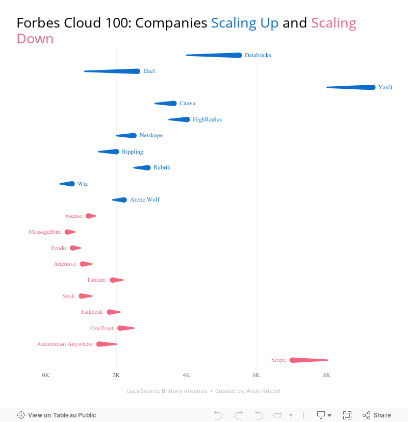
28 Charts in 60 Minutes - Forbes Cloud 100: Companies Scaling Up and Scaling Down

How many people power the Forbes Cloud 100? Is there a correlation between company rank and employee size? Have they expanded or contracted.
Learn how to build 28 charts in 60 minutes that compare two years.
August 1, 2023
How to Use ANY Tableau Public Dashboard as a Template for FREE!

Have you ever spotted a great dashboard on Tableau Public and wished you could repurpose it for your own data?
Look no further! 🌟
In this video, I'll guide you through the easy steps of using dashboards on Tableau Public as templates.
From downloading the workbook to swapping out the data and troubleshooting errors, learn how to quickly create dashboards in minutes.
Note: Ensure that you're respectful of original creators' work and provide appropriate credits or mentions when using their dashboards.
Get the data and python code to create your own mock data here - Link
Priya Padham's dashboard - Link | My dashboard - Link
July 31, 2023
#MakeoverMonday 2023 Week 30 - Drinking Fountains in Milan

You'll learn about:
- Joining spatial data sources
- Parameters
- Hexbin maps
- Custom shapes
- Using mapbox maps
- Dashboard layout containers
- Dynamic Zone Visibility
- Parameter Actions
- Custom colors
- Drill down / drill up actions
Enjoy the video and check out the viz below.
July 4, 2023
Create 10 ACTIONABLE & IMPACTFUL KPIs in Tableau

What is a KPI?
KPIs are measurable values that indicate how well a business is performing in achieving its key objectives and goals. They provide a clear and concise snapshot of critical areas within a business.
KPIs help to:
Monitor progress
Identify areas of improvement
Make data-driven decisions
In order to do this, KPIs must be tailored to specific goals and strategies.
Making KPIs Actionable
Here are 8 suggestions to ensure that KPIs are actionable and impactful.
Align with business objectives
Focus on relevance and simplicity
Set measurable targets
Collect accurate and timely data
Visualize your KPIs
Regularly review and update
Add context
Drill down
Actionable KPIs are vital for measuring performance and achieving results. You can drive your business forward by aligning data with goals and simplifying and visualizing KPIs effectively
Read more about KPIs in my newsletter here. Sign up so you don't miss any future newsletters at andykriebel.com.
⏬ DOWNLOAD the data, and starter and solution workbooks here. I would appreciate your support to continue making videos for you.
June 20, 2023
Tableau Tutorial for Beginners | Create Your First Dashboard

Learn how to use Tableau and created impressive dashboards.
Tableau is easy to use, but it can seem quite complex and confusing at first. The best way for you to learn Tableau is to download the files from the description of this video and follow along with me.
By the end of the video, you will have a much better understanding of Tableau and be confident that you can build dashboards on your own.
I'll take you step-by-step and show you how to create, publish and share your first interactive Tableau dashboard.
I'll cover:
- Tableau's welcome screen
- Connecting to data
- Making visuals
- Creating a dashboard
- Adding interactivity
- Publishing to Tableau Server
- Sharing with others
By the end of the video, you'll have created your first interactive Tableau dashboard which you can publish to the web or to your company's Tableau Server. I'll also show you how you can share your Tableau dashboard with others.
⏬ DOWNLOAD the data, and starter and solution workbooks here.
I would appreciate your support with a small donation to continue to make videos for you.
Sign up for my newsletter to get advance, exclusive viewing of all of my videos, tips for using Tableau, and exclusive discounts on products I create.
June 12, 2023
#MakeoverMonday 2023 Week 24 - Cereal and the Green Revolution: Yields vs. Land Use

At the global level, how has crop production changed over the last fifty years?
In this Watch Me Viz live stream, I analyzed how the yield and land use of producing cereal has changed over the last 50 years.
I really liked the original visualization, so I rebuilt it in Tableau. I learned how to use dynamic zone visibility, layout containers, and more. Check it out.
Resources:
1. Data - https://data.world/makeovermonday/2023w24
2. Final Dashboard - https://tabsoft.co/3P3Sdl3
===============
Watch Me Viz is a weekly live stream where I help people become better at #Tableau, #PowerBI and data analysis. I show how I take an existing visualization, critique it, analyze the data, and build several visualizations all the while looking for a "better" visualization than the original.
If you are considering participating in Makeover Monday, you can get started by downloading data sets from the Makeover Monday website. I promise you'll become better at data analysis and data visualization by practicing every week.
Data sets - https://www.makeovermonday.co.uk/data/
===============
LEARN FROM ME
Join my newsletter. Sign up at andykriebel.com.
ARE YOU INTERVIEWING FOR A NEW JOB?
Contact me for more information about how I can help you prepare for that big interview.
===============
CONNECT WITH ME
More Watch Me Viz - https://bit.ly/WatchMeViz2023
June 6, 2023
Mastering TABLEAU Dashboards from Scratch

This comprehensive video will help you create business dashboards that are more actionable and meaningful and that your users will find easy to use at first glance. You’ll be on your way to being a dashboarding expert!
You’ll learn:
- Building basic charts
- Formatting fundamentals
- Using layout containers
- Dashboard formatting
- Essential tips for padding
- Filter controls
We'll create an interactive sales dashboard for Adidas in Tableau that's going to dynamically update based on the filters on the side of the dashboard which will allow us to select specific years, regions, products, and more.
⏬ DOWNLOAD my preferences file, the data, and starter and solution workbooks for £2 (this covers the costs of making this and future videos):
https://andykriebel.gumroad.com/l/adidassalesdashboard
Sign up for my newsletter to get advance, exclusive viewing of all of my videos, tips for using Tableau, plus exclusive discounts on products that I create.
https://andykriebel.com/
May 23, 2023
Make an Awesome TABLEAU Dashboard in Just 10 Minutes

In this video we'll build a dynamic Tableau dashboard from scratch in just 10 minutes. We'll create a sales dashboard for Superstore’s European region.
1️⃣ We’ll create all of the charts which include a map, bar chart, line chart, and KPIs.
2️⃣ We’ll customize the charts to fit our style.
3️⃣ We’ll place the charts on the dashboard using layout containers, padding, formatting and more.
4️⃣ We’ll add interactivity to the dashboard to make for a great user experience.
DOWNLOAD the data and starter and solution workbooks (this covers the costs of making this and future videos):
https://andykriebel.gumroad.com/l/10-minute-dashboard
I would appreciate your support, however, if you want the Excel file for free, download it here:
https://data.world/vizwiz/superstore-europe
Want early access to my upcoming videos like this one? Sign up for my newsletter. Every Friday morning, you'll get actionable tips to launch, grow, and unlock your career in data.
Sign up here.
March 22, 2023
How to Master Containers in Tableau

If you use Tableau, you might be wondering how to organize your dashboards effectively. That's where containers come in handy. In this series of videos, I'll cover everything you need to know about using containers in Tableau.
→ I'll explain what containers are and why they're important.
→ I'll show you how to create and customize containers in Tableau, including how to adjust their size and position on the dashboard.
→ I'll demonstrate how to add worksheets to containers and how to control the layout of those worksheets within the container.
→ I'll also cover how to resize containers and how to align them with other objects on your dashboard.
Throughout these tutorials, I'll provide helpful tips and best practices for using containers effectively. I'll also answer common questions you might have about using containers in Tableau, such as how to use containers with filters.
By the end of these tutorials, you'll have a solid understanding of how to use containers in Tableau to organize and present your data effectively. Whether you're a beginner or an experienced Tableau user, this tutorial is sure to help you take your dashboards to the next level.
So, if you're ready to learn how to use containers in Tableau, watch these tutorial now!
January 30, 2023
#MakeoverMonday 2023 Week 5 - Where can you find a cheap slice of pizza in New York City?

- Prepare the data: calculations, joins, spatial intersections, and more
- Create maps: hexbin maps, map layers, spatial joins, using maps as shapes
- Create line charts and heat maps that are simple and effective (don't overcomplicate things)
- Build a dashboard using layout containers
December 6, 2022
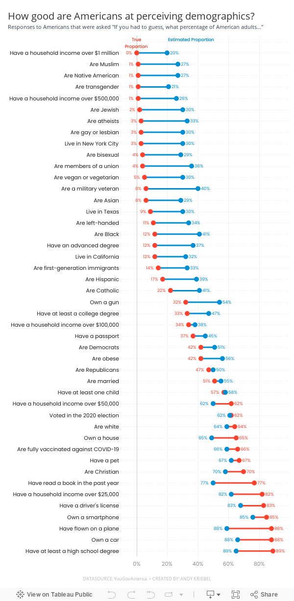
#MakeoverMonday Week 49 - How good are Americans at perceiving demographics?

- Barbell chart with dots on the ends and a line connecting them
- Coloring the lines by the larger value
- Choosing the colors
- Formatting the view (except the labels)
- Labeling the dots/ends of the lines; this took several iterations on the calculations
- Creating the color legend as headers; I had to use reference lines, turn on totals, move the totals to the top, then work on the formatting to get them close. They still aren't perfect.
- Creating the horizontal reference lines; this required me to create a dummy axis
September 19, 2022
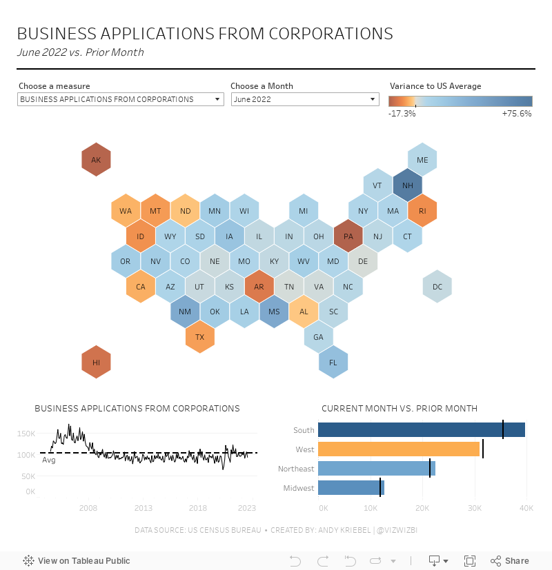
#MakeoverMonday Week 38 - American Business Applications

September 12, 2022
#MakeoverMonday 2022 Week 37 - Berkshire Hathaway Holdings

During Watch Me Viz, I covered set actions, parameter actions, highlighting, boolean calculations, table calculation, dashboard layout, and I failed at a starburst chart (I couldn't get the years to sort properly; I'll post it when I figure it out).
Enjoy! Check out the viz below the video.


