September 12, 2022
#MakeoverMonday 2022 Week 37 - Berkshire Hathaway Holdings

During Watch Me Viz, I covered set actions, parameter actions, highlighting, boolean calculations, table calculation, dashboard layout, and I failed at a starburst chart (I couldn't get the years to sort properly; I'll post it when I figure it out).
Enjoy! Check out the viz below the video.
July 26, 2021
#MakeoverMonday 2021 Week 30 - America's Racial Breakdown by State

Makeover Monday week 30 looked at this viz from Visual Capitalist showing the percentage of each race in each State in America.
In the video below, you'll see my recreate the tiled treemap before creating a tiled bar chart. Thanks for watching!
Click here to view the interactive version on Tableau Public.

July 12, 2021
#MakeoverMonday 2021 Week 28 - COVID Vaccination Rates by Ethnicity and Age in England

June 22, 2021
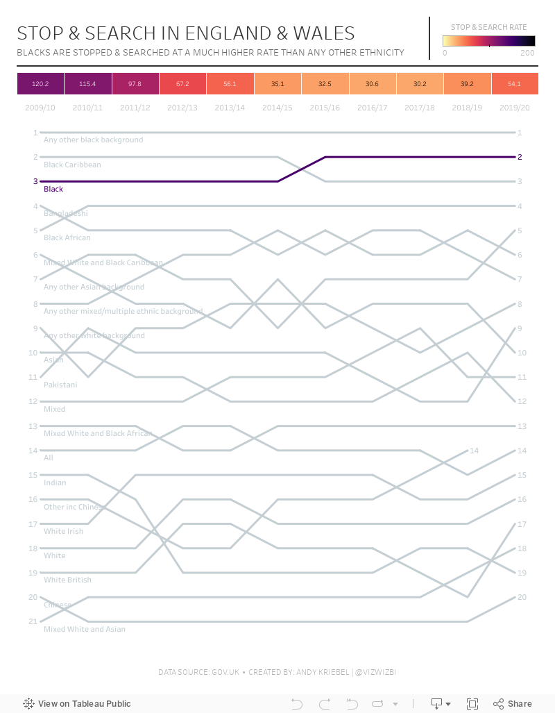
#MakeoverMonday 2021 Week 25 - Stop & Search in England & Wales

November 4, 2018
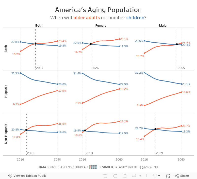
Makeover Monday: America's Aging Population

The original visualization is from the US Census Bureau:

What works well?
- The title above the charts tells us the insights in the data. This is a very effective technique.
- The colors work well together.
- Labels for the ages are well-placed and colored to represent the lines
- Labeling the start and end of the lines
- Hiding the axis but still leaving the axis title
- Including the note about the 2016 data
What could be improved?
- Remove the title at the very top, the entire blue section
- Make the footer less prominent; it's competing with the viz for attention when it should be secondary
- Kill the bar chart; it looks strange have axis labels for every five years, but then only showing the data for a set of years
- Remove the dots on the lines except for the start, end and where the lines cross
- Remove the vignette shading behind the charts
What I did
- I like the idea behind the line chart, so I used that as my starting point.
- I pivoted the data by age, then created age groups that match the original (under 18 and 65+).
- I wanted to compare ages and origins for the two age groups to see if the crossing of the populations is consistent (spoiler, it's not).
- I wanted to add focus to the year the lines cross. I did that by adding a black dot on that year and by including a reference line.
- I kept the labeling of the start and end of each line.
- While the population in total gradually shifts towards the older generation, the split between hispanic and non-hispanic does not follow the same pattern.
- Older hispanics will likely outnumber hispanic children between 2070 and 2075, whereas non-hispanic older people will outnumber non-hispanic children much sooner.
- The female population is shifting much more quickly to the older generation than males.
July 10, 2017
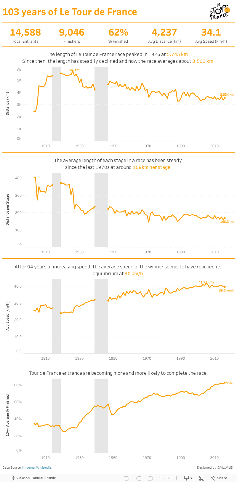
Makeover Monday: The History of Le Tour de France
If you're particularly bored, here's a recording of my screen for the whole hour.
Ok, still awake? Hopefully you enjoyed my Spotify playlist at least. This week's viz that we're reviewing is knomea.

What works well?
- Clear titles
- Line chart is easy to understand
What could be improved?
- Don't use dual axis area charts and not make it clear which is which
- The dual axis chart implies correlation when there may or may not be any.
- Why the blue background? This makes me think it means something.
- Labeling the axis every 33 years is a bit odd (pun intended)
- The connected lines make it look like race occurred during the World Wars.
- Tell more of a story. When I ask "so what?", I can't answer it.
I'm pressed on time, so here's my Makeover Monday week 28. Enjoy!
November 24, 2016
From London to New York in 500 miles | My New York City Marathon Training Visualized
Like most runners, I love my running data! My watch syncs to Tom Tom, Runkeeper, Strava and Nike+. Why all of them? Well, why not? Naturally, I wanted to see how my training went. Was it effective? How'd I do in my long runs? How often did I run? What was my average pace? The questions are endless.
I'm also in the middle of testing a new Web Data Connector for Strava that brings back A TON of information about each run. Mix all of this together and you get a dashboard of my marathon training.
Click on the image for the interactive version (it's too wide for my blog). Once you're there, you can click on any activity and see the map update with the route of each run. The activity will also be highlighted across all of the charts.
And yes, I got the data from Strava yet I'm using Runkeeper colors. I simply like their colors better. Enjoy!

February 8, 2016
Makeover Monday: How Many Blacks Did the Police Kill in 2015?

This week's Makeover Monday was much harder than I anticipated and I must note that it took me way, way over an hour to create something I was happy with (more about that in a bit). The website that we reviewed had a series of three charts about police killings in the United States. I'll focus on the first two:

What works:
- Good title and subtitle
- Bars are sorted properly
- Using a rate is good practice because it normalizes the data
- Using a different color of the U.S. average
What doesn't work:
- I hate charts that make me turn my head sideways to read the labels.
- I would have the U.S. average as a reference line.
- There's no sense for the rest of the population.
- It feels like there's more to the story.
Ok, so how about the second chart:
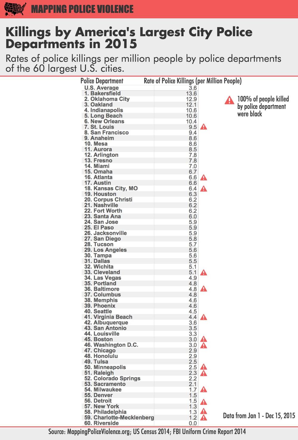
What works:
- Good title and subtitle
- Ranking the police departments
- Using a rate is good practice because it normalizes the data
- Calling out those that police departments that have only killed blacks
What doesn't work:
- I almost didn't notice the U.S. average (it's above the first police department).
- The column headers should wrap so they fit better.
- Again, it feels like there's more to the story.
- The table makes comparing police departments harder than necessary.
A quick bit of background before we get to my viz. Last week, we brought Caroline Beavon to the Data School to teach an infographics and information visualisation course. I would highly, highly recommend the course. It was a perfect blend of the courses that Andy Kirk and Cole Nussbaumer teach if you've ever been to their classes. We learned a ton about knowing your audience, choosing the aim for your visualisation and picking out the proper story in the data. In addition, we designed several infographics, which is something I was particularly excited to put into practice this week. With that being said, here's is my makeover of the two original charts, but really, it's completely different and delves much deeper into the story the data is trying to tell.
You can download the workbook from Tableau Public here.
August 7, 2013
Where did they come from? How did they do? Visualizing results from the Summer Breeze Half/10K/5K
This past Saturday, 1,589 runners/walkers participated in the Summer Breeze Half/10K/5K, put on by Brazen Racing. At the end of the race and on their website, when you want to find your time, you look it up on a table like this:

This is great when you simply want to find yourself and see where you placed, but it doesn’t give you any insight into the entire race. Being the data nerd/runner that I am, I wanted to know more. Who are the runners? What do we know about them? Where are they from? How do different demographics perform? Did certain areas in California produce faster average times?
To answer these questions, I downloaded the data and created this race results visualization. Go ahead…click around, look for patterns, get a feel for the race.


