August 30, 2024
How to Create a Win/Loss Sparkline

Check out the workbook here.
September 19, 2022
#MakeoverMonday Week 38 - American Business Applications

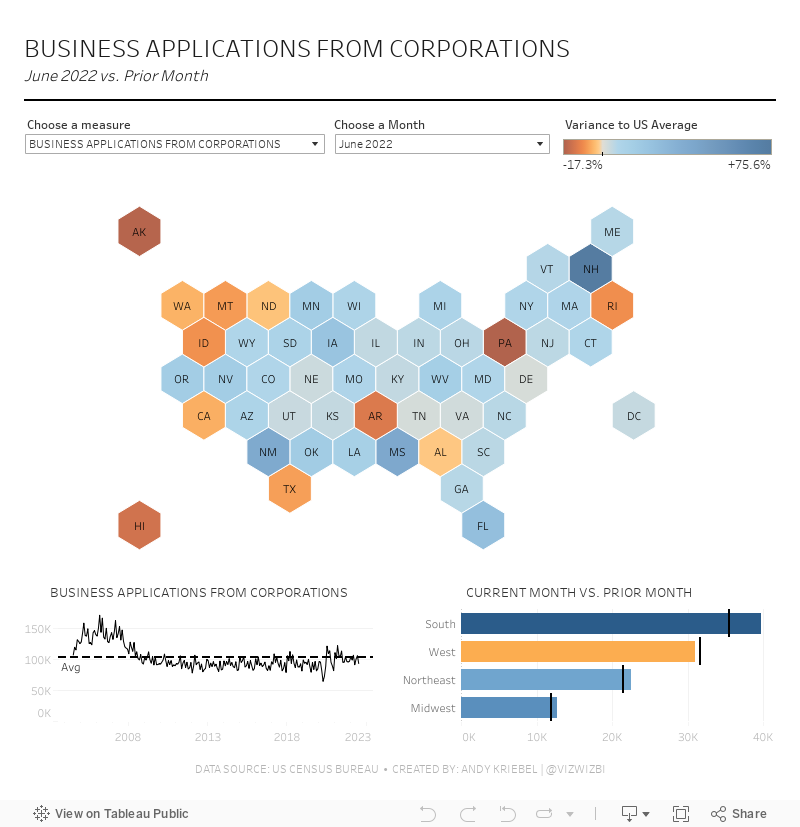
October 29, 2020
How to Create Time Series Tile Grid Maps

Unlike traditional maps, tile grid maps allow you to allocate equal space to each geographical area. We've probably all seen hex maps of the United States. Tile Grid Maps are similar, except they are squares with each block being the same shape and size.
In this video, I show you first how to create the tile grid map, then how to overlay time series data. I then show you three different visualization types for the time series. You could easily create bar charts as well.
Enjoy!

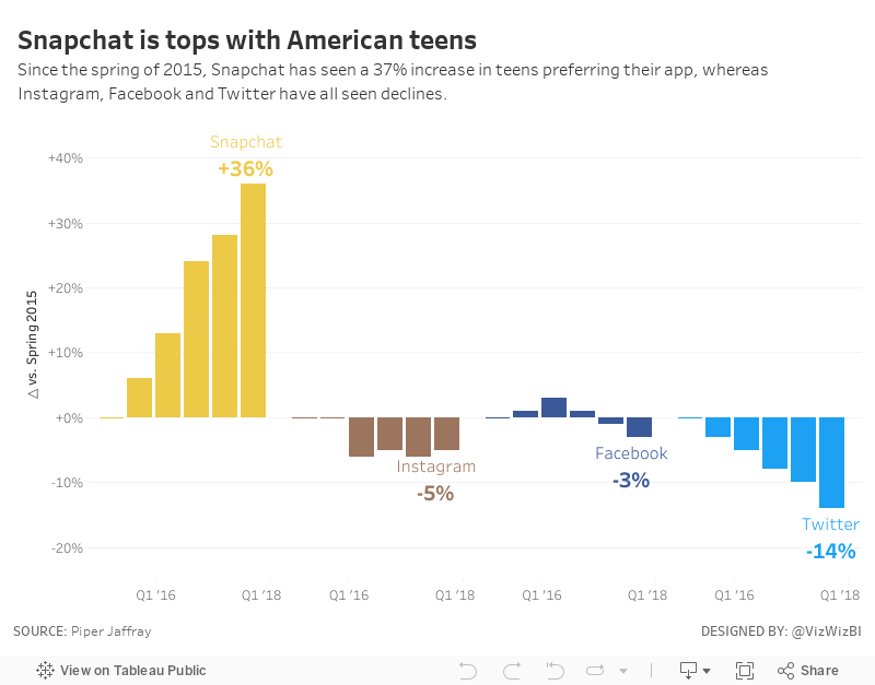
November 20, 2017
Makeover Monday: Snapchat is tops with American teens
The original viz comes to us from Business Insider:

What works well?
- Catchy title that quickly tells the story of the viz
- Bar charts are simple to understand and they show the pattern well
- Sorting the apps by the most recent value
- Including the axis, otherwise we wouldn't know what the labels mean on the top of the bars
What could be improved?
- The fading colors across the time periods are unnecessary. Include a time axis instead.
- Change the numbers above each bar to percentages
- The color legend doesn't match any of the bar charts and should be removed.
My Ideas
This tells the story simply, but also doesn't show enough of the change over time. Next, I took the original and turned it into a line chart, labeling only the start and the end and also changing the colors to match the official colors of each app.
I think the line charts help make the change and trends much more obvious than the bar charts in the original. From there, I decided to look at the change since the starting period (spring 2015) to make the growth or decline of each app easier to understand. And with that, here's my Makeover Monday week 47.
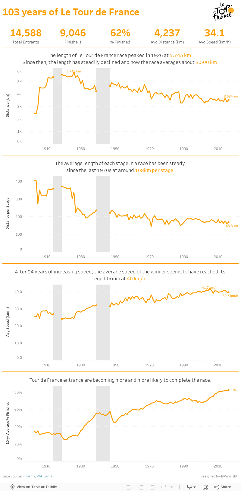
July 10, 2017
Makeover Monday: The History of Le Tour de France
If you're particularly bored, here's a recording of my screen for the whole hour.
Ok, still awake? Hopefully you enjoyed my Spotify playlist at least. This week's viz that we're reviewing is knomea.

What works well?
- Clear titles
- Line chart is easy to understand
What could be improved?
- Don't use dual axis area charts and not make it clear which is which
- The dual axis chart implies correlation when there may or may not be any.
- Why the blue background? This makes me think it means something.
- Labeling the axis every 33 years is a bit odd (pun intended)
- The connected lines make it look like race occurred during the World Wars.
- Tell more of a story. When I ask "so what?", I can't answer it.
I'm pressed on time, so here's my Makeover Monday week 28. Enjoy!
June 5, 2017
Makeover Monday: America's Most Visited National Parks
For week 23, we are looking at the popularity of America's National Parks. As an American, I've learned to cherish the amazing, free natural wonders sprinkled around the country. In particular, when we lived in California, we made it a point to visit Yosemite, Joshua Tree and the Grand Canyon amongst other places. They truly are worth a visit.
The viz that we are making over this week comes from FiveThirtyEight and it really quite fantastic, like most of their vizzes.

What works well?
- Great use of highlighting
- Including gridlines to help guide the eye
- Noting the source
- Nice use of a bump chart
- Shows patterns really well
- Subtitle explains how to interpret the viz
- Colors are distinct enough to follow through the viz
What could be improved?
- The title is very boring.
- Lack of interactivity
- How can I identify a park that's not highlighted? It would be nice to have a way to choose another park to highlight.
- The top 6 parks are highlighted, but why are the others highlighted? It seems pretty random.
- While this shows me the most popular parks, it lacks the context of how many visitors and how that has changed over the years.
What were my goals?
- Focus on the top 25 parks
- Focus on the last 50 years
- Include the visitors to provide more context when comparing parks
- Use a small multiples layout and try to recreate this viz that I highlighted on Data Viz Done Right
- Include the total visitors somewhere so the reader doesn't have to figure it out
- Create the entire viz in a single view (except the footers)
But then I had another question in my head: At State level data, how many States account for 80% of all visitors? For this, I created a simple Pareto chart. Two vizzes for the prices of one! Enjoy! Click on either image for the interactive version.
May 8, 2017
Makeover Monday: Which cars do the Dutch prefer?
The viz to makeover this week is merely a table:

What works?
- The table is ranked starting with the best seller.
- Including only the top 10 gives the table focus.
- Title gives us the overall summary for context.
What could be improved?
- Include a more impactful title
- How does this compare to prior years?
- The table makes me do math in my head to compare the top cars.
- Simply by making the table a bar chart it would become more engaging.
- Some of the models are missing the brand.
- How are purchases changing over time?
- What car brand do people prefer? Has that changed?
- How has the price per car changed over time?
- What's the most popular color?
- If I were moving to the Netherlands and needed to buy a car, what should I buy?
- When is the best time to buy a car? Conversely, when is the most expensive time?

I used Coolors.co to upload the images and pick off the colors. I then added these to my preference file. I created a regular color palette that included the green and a sequential palette for the more brown colors. Overall, I want to mimic this layout, replacing the text with charts as much as I can.
Lastly, I really like the storytelling and design of Pooja Gandhi's week 16 viz, so I wanted to emulate parts of that and also use this an exercise to see how long it may have taken her. HINT: It took me hours to float everything and get it just right. It sure would be easier if there was a grid to snap everything into.
Another fun week, one in which I feel like I learned a lot about design. With that, here's my week 19 visualisation about car purchasing in The Netherlands. Click on the image for the interactive version.
January 20, 2017
London Crimes: Exploring the Trends, Locations and Crime Types
Sasha Pasulka has been a good friend of mine for many years and is moving to London from the US soon in her new role with Tableau. Like anyone else that’s moving to a new country, she finds the entire process is ridiculously overwhelming. Trying to find apartments from thousands of miles away, not knowing anything about neighbourhoods, can be an incredibly daunting task. To help her, I decide to build a viz in Tableau.
I started by using the London Crimes web data connector from Tableau Junkie, only to realise that it’s somehow not returning all of the data. It looks like it returns the data via a radius versus for an entire postcode.

No worries though. Instead I went to data.police.uk and downloaded all crimes from the Metropolitan Police Service. This returned a separate CSV for each month and it also wasn’t limited to just the London area. On the London Datastore I was able to find a list of all LSOAs in the London area. Great! All I needed to do was union all of the CSVs then join them to the London LSOAs. I love that I can do all of this straight inside Tableau now.

From there, it was a matter of building a simple visualisation that allows Sasha to pick boroughs and see the crimes in those areas. Note that I set the map to only display when there are 3 or fewer boroughs selected. did this because the map was simply too slow to draw the dots. Hopefully she likes it and makes it easier for her to settle in.
May 4, 2011
Who’s visiting the VizWiz?
I started this blog 624 days ago on August 17, 2009 with the goal of helping others (and me) learn best practices for data visualization. There have been many twists and turns and the backlog of blog posts has gotten quite long. The breadth of the audience of this blog worldwide has both fascinated and humbled me. 145 blog posts later, here are the stats, visualized of course.
The bubbles are sized based on the rank of the country for the stat & time frame chosen. The color is based on the stat chosen.
Thanks for the visits and comments. I learn a lot from your feedback.
October 7, 2009
Cell Phone Usage
Here is how AT&T presents the data:

Icky, icky! Where are the dates? I can't tell the difference between some of the bars. Why are long distance and roaming included? You'd never be able to see them anyway. Why not use a simple line graph?

Come on AT&T, get your act together. Although I suspect these were created by a developer that only knows how to use the default graphs in Excel and thought "Oh, I can make these so pretty with the 3D bar charts."
Why the big spike in September? Conference calls...boooooo!
September 16, 2009
Why was Dave Stewart picked on?
THE RULES WERE CHANGED!
So what happened? In 1988, the Oakland Athletics led the majors with 76 balks or just over 8% of the total. 1988 accounted for 37% of the A's balks from 1985-2008...that's ridiculous!
Dave Stewart set a record with 16 balks. Order was restored in 1989 and Dave Stewart had zero balks. I do remember Dave Stewart going to the plate quickly, so maybe it was the change in the rule that says "the pitcher must come to a single complete and discernible stop" that got him.

September 3, 2009
A correlation justified
The first chart presented by Chris (via Nielsen) analyzes video game usage trends over the last four years. I don't think this chart proves anything more than the fact that video game usage has increased year over year for the last four years...that's it. You simply can't say that the upswing in time spent playing video games in 2009 is due to the recession.

The second chart tries to make the same correlation, but again, I see the same type of trend from 2007-2009 that you see in the first chart. People are just playing more variety of games...that's all. There is absolutely no way from this chart to draw a conclusion that used video game sales are in any way related to the recession.

Ok, so how can I say that it's just a matter of fact observation? Look at this chart (created with Tableau). If you look at the four year trend of hours played, there is a continuous increase is hours played. You might say "I don't see this in 2009." But in each year in May, you see a big decrease in hours played. As Chris says in his evaluation: "May has traditionally seen a drop-off each year (blame the improving weather)." I can see the reasoning there.
You can also see that from 2007-2009, a similar trend can be derived from used game sales.

I tried to find a correlation between hours played and used game sales (since the article says both are related to the recession), but the facts don't support this.

I decided to look at other factors that could correlate the recession to video game hours played to help support Chris' argument. We have been hearing quite a bit regarding the housing crisis and it's impact on the economy. I gathered economic data from FRED and was able to demonstrate that a prolonged decrease in housing starts does indeed indicate that a recession is coming.

My next step was to identify correlations between housing starts and the increase in video game hours played. Based on this analysis, I believe that a much stronger argument can be made the an increase in hours played is a possible indication that a recession is taking place. I set the "hours played" scale to match the Nielsen Data.

I find the color-coding of the years very useful and, to me, the relationship can be clearly seen. As housing starts decrease, video game hours player per week decrease. Since the years are color-coded, you can tie them back to the housing starts/recession trend chart above.
What's the bottom line? I agree with Chris that there is a relationship between video game hours played and the recession, but the way to get there is much more conclusive if you use economic indicators to support the theory.


