Showing posts with label popular. Show all posts
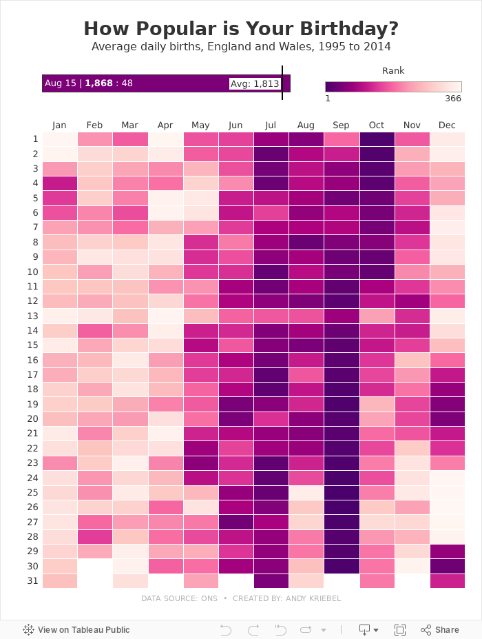
August 15, 2024
How Popular is Your Birthday?
birthday
,
births
,
data analysis
,
heat map
,
heatmap
,
popular
,
rank
,
tableau
No comments

Click on your birthday to see how popular it is.
June 5, 2017
Makeover Monday: America's Most Visited National Parks
area chart
,
bump chart
,
fivethirtyeight
,
Makeover Monday
,
national parks
,
pareto
,
popular
,
rank
,
small multiples
,
trends
,
United States
,
USA
5 comments
For week 23, we are looking at the popularity of America's National Parks. As an American, I've learned to cherish the amazing, free natural wonders sprinkled around the country. In particular, when we lived in California, we made it a point to visit Yosemite, Joshua Tree and the Grand Canyon amongst other places. They truly are worth a visit.
The viz that we are making over this week comes from FiveThirtyEight and it really quite fantastic, like most of their vizzes.

What works well?
- Great use of highlighting
- Including gridlines to help guide the eye
- Noting the source
- Nice use of a bump chart
- Shows patterns really well
- Subtitle explains how to interpret the viz
- Colors are distinct enough to follow through the viz
What could be improved?
- The title is very boring.
- Lack of interactivity
- How can I identify a park that's not highlighted? It would be nice to have a way to choose another park to highlight.
- The top 6 parks are highlighted, but why are the others highlighted? It seems pretty random.
- While this shows me the most popular parks, it lacks the context of how many visitors and how that has changed over the years.
What were my goals?
- Focus on the top 25 parks
- Focus on the last 50 years
- Include the visitors to provide more context when comparing parks
- Use a small multiples layout and try to recreate this viz that I highlighted on Data Viz Done Right
- Include the total visitors somewhere so the reader doesn't have to figure it out
- Create the entire viz in a single view (except the footers)
But then I had another question in my head: At State level data, how many States account for 80% of all visitors? For this, I created a simple Pareto chart. Two vizzes for the prices of one! Enjoy! Click on either image for the interactive version.
May 14, 2012
How common is your birthday? Find out exactly with an interactive heat map.
birthday
,
common
,
interactive
,
Matt Stiles
,
NYTimes
,
popular
,
tableau
43 comments

Matt Stiles posted a heat map on his blog yesterday that I thought was pretty well done. I decided to get the data from NYTimes.com and recreate it in Tableau.
It takes under 20 seconds and under 10 clicks to create it in Tableau, more like 15 seconds if you’ve been using Tableau longer.
Matt chose a brownish color palette, but I wanted to try lots of different colors. Tableau makes is incredibly simple to try out many options very quickly. I tested green, blue, gray and orange-blue palettes before settling on an orange palette. For my eye, the orange palette made distinguishing the colors easiest.
Creating this as an interactive viz in Tableau allows you to provide the reader/viewer/interactor with more information. Hover over your birthday and you will see exactly where it ranks. Try it!
In a static version, you’re left to guess at the approximate range in which it falls.

- Matt struggled with getting the colors just right using Illustrator. With Tableau, it’s all built in. There’s no need to tinker.
- Doctors apparently don’t like having their vacations disturbed. Check out how around major holidays (July 4th, Thanksgiving, Christmas) there a fewer babies born.
- September clearly has many of the top days (in fact it has all of the top 10), but July and August aren’t far behind. It looks like people conceive during all of those Thanksgiving, Christmas and New Year’s parties.
- A reader noted that the 13th seems to be least common on average. Perhaps that’s because many people see that as an unlucky day.
Subscribe to:
Posts
(
Atom
)


