April 28, 2026
How to Count Only Weekdays Between Any Two Dates in Tableau (No Excel Needed)

Stop doing this in Excel. Tableau has a cleaner, more powerful way to count only the weekdays between any two dates. And once you see how it works,you'll use it everywhere.
In this tutorial, you'll learn how to build a dynamic date range selector using parameter actions, then strip out Saturdays and Sundays using DATEPART weekday logic wrapped in a Level of Detail expression, so you always get an accurate weekday count, no matter the range.
This is one of the most common questions I get asked, and the solution is simpler than you think.
📥 Download the workbook + data: https://nlt.kit.com/weekdays
October 21, 2025
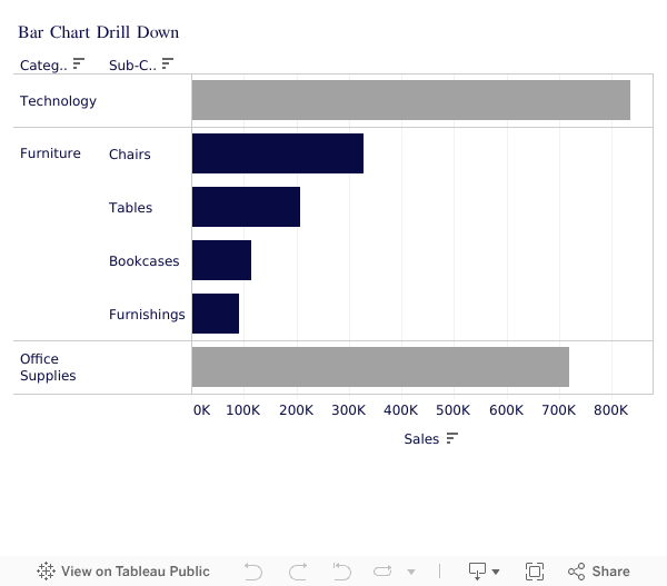
How to Drill Down in Tableau Using Set Actions (Bar Chart Tutorial)

Unlock Powerful Tableau Drill Downs With Set Actions 🔍
If you’re still clicking around dashboards trying to “fake” a drill down — stop! In this video, I’ll walk you step-by-step through how to use Set Actions in Tableau to build a fully interactive bar chart drill down.
👉 Start here to level up faster:
Tableau Starter Kit → https://www.nextleveltableau.com/starterkit
Core Concepts Course → https://www.nextleveltableau.com/tcc
Next-Level Tableau → https://www.nextleveltableau.com/
I’ve helped thousands of Tableau analysts move from frustration to clarity using features like this — and once you master Set Actions, your dashboards will finally work like your users expect them to.
📌 If you’re ready to stop confusing your users and start building cleaner, smarter dashboards… you’re in the right place.
See how it all works below the video.
March 19, 2025
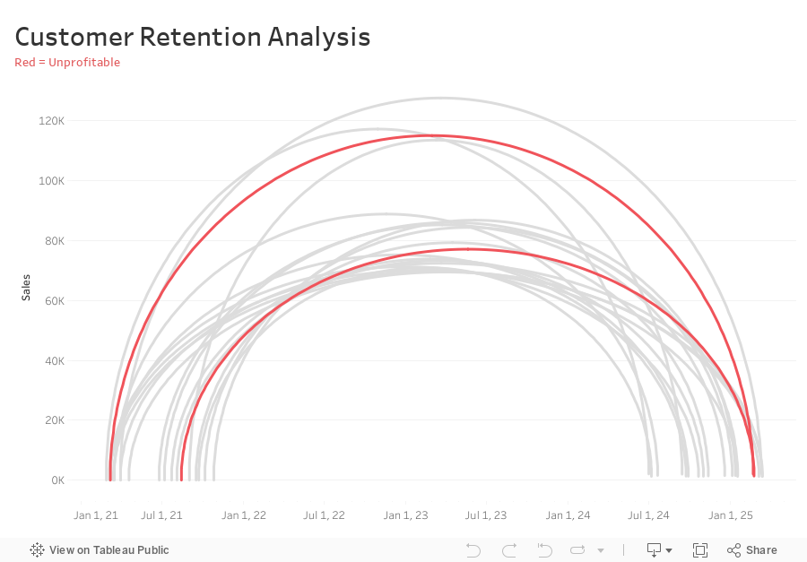
How to Analyze Customer Retention with a Jump Plot

-
Connect sales data source to 180 points and relate “1” to “1”
-
Compute Min Date by customer
{ FIXED [Customer Name] : MIN([Purchase Date]) } -
Compute the Max Date by Customer
{ FIXED [Customer Name] : MAX([Purchase Date]) } -
Filter customers that made more than one order (Max Date > Min Date)
[Max Date]>[Min Date] -
Create Customer Length calc
DATEDIFF('day',[Min Date],[Max Date]) -
Create Columns calc (continuous dimension)
DATE( ((COS([Point] * PI() / 180)) + 1 ) * (FLOAT([Max Date])-FLOAT([Min Date])) / 2 + FLOAT([Min Date]) ) -
Create Rows calc (continuous dimension)
SIN((MIN([Point])) * PI() / 180) * SUM([Sales]) -
Add Columns and Rows to viz
-
Add Customer to Detail
-
Add Path to Path
-
Create Profitable calc and add to Color
{ FIXED [Customer Name] : SUM([Profit])}>0
August 15, 2024
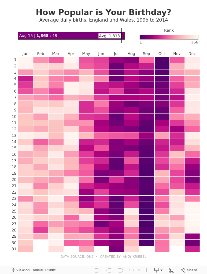
How Popular is Your Birthday?

Click on your birthday to see how popular it is.
May 1, 2024
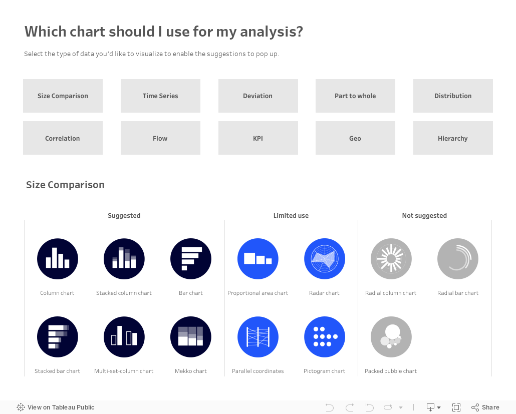
Which chart should you use for your analysis?

Over on Tableau Public, Judit Bekker create this fantastic directory of charts to help you pick the one that's most appropriate for your analysis.
Check it out below.
April 21, 2024
How to Create Custom Date Hierarchies in Tableau
April 10, 2024
How to make sense of ANY data set
Demystify ANY data set by answering 5 simple questions:
- When?
- Where?
- Which?
- Who?
- Why?
----------
P.S. Newsletter subscribers get a deeper dive into each of these for FREE when they sign up. Go to andykriebel.com to get yours.
March 27, 2024
8 Reasons Power BI isn't "FREE"
What are joins?
Fundamentals of Joins by Andy Kriebel
November 14, 2023
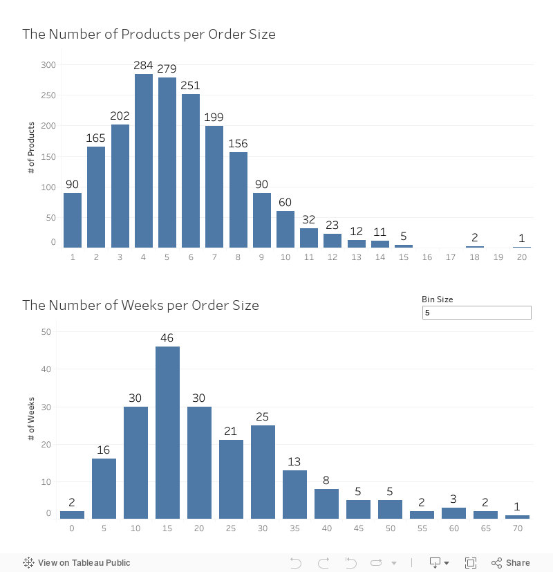
Harnessing Histograms for Data Analysis in Tableau

Explore the full spectrum of data visualization with Tableau histograms and the Data Guide feature!
This comprehensive video tutorial takes you on an exploratory journey from the basics of histograms to the advanced insights offered by Tableau's Data Guide.
In this instructional video, you will:
- Grasp the concept of histograms and their role in revealing data distributions.
- Tailor bin sizes and intervals in Tableau for customized data analysis.
- Utilize Tableau's Data Guide to enhance your understanding and interpretation of histograms.
- Apply your knowledge for practical learning.
Additionally, I'll walk you through the Data Guide in Tableau - a powerful feature that aids in decoding your data's story, ensuring you're not just seeing data but truly comprehending it.
By the end of this tutorial, you'll not only master the creation of histograms in Tableau but also leverage the full potential of the Data Guide to make informed decisions.
Download the workbook here.
June 6, 2023
Mastering TABLEAU Dashboards from Scratch

This comprehensive video will help you create business dashboards that are more actionable and meaningful and that your users will find easy to use at first glance. You’ll be on your way to being a dashboarding expert!
You’ll learn:
- Building basic charts
- Formatting fundamentals
- Using layout containers
- Dashboard formatting
- Essential tips for padding
- Filter controls
We'll create an interactive sales dashboard for Adidas in Tableau that's going to dynamically update based on the filters on the side of the dashboard which will allow us to select specific years, regions, products, and more.
⏬ DOWNLOAD my preferences file, the data, and starter and solution workbooks for £2 (this covers the costs of making this and future videos):
https://andykriebel.gumroad.com/l/adidassalesdashboard
Sign up for my newsletter to get advance, exclusive viewing of all of my videos, tips for using Tableau, plus exclusive discounts on products that I create.
https://andykriebel.com/
March 16, 2023
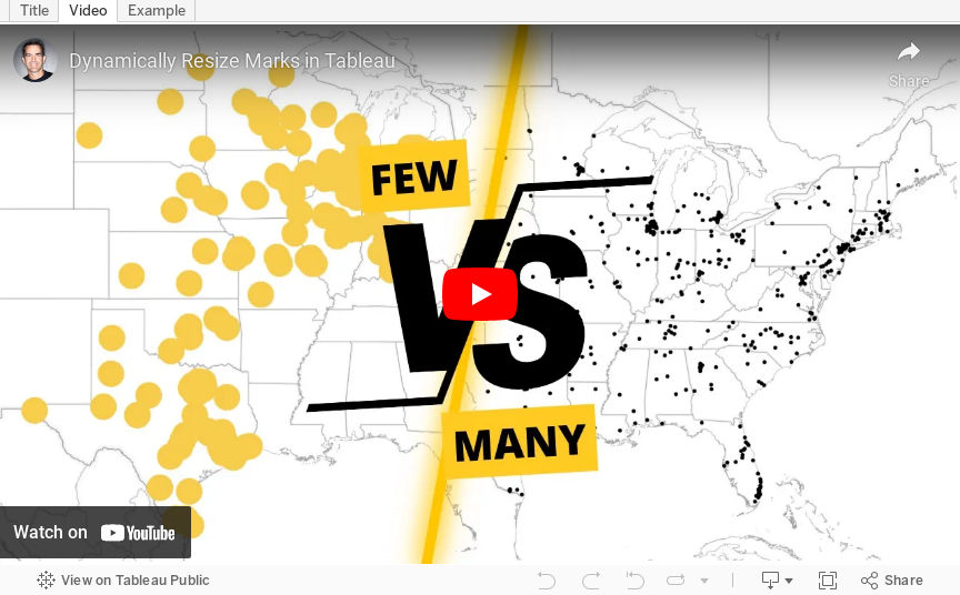
How to Dynamically Resize Marks in Tableau

In this video, I show you how to resize marks (in this case circles) dependent on how many marks are in the view. For example, if all possible marks are in the view (100%), the circles should be small. If only 10% of possible marks are in the view, the circles should be large.
I show how to do this on a map, but it can be extended to scatter plots, box plots, dot plots, jittered bar chart, and more.
January 30, 2023
#MakeoverMonday 2023 Week 5 - Where can you find a cheap slice of pizza in New York City?

- Prepare the data: calculations, joins, spatial intersections, and more
- Create maps: hexbin maps, map layers, spatial joins, using maps as shapes
- Create line charts and heat maps that are simple and effective (don't overcomplicate things)
- Build a dashboard using layout containers
December 8, 2022
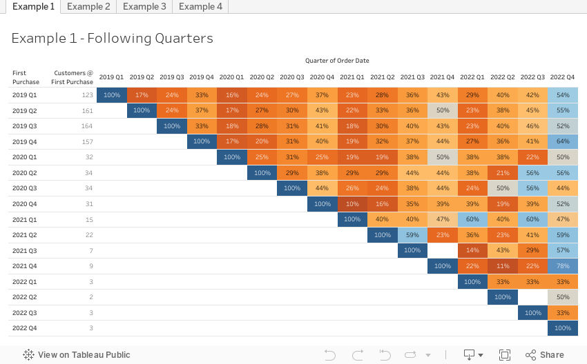
How to Conduct Customer Retention & Cohort Analysis

- First, down the view, the users are divided into cohorts based on when they first installed the app
- Then, across the view, the users are tracked for 10 days after the launch to see who continued to use it.
September 27, 2022
Parameter Actions: Geographical Drill Down in Tableau
March 29, 2022
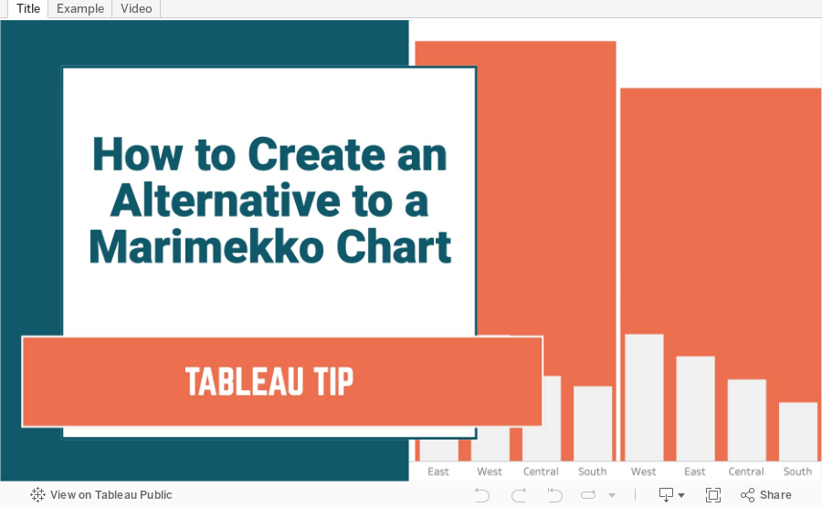
How to Create an Alternative to a Merimekko Chart
A Merimekko Chart, also known as a variable width bar chart, is useful for comparing both high-level data and low-level data in the same chart. However, since we have size variables for both the width of the bars AND the height of the bars, comparing different segments of the chart is more challenging than it needs to be. Read more about the problems with Merimekko charts here.
In this example, I show you how to make an alternative to a traditional Merimekko Chart. I show you how to compare both category sales and regions sales within each category at the same time.
This can be easily replicated by simply swapping out the dimensions and updating one LOD calculation. Alternatively, you could use two parameters to allow the user to pick both the high-level and low-level dimensions and a third parameter for the measure to compare.
February 15, 2022
How to Create a Barbell Chart
February 8, 2022
How to Create an Enclosed Dot Plot
February 2, 2022
How to Create a Jitter Plot
In this tip I show you how to create a jitter plot. A jitter plot is very similar to a dot strip plot other than it reduces the overlapping of the data points. The data is plotted like a dot plot and then we use either the RANDOM() or INDEX() functions to spread out the dots.






