Showing posts with label arc. Show all posts
March 19, 2025
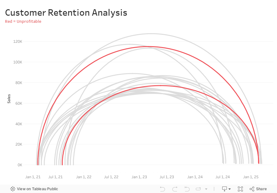
How to Analyze Customer Retention with a Jump Plot
arc
,
customer retention
,
data analysis
,
data visualization
,
how to
,
jump plot
,
relationship
,
tableau
No comments

Want to analyze customer retention trends in a more insightful way?
In this tutorial, I’ll show you how to create a Jump Plot in Tableau, a powerful visualization that helps track customer movement over time.
You’ll Learn:
✅ What a Jump Plot is and how it works
✅ How to structure your data for this visualization
✅ Step-by-step guide to building a Jump Plot in Tableau
✅ Key calculations to track customer retention effectively
The data sets, calculations, & steps are below the viz.
Create a free account to access the data:
📊 Download the sales dataset here
📊 Download the jump plot dataset here
Calculations you need:
-
Connect sales data source to 180 points and relate “1” to “1”
-
Compute Min Date by customer
{ FIXED [Customer Name] : MIN([Purchase Date]) } -
Compute the Max Date by Customer
{ FIXED [Customer Name] : MAX([Purchase Date]) } -
Filter customers that made more than one order (Max Date > Min Date)
[Max Date]>[Min Date] -
Create Customer Length calc
DATEDIFF('day',[Min Date],[Max Date]) -
Create Columns calc (continuous dimension)
DATE( ((COS([Point] * PI() / 180)) + 1 ) * (FLOAT([Max Date])-FLOAT([Min Date])) / 2 + FLOAT([Min Date]) ) -
Create Rows calc (continuous dimension)
SIN((MIN([Point])) * PI() / 180) * SUM([Sales]) -
Add Columns and Rows to viz
-
Add Customer to Detail
-
Add Path to Path
-
Create Profitable calc and add to Color
{ FIXED [Customer Name] : SUM([Profit])}>0
September 24, 2017
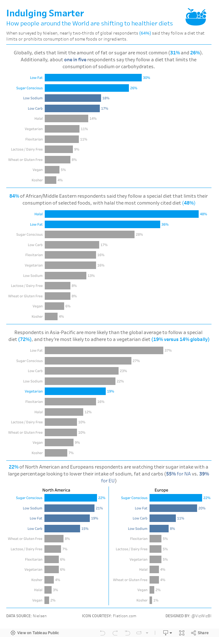
Makeover Monday: Restricted Dietary Requirements Around the Globe
arc
,
bar chart
,
curve
,
diet
,
Makeover Monday
,
narrative
,
story
,
vegan
,
vegetarian
No comments

What works well?
- Consistent ordering of the countries within each diet type
- Colors are easy to distinguish from one another
- Arcs, while not best practice, are engaging and capture your attention
- Subtitle that explains what the viz is about
What could be improved?
- Comparing the length of arc is difficult, especially across diet types.
- The icons are not needed since each diet is already labeled.
- The story in the data is lost as it's not included along with the charts.
My goals
- Simplify the visualisation; bar charts are a good place to start.
- Turn the text from the previous page that explains the findings into a story of some sort, probably long form and not story points.
- Remove the icons
With those goals in mind, here's my Makeover Monday week 39.
September 14, 2015
Dear Data Two | Week 22: Our Past
arc
,
Dear Data Two
,
history
,
past
,
timeline
6 comments

The topic for week 22 of Dear Data Two was our past. I immediately knew what I wanted to create in Tableau, and that was a visual resume (which you can view here). The inspiration for the resume comes from Ben Jones, who showed me his resume built in Tableau a couple years ago before he started working at Tableau.
From there, I started working on a couple of different draft versions of my postcard for Jeffrey. I thought I had settled on one and I showed it to my wife. When I asked for her impressions, she thought it was strange how I had stuff going left and right; she thought left looked negative and right positive, so in the final version I incorporated her feedback.
Data collection was pretty straight forward. I used:
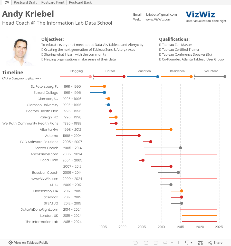
- LinkedIn for the dates of my professional history
- Blogger for the dates when I started my various blogs
- The rest was by memory (or what is left of it)
Subscribe to:
Posts
(
Atom
)


