October 5, 2022
How to Create a Starburst Chart
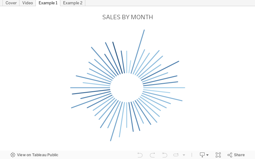
Starburst charts, sometimes called sunburst charts or circular timelines, are one method of displaying data over time. They may look cool, but they aren't exactly easy to understand. If you are going to use them, I'd advise you to check with your audience first to ensure they understand how to read them.
In this video, I take you through how to build a single starburst as well as a series of starburst charts as small multiples or trellis chart.
All of the calculations are in the description for the video here. You can download the workbook below.
March 29, 2021
#MakeoverMonday Week 13 - UK Trade With the EU Since the Brexit Referendum
I must admit I got a bit stuck with this week's dataset. It was very straightforward and I didn't like how anything turned out. With some ideas from the live audience on YouTube, I started comparing exports, imports and the trade balance. I then thought about a trick I had taught the Data School about using a timeline to filter.
Great, that's it! Wrong! The layout I had in my head was all wrong. I had to move some things around and then getting everything to line up took ages! Why or why isn't formatting easier???
Then, after creating the BANs, someone suggested that it would be good to show a zoomed in version of the line chart for the dates selected. I added those as sparklines with each BAN and it turned out so much better.
Check out and download the viz here.

March 2, 2021
How to Create a Circle Timeline

May 16, 2019
The History of English Football Champions: 1888-2018

Given that this requires animation, I knew I needed a tool that supported this and I turned to Flourish. The data has to be structured in a very specific way, so I downloaded the data from Wikipedia, imported it into Alteryx for a bit of a massage, and spit it back out in the format Flourish required.1889 ➡️ 2̶0̶1̶8̶ 2019— Squawka Football (@Squawka) May 13, 2019
Watch the race to become the most successful club in English top-flight history unfold before you. Now updated. pic.twitter.com/4IprWQ16ZT
And voila! An animated viz of the history of English football champions from 1888-2018. Very little effort required + great animation = win!
December 3, 2016
Celebrating 114 Years of the Bermuda Cup Match
Friday at the Data School, we had Rhiannon Fox in to run a workshop about her design process and how the Data School can apply that to their work. If Rhiannon’s name is familiar, it’s because we used her great Bermuda population growth infographic for week 30 of Makeover Monday.
We like to expose the team to multiple viewpoints throughout their training. Not every process resonates with every person, so providing them broad opinions helps them find their own way and their own process. Personally, I really enjoyed the workshop with Rhiannon as it opened my eyes to a whole new way of researching ideas and getting inspiration.
As a bit of context, the first day of every Data School cohort starts with me teaching them about data viz best practices, making choices, and critiquing visualisations. We use a lot of A2 paper and crayons! Then, about a month into their training, we have Caroline Beavon come in run a workshop. Caroline’s workshop is based more on infographics and storytelling as she comes from a journalism background. Her workshop builds upon mine. Rhiannon’s then builds upon Caroline’s, however, her approach is more from a graphic designer’s perspective.
I‘ve learned a ton from both of them, but don’t want to give away all of their secret sauce. Contact either or both of them if you’d like to hire them to run a workshop for you. Both of the workshops are absolutely amazing!
In Rhiannon’s workshop, I ended up missing out on a lot of the sketching parts due to meetings and the team presented some really amazing drawings they did for their project. The hardest part was NOT using Tableau to explore the data. In fact, the data exploration is done through the drawings themselves. Since I was not able to catch up, I cheated and used Tableau. Here’s what I built in about an hour or so. Click on the image for the interactive version.

May 30, 2016
Makeover Monday: The History of Famous Wrestlers

Confession: I worked on this on Wednesday, several days before the data went live to all of you. Sorry! But I’m on a family holiday to Paris. Yes, Paris. Lucky us!
Anyway, the visualisation and data this week comes from Horizontal History. Andy C did the data prep this week, so if there are problems, blame him, though he won’t respond because he’s camping somewhere in France. I’ve been dreading this data set for a while. I didn’t find it particularly interesting, but Andy insisted since I’ve been blowing this one off for 2 months.
Let’s start by looking at the original visualisation. You should definitely take the time to read through the original article because the author went through painstaking efforts to gather the data and gives an amazing overview. I’m going to focus on the last chart because it’s the most complete.
 |
| Click the image for the full size version |
What works well?
- This is a TON of information to display in one view. Given that constraint, the author organizes it probably as well as possible.
- The tall, thin layout works well and gives you a good sense for the length of the timeline.
- I like the dashed lines that signify a new century. It breaks up the viz and makes it easier to follow along.
What doesn’t work well?
- There are too many colors that are too bold. It’d be tough to come up with a color palette that works well for this many categories. Softer tones would work better.
- I don’t like turning my head sideways to read something. Rotate the whole viz and make it horizontal (which the author later did here).
- While I get that this is supposed to be an extensive list, it’s overwhelming. I’d love to see some interactivity like filtering and highlighting so that I can find my own story.
- If it were interactive, it would be good to include more information about each person as you click on them.
- Simply the visualization. It’s just too busy, but granted, that was kind of the point the author was making. Again, read the article and you’ll understand his approach.
I played with this data set, begrudgingly, for about 30 minutes and was getting a bit irritated. For me, it was overwhelming. I’m hoping others don’t feel the same way. I think my unconscious bias came into play this week against this data set. Finally I stumbled upon the Domain field and saw there was a sports category. Great! I love sports. This is the point where I decided to focus on a simpler subset of the data.
Within sports I first looked at footballers before finding the Holy Grail…professional wrestlers! I was a MASSIVE wrestling fan as a kid. The Hulk Hogan / Andre The Giant match from Wrestlemania III was totally changed wrestling. I’m watching it as I type this. Hulkamania shot through the roof! And in early 2015, I even got to meet the Hulkster in person!

So the heck with a makeover of the entire original viz, I wanted to create something about WRESTLING and the superstars I watched through the years. Enjoy!
May 12, 2016
The Data School Gym - Timeline Pareto Chart

Another Data School Gym challenge for you. Today Jonathan MacDonald reached out to me with a question. I’m glad he reached out because I’m constantly asking him question. He asked:
How can we create a timeline Pareto chart? That is, we need to calculate the cumulative sales for a dimension from it’s first sale until it’s most recent, but the time has to be expressed as a % of cumulative days.
So, here’s the challenge for you. Create this chart below. It’s based on Superstore Sales and there are no big tricks. Just see if you can do it. Some hints:
- You will need an LOD calc for the x-axis.
- Include a single select parameter for the dimensions. Each line on the chart represents one element of the selected dimension.
- Include an option to highlight a specific element within the dimension selected.
I’ve disabled the download option on the workbook so you can’t cheat. Tweet me when you think you’ve figured it out.
September 14, 2015
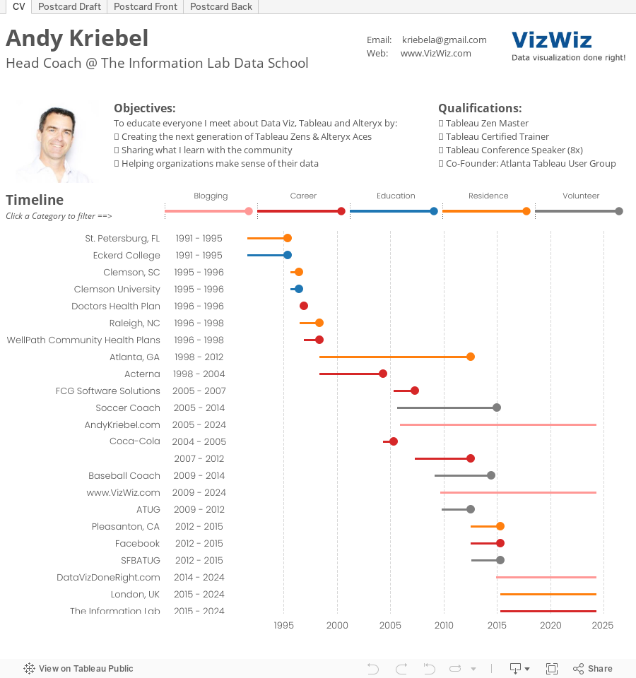
Dear Data Two | Week 22: Our Past

From there, I started working on a couple of different draft versions of my postcard for Jeffrey. I thought I had settled on one and I showed it to my wife. When I asked for her impressions, she thought it was strange how I had stuff going left and right; she thought left looked negative and right positive, so in the final version I incorporated her feedback.
Data collection was pretty straight forward. I used:
- LinkedIn for the dates of my professional history
- Blogger for the dates when I started my various blogs
- The rest was by memory (or what is left of it)