April 13, 2020
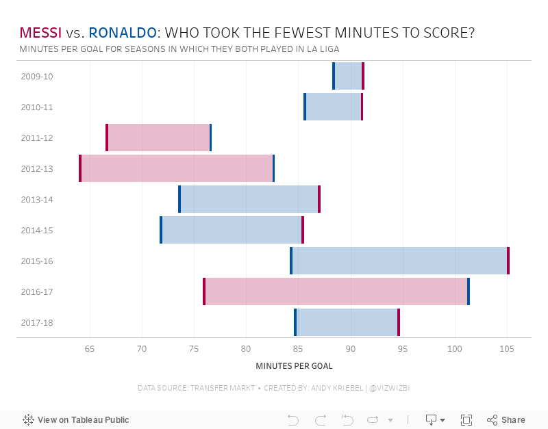
#MakeoverMonday: Messi vs. Ronaldo - Who Took the Fewest Minutes to Score?

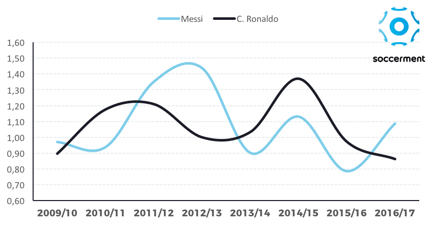
What could be improved?
- Curvy lines don't help you see the exact points of the data. When curved lines are drawn, they render to smooth out the lines, therefore misleading the location of the data along the axis.
- Does the data represent each season or matches within a season? Given that I haven't looked at the data yet, the curved lines make me think the latter.
- Is there a missing title?
- What does the y-axis represent?
- It looks like the data might be goals per match, but that would be misleading since they might have substitute appearances? Would goals per minute normalize the data better?
May 16, 2019
The History of English Football Champions: 1888-2018

Given that this requires animation, I knew I needed a tool that supported this and I turned to Flourish. The data has to be structured in a very specific way, so I downloaded the data from Wikipedia, imported it into Alteryx for a bit of a massage, and spit it back out in the format Flourish required.1889 ➡️ 2̶0̶1̶8̶ 2019— Squawka Football (@Squawka) May 13, 2019
Watch the race to become the most successful club in English top-flight history unfold before you. Now updated. pic.twitter.com/4IprWQ16ZT
And voila! An animated viz of the history of English football champions from 1888-2018. Very little effort required + great animation = win!
August 9, 2018
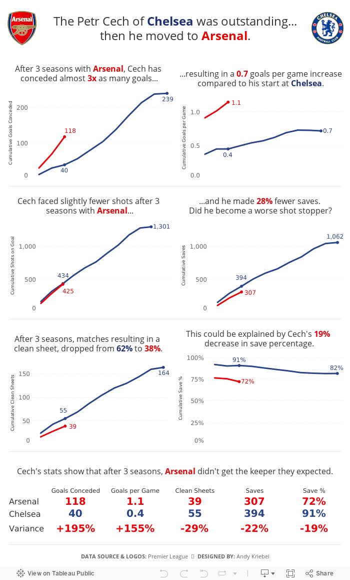
The Petr Cech of Chelsea was outstanding...then he moved to Arsenal
In an Arsenalesque sense of optimism, Arsene Wenger thought bringing in a great goalkeeper would solve their defensive woes. Many fans, however, knew that the real problems were in front of the goalkeeper. Without a solid defense, a goalkeeper cannot be effective.
This led me to thinking about how Cech's first three seasons compared to his first three seasons with Chelsea, when he was widely considered one of the best goalkeepers in the World. The data shows that Arsenal more or less ruined him. Or did Chelsea's stellar defense make him better than he really is?

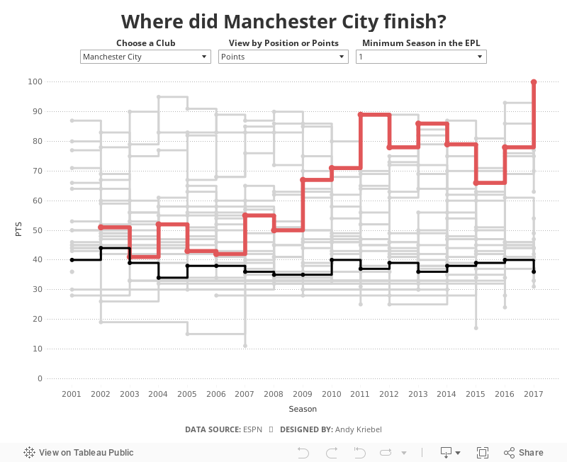
History of the Premier League Table
When I originally created this, I had to use table calcs to get the stepped lines to work, which can get complicated and is very time consuming. Now with stepped lines, it merely a matter of changing the lines type.
I decided to add in a couple of user options:
- Which team do you want to highlight?
- How do you want to compare the teams? By total points for the season of the final position in the table?
- Not all teams have been in the EPL for all 17 years, so I provided an option to filter down to just the teams that have been in the EPL for the user specified number of years.

May 21, 2018
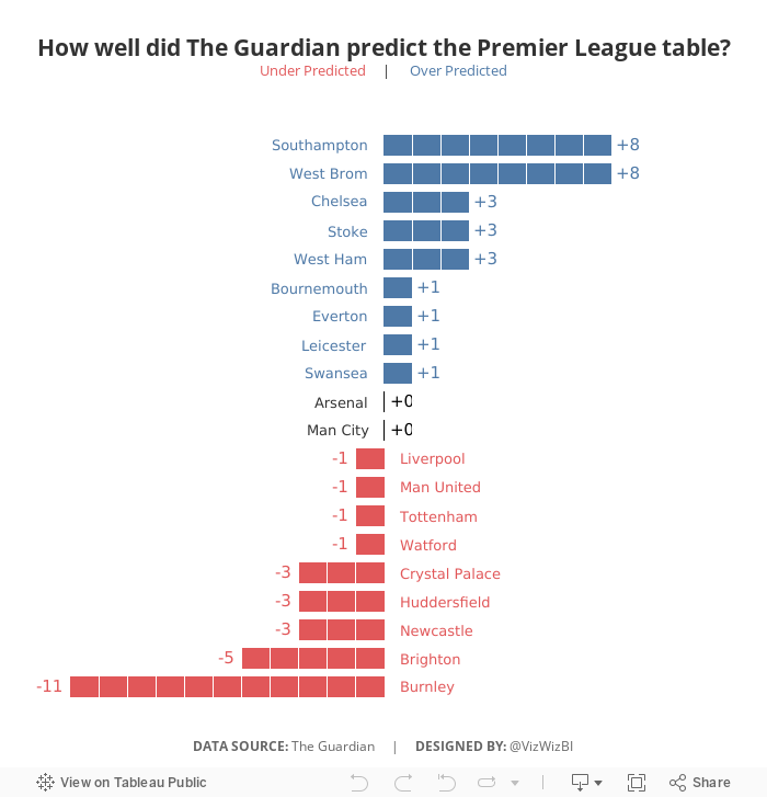
Makeover Monday: How well did The Guardian predict the Premier League table?


What works well?
- Sorting the teams by prediction makes sense since this is an evaluation of their performance against their prediction.
- Including the logos so people can find their favorite team
- Including the numbers for the table position so that the reader doesn't have to count as they go
- Shading every other row helps break up the view
What could be improved?
- If you don't know the team logos, it can be hard to track a team across the table.
- It's hard to see which team did better and worse than expected.
- There's no scale for how "well" The Guardian predicted the table.
My Goals
- Focus on the difference between the predicted and actual results
- Try to create some sort of unit chart (I didn't have time to figure out the calcs, so I cheated with distribution bands)
- Make it easier to see if team finished above or below the predictions
- Finish in under an hour because we did MM live at the Data School and had to present to Eva at the end of the hour
June 5, 2017
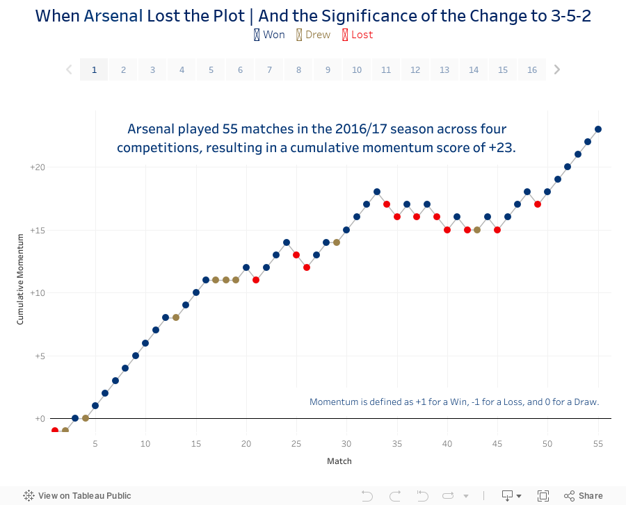
When Arsenal Lost the Plot...and the Significance of the Change to 3-5-2
So I sat down last night and cranked out this viz and story about Arsenal's 2016/17 campaign, including the up, the downs and the inevitable contract extension for Arsene Wenger.
Enjoy!
December 5, 2016
A History of the North London Derby in the Premier League
I really liked the learnings that I got last Friday from Rhiannon Fox and the cricket viz I ended up creating. It got me to thinking about other data that I could use with a similar visual display to continue practicing what I learned. Arsenal was preparing to play London rival West Ham on Saturday while I was watching my son skateboarding, so I thought I’d create something comparing Arsenal with their biggest rival, Tottenham Hotspur.
I was able to quickly get all of the results from Wikipedia, which I then imported into Google Sheets and then connected to Tableau. I showed a couple of iterations to Gwilym this morning at the Data School to get his feedback and we agreed that displaying goal difference was the most effective display. In addition, I added dots to indicate the winner. The goal difference display helped show the ebbs and flows of the rivalry way better than showing the goals scored by each team in each match as a diverging bar chart.
Click on the image for the interactive version. Does this display work for you? What might you do differently? Leave a comment and let me know or, better yet, download the workbook, iterate on my design and leave a comment with a link to your version. Enjoy!

February 29, 2016
Makeover Monday: Premier League Wages Soar as the Rest Creep Along

This week’s Makeover Monday takes a look at this donut chart from Mail Online:

We’re working again with a very simple data set this week and a chart that suffers many problems. Instead of listing them all out individually, I’ve used Tableau’s Story Points feature to walk you through the step-by-step makeover. In the end, it took me 10 steps to get to the final result that I’m satisfied with. To me, the story isn’t about the increase in wages for footballers, rather the increase in their wages compared to the average household.
December 24, 2015
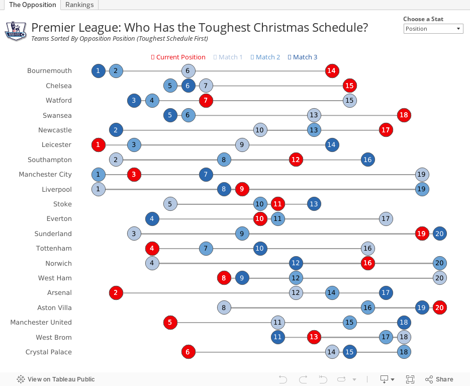
Premier League: Who Has the Toughest Christmas Schedule?

Using the viz below, you can see that, based on the average position of their opponents, Bournemouth has the toughest run followed by Chelsea. Leicester has the 6th toughest run, while Arsenal have the 5th easiest. This provides hope that Arsenal can finish the festive season on top of the Premier League.
I've added a parameter on the upper right to allow you to view by opposition points as well. In this view, Bournemouth and Chelsea still have the two toughest schedules, but the teams with the easiest schedules shifts a bit.
On the 2nd tab, I've added a bit of an exploratory view. Pick a metric and see the team rankings.
#COYG!
October 5, 2015
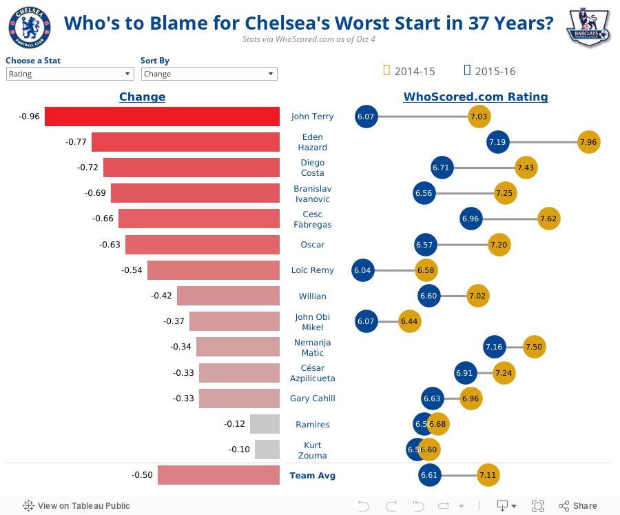
Who's to Blame for Chelsea's Worst Start in 37 Years?

It’s been interesting watch it unfold from this side of the pond. Mourinho is a media darling, even getting away without punishment from the FA and the club for his treatment of team doctor Eva Carneiro. After every loss he pushes the blame on someone other than himself. It’s likely only a matter of one more loss before he gets the sack.
Given all of Mourinho’s shortcomings as a manager this year, the ultimate proof comes in the form of his players’ performances on the pitch. So far this season, those performances have been downright dreadful. Just how bad has it been? The viz below shows that things are really, really bad.
I looked at three key stats from WhoScored.com: Player Rating, Pass Completion %, and Aerial Duals Won. I took the data and filtered it down to the outfield players that made contributions both last season and this. I then created the simple analysis below.
Some notes:
- Every player has a lower rating this year than last. Particularly in poor form are Terry, Hazard, Costa and Ivanovic.
- Some of Chelsea’s most creative players are struggling to connect passes. Are the likes of Ramires, Oscar and Fabregas trying too hard under the pressure perhaps?
- Matic has been taking a lot of stick from Mourinho, but his pass completion % is 3.5% better than last year. He’s not being nearly as sloppy with the ball as his midfield counterparts, though if you read the papers you would think it was the opposite.
- John Terry is showing his age when it comes to aerial duals. He’s winning less than half as many as last year.
If things don’t turn around in the next fixture against Aston Villa, I wouldn’t be at all surprised if Jose got the sack. Why? Because you can’t fire 24 players at once and because Mourinho’s ego is too big to last more than three years at any club.
April 20, 2015
Makeover Monday: Chelsea Are the Worst-Behaved Team in the Premier League When It Comes to Showing Respect to Referees

As I was scouring the various reports, I didn’t see anyone actually create a viz on the subject. The best I found was this table from The Daily Mail:

A table is great for ranking and looking things up, but terrible for doing any sort of analysis. I downloaded the FPL table into Excel (here) and combined it with the BPL standings as of the same date.
In the viz below, I’m using Chelsea as the baseline for comparison, because the story that interested me was how much worse does Chelsea behave compared to the other teams. For example, if you hover over Liverpool, you will see that Chelsea is 14% worse with its respect for referees.
I then added a second tab that allows you to explore the data on your own. Pick a FPL stat, a BPL stat and you can compare and contrast. The question I wanted to answer here was “Is there a relationship between FPL and BPL stats?” I can’t find any interesting relationships, but maybe you can.
April 12, 2015
English Football Stadium Tracker

Today, I set out to see some football stadiums. I mapped a route that took me from Wimbledon, past three iconic football stadiums.
 |
| Craven Cottage - home of Fulham FC |
 |
| Loftus Road - home of QPR FC |
 |
| Stamford Bridge - home of Chelsea FC |
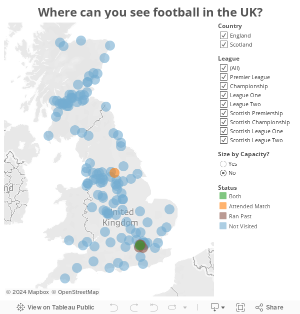
And yes, I know I titled this post "English" and Scotland is not part of England, but UK football stadium tracker doesn't resonate as well with me.
March 9, 2015
Makeover Monday: Alexis Sanchez Shows Angel Di Maria How to Shine

This is the aforementioned bar chart:

At the initial glance you might think there’s not much wrong with this, but there is one major problem - the bars are not synchronously scaled. Look at the Di Maria side. Since when is 8 assists 75% of 37 shots? See what I mean?
I’ve created two alternative versions of the same infographic that are scaled proportionately. This first version is basically identical to the original other than the bars are scaled correctly.

There are times when I find look at the bars next to each other, but going in opposite directions, harder to compare than they need to be, so I created this second version to take care of that. In this version, I show the bars above/below each other to make the bars much easier to compare.

Now that’s better! Remember folks, scale your axes properly! Which version do you prefer? Why?
I build these in Tableau, so if you’d like to have a crack at your own version, you can download the workbook here (requires Tableau 9).
February 16, 2015
Makeover Monday: How Does Francis Coquelin's 14/15 Season Compare to Alex Song's 11/12 Season at Arsenal?
That decision left Arsenal very thin at the back to start the 14/15 season. Fast forward a few months and injuries, as they always do, hit Arsenal hard. They were forced to recall Francis Coquelin from a loan spell at Charlton.

As the saying goes, he's been like a new signing. In his previous spells with the first team, he failed to establish himself, but this time around, he grabbed hold of the opportunity and surely now Coquelin is the first name on the manager's team sheet.
Late last week, I ran across this article from HITC Sport. In it, Dan Coombs says "Coquelin has shown already that he is playing defensively at an equal or higher level than Song's final season at the club." Dan then provided this simple table:

This table is perfectly fine. It's a table and it provides a great way to look up the data. In the end, the point of the story is to show how effectively Coquelin is playing compared to Song. I created this infographic in Keynote with the hope that it is more interesting, more engaging and makes comparisons easier.

January 13, 2015
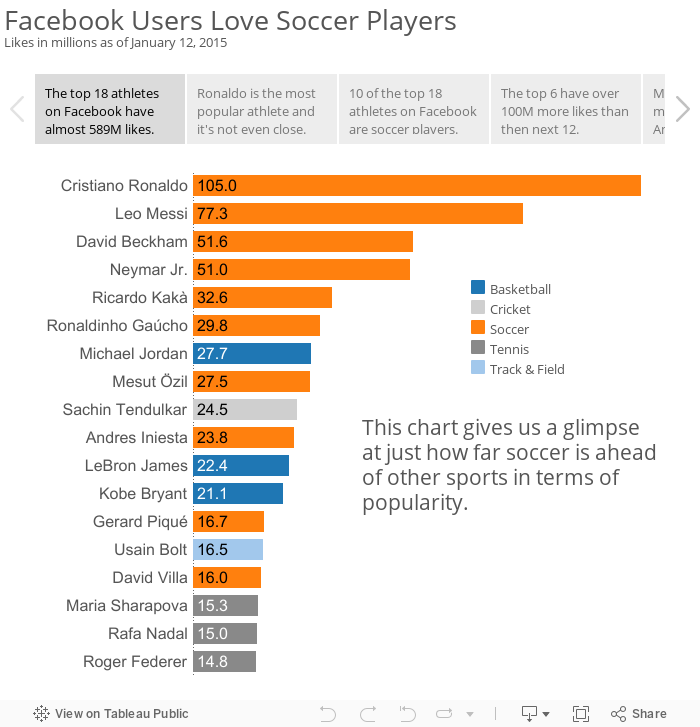
Makeover Monday: Cristiano Ronaldo is the Most Popular Athlete in the World and it isn't Even Close

I've reviewed a lot of Cork's charts and this one makes many of the same mistakes as his past charts:
- It's incredibly annoying to have to turn my head sideways to read the chart.
- The chart is in ascending order, yet the story emphasizes the descending order.
- The colors aren't distinct enough from each other for me. For example, the colors for Track & Field and Cricket and too similar.
- The chart, on it's own, doesn't capture the entire story that's in the article.
You can download the data here and the workbook here.
January 11, 2015
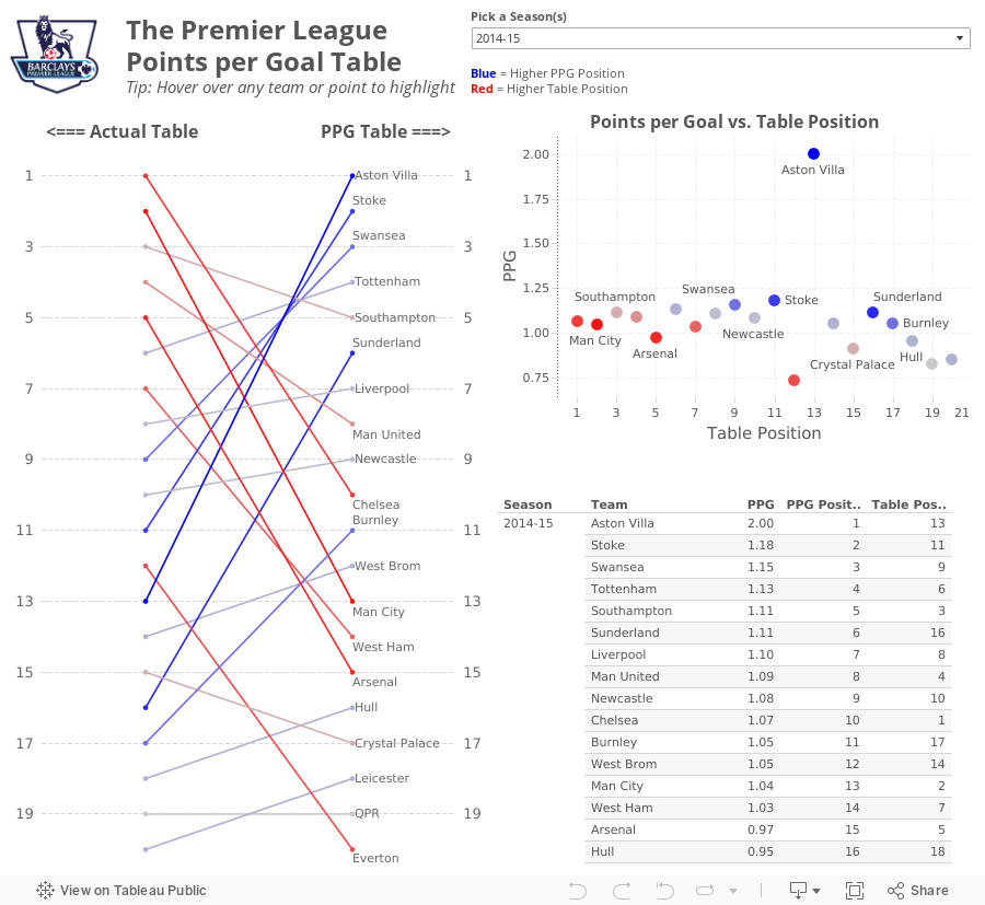
What If Premier League Standings Were Based on Points per Goal?
So far in the 2014-15 season, Aston Villa has the highest points per goal of any Premier League team in the last 10 seasons.This was quite intriguing to me, so this morning while I was enjoying a cup of coffee at Tully's I went to ESPNFC.com and downloaded the standings for the last 10 years. I added two columns to this dataset, which you can download here.
- Points per Goal (PPG)
- PPG Position (i.e., a rank of each team based on PPG)


From there, I wanted to understand the difference between Villa's actual place in the EPL table and their place in the fictitious points per goal table. For this view, I created a slopegraph, which I first wrote about creating in Tableau here.
If you're unfamiliar with slopegraphs, Andrew Wheeler summarizes them well in his paper "A Critique of Slopegraphs":
Slopegraphs show values for two numeric variables by line segments for each observation by connecting points on two parallel axes. They are frequently recommended for visualizing the changes in ranked data (Bertin, 2011; Tufte, 2001).I put all of the pieces together in this simple dashboard, which you can download here. Do you notice anything else interesting or unusual?
December 17, 2014
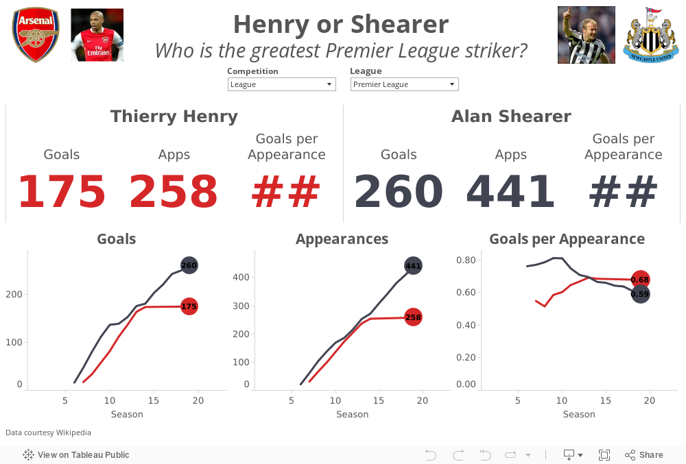
Henry or Shearer? Who is the greatest Premier League Striker?
In a tribute to The King, the Premier League created this great compilation video.
Henry's retirement led to the inevitable debate of who is the greatest Premier League striker ever? Most people agree that Thierry Henry and Alan Shearer are in a class by themselves. The great thing about sport is that it leads to lots of opinions and great debates. There are Henry camps and there are Shearer camps.
I gathered their career data from wikipedia (here and here) and combined them into a single spreadsheet here. I built this quick viz in Tableau to allow you to answer the question for yourself. Download the workbook here.
October 28, 2014
My first experience with import.io and Tableau
During the webinar, Alex revealed that he was a huge Arsenal fan (as am I), and I wanted to find a simple project to become more familiar with the tool. My basic idea was:
- Use the import.io Extractor to download the Premier League table from ESPNFC for every season since 2002
- Create a visualization in Tableau
- Allow the people interacting with the viz to highlight their favorite team
- Make Alex happy!

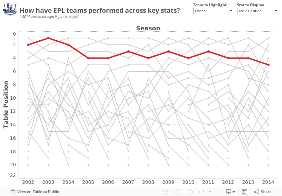
Download the Tableau workbook here.
September 3, 2014
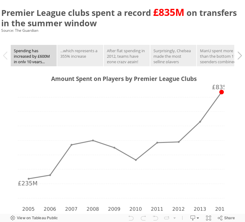
Premier League summer spending was out of control - A Story
I created most of the charts you see on my commute into work on the shuttle and polished it up after breakfast. What was most fun about creating this story was the process itself; I went from idea to data to vizzes to story in a very short amount of time.
My advice to you: If you hear an interesting fact, look into it. Find some data. Tell the story in your own words. It's a great way to practice and develop your craft.
November 13, 2013
VizCup roundup–data viz hackers unite!
Last Thursday evening, Facebook hosted 80 people for the VizCup, a data visualization competition. We provided eight data sets two days ahead of time for the participants could choose from. The data ranged from UFO sightings, to natural disasters, to the Premier League, to Foursquare check-ins, to stats about blogs, pages and portals. They also had the option to supplement the data with data of their own, like corn yields to see if there’s a relationship to UFO sightings.
We allowed the participants to self-organize into teams or they could work on their own. In the end, we had 25 individuals or teams present.
Ken Rudin, who leads all of analytics at Facebook, kicked off the evening with a few words about what it means to be an analyst and the future of analytics. Ken was followed by our three awesome judges, who came out to loud cheers and a bit of Crazy Train for intro music. Anya A’hearn of datablick, Drew Skau of Visual.ly and Cole Nussbaumer of storytelling with data served as our judges. Check out Cole’s review of the VizCup. When the hacking began, the judges roamed the room to get a feel for what people were building.
One interesting note was that every participant, except one, chose to use Tableau to build their viz, despite being given the freedom to use whatever tool they wanted. Personally, I think this is for two primary reasons:
- Tableau’s ease of use and the ability for a user to build something meaningful in an hour
- The enthusiasm and passion of the Tableau community. What I mean by that is Tableau’s users look for any excuse to use Tableau on their free time. Mike Evans, our 2nd place finisher, even flew up from LA!! Now that’s passion!
There will be summaries of the top 3 finishers coming soon, written in their own words. But first, here are a few pictures to give you a feel for the atmosphere (thanks to Peter Bickford of Slalom Consulting for many of the pictures). Farther down in this post, you can see some of the entries submitted. We’re super excited to host the event again soon!






